Walk into almost any fast-food outlet or bustling cafe, and one colour is likely to greet you before the aroma of freshly prepared food does red. From vibrant facades and illuminated signage to accent walls, upholstery and branding, red has become an unmistakable feature of many restaurants worldwide. While it may appear to be a stylistic choice, its widespread use is far from accidental. Behind this bold hue lies a carefully considered design strategy rooted in psychology, neuroscience and architectural thinking.
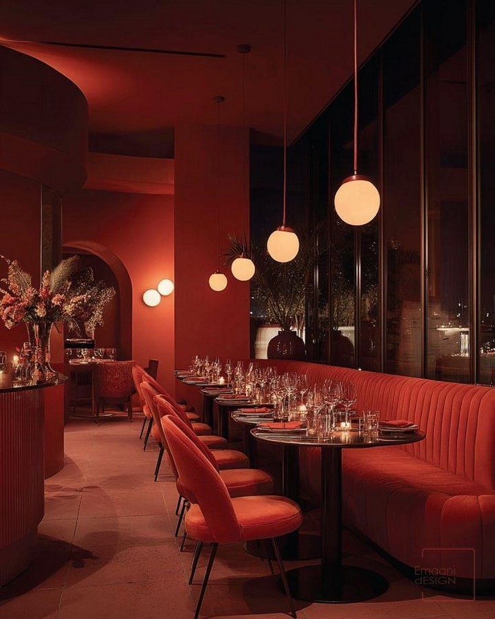
Architecture is often understood through its physical form, yet the spaces we inhabit influence us in ways that extend far beyond walls and roofs. Interior colours, lighting, materials and spatial composition shape our emotions, behaviour and perception. In restaurant design, these elements work together to create experiences that encourage comfort, social interaction and, perhaps most importantly, appetite.
The popularity of red in restaurants raises an intriguing question: can a colour really make people feel hungrier? While no single design element can determine human behaviour on its own, research in environmental psychology suggests that colour has a measurable influence on how people perceive spaces and respond to them. Red, in particular, has become one of the most powerful tools in the designer’s palette for creating energetic and engaging dining environments.
Colour as Design Language
Colour is one of the earliest visual cues people register when entering a space. Long before noticing furniture details or decorative elements, the human brain processes colour and begins forming emotional impressions. Architects and interior designers use this principle deliberately, recognizing that colour is not merely decorative but a means of influencing mood, movement and spatial experience.
Warm colours such as red, orange and yellow are commonly associated with energy, excitement and sociability. Cooler shades, including blue and green, tend to evoke calmness, relaxation and introspection. These psychological associations are particularly significant in hospitality design, where every design decision contributes to the overall customer experience.
Restaurants are carefully choreographed environments. The layout, circulation, acoustics, lighting and colour palette are designed to support a particular style of dining. Whether encouraging quick service in a fast-food outlet or creating a leisurely atmosphere in a fine-dining establishment, colour becomes an invisible guide that subtly shapes how people interact with the space.
Why Red Captures Attention
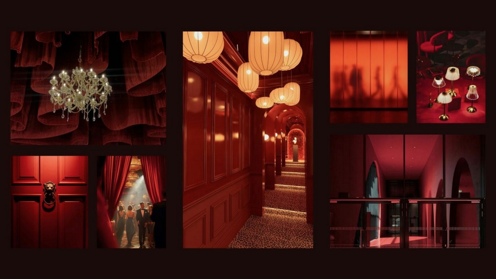
Among all colours, red possesses exceptional visual dominance. It is naturally associated with energy, warmth and urgency, making it one of the first colours our eyes notice. This heightened visibility explains why red frequently appears in traffic signs, emergency equipment and retail branding.
Within restaurant environments, red immediately attracts attention to entrances, menus, promotional displays and seating areas. It creates a sense of activity and liveliness, making spaces feel vibrant and inviting. This psychological stimulation can increase alertness and emotional engagement, encouraging diners to interact more actively with their surroundings.
Studies in colour psychology suggest that exposure to warm colours can increase physiological arousal by slightly elevating heart rate and stimulating the senses. Although red does not directly create hunger, this heightened state of alertness can make food appear more appealing and encourage quicker decision-making. When combined with the aroma of freshly prepared meals, warm lighting and an inviting ambience, red contributes to a dining environment that feels energetic and appetising.
The Role of Environmental Psychology
Environmental psychology explores the relationship between people and the spaces they occupy. It demonstrates that the built environment can influence behaviour, emotions and decision-making through subtle sensory cues.
Restaurant interiors engage multiple senses simultaneously. Diners respond not only to food but also to colour, sound, texture, temperature and lighting. These elements collectively shape their perception of comfort, quality and satisfaction.
Red functions as one component within this broader sensory experience. Rather than acting independently, it works alongside architectural features and interior elements to create an atmosphere that encourages social interaction and enhances the dining experience.
This holistic approach highlights an important principle of architectural design: successful spaces are rarely defined by a single feature. Instead, they emerge from the careful integration of multiple design elements that support a common objective.
How Restaurants use Red Strategically
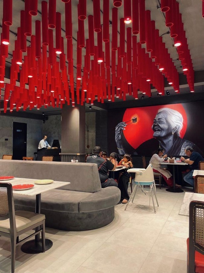
The application of red extends beyond painted walls. Designers incorporate the colour across multiple aspects of restaurant architecture and branding to reinforce the desired customer experience.
Branding and Identity
Many internationally recognised restaurant brands incorporate red into their logos and visual identities because of its strong visibility and memorable character. The colour projects confidence, excitement and energy, making it particularly effective in highly competitive commercial environments.
Consistent use of red across signage, menus, packaging and interiors creates a cohesive brand identity that customers instantly recognise.
Interior Design
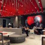
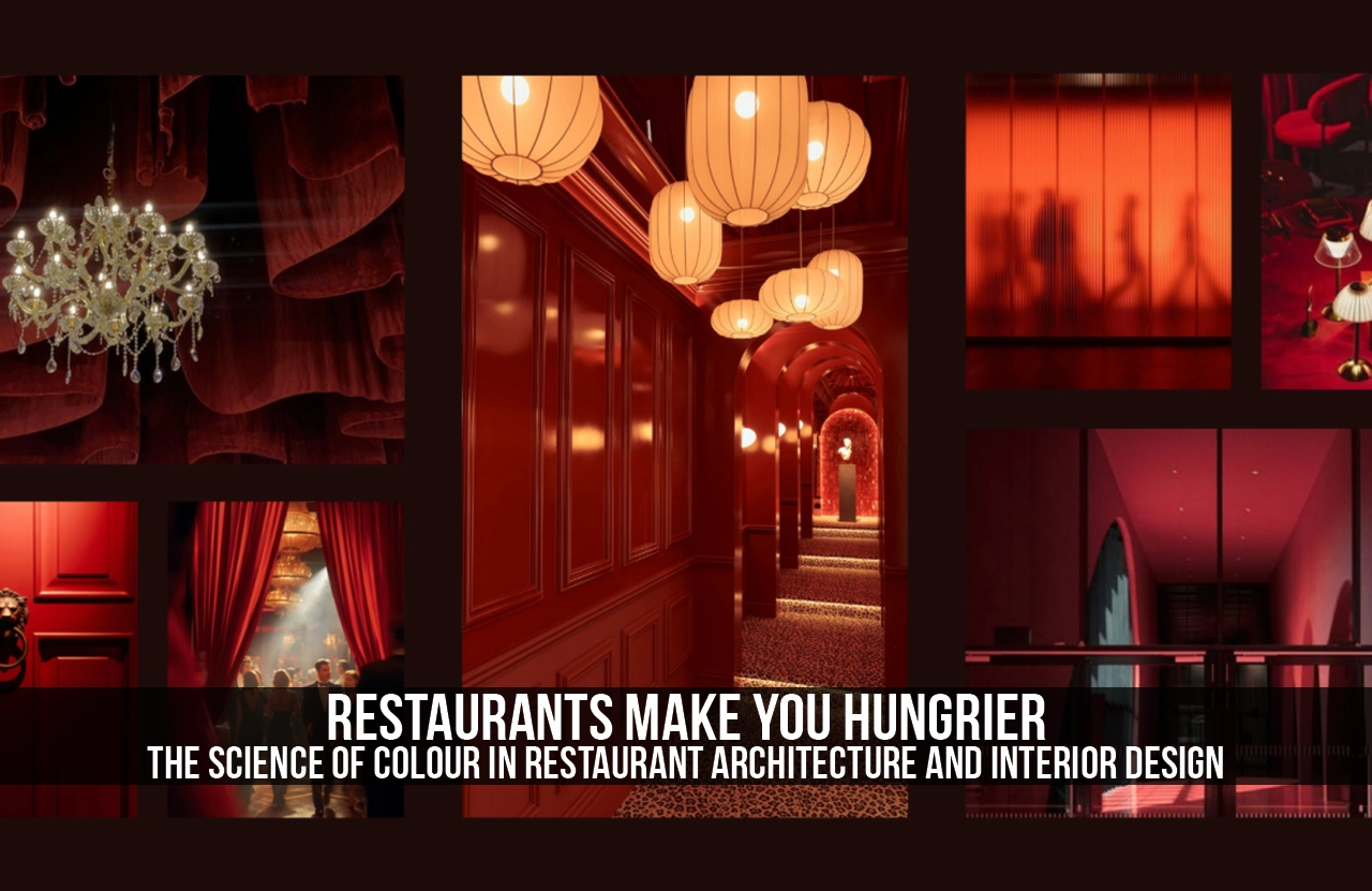
Inside restaurants, red is often introduced through feature walls, seating upholstery, decorative artwork or architectural details. Rather than overwhelming the space, designers frequently balance it with neutral colours such as white, grey, timber finishes or exposed brick.
This contrast allows red to remain visually impactful while maintaining a comfortable atmosphere for diners.
Lighting
Lighting significantly influences how colours are perceived. Warm lighting enhances red tones, creating an inviting and intimate environment that complements dining activities. The interaction between colour and illumination demonstrates how architectural design relies on multiple layers of sensory experience rather than isolated visual elements.
Materials and Texture
Contemporary restaurant interiors often combine red accents with natural materials such as timber, terracotta, brick and stone. These combinations introduce warmth and authenticity while preventing interiors from feeling overly artificial or visually overwhelming.
Fast Food versus Fine Dining
Not every restaurant uses red in the same way. The colour strategy often reflects the intended dining experience.
Fast-food restaurants commonly employ bright reds and yellows to create energetic environments that encourage quick ordering and efficient customer turnover. Open layouts, bold graphics and vibrant colour palettes reinforce a fast-paced atmosphere suited to high volumes of visitors.
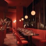
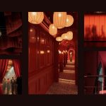
Fine-dining establishments, by contrast, usually adopt more restrained interpretations of red. Deep burgundy, wine tones or muted terracotta accents are paired with darker materials, softer lighting and carefully curated furnishings. These palettes encourage guests to relax, linger and enjoy a slower, more immersive dining experience.
This contrast demonstrates that colour selection is never arbitrary. It is closely aligned with operational goals, customer expectations and the emotional atmosphere designers wish to create.
Beyond Red: The Complete Dining Experience
Although red attracts considerable attention, successful restaurant design depends upon the harmonious integration of many architectural and interior design elements.
Spatial planning determines how comfortably guests move through the restaurant and how efficiently staff operate. Lighting establishes mood while highlighting architectural features and food presentation. Acoustic treatments manage background noise to support conversation without creating discomfort. Materials contribute texture, durability and sensory richness, while furniture influences posture, comfort and the length of a guest’s stay.
Natural daylight, indoor planting and biophilic design are increasingly incorporated into restaurants to promote wellbeing and strengthen connections with nature. These elements soften commercial interiors and create more memorable dining experiences.
Viewed collectively, these design strategies demonstrate that appetite is influenced not simply by colour but by the atmosphere of the entire space.
The Future of Colour in Restaurant Design
Changing lifestyles and evolving customer expectations are reshaping restaurant interiors. Increasingly, designers are moving beyond bold colour palettes towards more nuanced sensory experiences that prioritise comfort, sustainability and wellbeing.
Biophilic design, natural materials, adaptive lighting systems and flexible seating arrangements are becoming integral components of contemporary restaurant architecture. Earthy colours, muted greens and warm neutrals are gaining popularity, particularly in cafés and wellness-focused dining environments that encourage longer visits and stronger emotional connections.
Nevertheless, red is unlikely to disappear. Instead, its application is becoming more refined. Rather than dominating interiors, it is increasingly used as an accent colour that draws attention to key architectural features, strengthens brand identity and introduces moments of visual energy without overwhelming the space.
This evolving approach reflects a broader shift in design philosophy: creating environments that influence behaviour subtly while enhancing comfort, authenticity and overall user experience.
The prevalence of red in restaurants is not merely a matter of tradition or aesthetics. It reflects a sophisticated understanding of how colour, architecture and human psychology intersect to shape behaviour. Red captures attention, introduces warmth and stimulates emotional engagement, making it an effective component of restaurant design. Yet its success lies not in the colour alone, but in its thoughtful integration with lighting, materials, spatial planning and branding.
Ultimately, great restaurant architecture extends beyond creating visually appealing interiors. It crafts environments that communicate with people on a sensory and emotional level, influencing how they feel, interact and remember a place. In this context, red becomes far more than a decorative choice—it becomes part of an invisible design language that transforms dining into a carefully curated spatial experience.
References:
- Bellizzi, J. A., Crowley, A. E., & Hasty, R. W. (1983). The Effects of Colour in Store Design. Journal of Retailing, 59(1), 21–45.
- Elliot, A. J., & Maier, M. A. (2014). Colour Psychology: Effects of Perceiving Colour on Psychological Functioning in Humans. Annual Review of Psychology, 65, 95–120.
- Mehrabian, A., & Russell, J. A. (1974). An Approach to Environmental Psychology. Cambridge, MA: MIT Press.
- Birren, F. (2016). Colour Psychology and Colour Therapy: A Factual Study of the Influence of Colour on Human Life. Pickle Partners Publishing.
- Heller, E. (2009). Psychology of Colour: How Colours Affect Emotion and Reason. Wiley-Blackwell.
- Spence, C., Puccinelli, N. M., Grewal, D., & Roggeveen, A. L. (2014). Store Atmospherics: A Multisensory Perspective. Psychology & Marketing, 31(7), 472–488.
- Kotler, P. (1973). Atmospherics as a Marketing Tool. Journal of Retailing, 49(4), 48–64.
- Pile, J. F. (2007). Interior Design (4th ed.). Pearson Prentice Hall.
- Ching, F. D. K. (2014). Interior Design Illustrated (3rd ed.). John Wiley & Sons.
- The Interaction Design Foundation. (n.d.). Colour Theory and Colour Psychology in Design. https://www.interaction-design.org/literature/topics/color-theory