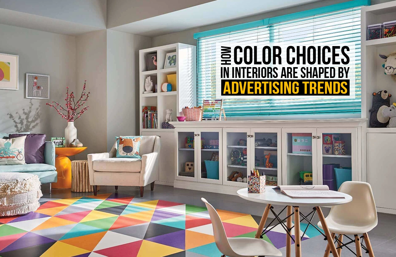
A homeowner and their family sit in an air-conditioned interior designer’s office, with numerous paint swatches laid out. The task at hand- to pick the colours their children would grow up with, the colours they would see as they walked into their home, even ten years later. But what if, years before this family met with their interior designer, a small team of designers in a glass-walled studio in Cupertino held the mood and theme of their family home? Absurd yet right, choices that are personal expressions of an individual’s taste and comfort are actually, subtly but very really, connected to marketing in the global technoworld.
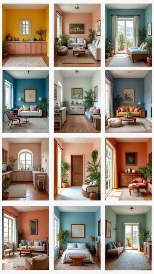
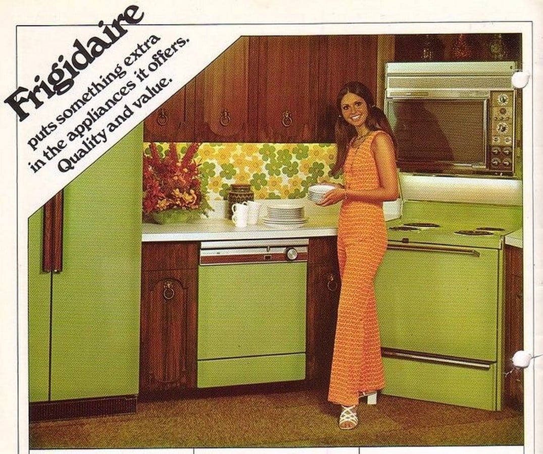
This isn’t new. Homes have long reflected the commercial and economic trends of their eras. Look back to the 1970s- avocado green appliances, burnt orange kitchen tiles, thick shag carpets- were not multiple families having coincidental choices. The 1970s aesthetic was the direct output of post-1960s manufacturing shifts, synthetic textile booms and commercial media framing these aesthetic choices as a collage for a cosy, grounded sanctuary during uncertain economic times. Every decade has its own unmistakable aesthetic signature, formed by commercial systems involving global-level markets. And no, they aren’t performing voodoo, just analysing and predicting.
The Science of Seeing: The Priming Effect
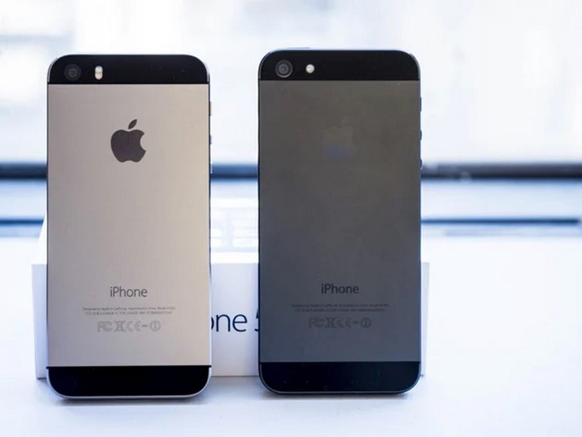
Repeated exposure to the media trains the human mind to associate visual palettes with abstract concepts. Brands launch global-level campaigns that do more than just launch a single product; they perform numerous studies and predict the “next new thing.” This is how a design movement called modernism came to have a visual signature. Through the 2010s, when Apple launched their iPhone 5s in 2013, it also introduced space grey and high-gloss jet black, colours that today represent high performance and modern living. The next couple of years saw cool grey interior finishes and high-contrast palettes that screamed clean and sleek.
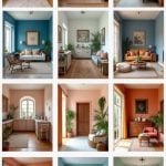
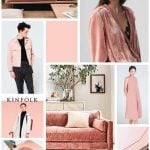
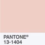
Parallel to this, modern wellness and lifestyle brands played with the public perception of softer hues. Glossier and Away saturated the world with dusty blush backdrops that were matched with self-care and emotional balance. Now, a shade that was used in nurseries and children’s rooms today lives in sophisticated living rooms as Millennial Pink.
Cross-Industry Cascade and Colour Forecasting
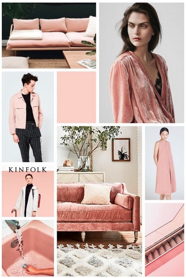
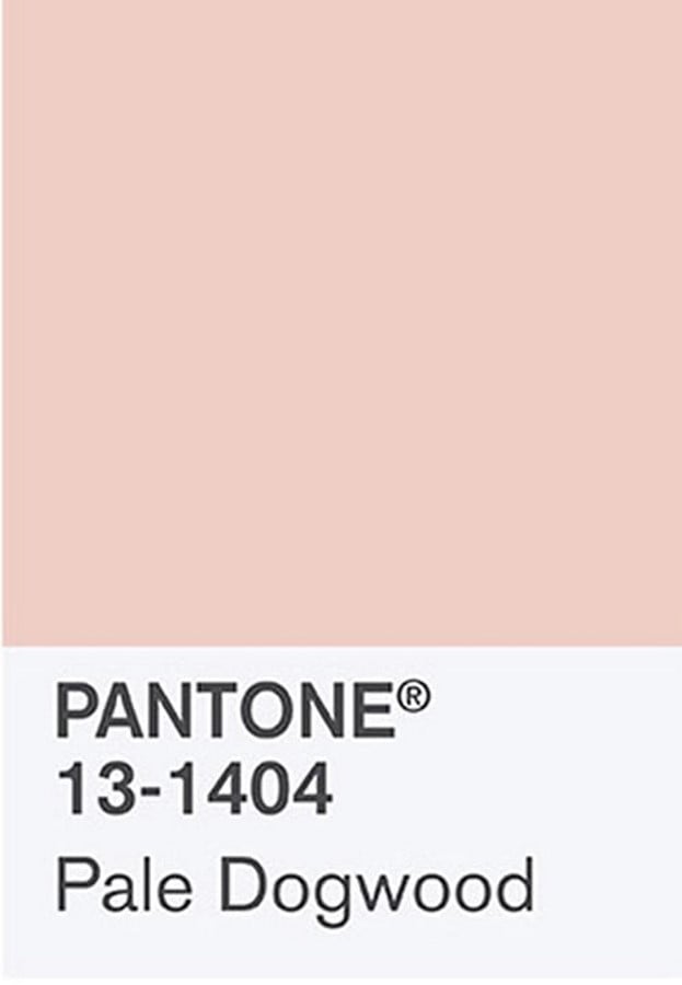
Trends rarely start in an interior designer’s studio. These aesthetic palettes are formed in the fast-paced industries of consumer goods, high fashion, luxury media and consumer tech. The movement of these palettes from these seemingly unrelated markets into home architecture is known as the cross-industry cascade. At the centre of this system function dedicated trend forecasting agencies like the Pantone Color Institute, World’s Global Style Network (WSGN), and the Color Marketing Group. They don’t take turns publishing their favourite colours as the next colour of the year; they have a complex framework of processes that involve analysing macroeconomic shifts, geopolitical moods, technological developments and media consumption patterns for up to three years in advance.
When Pantone selects its annual Colour of the Year, when major manufacturers like Sherwin-Williams, Benjamin Moore and Asian Paints reveal their respective palettes, it represents the final stage of a synchronised commercial system of processes. Cross-industry committees ensure that the shades advertised on a runway or a smartphone marketing campaign appear at least 18 to 24 months later in furniture showrooms, rug collections or paint catalogues. By the time someone sees a cushion cover at IKEA or Target, they already have a living room where it would fit just right in.
So, Who Really Liked It?
This commercial system serves an important function in modern culture. Beyond driving commerce, this system democratizes design. It helps all homeowners choose their colours from a list of pre-curated themes that remind them of an abstract feeling. They move from choosing a square inch of colour to a feeling they would paint their walls or furniture with.
Furthermore, this “little engine” that spits out palettes gives each generation a cohesive identity. Pottery Barn, Gap and Starbucks may have painted the 1980s homes in Hunter Green, Burgundy Red and Warm beiges with brass accents. The 2010s’ Millennial Grey and Millennial Pink may have been driven by Apple’s and Glossier’s product launches. However, their choices with these colour relations were guided by user trends. Ultimately, advertising chooses the visual language of an era, and an individual’s home remains a deeply personal space. Recognising the influence of these global trends does not diminish free choice, but rather allows for a more intentional engagement.
Citations:
Blaszczyk, R.L. (2012) The Color Revolution. Cambridge, MA: MIT Press.
Gage, J. (1999) Color and Meaning: Art, Science, and Symbolism. Berkeley, CA: University of California Press. Available at: williamwolff.org/wp-content/uploads/2009/03/gage-color-part1.pdf
McCracken, G. (1986) ‘Culture and consumption: a theoretical account of the structure and movement of the cultural meaning of consumer goods’, Journal of Consumer Research. Available at: https://www.jstor.org/stable/2489287
Reber, R., Schwarz, N. and Winkielman, P. (2004) ‘Processing fluency and aesthetic pleasure: is beauty in the perceived eye of the beholder?’, Personality and Social Psychology Review. Zajonc, R.B. (1968) ‘Attitudinal effects of mere exposure’, Journal of Personality and Social Psychology. Available at: https://cdn.isr.umich.edu/pubFiles/historicPublications/Theattitudinaleffects_2360_.PDF
Zajonc, R.B. (1968) ‘Attitudinal effects of mere exposure’, Journal of Personality and Social Psychology. Available at: https://cdn.isr.umich.edu/pubFiles/historicPublications/Theattitudinaleffects_2360_.PDF