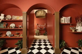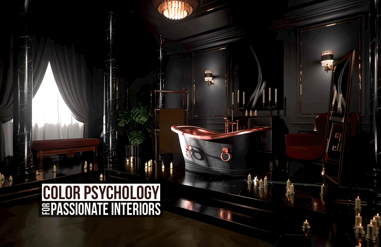
The human nervous system responds to colour before the brain has time to form an opinion. In the context of passionate interiors, this means that colour choice is not a matter of taste but of engineering a specific emotional and sensory state. Two colours dominate this conversation – black and red – and the reasons seem biologically and historically undeniable. But that doesn’t mean the loss of other colours at all – and here’s how they can work.
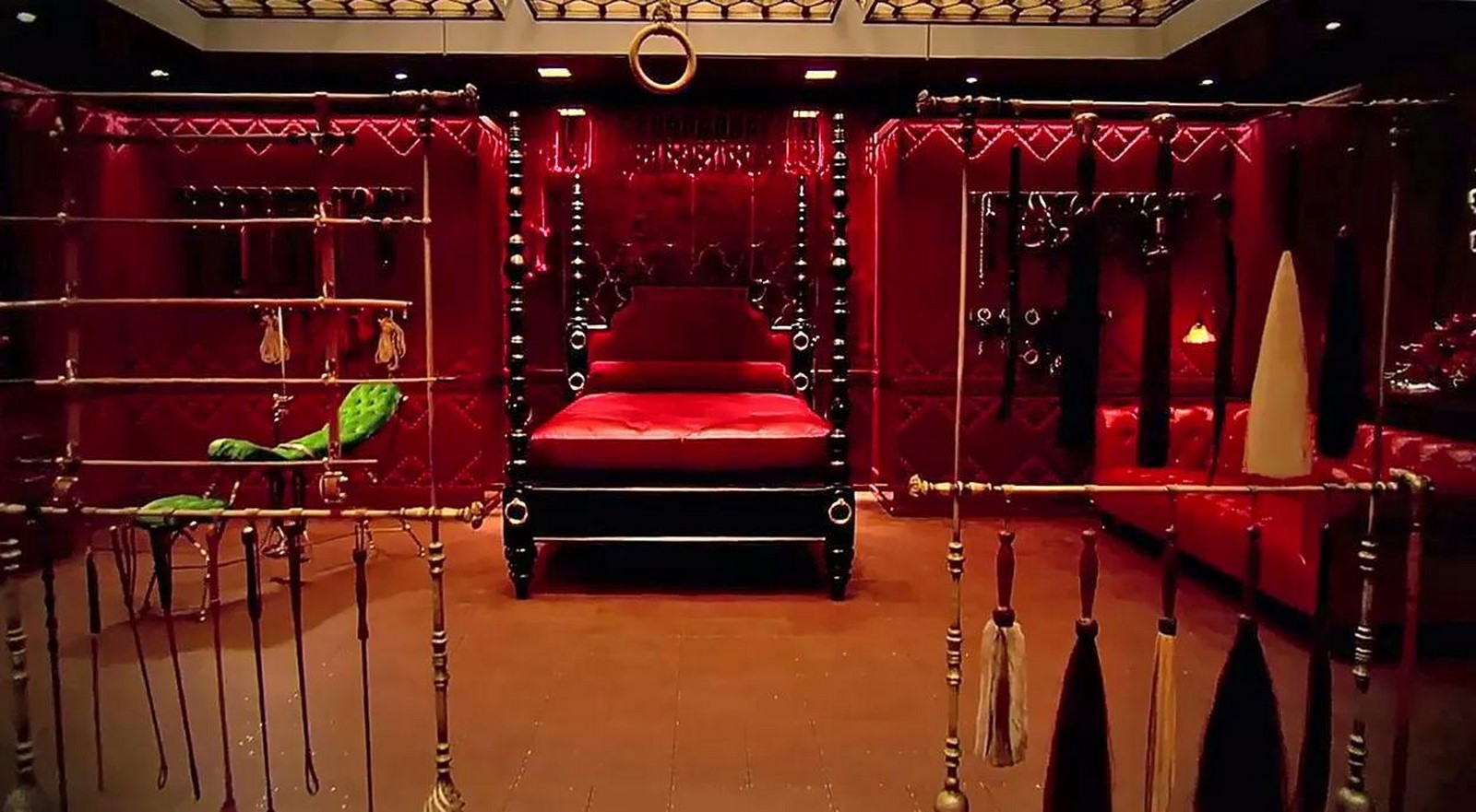
Why Red?
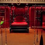
It is well-known that red triggers physiological arousal. Research consistently demonstrates that exposure to red increases heart rate, elevates blood pressure, and activates the sympathetic nervous system. A 2025 study published in ScienceDirect found that red was the colour most congruent with erotic stimuli across all tested hues (Rahimian et al., 2025).
The association of red with passion is also rooted in the body’s own signalling system. When a person experiences arousal or heightened emotion, blood vessels dilate, blood pressure rises, and the skin flushes red. That’s why in competitive and romantic contexts alike, red signals dominance – a finding replicated across species and cultures (Hill & Barton, 2005).
Why Black?
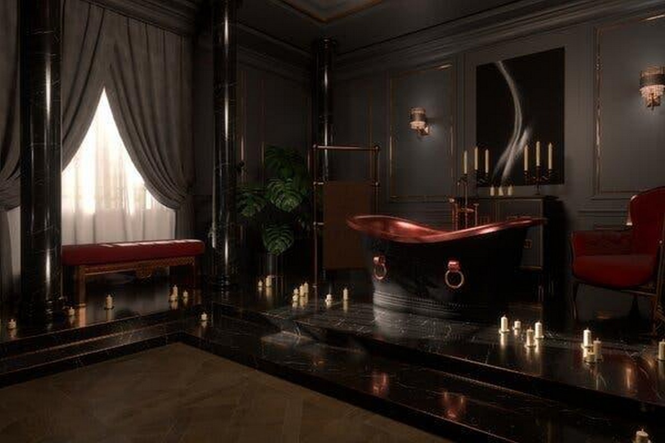
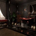
Psychologically, black evokes power, mystery, and a particular kind of luxury that lighter colours simply cannot produce – because black absorbs all wavelengths of visible light, reflecting nothing (Typeform, 2024). Black surfaces also compress perceived space and create what color psychology researchers describe as a sense of containment – a necessary precondition for intimacy (Valdez & Mehrabian, 1994).
The material behaviour of black matters as much as the colour itself. Matte black plaster absorbs light and creates depth. High-gloss black lacquer reflects it, producing a completely different psychological register – closer to glamour. The same wavelength of light, bounced off two different surfaces, produces two entirely different emotional outcomes – and both work well for passionate interiors.
Itten’s Framework: How Colour Actually Works
The single most useful framework for understanding why passionate interiors succeed or fail is still Johannes Itten’s The Art of Colour, published in 1961. Itten’s central argument is that a colour has no fixed appearance, only relational appearance. In the context of passionate interiors, colour psychology means that colours chosen for one surface are always perceived in simultaneous contrast with every other surface in the room.
Itten demonstrated that warm colours advance and cool colours recede – but only relative to one another. A deep burgundy placed against warm amber appears richer and more sensual than the same burgundy placed against a cool grey, where it reads as corporate and heavy (Itten, 1961, p. 47). Full-saturation colours placed together create visual competition rather than emotional coherence. In a passionate interior, the dominant palette should operate at reduced saturation – deep, muted, complex – with one accent at full saturation providing the tension point. Private members’ clubs throughout London’s Mayfair district have deployed it in exactly this way – because it performs.
Role of Lighting
Here is a truth about colour psychology in interiors: the most precisely chosen palette will fail entirely under the wrong light. Bright, direct overhead lighting destroys the effect of passionate colours. It flattens texture, eliminates shadow, and converts the intimate into the clinical. Under high-lux direct light, even red and black lose their psychological potency.
Passionate interiors require light that behaves like a secondary material – present, but invisible as a source. Indirect LED strip lighting installed behind furniture or beneath surfaces, warm-toned (2700–3000K), creates pools of light without identifiable fixtures. No chandeliers, no standard pendant lamps. The light should feel atmospheric rather than be functional. When this principle is applied correctly, other colours, such as deep blue or graphite grey, also become viable territory for a passionate interior.
The Whole Space as a Colour Instrument
The most common misunderstanding in colour psychology applied to interiors is the idea that colour refers to paint – it doesn’t. Colour is the total optical and tactile output of a space – walls, floors, ceiling, textiles, furniture, hardware, and objects combined.
Consider a concept built around matte black and deep jewel tones: correct palette, correctly specified, correctly lit. Now introduce polyester-blend cushions with a synthetic sheen, a chrome towel rail, or a gloss-laminate bedside table. Each of these elements refracts light in a way that disrupts the psychological enclosure the colour palette was creating – not only because they are not aesthetically pleasing on their own, but also because their surface behaviour contradicts the emotional logic of the concept.
Color psychology in application is not only about identifying the right colours, but also about controlling the entire light-and-surface environment so that every element reinforces the same psychological state. Velvet, aged leather, linen, plaster, and natural stone absorb and scatter light in ways that deepen colour perception and maintain intimacy. Synthetic fabrics, plastic trims, and high-gloss laminates reflect light specularly, introducing hard highlights that break concentration and puncture the atmosphere.
The same way works décor. Scented candles in predictable holders and mass-market cushions introduce visual noise that disrupts the colour’s operation. Other examples of visual noice are a child’s toy visible in the corner – they activate the completely opposite scenario of using the space. A single incongruous object is sufficient to break the psychological passionate effect entirely. Passionate interiors do not require decoration – they require editorial discipline.
The Colours of Power
Passionate interiors often derive their power from associations with dominance, exclusivity, and intensity. And here, deep purple comes in first place. In the ancient Persian Empire, the Byzantine Empire, and across the Hellenistic world, the colour of absolute power was purple – specifically Tyrian purple, extracted from Murex sea snails at extraordinary cost and labour. That’s why a deep aubergine space with warm indirect light and black material accents will work even better than the stereotypical red one.
Summary
Colour is a system, not a selection. Every surface in a room participates in the colour experience simultaneously. Lighting is part of that system. Material finish is part of that system. Cultural coding is part of that system. The moment any one element is specified in isolation – the moment a wall colour is chosen without knowing the light source, or a fabric is selected without reference to the palette it will sit within – the system begins to fail. Because that’s how colour perception works from the psycological point of view.
An extraordinarily passionate interior is not one where the correct colours have been chosen. It is one where every decision – colour, material, light, proportion – has been made in service of a single, coherent psychological state. That requires precision, discipline, and a serious engagement with color psychology as a framework, not a shortcut.
References:
Hill, R.A. and Barton, R.A. (2005) ‘Red enhances human performance in contests’, Nature, 435(7040), p. 293.
Itten, J. (1961). The Art of Color: The Subjective Experience and Objective Rationale of Color. New York: Reinhold Publishing Corporation.
Rahimian, M., et al. (2025). Designing for desire: Impact of indoor residential spaces’ colour on cognitive and sexual sensitivity. Journal of Environmental Psychology.
Typeform. (2024). The Color Black: Psychology, Meaning, & Facts.
Valdez, A. and Mehrabian, A. (1994) ‘Effects of color on emotions’, Journal of Experimental Psychology: General, 123(4), pp. 394–409.