Several conscious and unconscious cues in our psycho-spatial relationship are caused by colors and how we perceive them. It exists everywhere despite its presence and variances. Have you ever considered the function it plays in architecture?
Color in architecture refers to the deliberate use of diverse colors, tones, and saturations of color to create the visual and emotional experience of a space.

Along with the structural components that make up an architectural product, color application on surfaces affects how the space is perceived by users. Israel Pedrosa states that “A colorful sensation is produced by the nuances of light refracted or reflected by a material, commonly the word color is designated to those shades that function as stimuli in a chromatic sensation.”
History And Color
In architecture, color was frequently used because people wanted to pay homage to deities or kings or to celebrate the magnificence of the building itself. Ancient Greek stone statues and temples, which were once thought to be austere and neutral, have recently been found to be exquisitely painted with colors drawn from jewel stones to flora and minerals.
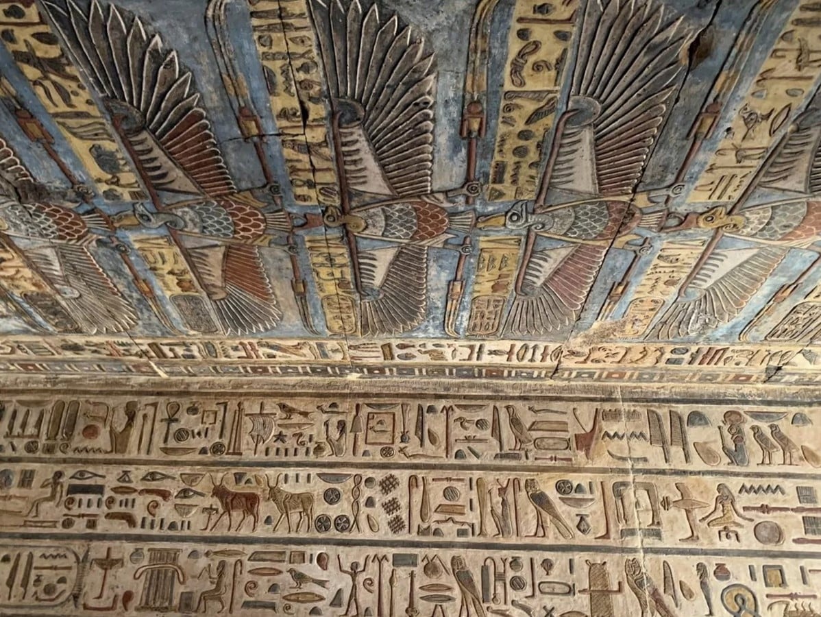
The Egyptian temples, tombs, and rooms were previously adorned with brilliant hieroglyphics and representations of pharaohs. The palaces and temples of China, as well as the cathedrals of medieval Europe, were all painted, and color symbolism was used liberally.
Other than religious buildings if we look at some architects from history, Luis Barragán’s work exemplifies color’s spatial purity as a component that produces emotions, in contrast to Siza Vieira, who keeps to the achromatism of surfaces. Red is incorporated into some of Lina Bo Bardi’s architectural features, and Legorreta uses brilliant hues that are influenced by Mexican culture.
Color And Architecture
Colors have an essential role in forming our impression of the world around us, and this is especially true in architecture.
Color in architecture refers to the deliberate use of diverse colors, tones, and saturations of color to create the visual and emotional experience of a space. It is an essential part of the design process and can be employed on a variety of architectural elements such as walls, floors, ceilings, facades, and even the surrounding landscape.

Color is used to create a desired mood, guide the viewer’s eye, add depth and movement, and even impact how people interact with a space. Color is used in architecture to shape the appearance of a structure and how it interacts with its surroundings, not just the interior.
Color Perception in Architecture
Biological reactions to color are entirely physical. Instead of the obvious optical reaction to color, it is a reaction to the energy of the light waves. According to studies, even when a person is blindfolded, his or her pulse increases when exposed to red and decreases when exposed to blue or green.
Color is an essential component of our world, not just in the natural environment but also in man-made architectural environments. The environment and its colors are perceived, and the brain processes and judges what it perceives on an objective and subjective basis.

Psychological impact, communication, information, and psychological effects are all parts of our perceptual judgment processes. As a result, the purposes of color design in an architectural environment are not limited to ornamentation alone. Empirical observations and scientific studies, particularly over the last eleven decades, have demonstrated that human-environment-reaction in the architectural environment is, to a considerable extent, based on sensory perception of color.
The Emotional And Psychological Impacts of Color
Color is important in affecting a user’s experience and perception of space, establishing moods, influencing behavior, and invoking specific emotions and connections that are intimately tied to cultural and symbolic meanings. Color can represent volume or constructive detail, or it can visually simulate certain qualities of space. It can also deliver a collection of emotions or visual effects.
When we design a setting with walls, floors, and neutral ceilings, we obtain diverse visual impacts when we apply different colors to the various surfaces. For example, if we apply a darker shade to the ceiling, the sensation of a lower space is produced; if we apply color to the central wall of space, the idea of a certain “spatial shortening” is visually created; whereas, if it is applied to all walls, the perception of a space longer than it is produced.

When only the lateral walls of the area are painted, the environment appears to narrow; but, when the central wall and ceiling are painted in the same hue, the environment appears to expand. If you want to lower the height of the area or put the attention at the height of the observer’s gaze, we may achieve this by painting all the surfaces at half height and putting the darker tones on the top surfaces.
Color’s Cultural And Symbolic Associations
Color has varied meanings and connections in different cultures, and we must consider this when designing for a specific cultural environment. In traditional Chinese architecture, for example, red is considered a lucky color and is frequently used in auspicious situations, but white is typically linked with purity and innocence in Western architecture.

Geometric patterns and brilliant colors are commonly utilized in traditional Islamic architecture to produce a sense of awe and to convey a spiritual connection.
Furthermore, color’s cultural and symbolic connections might differ within a culture. Black, for example, is generally linked with elegance and refinement in Western civilizations, but sadness and death in Eastern traditions.
The Impact of Light on Color Perception
Light has a significant influence on color perception, with different colors appearing differently under natural and artificial light.
Natural light has a big impact on how we see colors. Warm colors, such as red and orange, appear brighter and more brilliant in natural light, but cold colors, such as blue and green, appear muted and subdued. Natural light can be used to improve or alter a person’s visual perception of a space, as well as the emotional impact of color. For example, we can create a warm and inviting ambiance by constructing a space with large windows to take advantage of natural light.

Artificial light can also have a substantial impact on color perception. Different types of artificial light, such as incandescent, fluorescent, and LED, can alter the look of a color. Incandescent light, for example, can make warm colors appear more yellow, whereas fluorescent light can make cool colors appear more blue.
Furthermore, the intensity, direction, and quality of light have an equal impact. The strength and direction of light can have a significant impact on color perception, with bright light making colors appear more brilliant and dark light making colors appear more muted. Color perception can also be influenced by light quality, with warm light making colors appear more yellow and cool light making colors appear more blue.
Visual Impact of Colors
Color may significantly alter how we perceive depth, movement, and texture in our environment. Cool colors like blue and green can make a place feel wider and more expansive, while warm colors like red, orange, and yellow can make a space feel smaller and more cozy.
This is because warm colors tend to go forward while cool colors prefer to move backward. This effect can be used by designers to give a space a sense of depth and movement, making it seem larger or smaller than it is.
Furthermore, the illusion of texture can be produced through the use of contrasting colors. We can use contrasting colors to provide the impression of texture or use several tones of the same color to give the impression of depth and movement. For instance, placing a light-colored wall next to a dark-colored wall might provide the impression of texture, adding interest and vibrancy to the room.
To highlight particular sections or aspects, such as a focal point, or to add drama, contrasting colors can be utilized to create a sense of hierarchy. This method is frequently employed to draw the user’s attention to certain aspects or features.
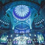
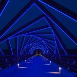
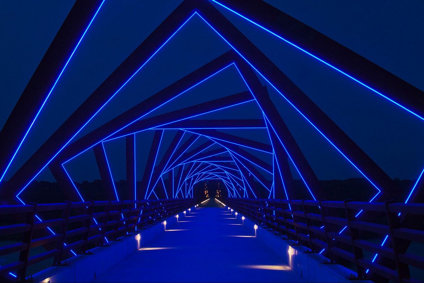
Blue
Blue is a common choice for rooms where serenity and peace are needed since it is a cold, calming color that is frequently linked to tranquility and security. For instance, it is frequently utilized to establish a tranquil and calming ambiance in bedrooms, bathrooms, and other relaxing locations. It exudes an optimistic, assured, and secure feeling.
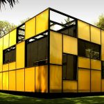
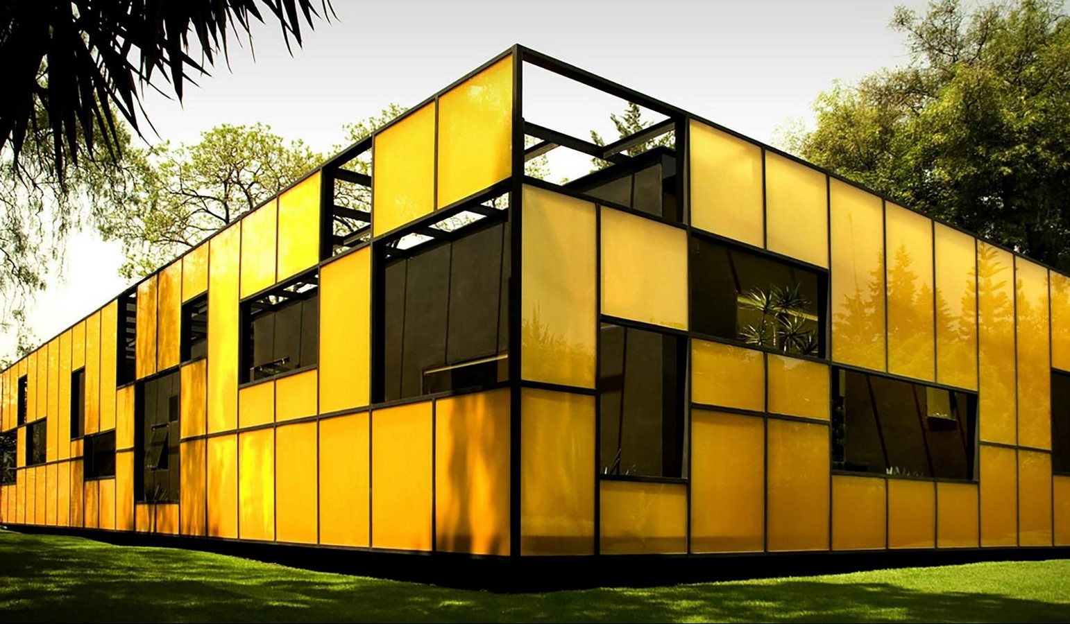
Yellow
Yellow is a striking and eye-catching color that, when employed in architecture, can have a big impact. It attracts the eye due to its vivid nature. In terms of psychology, yellow depicts optimism, curiosity, joy, and a cheerful mood. It is widely used to draw pedestrian attention in commercial venues or eateries. The color yellow can be utilized to establish a positive, upbeat environment.
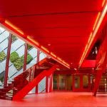
Red
Warm and brilliant red can elicit a variety of feelings and connections. It is a common option for interiors where energy and excitement are sought because it is frequently connected with passion, excitement, and warmth, exudes vigor and impulsivity. For instance, it is frequently employed to create a vibrant and energetic ambiance at restaurants, nightclubs, and other entertainment venues.

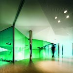
Green
Green is not a color that is frequently utilized in architecture, but it has a lot of power in calming and relaxing the environment. Particularly successful in this regard are shades of pastel or emerald green. Even neon green can seem more serene than other neon colors, despite both being extremely bright. Brings about feelings of peace, tranquility, and well-being. Hospitals and relaxation centers are only two examples of places where it is frequently employed.

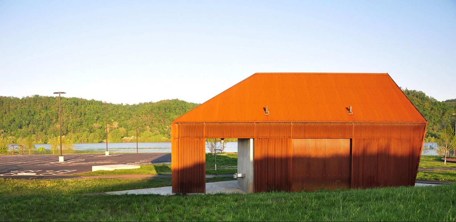
Orange
Orange, a color created by mixing yellow and red, conjures up images of fervor, innovation, happiness, and passion. Offices, studios, and educational institutions that foster creativity frequently use it. Banking institutions and offices utilize it because, when combined with blue, it suggests impulsivity and trust.
Purple
Purple, like blue, can have a calming effect, especially when utilized in pastel hues with indirect lighting. However, neon purple may bring a sense of playfulness, brightness, and excitement to a space, especially when used in lighting. It conveys tranquility, gentleness, and happiness.

White
White is a popular color in modern architecture because it conveys purity, cleanliness, and simplicity. Its ability to generate a sense of minimalism and an uncluttered aesthetic makes it a popular choice for contemporary residences and art galleries.

White may also convey a sense of quiet and serenity, making it a popular option for spas, meditation rooms, and other settings where relaxation and tranquility are crucial. White walls and ceilings can help disperse light, making interior spaces feel brighter and more expansive.
Black
Black is not a frequent color utilized in architecture, but when used intelligently, it can produce a cold and introspective atmosphere. It may be utilized to produce a sense of mystery and elegance, making it a useful color for rooms that seek to create a sense of intrigue or secret.

Black is also linked with power and authority, making it a popular option for venues such as government buildings, legal offices, and other places where power and authority are crucial. It may impart a sense of seriousness and heaviness, making it a popular choice for settings such as courtrooms and other places where a sense of gravity is crucial.
Conclusion
Color is important in shaping a user’s experience of a space. The way a room is colored can have profound implications on how its users feel, whilst the way a façade is colored can be interpreted in dramatically different ways.
Architects utilize color in a variety of ways to achieve certain emotional and visual effects and highlight the richness and complexities of the color-architecture relationship. Color in architecture is an important part of design that can considerably improve a building’s overall user experience.
The progression of color in architecture is defined through senses, comfort, mood, and history. Without color, architecture loses its personality. It is essential in architecture, construction, and urban planning, as well as in everyday life. Color is much more than an aesthetic component of design.
References
- Articles
Matheus Pereira (2018). The Role of Color in Architecture: Visual Effects and Psychological Stimuli. [online] ArchDaily. Available at: https://www.archdaily.com/895498/the-role-of-color-in-architecture-visual-effects-and-psychological-stimuli.
www.archisoup.com. (2023). Color in Architecture: How color affects the emotions & visual effects of buildings – archisoup | Architecture Guides & Resources. [online] Available at: https://www.archisoup.com/color-in-architecture.
- Online Sources
Anon, (2023). How Color Affects Architecture And Design. [online] Available at: https://urbandesignlab.in/how-color-affects-architecture-and-design/.
Anon, (2022). Colour And Architecture: Why Is Colour Psychology Important In Architecture? | The Design Gesture. [online] Available at: https://thedesigngesture.com/colour-and-architecture/.
GreenBuilt (2010). Color Psychology in Architecture – GreenBuilt. [online] Greenbuilt.no. Available at: https://www.greenbuilt.no/en/2018/01/04/color-psychology-in-architecture/.