Colour Is Everything
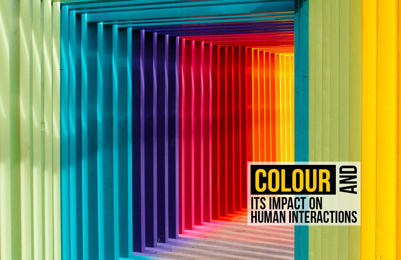
Close your eyes and think of your childhood bedroom, your favourite holiday destination, your favourite food, and your most-loved piece of clothing. Were any of these images colourless? The first thought for most of us would be the colour, rather than the shape or texture. That one shade of blue on your walls, the golden glow of the beach sunset, the deep red of ripe strawberries, or the pastel fabric you reached for again and again.
We misunderstand colour as an afterthought; it is the medium of memory and emotion. It is the way we remember the past, experience the present, and imagine our future. If we try to think of this scientifically, when light bounces off an object and passes through the retina, we perceive the colour of an object. Colour is not a decorative layer added to the world; it is the layer through which the brain understands and responds to reality.
Strip the world of colour, and life instantly loses its charge. Our emotions are related to hues and tones of colours, silently influencing how we feel, behave, and connect be it happiness, sorrow, or alertness. Colour is not just what we see; it is the medium through which we experience everything.
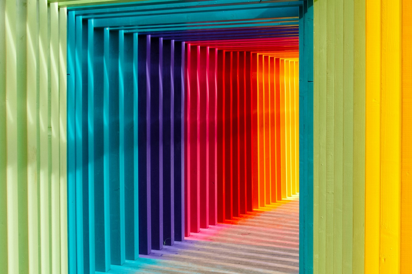
Colour and Emotions are related
Every shade we see dictates how we feel long before we can understand the impact it has. Psychologists call this “affective response”; our brains function in a way to associate colours with emotions instantly.
For example, the spectrum of reds raises our heartbeat. It can signify love and passion or danger and urgency. Blue is often associated with trust; it reduces stress and slows and soothes the heart rate. Yellow is an optimistic colour, but when used too much, it can incite anxiety. From a psychological point of view, green enables healing, growth, and renewal, while purple stands for privilege, sophistication, or mystery.
While these seem like textbook understanding, they also stand true from personal stories. Consider a mela or a fair from a rural setting in India, a wash with fiery reds, hot pinks, and oranges. The colours themselves energize thousands of visitors, creating a collective high without a single announcement of what’s happening. In contrast to the previous scenario, the muted greys and whites of illness and mourning are the colours that are associated to drain energy, symbolising stillness, absence, or grief.
Chromotherapy or colour therapy has long been formalised, with the interaction of colour with emotions being considered. It is an alternative healing system that uses colours and light to subdue or uplift moods, influencing health and energy. Medical Experts believe that each colour has a unique vibration felt in the human body: red for vitality, blue for relaxation, green for balance, and yellow for clarity. While modern day research would question the qualitative scientific evidence, the fact that chromotherapy is still practiced in therapy centres, spas, and even healthcare design shows that humans instinctively believe colour as a healing power.
Hospitals are an example of this shift in understanding. For years, harsh and stark whites were used for a sterile and crisp environment, but that had become a major source of inducing anxiety and detachment. Patients entered already in pain, and the colour only deepened the gloom. Today, there is a conscious effort to introduce warmth into these environments. Happy yellows, soothing greens, and cheerful oranges have been incorporated to lift spirits and ease fear. The transformation of the same spaces has moved the emotions from intimidating to hopeful, not because of the walls or equipment, but due to the impact of colour.
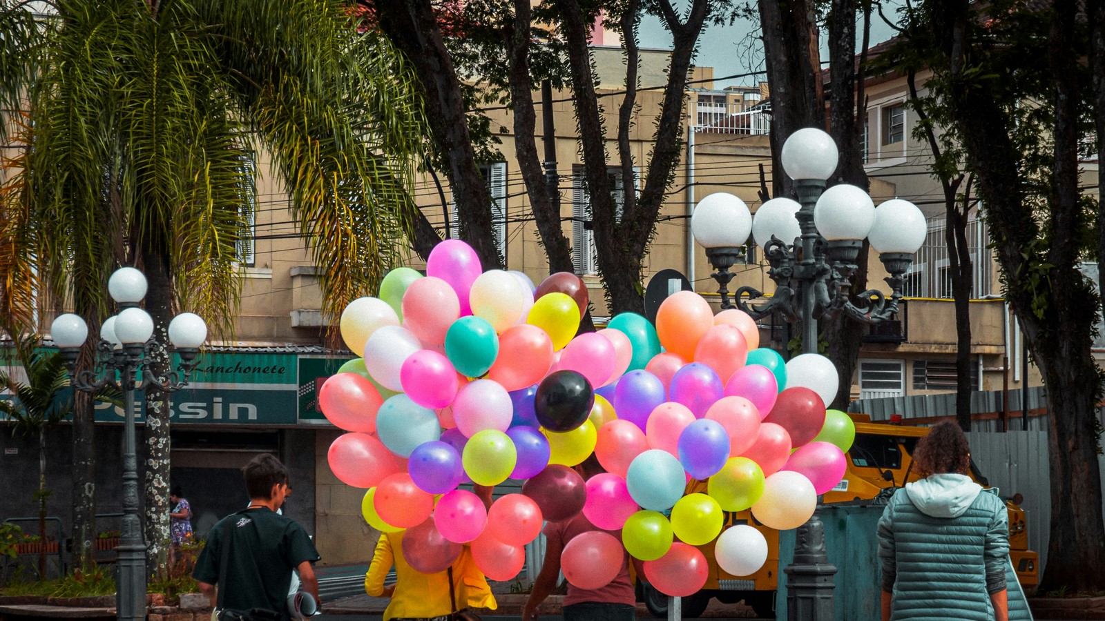
The Experiment
Shared meals have always influenced architectural form. In South India, these meals To truly understand how personal colour is, consider the psychological experiment by a renowned design firm. Visitors were made to experience three colour immersive spaces, each designed with a distinct palette. All participants wore wrist bands that sensed the temperature of your bodies while reacting to visual stimulation to track and measure comfort and emotional response.
- The first room: this one is rooted to a biophilic blend – Earthy tone of greens, browns, and rusts. It was an echo of nature, tapping into our deep connection with landscapes, forests, and gardens.
- The second room: Scandinavian neutrals and chic – muted greige, sophistication, and beiges with clean, minimal design. A palette often equated with elegance and calm.
- The third room: Vibrant and maximalist – a chapter of bold hues, eclectic textures, and untampered saturation.
Prior to the experiment, most participants and hosts guessed they would mostly feel comfortable in the neutral Scandinavian room, assuming that low stimulation would be equally calm. Another set of participants believed the biophilic room would be calming since we would feel connected and rooted to nature. The Least picked option for a comfortable and calm palette was the vibrant room.
The emotional response from this experiment yielded slightly different results. Comfort levels were almost equally divided across all three. Why? Because colour is never universally the same for all, it is deeply tied to the life we have experienced to date.
- A participant raised in an overstimulating, maximalist home craved minimalism as a visual breath of air.
- Someone surrounded by greens through their childhood neighbourhoods and homes found peace in a biophilic palette, as if returning to a natural rhythm of comfort.
- A participant from the city of Rio instantly felt at home in the vibrant room, where the chaos and loudness of colour reflected their upbringing.
- Few who grew up in a dull, muted environment found themselves gravitating toward vibrant pallets as an antidote to the absence of colour in their past.
This activity showed us something profound: emotional response to specific colour themes isn’t about good, bad, calm, or chaotic. It is about a very personal narrative we all carry through life. The home we grew up in, festivals we celebrated, food we consumed, clothes we wore, neighbourhoods we walked, even the movies and shows we watched, these layers program our emotional response and preference to colour.
In a deeper sense, colour is not a palette outside of us; it is the palette engraved inside us.
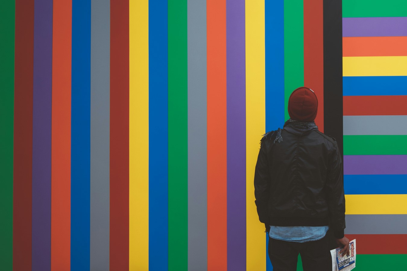
Colour in Every Corner of Life
Colour is a major influencing factor for everything in our lives, our homes, our food, clothes, objects, even defines the packaging of what we use. It’s the character of every neighbourhood we have experienced, the natural landscapes we live in, and the films or shows we watch.
We choose colours that align with our personalities for our homes. Generally neutral palettes for coziness, bold tones for energy, or earthy shades to feel grounded. The Food we consume also reflects a specific emotion of colour. A plate with red tomatoes, green herbs, and yellow mangoes feels vibrant and psychologically nourishing, while a meal which is on a monochromatic palette can appeal as bland even before we taste it.
Clothing and fashion are also important areas where we can see the heavy influence of colour. The colours we wear are never bland; they are a representation of ourselves. Even branding and packaging use colour as a mode of reflection of their values and beliefs: red for depicting urgency and appetite (think of food chains), blue is for evoking trust (think finance and tech), and green is for eco-consciousness.
Zoom out, and entire neighbourhoods are defined by colour. It can be a major factor in a large urban setting as well, like the pink city of Jaipur, the blue Chefchaouen in Morocco, or the whitewashed villages in Santorini; each speaks of cultural identity through a colour palette. Nature also is a great symbol for the impact of colour, in shaping moods through seasonal colour cycles: the freshness of spring greens, the intensity of summer yellows, the melancholy of autumn browns, the stillness of winter whites.
Finally, what we watch ; cinema, media, and digital design, is also driven by colour grading and visual depictions. Filmmakers intentionally use warm tones for nostalgia, cool tones for suspense, and saturated tones for fantasy. Whether we realise it or not, our interactions are continuously mediated by colour.