For years, architecture seemed to forget how to communicate as a living entity. Instead, it began producing responses like a machine. Whites, greys, and flawless concrete were used in our construction; our houses resembled galleries, and our cafes resembled labs. Calm, order, and clarity were the promised virtues of “minimalist aesthetic.” And it worked well for a time. But after a while, the calm became noisy.
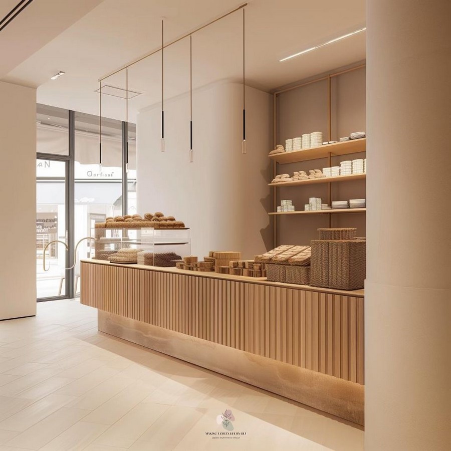
The beige hallways and white walls started to feel cold and uninviting. We yearned for something more human as a result of our obsession with reduction: fewer lines, fewer colors, fewer emotions. People began to yearn for warmth, vibrancy, and imperfection in the post-pandemic era, which was marked by uncertainty and a sense of sameness. The constraint of minimalism had done its job, and architecture was now prepared for its next emotion: happiness.
It turns out that joy is actually a vibrant, colourful experience!
The Rise of the Post-Minimalist Palette
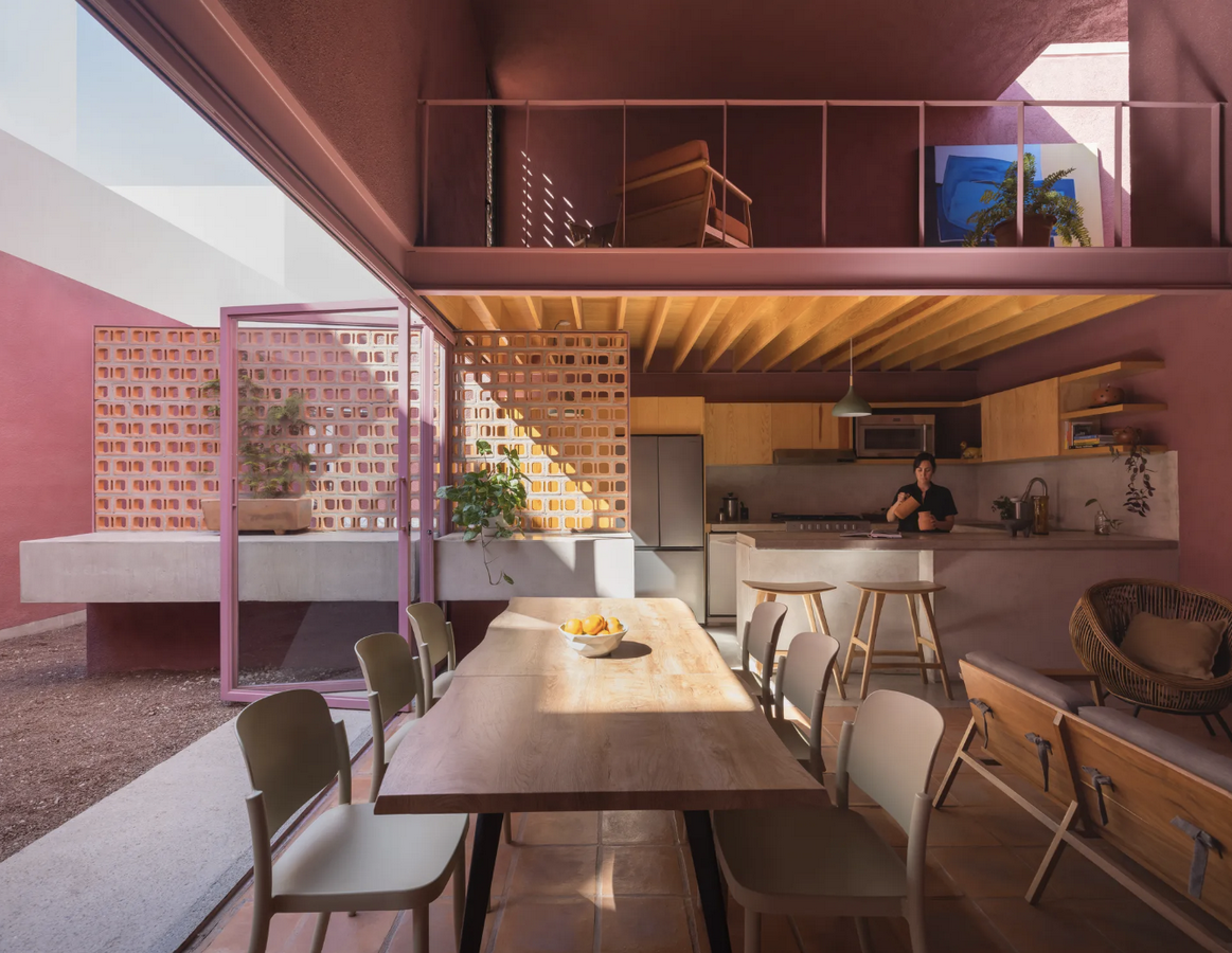
Color has finally made a comeback, not as mere decoration, but as a bold statement of resistance. Designers are starting to use a rich palette that includes clay pinks, turmeric yellows, oxblood reds, and deep indigos in both studios and urban environments. These colors do more than brighten spaces; they reinstate emotional resonance into an architectural language that had become detached from feeling.
While the post-minimalist color scheme does not entirely dismiss minimalism, it moves away from its emotional neutrality. Instead, it retains honesty through clean lines and clarity of form. This movement suggests that “less can still be warm” rather than the traditional view of “less is more.”
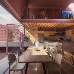
Consider post-therapy minimalism, still composed but at last ready to laugh, like Sensacional Dinamica Mexicana’s Casa Cardona in San Luis Potosí, Mexico (2025). Inspired by the local flora and arid terrain, this dusty pink façade softens a minimalist concrete structure. As the light changes, the color changes from rose to violet, demonstrating that brilliance and restraint may coexist and that color can evoke strong feelings without taking up too much room.
The Emotional Architecture of Color
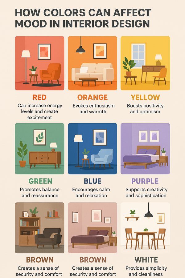
Humans react to color due to their biological makeup. Research in neuroaesthetics shows that colors can influence our serotonin levels, attention spans, and even our perception of temperature. In design, colors have both psychological and physiological effects.
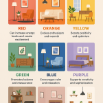
For example, red energizes, yellow evokes optimism, green promotes calmness, and blue creates a cooling and distancing effect. However, these responses can vary based on the environment and culture. In one culture, the color red may symbolize danger, while in another, it could represent prosperity. Similarly, the shade of pink that conveys playfulness in Copenhagen might be seen as sacred in Jaipur.
This subjectivity is embraced by the post-minimalist palette. It aims for personal resonance rather than general serenity. It’s architecture that asks, “Does this make you feel alive?” rather than, “Is this beautiful?”
Local Colours, Worldwide Spirit
After decades of relying on imported aesthetics like industrial grey, Tokyo white, and Scandinavian beige, architects are now embracing indigenous colors. Designers in India are rediscovering locally sourced materials and tones. For example, the upper floors of Studio Lotus’ Krushi Bhawan in Bhubaneswar feature a brick-louvred screen made in three different clay colors that represent the native soils of Odisha.
In Mexico, studios like Taller Héctor Barroso are reinterpreting terracotta and adobe-based color schemes, although specific project details may vary. Moroccan designers continue to experiment with traditional finishes, such as the smooth, pigmented tadelakt plaster used in riads, to observe how these materials interact with location and light.
This trend is more about reconnecting with one’s roots than it is about nostalgia. The incorporation of local colors serves as a strong declaration of place and belonging in an increasingly homogeneous world.
The Most Important Principle of Design
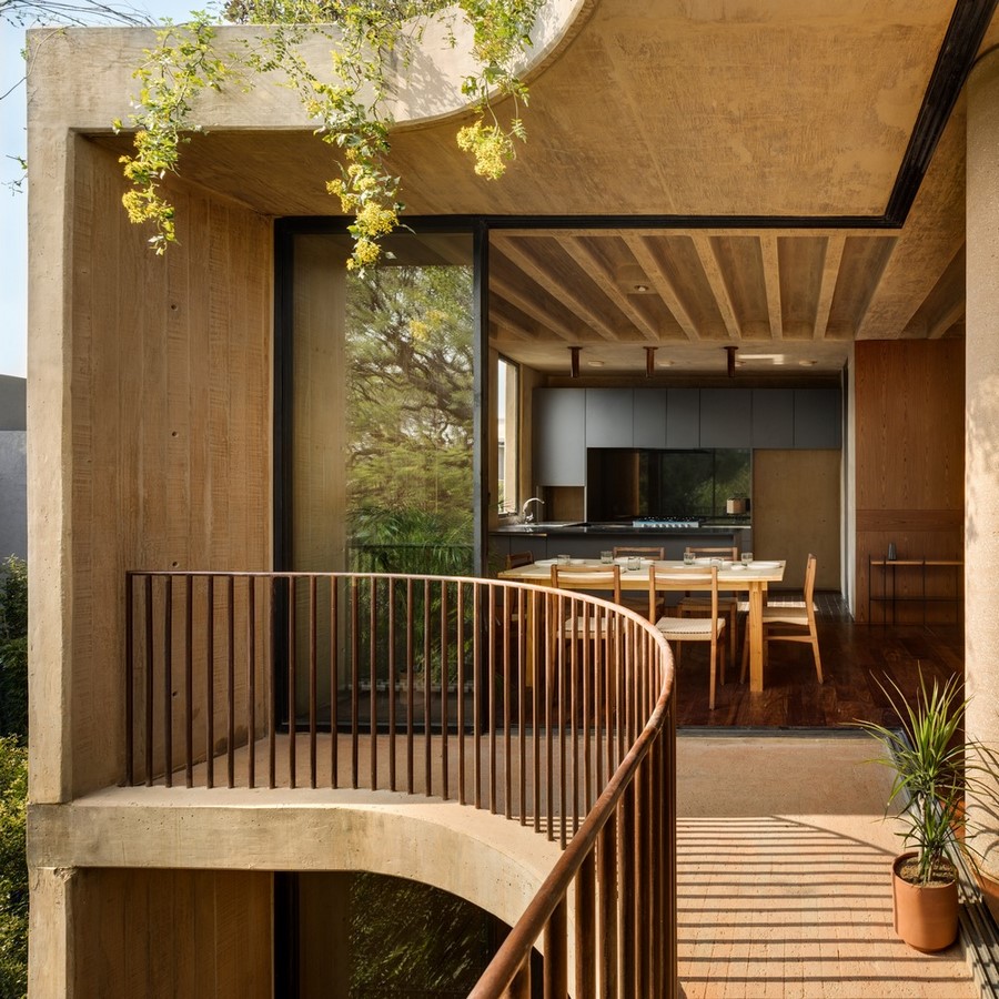
Post-minimalism communicates a sense of caring, whereas minimalism once only sought clarity. Today’s designers are moving away from clinical perfection and toward more democratic, joyful spaces that generate joy. Joy can be found in simple gestures, like a stairwell painted in pastels that catch morning light, a courtyard shaded by blush limewash, or a café wall tiled in mustard or indigo. Joy is not dependent on grandeur or extravagance. Examples of this imperfection-embracing aesthetic include fabrics that fade slowly over time, oxide paints that breathe with humidity, and uneven, hand-applied finishes that exhibit human touch.
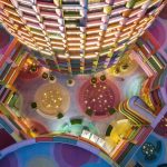
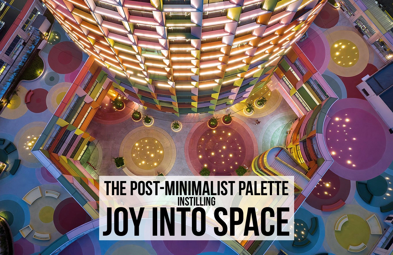
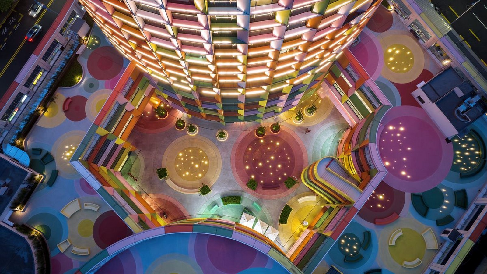
The Shenzhen Women & Children’s Centre by MVRDV (2024) is a remarkable large-scale manifestation of this mentality. The architects used a high-rise from the 1990s to create a bright landmark with a multicolored façade that includes frames of magenta, lime, cyan, and yellow. The color scheme, which is a conscious break from the glass and grey tones of corporate modernity, exudes warmth and optimism throughout the metropolitan skyline. In this case, color is not only decorative; rather, it is an act of compassion and inclusivity, a building that physically reflects back to the community. These examples turn the ordinary into a poetic representation of love and care, giving locations the patina of life rather than the gleam of perfection.
Colour as Resistance
If minimalism used to represent control, the current color trend represents freedom. The never-ending parade of glass towers, white walls, and industrial greys that characterized architectural neutrality for far too long was a reflection of the general apprehension about excess. However, designers are finding independence as they rediscover color. In a society that has historically viewed emotion as a weakness, color has emerged as a language of rebellion, reclaiming emotion.
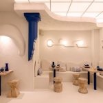
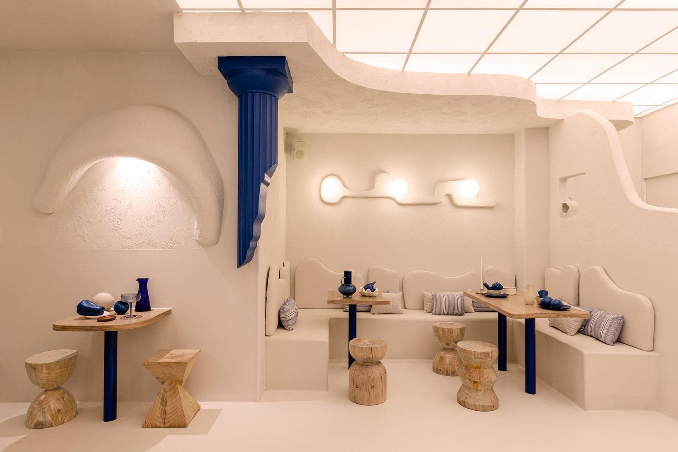
Valencia, Spain’s Masquespacio’s Egeo Bakery Café (2022) is a striking illustration of this colorful confidence. An immersive, nearly aquatic sensation is created by the interior’s vivid Aegean blue saturation in every square inch, from light fixtures to counters to arches. The café turns simplicity into spectacular with its modern perfection and inspiration from Greek island architecture. The color defines rather than embellishes. The area itself turns into a statement against neutrality, demonstrating that feeling and delight can be created and organized.
Similar changes are emerging globally in residential, commercial, and municipal projects that use color as a storytelling tool. By establishing distance in emotion rather than formula, these designs challenge sameness. Color is now the idea itself rather than an afterthought at the conclusion of a render. As a result, the built world at last regains its sense of emotion through a new architectural energy that is both loud and intelligent, local and global.
Lessons from Vernacular Joy
India has always embraced a post-minimalist aesthetic. Indian architecture has skillfully utilized color to create a balance between chaos and tranquility long before minimalism became popular in the West. Color was never an afterthought; it was intricately integrated into the structure, climate, and storytelling of everything from the coral-pink façades of Jaipur’s havelis to the indigo-washed homes of Jodhpur. For instance, the blue limewash of Jodhpur wasn’t merely decorative; the indigo pigment was believed to help keep houses cool in Rajasthan’s scorching sun by reflecting heat and repelling insects.
Local laterite and natural iron oxide combined with lime produced the deep red-oxide flooring that shines in ancestral homes in Kerala. These floors are cool underfoot, cost-effective, and remarkably resilient. Interiors in Chettinad remained bright even in low light because to walls tinted with natural egg-white gloss and golden lime plaster. Furthermore, the ochre, teal, and mustard façades in Pondicherry‘s French Quarter served as visual codes for municipal identity, tradition, and ownership rather than being fads.
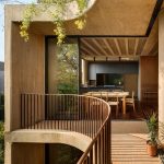
This chromatic expertise is being relearned by modern architects. Projects like Samira Rathod Design Associates’ Jaali House (Alibag, 2020) use contemporary materiality to reinterpret indigenous logic. Oxide colors and textured plasters allow air and sunshine to dynamically interact with the walls.
Vernacular design reminds us that color has always held significance in India. It serves various purposes: it is climatic, helping to regulate temperature and light; psychological, aiding in memory stabilization; and functional, contributing to thermal comfort. In this context, color complements form rather than competes with it. After years of relying on neutral steel and glass, the world is now recognizing what India has quietly practiced for generations: that color can communicate, provide a sense of calm, and offer protection.
A Chromatic Future
Architecture is at a turning point after years of restraint, moving toward a philosophy that values both care and clarity. The once-dominant minimalism has been replaced by a movement that emphasizes form and emotion equally. The resurgence of color in architecture is not just a stylistic choice; it serves as an emotional and ethical restoration.
Color invites architecture to reconnect with human experiences, culture, and climate. By integrating buildings into their natural surroundings, it highlights that the built environment is an essential part of daily life, rather than merely an abstract concept. Color transcends being just a surface treatment; it becomes a bridge between memory and material, as well as between people and place.
Joy is the core of architecture, not just an added feature, as the post-minimalist approach suggests. This perspective illustrates that warmth can be intentionally crafted, just as structure can be. It shows that comfort and beauty can coexist harmoniously. Through the use of color, architecture regains its capacity to breathe, resonate, and heal. The future of design will be guided by the degree of humanization rather than simplification. In exploring color, architecture rediscovers its vibrancy and responsiveness, becoming more alive than ever.
References:
Abin Design Studio. (2022, August 9). Gallery House / Abin Design Studio. ArchDaily. https://www.archdaily.com/983319/gallery-house-abin-design-studio
ArchDaily. (2020, May 12). Jaali House / Samira Rathod Design Associates. ArchDaily. https://www.archdaily.com/937429/jaali-house-samira-rathod-design-associates
Dezeen. (2022, February 28). Egeo Bakery Cafe by Masquespacio channels the colours of the Greek islands. Dezeen. https://www.dezeen.com/2022/02/28/egeo-bakery-cafe-masquespacio-valencia-blue-interior/
MVRDV. (2024, February 6). Shenzhen Women & Children’s Centre. MVRDV Projects. https://www.mvrdv.nl/projects/585/shenzhen-women-and-children-centre
Wallpaper*. (2025, August 19). Casa Cardona, Mexico: A Dusty Pink Desert Retreat by Sensacional Dinámica Mexicana. Wallpaper*. https://www.wallpaper.com/architecture/residential/casa-cardona-mexico