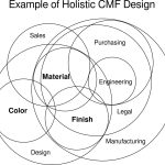
What is CMF Design ?
The word CMF stands for colours, material and finishes. An expert in the field, Cristina Boeri describes the world of CMF, very crucial in designing stages in every field. She elaborates –
“CMF focuses on the design of the perceptive and technical aspects of surfaces as a privileged “place” for experiential interactions, research, experimentation and anticipation of aesthetic and socio-cultural trends, starting from the functional and sensory qualities of surfaces.”
Understanding CMF Design through Case Studies
Understanding the concept of CMF can be easier when studied through live examples. Some interior design projects have been chosen and presented below that have used CMF design as a strategy to increase work productivity in the office.
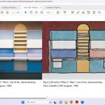
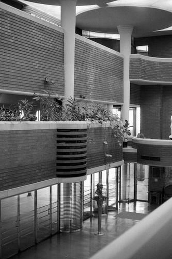
Action Office 2 The earliest example of colours and surfaces proving to transform the interior design field is specific to the Herman Miller Design Studio. In 1983, a new collection was launched under the name of ‘Action Office 2’ under the furniture design studio.

The innovator for the collection Italian designer Clino T.Castelli says that,
“In the early 1980s, the American office with systems furniture followed a military kind of organization. We transformed this and made it a very “High Touch” kind of environment – introducing a multiplicity of colour complexity, as well as other aspects that made the environment very rich, more similar to the hotel environment.
This high-touch office with a polychromatic colour scheme, very rich fabrics, materials, environmental wallpapers, and wood – lots of rich wood. The enhancement of technology in an environment, as in an office where you have more and more machines, is based on a sort of reduction of the sensory stimulation, a limitation of subtle and profound experience.’’
This strategy was incorporated by the Herman Miller furniture design studio to create an office environment from the polychromatic schemes. With the growth in technology, different materials could be used to create various surface materials which gave differing tactility experiences. This helped to ‘enrich the environment with light and shadow’ says the Italian designer Clino T. Caselli.
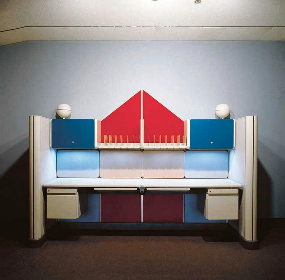
From this, we can conclude that the Italian designer resorted to the effect of colours and surface finishes to create and add a distinguishing characteristic and change the design language of offices. This collection designed by the Herman Miller design studio won numerous design awards including the IBD Gold Award and was highly appreciated. This example highly speaks about the importance of colours and finishes and how they can bring about a transformative change in the functioning of an office environment..
-
Bringing Nature Inside
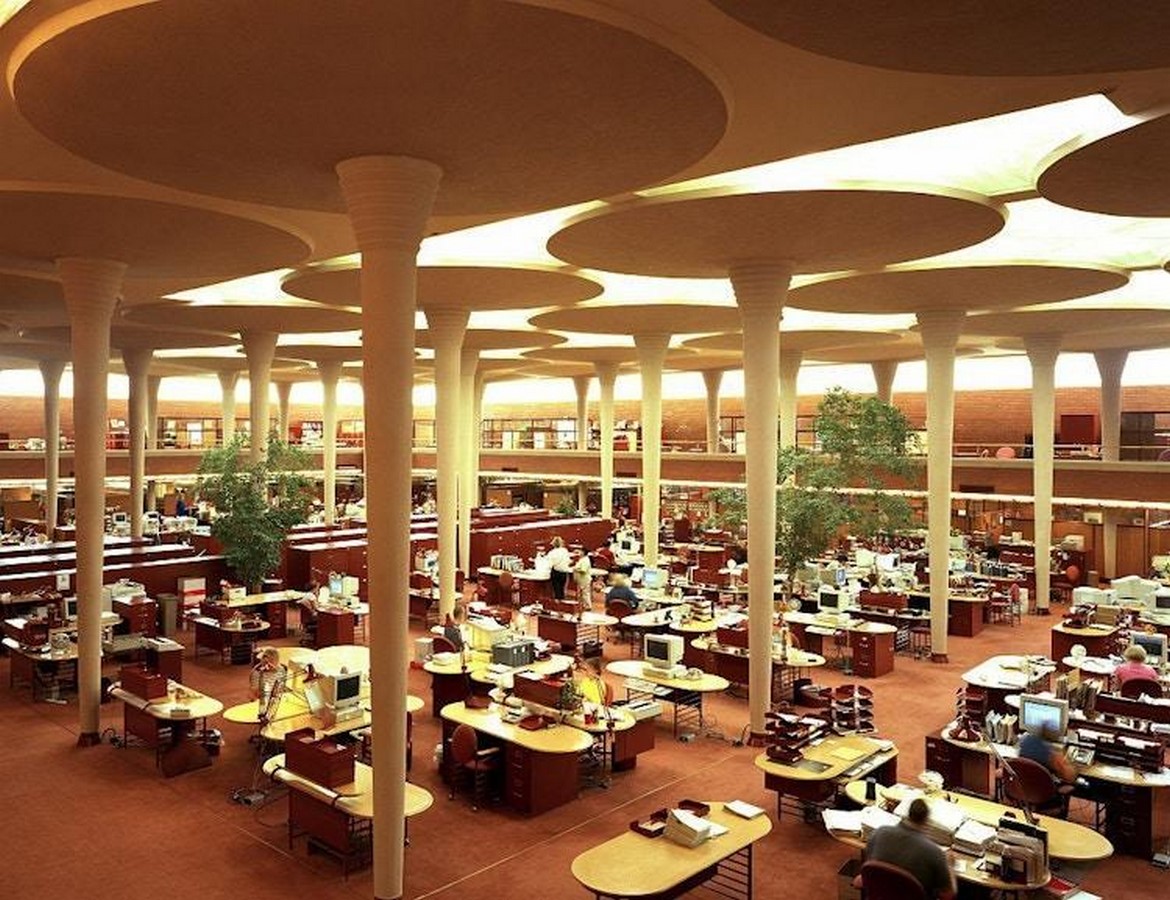
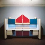
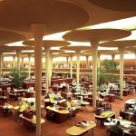
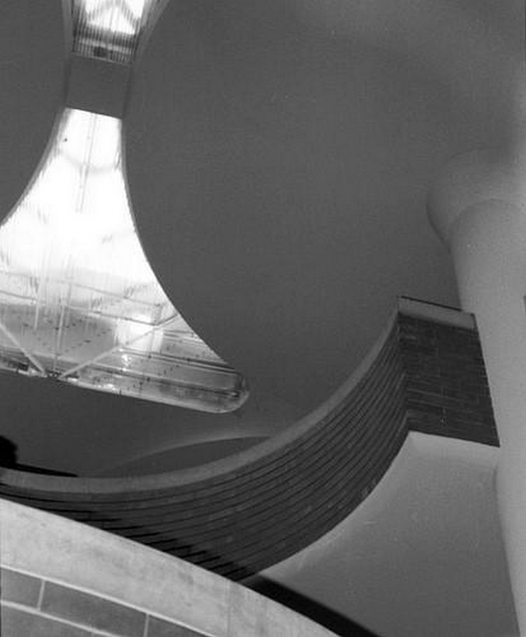
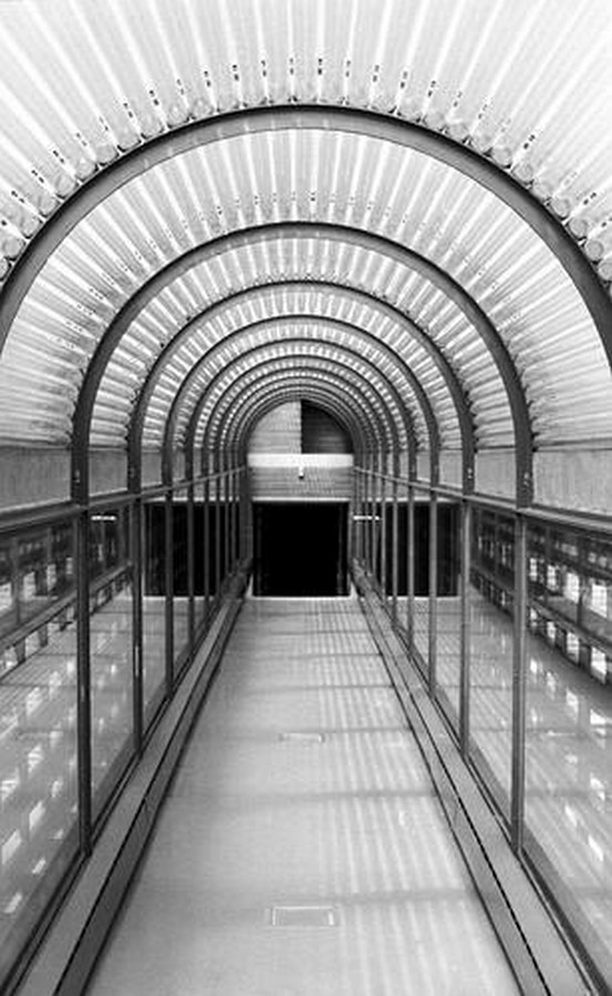
This office building built in the year 1939 was a revolutionary building during its time. The American Architect, Frank Lloyd Wright, experimented with an array of materials and design styles to curate a design project specifically for the Johnson Wax Building Office. The key elements that made his design stand out were bright lights, warm spaces incorporating a warm colour palette and cork ceilings. These cork ceilings played a crucial role in maintaining the office acoustics.
The whole palette for the building’s interiors was inspired by nature. The colour scheme was warm coloured tones of orange and red that took cues from natural hues. The signature colour of the architect of Cherokee Red colour was used in this project. The distinguishing element of the design was the lotus leaf-shaped columns, which towered over the working spaces like huge exotic trees. Between these columns were skylights made from Pyrex glass tubes. These tubes of glass brought diffused light into the office area like beams of light piercing through the canopy of a tree. There is significant use of Kasota stone and custom-built bricks to create a streamlined effect visually. These remarkable materials created a work environment conducive to creativity and productivity.
-
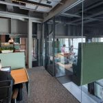
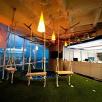
Make Work Fun
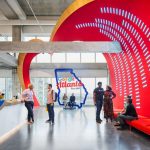
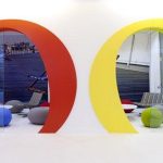
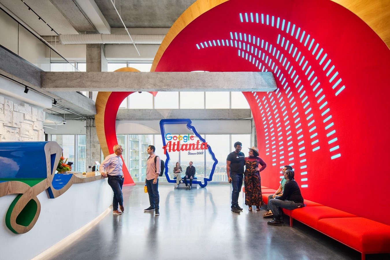
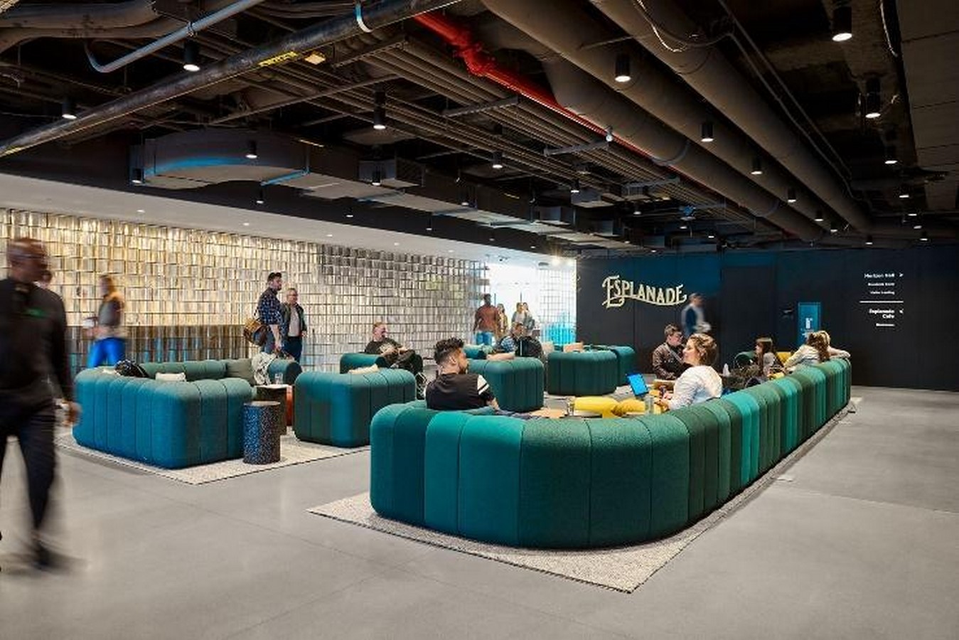
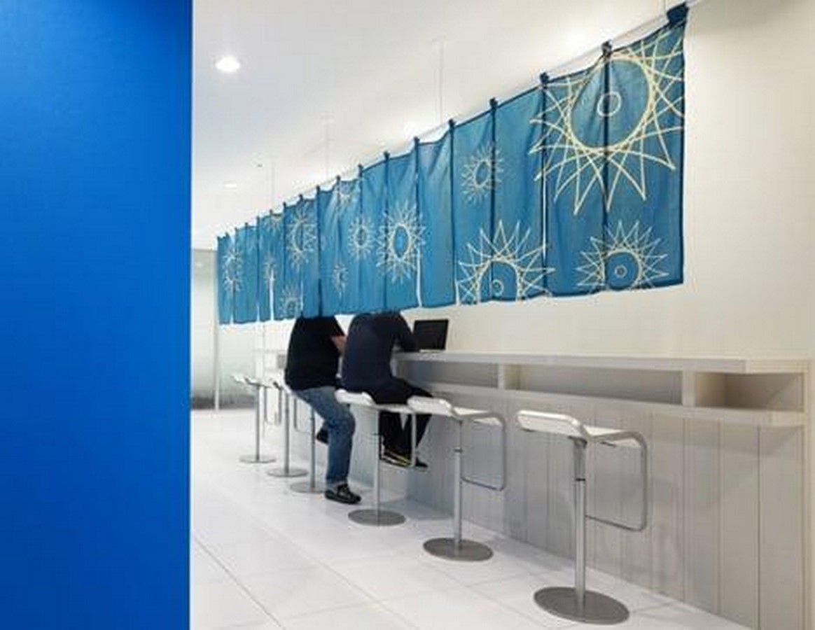
One of the best and ideal examples of office design today are often linked to Google Offices. Google Offices aim to create a working culture for its employees where they could experience ideal ergonomic working areas along with innovative and stimulating rest areas. These rest areas are often physically and mentally stimulating!
- The Google offices strategise their interior design in such a way that it speaks about the branding of the company. Google uses a combination of primary and secondary colours for its branding, Red, Yellow and Blue. These colours are vividly used in its offices. Brighter colours are often linked to better mind and body stimulation.

An Australian-born, London-based Karen Haller, a leader international authority on applied colour psychology talks about the ‘Google effect’: “It’s a multi-coloured, multi-sensory stimuli. Natural-toned and cool colours like green and blue help with steady focus and a state of calm that improves efficiency. In contrast, warmer colours, such as yellow and orange, can elicit feelings of freshness, optimism and creativity.’’
- Along with this, every location of a Google office strives to incorporate the local cultures and colours used in the region. This might feel like a small design consideration but strengthens the connection and bonding between the employees, the company and their city.
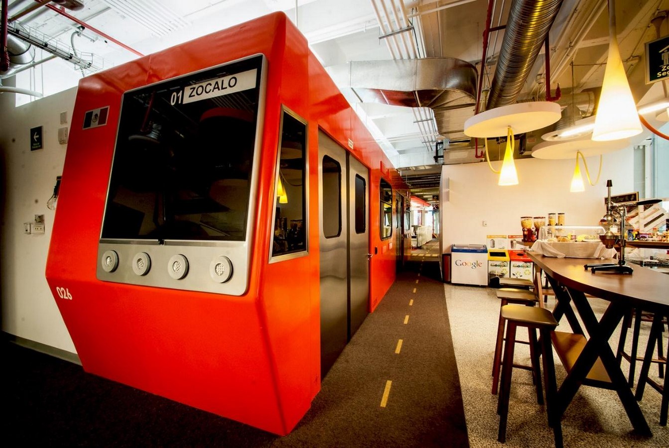
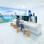
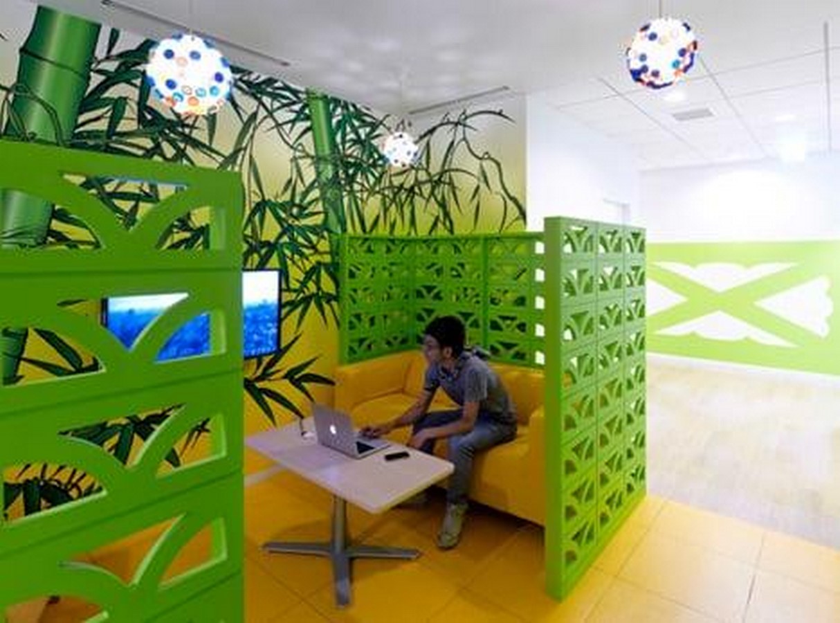
For example, Google offices across the globe pick one key element from their respective localities and make it the hero element. Like the Dublin Google office houses an authentic green jungle aesthetic, the California office has physically stimulating activities like beach volleyball and climbing walls.
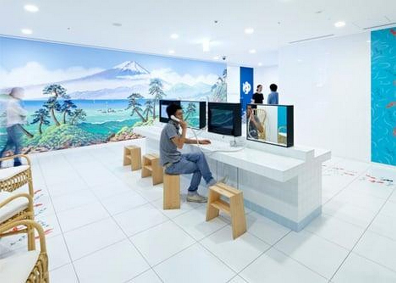
The Google office in Tokyo is designed in such a way that they absorb the Japanese culture in their interior design. The furniture, murals and accessories are all inspired by Japanese culture.
“What the designer is looking for by creating all these environments is for the employee to go to an area where he feels most comfortable mentally and physically while working, which increases his productivity and creativity’’ explain architects Mark Dytham and Astrid Klein.
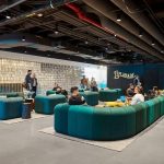
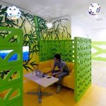
- Google envisions creating spaces that mimic traditional third spaces of relaxation and reenergizing within the confines of their office working areas. These areas are distinctly separated using visual and tactile design features.
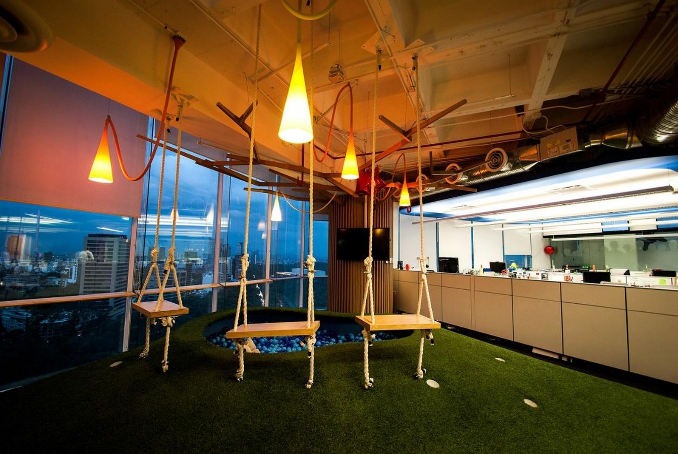
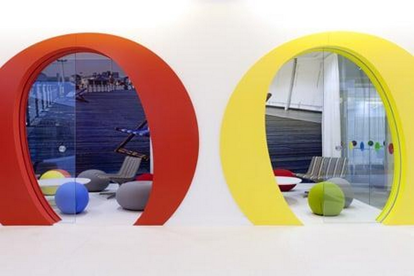
For example, the office distinguishes working areas with pastel soft colours which keep the mind calm, relaxed and focused. Common interaction spaces like corridors, reception entry areas and canteen spaces use warm vibrant colours to create an energising environment.
References
- Barbara, S., Student, C. and Kang Zhou (n.d.). The CMF Design approach engaging the Contemporary Interior Design practice The interdisciplinary perspective of branding strategy, marketing and sensorial user experience. POLITECNICO MILANO 1863 SCHOOL OF DESIGN. [online] Available at: https://www.politesi.polimi.it/bitstream/10589/154579/3/The%20CMF%20Design%20approach%20engaging%20the%20Contemporary%20Interior%20Design%20practice_903393_ZhouKang.pdf
- K2 Space. (n.d.). The History of Office Design. [online] Available at: https://k2space.co.uk/knowledge/history-of-office-design
- ArchDaily. (2010). AD Classics: S.C. Johnson and Son Administration Building / Frank Lloyd Wright. [online] Available at: https://www.archdaily.com/90519/ad-classics-s-c-johnson-and-son-administration-building-frank-lloyd-wright.
- Gibson, E. (2017). Frank Lloyd Wright designed the Johnson Wax offices like a forest open to the sky. [online] Dezeen. Available at: https://www.dezeen.com/2017/06/14/frank-lloyd-wright-johnson-wax-administration-building-headquarters-racine-wisconsin-open-plan-office/.
- www.linkedin.com. (n.d.). What can we learn from Google’s offices about workplace design? [online] Available at: https://www.linkedin.com/pulse/what-can-we-learn-from-googles-offices-workplace-design-john-wallace/.\
- You won’t believe work gets done at these three Google offices. (2023). Architectural Digest India. [online] 12 Feb. Available at: https://www.architecturaldigest.in/story/you-wont-believe-work-gets-done-at-these-three-google-offices/
- http://hadijanbaz.ir (n.d.). How is the interior design of Google offices? [online] Mohitara. Available at: https://en.mohitara.com/blog/how-is-the-interior-design-of-google-offices#:~:text=In%20the%20interior%20spaces%20of