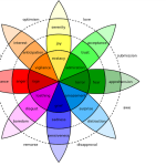
Have you ever wondered why, in a nation, every region has its own colour palette which ranges from bright hues of Pink in Jaipur to muted white plastering and terracotta tiles in Kerala ? Why do hospitals and churches calm us with cool tones of white, beige, or blue while auditoriums and theatres immerse us in darkness with their dark panelling? These questions open up into a wide spectrum of psychology of colour in architecture – the study that bridges aesthetics and emotions, visual science to neuroscience.
Architecture is just like a Lego puzzle, which can be completed only when every piece of it is synchronised and is placed in its designated position, working together to shape a new entity . Its materiality, scale, light, and most subtly, color, together create environments that shape how we perceive, feel, and behave. The hues of a wall can whisper tranquility or vibrate with energy; they can make a room breathe openness or compress into intimacy.
In Rajasthan, the radiant facades of palace auditoriums designated for performance showcase wraps themselves in deep burgundy and charcoal tones to absorb excess light and enhance focus. while performance spaces absorb distraction in deep burgundy and charcoal tones to enhance focus. Let’s get into the article to look into how the emotional spectrum of colours has been impacting the architecture.
The Theoretical Foundations:
A. Historical and Philosophical Roots of Color Psychology
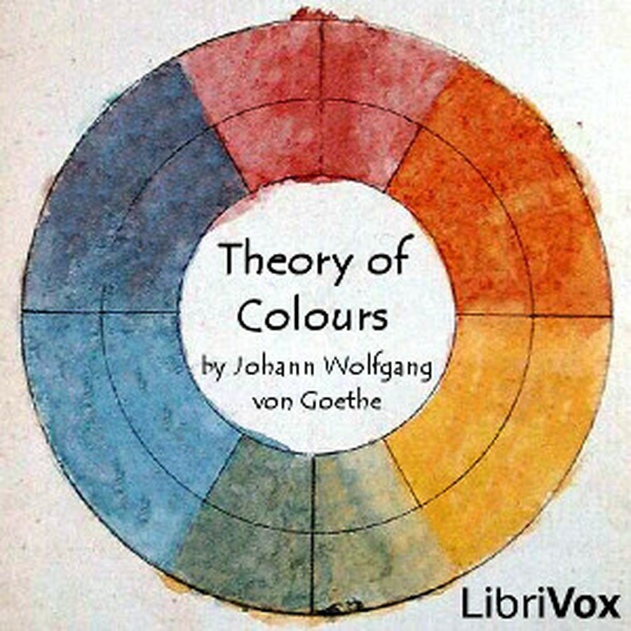
Johann Wolfgang von Goethe is a name to be remembered and etched in the history of colour psychology, as he was the pioneer to explore the response to colour as a balance between light and darkness, even before neuroscience qualified emotion. He argued at Newton’s physical optic perseverance of light and challenged that colour is not just light it carries emotions. In his Theory of Colours (1810). He strongly implied that color is perceived not only as light but as an emotional experience born from contrast.
He proposed a polarity—Yellow as “light dampened by darkness” and Blue as “darkness weakened by light.
This duality gave rise to the fact that colour carries emotion. This philosophical premise became the cornerstone of color psychology, asserting that hues affect not just vision but emotion and behavior—a theory that architecture continues to translate into space and form.
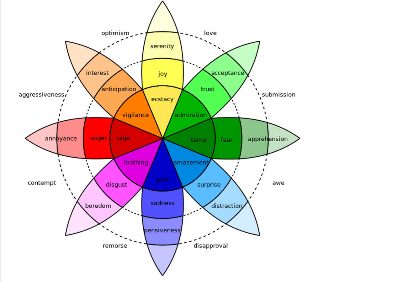
Fundamental Color Associations
Modern design practice still resonates with these early associations.
- Blue evokes trust, serenity, and focus—ideal for healthcare and academic environments.
- Yellow embodies warmth, curiosity, and vitality, enlivening social or transitional spaces.
- Red, though vibrant and passionate, can signal urgency or aggression when overused.
- Green restores equilibrium, linking the human eye instinctively to nature’s calm.
Each color, when placed within an architectural context, transcends its aesthetic role and becomes a psychological device—shaping perception, performance, and emotional well-being.
B. The Physiological Impact of Architectural Color
The Subconscious Mechanism
It is an observed fact that any human interaction with a space is highly perceived by the subconscious mind than conscious reasoning, as the conscious mind can only process 40 stimuli per second, while the subconscious interprets over 20 million. Nearly half of the brain’s activity is dedicated to vision, which means the emotional centers are triggered by vision.
When an environment sends dissonant visual signals—overly bright tones, chaotic contrasts, or ill-balanced palettes—the adrenal glands release stress hormones like cortisol, leading to fatigue or anxiety. Thus, color is not a decorative layer; it’s an environmental regulator of emotion.
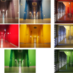
Warm vs. Cool Hues
Warm hues—reds, oranges, and yellows—stimulate arousal, raising both heart rate and alertness, which is why these tones are used in police stations and fire stations to demarcate the emergency call. They activate the sympathetic nervous system, invoking energy, warmth, and even appetite. Conversely, cool hues—blues and greens—induce calm by slowing physiological activity, lowering blood pressure, and reducing sensory load, which is why these tones are used in hospitals, sanctums, and libraries.
A red-painted lobby, for example, can feel vibrant during a brief interaction but overwhelming if used in a long-stay workspace. A pale green hospital corridor can make recovery feel more natural and less clinical.
Color-in-Context Theory
Color is not universal; it is contextual. According to the Color-in-Context Theory, response to color is moderated by culture, brightness, saturation, and even gender or age.
- Red may symbolize celebration in India, yet caution in the West.
- A deep indigo might exude solemn dignity in one culture but appear oppressive in another.
Thus, architects must balance cultural semiotics with biological constants, ensuring that the emotional language of color aligns with its spatial purpose.
C. Second and Third-Order Insights
Architectural color is not a fleeting impression; it sustains long-term psychological effects.
High-arousal hues like red and orange can invigorate but, in prolonged exposure, may lead to cognitive fatigue or sensory stress. Hence, their presence is best reserved for accents or transition zones. Conversely, neutral and cool tones create conditions conducive to sustained well-being in homes, offices, and healthcare environments.
The absence of color—monotone or sterile spaces—can also affect mental health, contributing to disorders such as Seasonal Affective Disorder (SAD). Balanced chromatic composition ensures visual nourishment, providing sensory variety that subtly regulates mood over time.
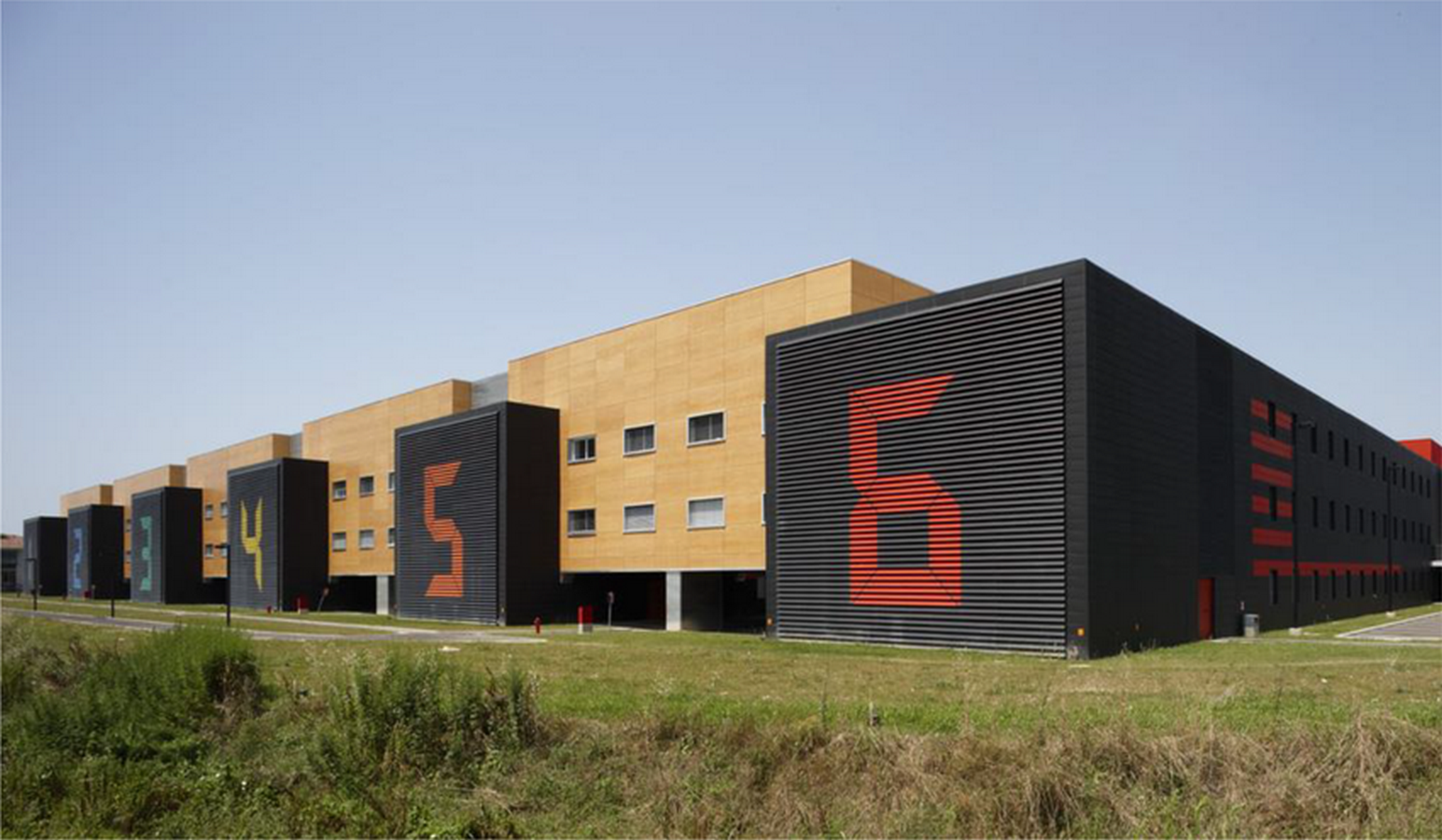
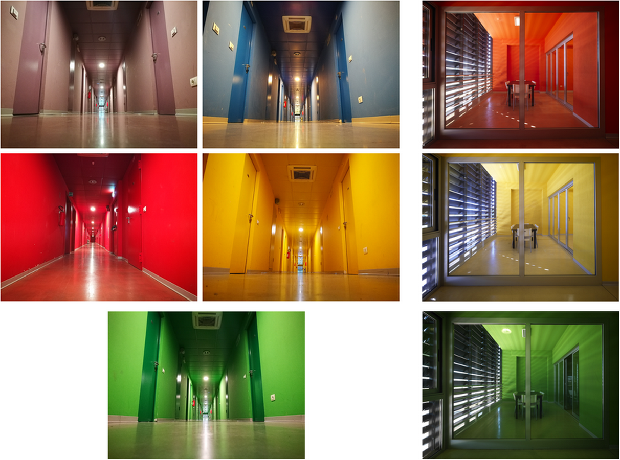
Empirical Validation: The I praticelli University Residence Hall Case Study
While theories establish principles, their architectural validation lies in empirical research. The most referenced large-scale experiment in color psychology was conducted in Italy, within a University Residence Hall complex designed explicitly to test chromatic influence on mood and behavior.
A. The Controlled Design
Six identical residential buildings were constructed—each painted in a single monochromatic hue: Violet, Blue, Green, Yellow, Orange, and Red. The architecture, lighting, and spatial layout remained constant, isolating color as the sole variable.
Over 443 students lived within these environments for over a year (average 13.3 months), providing a rare opportunity to evaluate long-term psychological responses in an actual occupied setting.
B. Key Findings Overview
- Blue’s Functional Superiority:
Blue emerged as the most preferred hue. Students reported calmness, clarity, and improved focus, particularly for study areas.
- Green’s Harmonious Effect:
Green interiors supported emotional balance and social comfort, confirming its restorative quality.
- Cognitive Mapping Advantage:
Differentiated color schemes aided wayfinding and memory—occupants recalled spatial locations based on hue, validating color’s role in environmental cognition.
- Perception of Lightness:
Yellow interiors were perceived as significantly brighter than actual light measurements indicated, proving that color manipulates spatial luminance perception.
C. Second-Order Insights
Long-term exposure confirmed that while preference adapts, functional outcomes remain consistent—blue environments sustained concentration; red stimulated sociability but caused fatigue over time. The experiment bridges the gap between laboratory neuro-studies and lived architecture, establishing color as a measurable determinant of spatial experience.
It also revealed a psychological phenomenon: color self-selection bias. Occupants tended to develop preference for the color they inhabited, suggesting an emotional acclimatization to one’s spatial hue—a concept linking environmental psychology to architectural identity.
Theories on Color and Spatial Perception
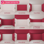
The perception of color in architecture is inseparable from the perception of space itself. Color alters spatial boundaries, depth, and the sense of enclosure.
A. Spatial Expansion and Compression
- Light, cool hues (like sky blue or pale gray) expand a space visually by reflecting more light and dissolving edges. This is why most residential interiors with lesser space use white walls to make it look bigger.
- Dark, warm hues (like maroon or terracotta) compress space, making interiors feel intimate and secure. which is why restobars and pubs typically opt for dark hues, as it is a place to socialise
A museum’s pale stone walls might draw attention to art through neutrality, while a theatre’s dark tones pull the gaze toward the illuminated stage.

B. Chromatic Hierarchies and Movement
In large architectural compositions, color guides wayfinding and hierarchy. Accent tones mark transitions or focal points, while muted bases provide rest. This rhythmic chromatic sequencing mimics musical progression—building anticipation, pause, and resolution within spatial movement.
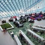
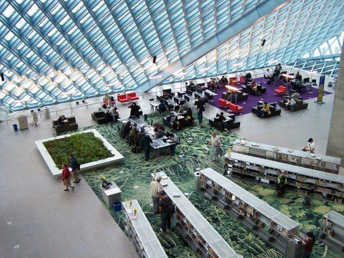
Seattle Central Library (by OMA/LMN) is the best example to demonstrate this principle in real life.
- Wayfinding: The building’s design is highly complex and non-linear. To help visitors navigate, the architects used bright, distinct colors in circulation areas like the escalators, rooms, and passageways. These vibrant colors act as visual landmarks and coding cues, making the different programmatic areas (such as the “Books Spiral” or the “Mixing Chamber”) immediately identifiable and memorable, simplifying movement through the unconventional space.
- Hierarchy/Zone Definition: The library is organized into nine functional zones, which are stacked like platforms. Color is used to differentiate these platforms and their specific functions, thereby creating a clear visual hierarchy of the building’s internal organization.
C. Color as Material Memory
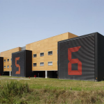
Beyond paint, the inherent color of materials—terracotta, timber, brass, or concrete—anchors architecture in cultural memory. The pink of Jaipur, the blue rampages of Mehrangarh fort or the whites of Kerala are not mere pigments but the identity of the place and its culture.
Architecture in the Language of Emotion
Color in architecture is far more than an ornamental decision—it is the guidelight to perception, guiding how we inhabit and experience space. From Goethe’s duality of light and darkness to modern neurobiological insights, every hue has a great role in fine tuning how the space is inhaled by the users.
Rajasthan’s exuberant facades and Kerala’s serene whites are not contrasts of taste but manifestations of context—climate, culture, and psychology intertwined. The blue walls of hospitals comfort not by accident but by science; the dark auditoriums focus not by chance but by design.
Architects like Richard Rogers used colours to code the functions as well as to create a signature style of the building with a muted concrete shell to create something unique using colours . The usage of colours can change a simple shell into a statement.
In every built space, color negotiates the invisible boundary between the external and internal worlds. It bridges architecture and emotion—reminding us that buildings, too, can feel.
References:-
Costa, M., & colleagues (2018) “Interior Color and Psychological Functioning in a University ResideCosta, M., & colleagues (2018) “Interior Color and Psychological Functioning in a University Residence Hall”, PMC (US National Library of Medicine). Available at: https://pmc.ncbi.nlm.nih.gov/articles/PMC6120989/ (Accessed: 4 November 2025).
PMCBower, I. S., Clark, G. M., Tucker, R., & Enticott, P. G. (2022) “Built environment colour modulates autonomic and EEG indices of emotional response”, Psychophysiology, 59(12), e14121. Available at: https://pmc.ncbi.nlm.nih.gov/articles/PMC9786701/ (Accessed: 4 November 2025). nce Hall”, PMC (US National Library of Medicine). Available at: https://pmc.ncbi.nlm.nih.gov/articles/PMC6120989/ (Accessed: 4 November 2025).
PMC
Bower, I. S., Clark, G. M., Tucker, R., & Enticott, P. G. (2022) “Built environment colour modulates autonomic and EEG indices of emotional response”, Psychophysiology, 59(12), e14121. Available at: https://pmc.ncbi.nlm.nih.gov/articles/PMC9786701/ (Accessed: 4 November 2025).