Here’s a mind-boggling question for all the readers. When surrounded by a wide range of products, which are the ones that draw attention the most? The answer: Paradoxically, it is both the ingeniously brilliant and appallingly garish ones. Surprising, isn’t it? The decisive factor in both these cases is the aesthetics involved. When one considers the “art” of designing, aesthetics becomes the deciding factor for the outlook of the product, resulting in the kind of impact it bears on the audience. While addressing the topic of aesthetics in design, navigating the fine line between what is considered to be ‘good’ and ‘bad’ becomes crucial. As demands grow and the user groups widen, it becomes increasingly difficult to ascertain the suitable option, for aesthetics hold the power to transform the way a product is perceived. And in today’s world, where a ginormous chunk of our lifestyle is driven by social media and advertisement, aesthetics is everything. Like the popular saying, “First impression is the best impression,” aesthetics helps businesses everywhere to brand, rebrand and make themselves memorable by assigning an identity to them.

In this article, we will look at the parameters that set apart the good from the bad and ugly. We will also understand how good aesthetics can be achieved by following a few simple concepts. So, without further ado, let’s dive into a world where beauty, art and function intersect!
Aesthetics: Where beauty & purpose unite
Aesthetics, as opposed to popular belief, can be more than just a shallow, trite element. When used appropriately, it enhances the ‘function’ of the design by articulating the purpose. Good aesthetics are clean, easy on the eyes, and mindful. They elevate the user experience by actively engaging with all our senses and reinforce the memory of the product in our brains. Loud and overt aesthetics, on the other hand, create a sensory dissonance, confusing the mind into immediately rejecting its presence. This in turn drastically lowers user engagement, leading to product failure. Good aesthetics, unlike their opponent, are always simple. Simplicity often attracts more users as it focuses on the product intent and communicates the message effectively, resulting in a high design efficiency. Therefore, it automatically garners a large user group without having to try too hard to attract attention.
Human minds are wired to seek beauty. It is a biological universe and conscious response, which has evolved continuously over several centuries, consistently in pursuit of sensory harmony—whether visual, aural or haptic. However, beauty must serve a purpose. Without a purpose or a direction, aesthetics will fail because it would neither cater to the right audience nor to the right function. Good aesthetics are those which always prioritise functionality. Additionally, it enhances the “function”, convincing the user of its necessity and remarkability, thereby leading to its subsequent integration into the user’s routine.
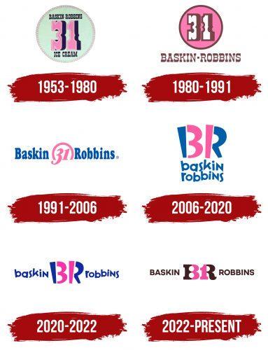
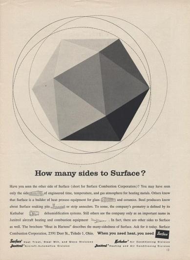
Aesthetics, when utilised ingeniously, have transformed brands, with their popularity skyrocketing through the roofs. In a brief period, they have amassed a huge fanbase owing to these creative decisions. Aesthetics, especially in today’s time and age, play a vital role in driving media and advertisement trends, unlocking new means of capturing attention to widen their fanbase. Several brands and products have time and again changed their designs and logos to stay relevant with changing times. Whether it be Starbucks, Baskin Robbins, Mercedes, or Coca-Cola, every brand, irrespective of scale and popularity, has used aesthetic design to rebrand itself. At times, this phenomenon has worked in their favour, but sometimes it hasn’t as well. For a design to succeed—at least at face value—good aesthetics is a must. A powerful design can turn around the audience’s perception, convincing them of its superior quality and make. It is a visual representation of the brand’s ethos—one that is communicated from the brand to its user through a physical or virtual entity.
So, let’s look at a few concepts that can help designers create beautiful and impactful aesthetics — one that’s not just attractive but meaningful as well.
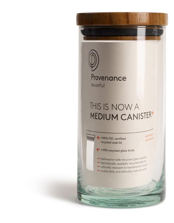
Keeping it simple
As mentioned earlier, the benefits of maintaining a simple palette for aesthetic design go a long way. However, ‘simple’ does not always have to mean ‘minimalistic’. Simplicity in design just refers to maintaining a clear, concise design that is thoroughly focused on the client’s needs. The design language must resonate with the brand or product’s purpose to communicate its values. Differences must be kept to a minimum, as uniformity in design lends a refined quality that aligns with the user’s preferences. Simple aesthetics always capture users’ attention quickly and are highly memorable owing to their unique expression.
Say no to clutter!
Irrespective of the entity being designed—whether a motif, a logo, a website, a poster, a signage or even a user interface for a mobile app—one must always avoid crowding multiple elements with each other. Clutter leads to visual disharmony which makes the design or datum incomprehensible. While designing, one must ensure that all the elements (images, captions, headings, options, etc.) coexist with each other. Instead of clashing with each other and dissuading the audience, they must direct their focus by complementing one another. By maintaining a suitable number of elements and ensuring proper spacings and scale, one can achieve a neat, decluttered aesthetic that is legible and captivating.

Follow the rules!
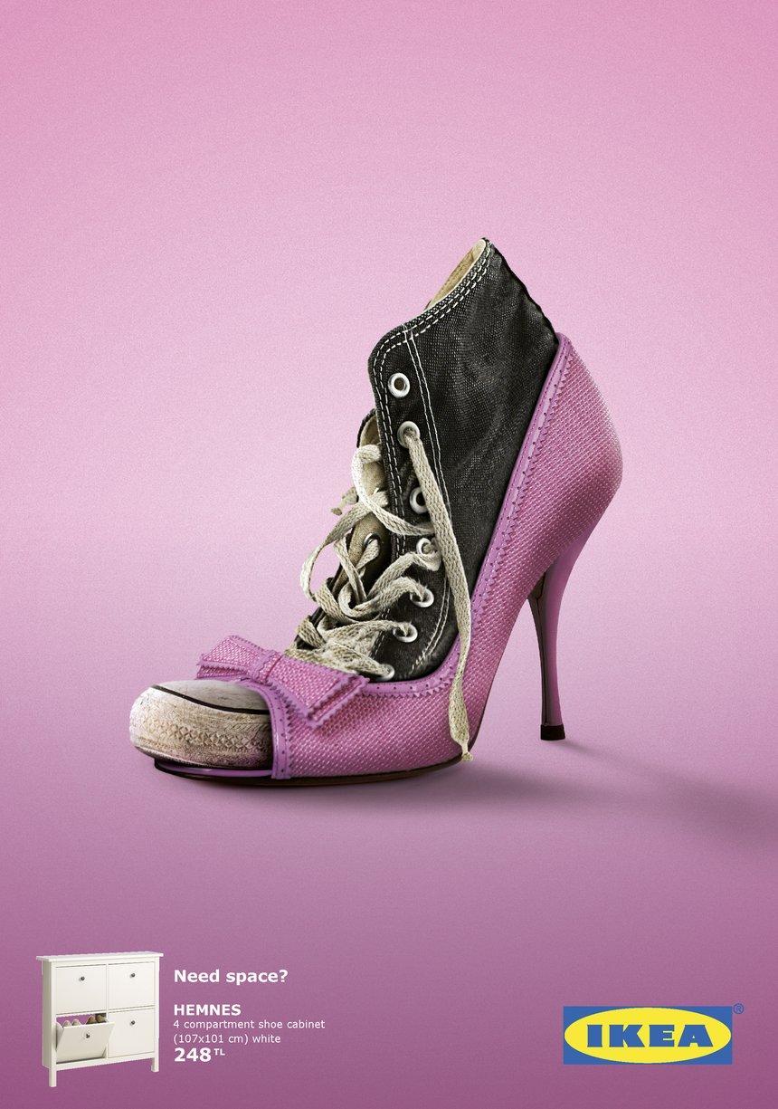
- Colour: Using the right colours can set the mood and tone of the product by responding to the user’s emotions. The right colour palette can express the brand’s intent effectively. For instance, brands like Zomato, McDonald’s, KitKat, and Netflix use red in their colour palette, as it is associated with emotions such as hunger, energy and passion. Similarly, brands such as Lamborghini, Versace, Rolex and others use black and gold to indicate luxury and sophistication.
- Balance: Balance in design ensures all the elements that comprise the design complement and enhance each other. It promotes visual harmony and legibility, thus catching the viewer’s attention quickly.
- Hierarchy: Hierarchy in design is necessary for maintaining order. It is primarily responsible for directing the focus of the viewer to various elements in a sequential manner. A visually cohesive and strong design always utilises hierarchy to convey the significance of each element within the design.
- Scale: Scale, in aesthetics, reinforces readability and hierarchy via the use of different sizes for texts. Differentiating between multiple sections—say, in a blog— becomes easy when each entity is assigned a specific attribute such as size, angle and thickness. Scale also ensures the message is communicated effectively — the bigger the size, the quicker the attention gathered by the design.
- Repetition: Repetition can create a pattern or language in aesthetic design. Leitmotifs are often used to establish an identity for a brand or product by ensuring uniformity across different platforms. Whether it be a recurrent symbol, specific fonts, or even a common palette across different media, repetition influences memory, perception, and recognition.
- Contrast: Contrast can be noted as one of the most influential factors in aesthetic design. Maintaining proper contrast in colour, typography and scale ensures instant perception by increasing the legibility and clarity of the design. This also increases user engagement as people find it easier to read and perceive elements that have a high contrast ratio between them.
- Typography: Typography is a key player in the world of aesthetics, as it is responsible for communicating ideas, sentiments and tones of the product or brand. Oftentimes, a well-placed logo posed against a catchy phrase can instantly grab the viewer’s attention. Ingenious use of typography can result in a visually cohesive and successful design that can turn heads and even pioneer new trends.
- Proportions & Principles: Going old school, believe it or not, is the best recourse for creating good aesthetics. By following rules and principles associated with the ideas of proportions, sequences, uniformity, and proximity— such as Gestalt’s laws, the Golden ratio, and the Rule of triads— the gap between objectivity and subjectivity can be bridged effectively. Doing so, results in an interesting and cherished design that is capable of catering to a wider group of users.

Finding the balance between subjectivity and objectivity
A longstanding debate in art is between subjectivity and objectivity. While subjectivity infuses aesthetics with fresh perspectives and novelty and personal signature, it requires objectivity to step in to lend order to it. Objectivity offers rationality and practicality to aesthetics. It depends upon meticulous research, design principles and extensive data to inform design decisions. While subjectivity brings in originality and emotive appeal, objectivity extrapolates on these ideas and communicates them to a wider audience by appealing to pre-established aesthetic preferences. Establishing the right balance between subjectivity and objectivity inarguably results in a visually and emotionally rich aesthetic that caters perfectly to the user’s requirements and preferences.
Change is the only constant: Let beauty evolve
To ensure creativity flows freely and novel ideas and aesthetics are introduced into the world of art and design, it is imperative that the concept of “beauty” be allowed to evolve. While certain concepts and principles revolving around what constitutes “beauty” remain (e.g., the golden ratio), it is equally necessary to provide space for exploring new possibilities and setting new trends. These explorations can be used to redefine the differences between good and bad aesthetics, thus setting new standards of beauty.
Good aesthetics: The secret to a happy client
Another rule for achieving good aesthetics is to conduct extensive research of the user group. Understanding demographics, user patterns and requirements, aesthetic preference, brand intent, context, etc., can give a thorough understanding of the audience. These studies help create a suitable and intuitive design that aligns with the user’s interests, ultimately resulting in a successful product.

In a world as complex, ephemeral and diverse as art and design, rife with infinite possibilities, it becomes tricky to designate a specific standard for beauty and aesthetics. However blurry these lines may appear, the few criteria mentioned above can always be used to assess the quality of aesthetics. These non-negotiable factors can help us easily determine good aesthetics, thus elevating our designs to awe-inspiring levels.
So, here’s to learning new titbits about design and making the world more colourful and vibrant with amazing aesthetics, one design at a time. Happy designing, folks!
References List:
- Hafizji, A. (2024). The Intersection of Design and Art: Exploring the Relationship. [online] www.wednesday.is. Available at: https://www.wednesday.is/writing-articles/the-intersection-of-design-and-art-exploring-the-relationship [Accessed 11 Apr. 2025].
- Shokurova, K. (2020). Aesthetics in Design: How Do We Decide What’s Beautiful. [online] shakuro.com. Available at: https://shakuro.com/blog/what-makes-something-beautiful-and-how-to-use-it-in-design [Accessed 11 Apr. 2025].
- The Interaction Design Foundation. (2016). What is Aesthetics? [online] Available at: https://www.interaction-design.org/literature/topics/aesthetics?srsltid=AfmBOopji2pVOluFDQW-Fm_Ygm5aJfhThOqdjH-5j1ViB6OPRw1eClRN [Accessed 11 Apr. 2025].
- www.coreldraw.com. (n.d.). CorelDRAW Graphics Suite | Free Trial. [online] Available at: https://www.coreldraw.com/en/tips/aesthetic-design/ [Accessed 11 Apr. 2025].