Why buildings make us get lost
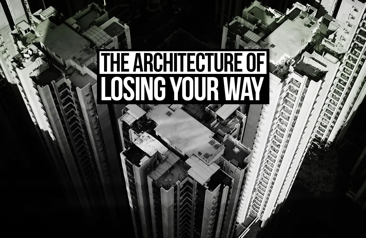
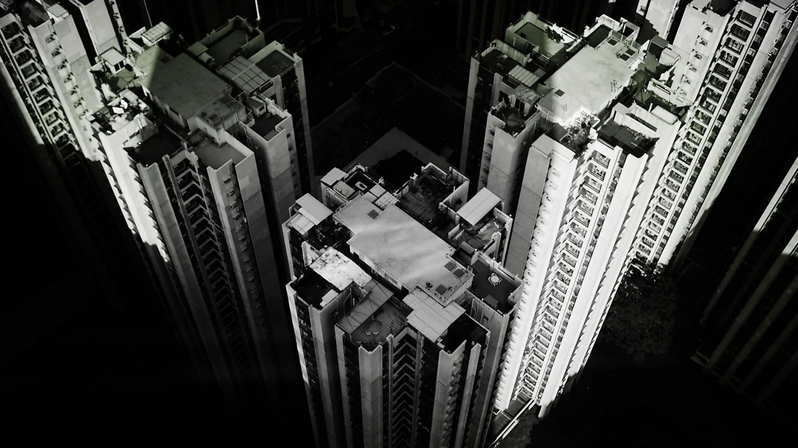
The human brain builds a “cognitive map” as you move through a space, analysing how spaces connect, identifying distinct landmarks, and recognising the hierarchy of spaces by splitting them into understandable parts. Specific design elements can increase the chance that someone will get lost: long, monotonous corridors and floors that lack unique elements to distinguish one section from another; symmetrical or minimally differing areas, which may confuse left-right perception; excessive branching, which leads to decision overload and breaks one’s navigational focus; and lack of long-distance visibility, such as dead ends or unseeable paths due to partitions or other design elements. Overall, a minimally differentiated built environment with too many alternatives challenges one’s ability to build and update mental models of the space and one’s position within it.
The challenge of scale is linked with other design elements, such as the number of levels and the distribution of entrances and exits. The more floors a building has, the more opportunities it has to utilise mezzanines, split-level design elements, and skybridges—connections between different buildings at a higher level. All of these add to the complexity of the space. Moreover, the larger the building is, the more information a person may need to process: hundreds or thousands of objects require more filtering and attention to be incorporated into one’s mental model. Hospitals have an increased number of abbreviations, multilevel constructions, and similar units and are filled with stressed and drugged people who are not in the best state to reason about their location.
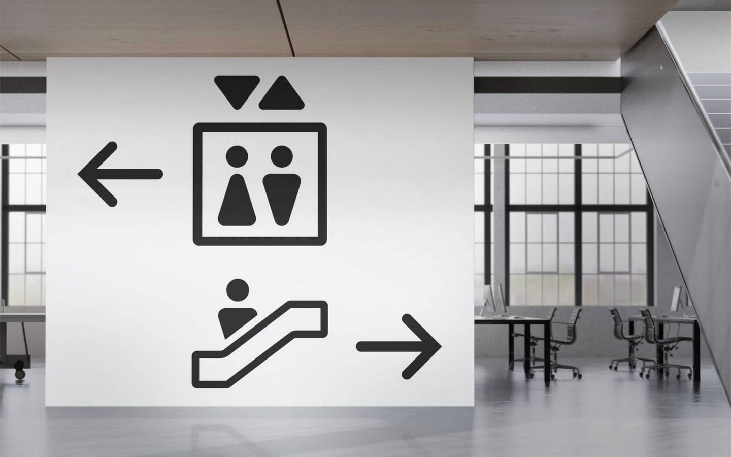
 Finally, there are several architectural and design elements that seem intuitively important but were never quantified before. It appears that to reduce the “degree of being lost”, a building needs to have an architectural layer with a clearly defined entrance sequence, a main circulation core, and a set of major destination points in the environmental layer that incorporates varied lighting, materials, colours, and biophilic elements to create major zones and place-specific furniture and other elements, and an information layer that uses sequential information signs and destination wayfinding, filters content based on a destination and a visitor’s task, and uses consistent naming conventions.
How architecture guides us without signs
Daylight and framed views serve as a compass. People are drawn towards the light and use it as a reference point. Atria, light wells and skylights provide important vertical beacons which can be seen throughout the building, helping wayfinding through triangulation. Clerestories and long vistas to courtyards or landscapes provide distant references with which to orient themselves, for example, in relation to the garden or away from the sunlit court. The varying characteristics of daylight through the day provide a temporal reference, helping to define a sense of time as well as place. Strong visual features such as greenery or large expanses of canopy often dominate the field of view and act as significant primary orienting devices.
Floor finishes can be used to provide a ‘read’ of the building plan. The use of colour coding for floor plates provides a simple wayfinding device, allowing people to recognise their location on the building plan without the need for wayfinding devices. Directional patterns and linear features within the floor finish allow for simple directional wayfinding cues. The use of different materials or the transition between materials can provide useful cues as to the change in function, allowing the user to interpret their position within the building. The use of distinctive architectural devices provides a ‘postcode’ for the building. Atria act as focal points, providing a sense of place and aiding orientation within the building. Express staircases provide vertical landmarks which can be used to navigate the building and regain an awareness of position after changing levels. Courtyards and planted courts act as visual beacons, bringing the outdoors in with all the visual and sensory clues that this provides.
The spatial hierarchy serves as a guide to the destinations: what the eye is led to look at before any signage appears. Massing and sight lines provide a visual hierarchy, helping to define the building plan and its relationship to the external landscape. A simple building structure with strong primary spines and axes will allow the eye to be led easily through the building, with secondary routes and the entrances to lesser functions being clearly subsidiary. Strong visualisations achieved by framing views or using simple façade devices will create areas of high visualisation and should be placed so that they draw attention to main destinations. If the correct balance is not struck, the eye will be unduly distracted, and the intended destinations will not be realised. The importance given to a destination within the building should be reflected to a large degree by its level of visual prominence.
Can getting lost be good in architecture?
Confusion becomes discovery when mystery is promised and delivered: the space generates the sense of “more beyond” and rewards the curiosity with vistas, rooms, or dramatic narrative turns; complexity is revealed at a larger scale: the plan is comprehensible in its key elements, if not fully legible, so that the user can form a general idea of where to go, even if getting there requires navigating multiple dead ends and subways; emotional payoff is integral to the programme: discovery is the goal, the means to the end, or serves a larger message (pilgrimage to an object, contemplation of memory) rather than an impediment to a task (getting to the airport). Buildings that turn confusion into a plus use narrative devices familiar to storytellers to guide the users through an immersive experience.
When circulation allows the “wrong” turns, it can deliver on the promise of adventure and exploration. Looping, weaving, folding, and branching can be used to navigate users’ expectations and encourage them to meander, while not losing sight of the target. The sense of arrival at a crossroads or a bifurcation can be enhanced by using thresholds as places for pause and reflection, framed by courtyards, terraces, or mezzanines. Different ceiling heights and lighting levels create vertical and lateral variations that also serve to delineate phases of exploration, with changes in material signalling that a new “chapter” has begun.
Should the architect always make it easy? It depends on the programme. Hospitals and transportation hubs prioritise legibility and visibility because they are all about keeping users on a well-defined track towards a clearly stated goal. If the hospital emergency ward cannot be reached right away, it defeats its own purpose. Cultural and contemplative buildings, on the other hand, can embrace the value of getting lost within their embrace. Buildings with mixed programming can have mixed strategies, as long as a primary circulation pathway is prioritised and other, secondary ones offer opportunities for meandering and exploration. The same principle can be applied to the use of scale: large-scale environments can create the sense of compressed time and space and the feeling of getting to a real “destination” within the building.
Emotionally expressive architecture will create vertical and horizontal variations in the environment to engage the senses and prompt reflection. The changing quality of light can be used to underscore the difference between day and night or to create associations (cold night air, warm days in a distant country). The alternation of shadows and light can be utilised to generate mystery (when a room is hidden in the shade) and release (when a new area is unveiled in daylight). Exploration at different scales is inherently emotional, as it hinges on our perceptions of space and time. The same applies to the richness and variation of materiality and acoustics; a stone corridor, a babbling stream, or an echoing chamber can turn an ordinary walk into a journey of self-discovery.
“Architecture is the masterly, correct and magnificent play of masses brought together in light.” — Le Corbusier (Journal, 2019)
References:
[1] Alinam, Z. and Celani, G. (2026). Before the sign: Evaluating visual hierarchy and navigational clarity on a high-tech campus using VAS. Interdisciplinary Journal of Signage and Wayfinding, [online] 10(1), pp.5–18. doi:10.15763/issn.2470-9670.2026.v10.i1.a174.
[2] De Paiva, A. (2018). Spatial navigation: NeuroArchitecture and the brain’s GPS. [online] NeuroAU. Available at: https://www.neuroau.com/post/spatial-navigation-neuroarchitecture-and-the-brain-gps [Accessed 3 Oct. 2026].
[3] How Flooring Supports Wayfinding in Commercial Spaces. (2025). How flooring supports wayfinding in commercial spaces | AHF products. [online] Available at: https://www.armstrongflooring.com/commercial/en-us/resources/blogs/how-flooring-supports-wayfinding.html [Accessed 3 Oct. 2026].
[4] Journal. (2019). Exploring the mystical relationship between architecture and light – architizer journal. [online] Available at: https://architizer.com/blog/inspiration/industry/forms-assembled-in-the-light/ [Accessed 3 Oct. 2026].
[5] Ozen, S. (2025). Emotional architecture: Can buildings make us feel? [online] illustrarch. Available at: https://illustrarch.com/articles/60507-emotional-architecture-can-buildings-make-us-feel.html [Accessed 3 Oct. 2026].
[6] PA Editorial Team (2026). Wayfinding in architecture: Signs as part of the design. [online] PA | Architecture & Technology. Available at: https://parametric-architecture.com/wayfinding-in-architecture/ [Accessed 3 Oct. 2026].
[7] Stamps, A.E. (2004). Mystery, complexity, legibility and coherence: A meta-analysis. Journal of Environmental Psychology, 24(1), pp.1–16. doi:10.1016/s0272-4944(03)00023-9.
[8] Swetha Prabakaran (2024). Designing narratives in experiential architecture. [online] RTF | Rethinking The Future. Available at: https://www.re-thinkingthefuture.com/architectural-community/a13343-designing-narratives-in-experiential-architecture/ [Accessed 3 Oct. 2026].
[9] webmaster (2020). Above and below: Natural light | IA interior architects. [online] IA Interior Architects. Available at: https://interiorarchitects.com/above-and-below-natural-light/ [Accessed 3 Oct. 2026].
[10] Written and Reviewed by the, Cognitive Train Team and Spatial Reasoning (2026). Pathfinding skills: How to navigate complex layouts – ⚡ cognitive train. [online] Cognitivetrain.com. Available at: https://cognitivetrain.com/pathfinding-skills/ [Accessed 3 Oct. 2026].
[11] Zhang, Z., Lu, J. and Zhang, X. (2024). Emotionally-oriented design in museums: A case study of the jewish museum Berlin. Frontiers in Psychology, [online] 15. doi:10.3389/fpsyg.2024.1423466.
[12] Bond, M. (2017). The hidden ways that architecture affects how you feel. [online] BBC.com. Available at: https://www.bbc.com/future/article/20170605-the-psychology-behind-your-citys-design [Accessed 4 Oct. 2026].
[13] Makeshoff, P. (2025). Wayfinding Design: Helping People Navigate Complex Spaces with Style. [online] Designer Daily: graphic and web design blog. Available at: https://www.designer-daily.com/wayfinding-design-helping-people-navigate-complex-spaces-with-style-199944 [Accessed 4 Oct. 2026].