A mesmerising background of white-painted buildings in Greece, while Hrithik & Katrina romance on ‘Meherbaan Hua’ in Bang Bang. It gives a feeling of tranquil love and affection. While Sushant Singh in ‘Shaam Gulabi’ of Shuddh Desi Romance evokes a playful emotion in Pink City Jaipur, showcasing pink streets of Hawa Mahal & Jal Mahal. A place wrangling with tourists & merchants, aroma of spices filling the air amidst blue mosaic-tiled mosques. All we can imagine is Morocco. The blue colour of the Majorelle Garden or the Bahia Palace in Marrakech city certainly captures the essence of the Moroccan style, representing spirituality & the sky.
While a bird’s-eye view from Mehrangarh Fort shows the iconic blue houses of Jodhpur, evoking a sense of culture & unity.
As we move along the French colony of Pondicherry, it defines an aura of order & discipline, while the yellow colour adds charm to the space. The contrast created by pink bougainvillaea evokes a playful ambience.
At the same time, the yellow city of Jaisalmer evokes discipline and calm.
The Nomenclature of Emotions
Architecture evokes emotion. But colour defines the nomenclature of emotions. It defines the purpose of a space. While architecture outlines the function of a space, colour adds to the character of that space.
Far from being random decoration, the colours served as a form of emotional technology designed to influence the feelings of those who entered the space. Ancient designers used specific colours to guide spiritual experiences. Entrances of temples often featured bold, alerting reds, while interior spaces transitioned to softer yellows, greens, and calming blue-and-white tones in the innermost sanctums to facilitate meditation and focus. (Beyond 5000, 2025)
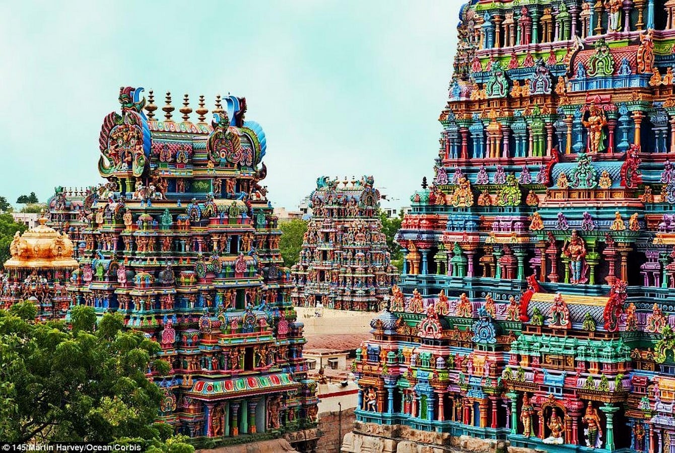
The churches often showcased stucco-plastered, highly colourful ceilings. The intention was to direct one’s eye to the sky. Even though the blue colour denotes the sky, the insanely painted ceilings concentrate one’s attention on the supreme power.
The pigments were derived from natural, eco-friendly ingredients like turmeric, laterite, indigo, and crushed seashells, often bound with tree sap or egg whites.
According to colour psychology, every hue reflects a particular emotion. Red denotes passion, green denotes tranquillity, white represents peace, blue denotes calm, while yellow denotes happiness.
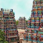
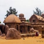
Ironically, the historic religious buildings were monochromatic. The Kailasa Temple, Ellora, the pink granite Pancha Rathas in Mahabalipuram, and the Sun Temple, Modhera, are a few examples where the monochromatic stone colour scheme is conquered by beauty and devotion. The highly colourful Dravidian temple houses the deity in a dark-coloured, dimly lit black stone sanctum.
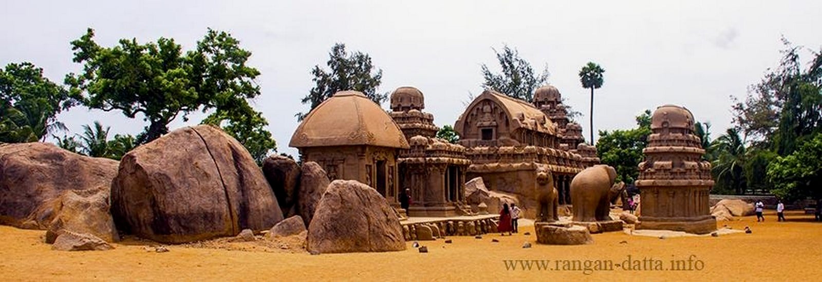
This clearly demonstrates that the colour of the building alone may not always directly evoke emotions. It is the context in which the building is set that determines the emotion induced. Colour plus sound equals sacred harmony.
Going Achromatic
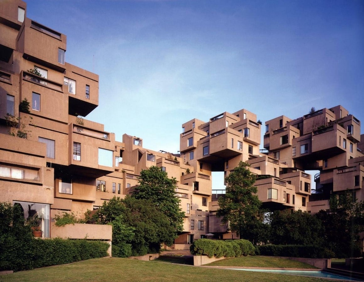
The shift toward plain, minimalist architecture is not accidental; it is the result of a combination of historical, economic, and philosophical changes that took hold in the 20th century. Influential architects believed that beauty should come from the “honest” expression of a building’s structure and materials rather than from added historical decoration. (Beyond 5000, 2025)
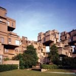
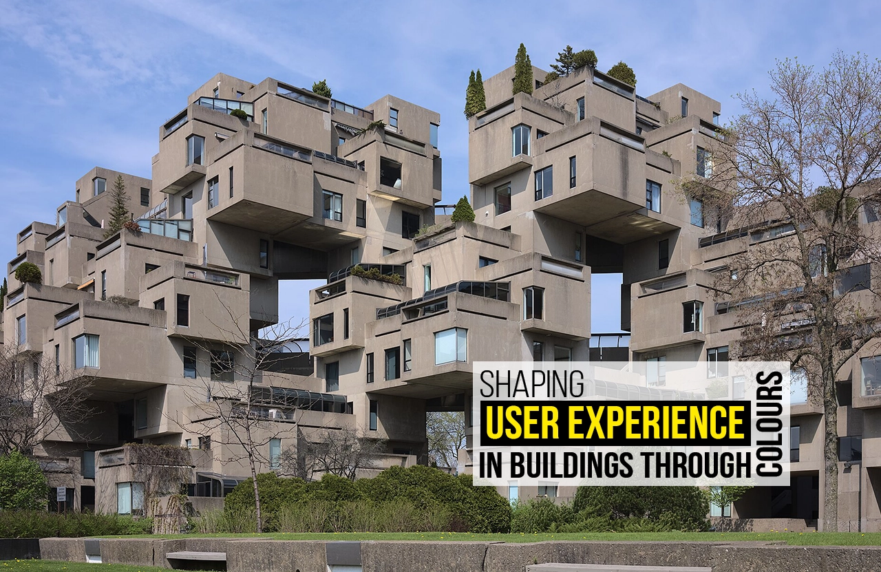
The Brutalist era highlighted the concrete facades, displaying the truest character of the material. Habitat 67 or the Sirius Building of Sydney caught the viewer’s eye with achromatism.
The Great Mosque of Djenne reflects the harsh desert sun in golden ochre colour, seamlessly blending into the landscape. This evokes a feeling of culture and oneness.
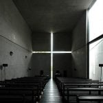
Pritzker Prize winner Tadao Ando‘s masterpiece, Church of Light, is a fascinating example of the absence of colour & honesty of material. The piercing warm white sunlight through the raw ash grey finish reinforces the concentration of the devotees on the cross-shaped void.
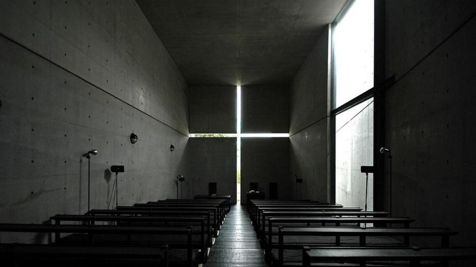
Architects argue that minimalist designs often consume fewer resources during construction and maintenance, promoting sustainability. By using durable, straightforward materials, these buildings are designed to be long-lasting and adaptable to various uses over time.
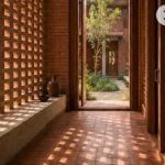
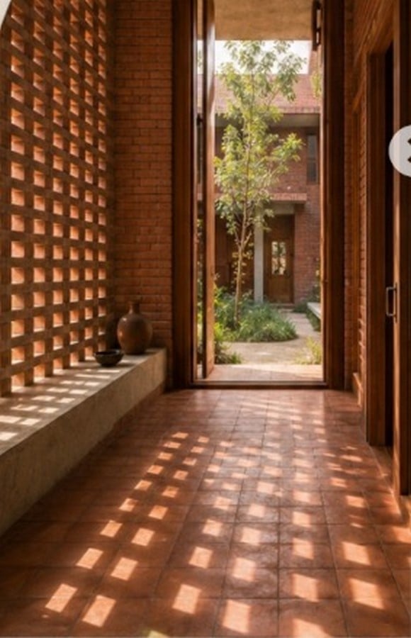
While talking about the sustainability and honesty of building materials, one cannot miss the local or indigenous works of Laurie Baker. The red brick facade accentuates the groundedness of the material & the user. The filtered sunlit colour entering through the red brick jaali & terracotta flooring creates a subtle contrast, generating beautiful shadow patterns inside the space. Such a contrast accentuates vernacularity & calmness for the user.
Breaking the Monotony
Wassily Kandinsky talks about the impact of colour on the soul. Adding a brushstroke of a contrasting colour accentuates the overall appearance of the façade. Many rural houses implement mud architecture. The addition of cow dung used in some rural art paintings in India signifies its role in transforming traditional art forms like Warli painting to make the façade aesthetic and lively. The white coloured warli against the brown mud heightens freshness while entering the house. Similarly, Mandana art, practised in Rajasthan and Madhya Pradesh, often uses cow dung as a base layer for intricate designs. Cow dung’s quaint colour, organic texture, durability, and cultural symbolism of being close to nature make it a unique medium in folk and tribal art. (Anon., 2025)
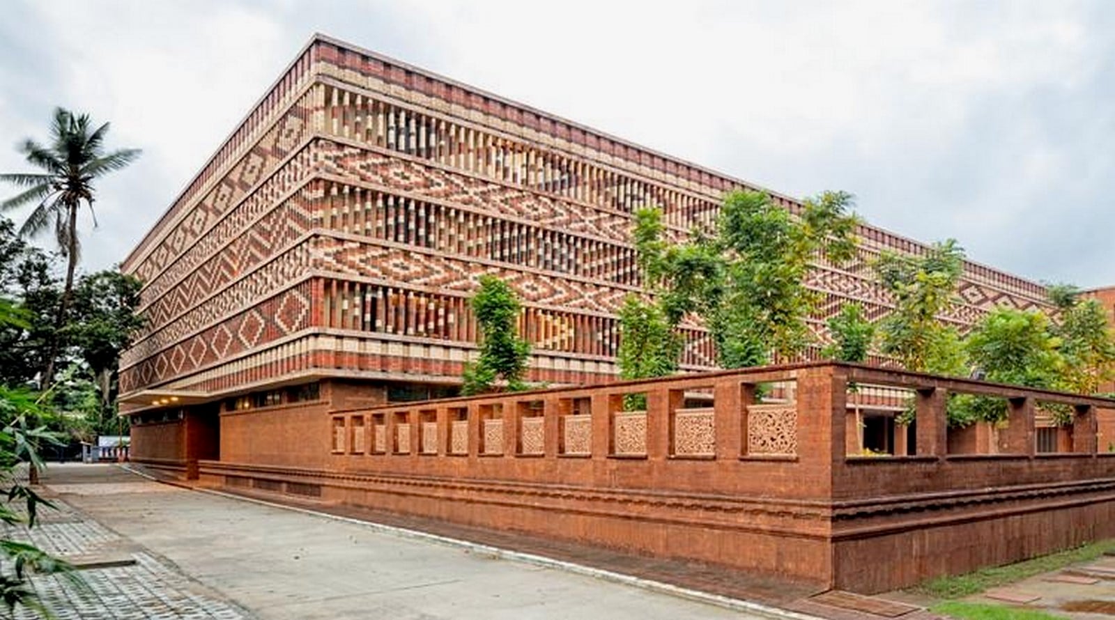
The Krushi Bhawan is one such modern example — one step ahead, to exemplify the red bricks with a black & white coloured pattern of ikat work in Bhubaneshwar. The alternating colours combined with staggered depth create a visually rhythmic pattern (Red + Black + white pattern = curiosity & awe)
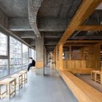
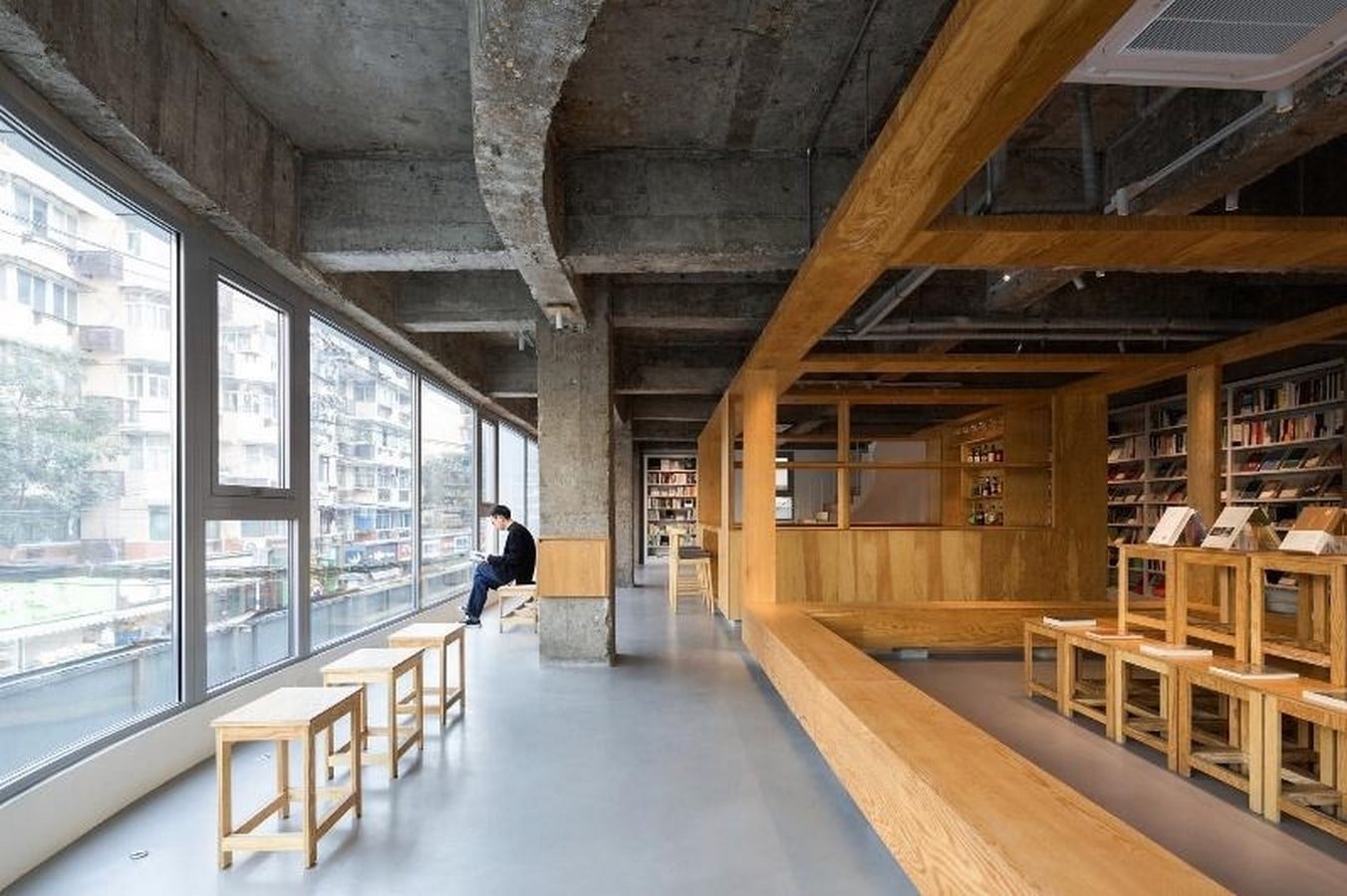
A dual palette concept in Arcade Project transforms the space’s atmosphere from daytime bookstore to nighttime bar. The cold concrete and warm timber create a striking contrast with the colourful books in the natural daylight, though at nighttime, the golden honey timber gets accentuated by the dim lights, forming an intimate and amber mood.
Colours shaping the buildings
Architecture and design rely heavily on visual cues to evoke emotional responses and define the purpose of a space. Colours validate the statement by applying character and shape to the space. A well-defined shape is always filled by proportionate use of colour, maintaining the principles of aesthetics. The discussion can be summarised into the following key pointers:
- Colour Defines Character, Not Just Function: While architecture establishes the physical function of a space, colour adds character and directly shapes emotional experience.
- Contextual Reality undermines Psychological value: A building’s emotional value depends heavily on its context, setting, and environment rather than the colour alone.
- Spirituality transcends colour palette: Despite the changing ambience of religious places, the deteriorating quality of paints fails to reduce people visiting these places.
- Achromatism induces focus: Modernist and Brutalist architecture displays the natural hues of building materials to induce attention and independence.
- Dual Palettes accentuate emotional diversity: The same space can encourage multiple emotions by using a dual colour scheme during different times of the day.
Colours not only shape the buildings we strive for, but also our worlds, influencing our emotions and dictating the user experience of the built environment.
Attitude is the mind’s paintbrush; it can colour any situation
-Barbara Johnson
References:
Beyond 5000 (2025). Why Were Ancient Indian Temples So Insanely Colourful? Youtube. Available at: https://www.youtube.com/watch?v=EjynpsPY0NM [Accessed 6 Aug. 2026].
Anon., 2025. A Symbolic Journey Through Hues, s.l.: ArtLife Gallery.