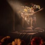
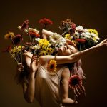
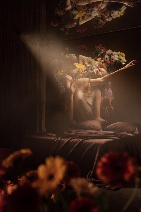
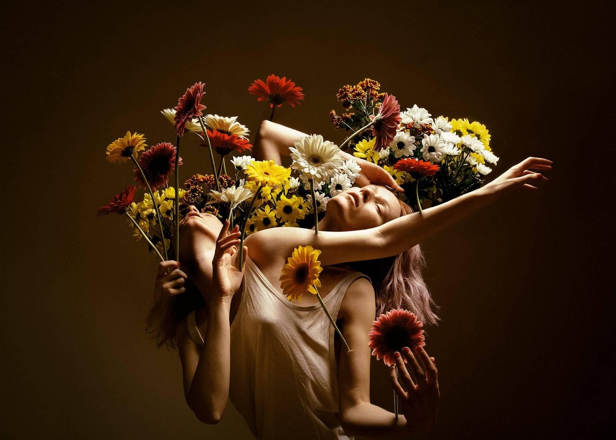
There is a particular species of interior that does not decorate space but instead transfigures it – rooms that refuse to be background and insist, instead, on being felt. Flóra Borsi’s In Bloom, a chiaroscuro self-portrait in which a figure surrenders to a cascade of gerberas, chrysanthemums, and daisies against deep umbra shadow, works great for this interior design task. The design concept examined here takes that proposition seriously: a luxury hotel suite conceived not as a hospitality product but as an immersive emotional event, translating the photograph’s ecstatic stillness into architecture, materiality, and light.
Emotional Theatre of The Art and the Artist
Self-taught in digital manipulation from the age of eleven and later formally trained at the Moholy-Nagy University of Art and Design, Flóra Borsi has built a practice centred on the surrealist self-portrait: images in which her own body becomes the site of metamorphosis, dissolving into fauna, flora, and atmospheric abstraction. Her work has been exhibited at the Louvre, featured at the Saatchi Gallery as part of the ‘Continental Shift’ group exhibition, and recognised by Forbes’ 30 Under 30 Europe Art & Culture list in 2020. Adobe selected her imagery as the face of Photoshop – an accolade that speaks less to technical virtuosity than to the uncanny emotional legibility of her compositions.
Her images are neither cold nor clinical but fundamentally warm, even when formally precise. In Bloom encapsulates this quality – the figure does not pose but yields, arms extended, head back, as if the flowers are not props but evidence of an interior state made suddenly visible. The figure is not passive – her gesture is expansive, arms wide – yet she has relinquished control over the accumulation of beauty pressing in from every direction.
For a luxury hotel room, this is a precise and demanding brief. The space must feel as though it has already been lived in by feeling as though the guest does not enter it but is received by it.
Room Classification and Intended Audience
The suite belongs to what may be defined as the romantic-sensory category of luxury intimate design: a room oriented toward heightened emotional and sensory experience between partners, governed by beauty and tactile richness rather than explicit erotic apparatus. It is emphatically not a bondage or kink-configured space – there are no restraint points or dungeon aesthetic. The design’s erotic charge is entirely implicit: it operates through softness, darkness, scent, and the psychological permission granted by the room’s pre-disheveled intimacy. The primary audience is both men and women – specifically couples seeking an experience of romantic intensity that transcends the conventional hotel idiom.
Color Harmony
The color palette extracted from In Bloom identifies the colors of the room. Deep Umbra functions as the room’s chromatic ground: a warm near-black that absorbs ambient light and forces every accent colour to appear as incandescence rather than surface. Against this ground, Crimson Gerbera and Solar Yellow operate as a split-complementary pair – their inherent contrast amplified by the darkness into which they are set, echoing that maximum luminosity is achieved not by brightness of hue but by strategic opposition.
The supporting palette – Warm Amber, Ivory Petal, Dusty Rose, and Earthy Burgundy – constitutes an analogous sequence running from orange-red through warm neutral to desaturated pink. These related hues create cohesion and a sense of organic warmth without visual competition. Dusty Rose performs a particularly sophisticated function: it is the palette’s emotional mediator, bridging the saturated crimson and the cool ivory while reading in low light as skin itself – a tonal echo of the figure in the photograph. The result is a room whose colour relationships are legible both intellectually and viscerally: guests experience the harmony before they can name it.
Structural Detail, Furniture, Light, and Decoration
The space reads as a compressed, intimate interior – likely a small bedroom or boudoir – defined by dark, enveloping walls that absorb light rather than reflect it. The ceiling becomes an architectural participant rather than a passive surface: a mirror doubles the floral installation and expands the spatial depth beyond what the room physically offers.
The bed dominates the composition as the sole piece of furniture, rendered in deep charcoal satin or silk – a surface whose sheen catches the ambient warmth of the light and contrasts beautifully with the organic textures surrounding it. The bed’s low silhouette and matte-dark frame keep the form understated, ensuring the human figure and the flowers claim full visual authority over the room.
The lighting is the true protagonist of this image. A single dramatic shaft of warm, hazy light – reminiscent of a crepuscular ray – cuts through the upper left of the frame, scattering through what appears to be atmospheric smoke or mist. This technique, borrowed from Baroque chiaroscuro tradition, sculpts the figure in luminous relief against the surrounding darkness. The glow is golden and diffused, never harsh, creating a sacred, almost devotional quality – as if the light itself is descending with intention.
The decorative language is singular and obsessive: flowers, everywhere. Daisies, sunflowers, chrysanthemums, and deep burgundy blooms appear in every spatial layer. This layering transforms decoration into environment – the room does not contain flowers so much as become them, dissolving the boundary between setting and subject in a gesture that feels both maximalist and deeply poetic.
What the Space Finally Transmits
This space is designed to be focused on intimacy and provides sensuality without vulgarity. Every material is chosen for its tactile weight and its capacity to absorb and modulate light, not for surface glamour. The room seduces through texture and temperature, never through explicit symbols.
The room vibrates between arrival and departure, between anticipation and memory. And that’s what the design around art principle works the great – the feeling and experience that cannot be achieved by standard design approaches.
That’s how the art in space talks.