Humans are massively tied to the places they visit, and the impression continues to linger after that. Public spaces are the fundamental foundation of human existence. Therefore, undoubtedly, the colors used in public and urban spaces such as houses, schools, workplaces, and interior and exterior perspectives, including furniture, significantly impact the consciousness and subconsciousness of humans and how they perceive it. For a balanced and well-maintained existence, pleasant urban spaces and environments are prominent, which can be implemented by understanding the properties, characteristics, and effects of color on humans. And this dramatically proves the importance and role of color in public spaces.

Humans and the Relation to Color
Over the years, many researchers have shown data on how a large amount of human reaction and perception depends on the colors of a space. The proper choice of materials and color design of a building contributes to the psychological well-being of humans. Hence, human emotions are the starting factor that defines the relationship between humans and colors and how public spaces were built around the concept of colors and psychology. The use of colors for specific areas can vary on age, social and cultural aspects, character, preferences, and experiences. Alternatively, the color design for an ideal environment is subjective to the individual stimuli interpreted from the surroundings.
In general, color theory is a set of rules and guidelines applied to visual interfaces. The designers use these guidelines to further communicate through the laid color schemes. This science is centered around the impact of colors on humans and their minds and how it affects their moods. The designing of a public area involves the appropriate furniture and material selection with spatial planning. Still, above all these aspects, the most significant one is the applied color. Moreover, with the right color in a space, it can be a way to enhance the memory and moods of the inhabitants and improve concentration and show a decrease in anxiety and stress.
Meaning and Impact of Each Color
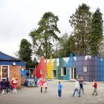
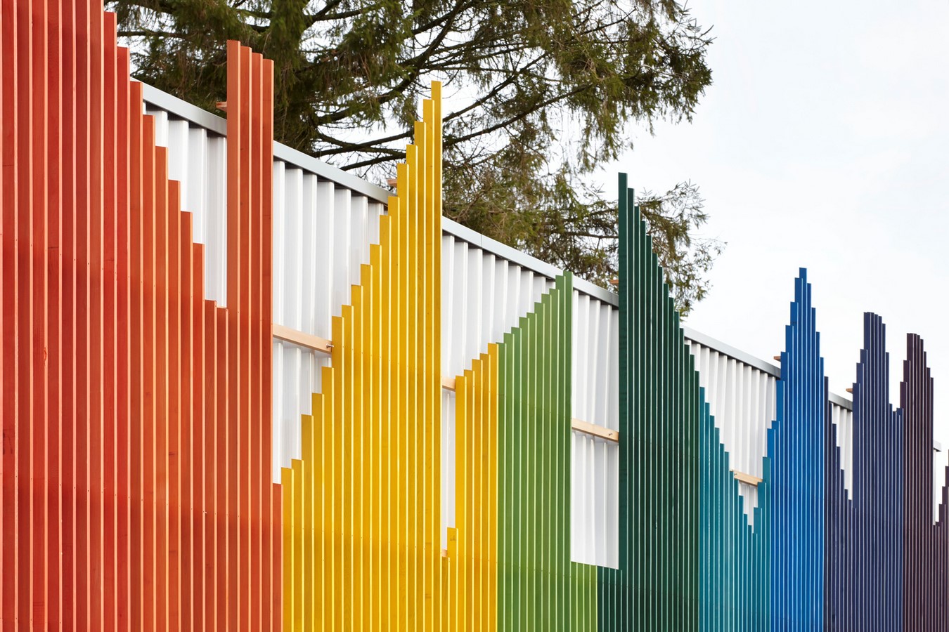
Public spaces can be adorned with various colors in the form of furniture, plants, and other decorative items; the options are endless. But the question is, how do these additions of colors contribute to the well-being of the people? Read on to find out each color used in public spaces and its impact on the moods and well-being of humans, along with their meaning and symbolism.
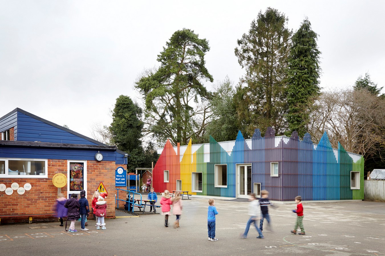
Red
Red is a color categorised as bold and often seen as a symbol of strength, power, energy, and passion. As it is an intense and strong color, including it in making vital signs are beneficial. Further, red can be seen as a color used prominently in restaurants as it is known to increase appetite and enhance creativity.
Orange
Orange is the epitome of bright and joyful situations, like a sunset. On the other hand, even though it is inviting, it can also overstimulate the senses making it difficult to concentrate on specific tasks.
Yellow
In recent years, yellow has been immensely used in public spaces. The reason for this is that the yellow color helps increase mental activity and provides energy. They are also the best source of positive feelings and happiness.
Green
It symbolizes nature and our relationship with it. Green can be used to elevate productivity and helps to reduce fatigue, and improve memory. Designers commonly use green in restaurants and hotels due to their contribution to creating a pleasant environment.
Blue
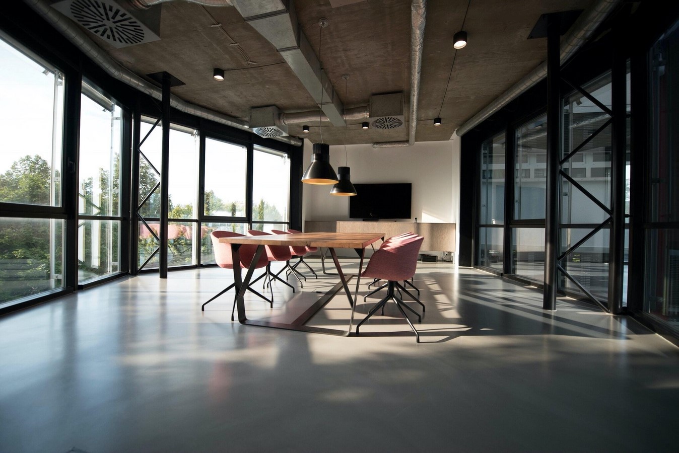
With the representation of calm and serenity, blue is a color that inculcates imagination in people and helps to remain productive. One of the reasons why it is primarily used in office buildings.
Brown
A symbol of stability, dependability, and wisdom. It is a color that provides relaxation and a sense of resilience.
White
A common color, seen everywhere and loved and preferred in public spaces due to its quality of communicating cleanliness and neutrality.
Selecting Color for Public Spaces
The process of choosing colors for private and public spaces inherently varies. Private spaces are designed solely on the requirements of the clients by the architects. Public spaces, on the other hand, need to carefully study the emotional and functional state of the users depending on the significance of the colors used. The choice of color depends on subjective and objective needs and the inclusion of functional criteria.
Applying a specific color and later perceiving it is different. Perceiving a particular color depends on the lighting and positioning of the items in an area. For instance, warm colors suit north-facing spaces, while south-facing areas go well with neutral and cool hues. On top of these inferences, warmer and brighter colors create a sense of proximity. In contrast, warmer, darker colors provide elegant and classic aspects. This can further be enhanced by incorporating functionality into public spaces. Lighter colors that help concentration are better for working areas, and restaurants go well with dark shades. For health areas, warm and welcoming colors with muted tones for calm and relaxation are recommended. As a result, architectural variations happen due to the difference in the composition and positioning of these applied colors in public spaces.

Conclusion
There is a continuous trend of experiencing and experimenting the color palettes and the feelings it creates in the contemporary design world. And all these discussions denote the same conclusion that the use of colors in architecture and design is far more valuable than just for aesthetics and beauty. With the appropriate materials and products, public space can function highly well, along with the proper color scheme. And lastly, the color will continue to determine how we perceive and reflect our surroundings and has the power to emphasise positivity leading to better user experiences.
References
- Polyvision. (2022). The Psychology of Color in Public Spaces. [online] Available at: https://polyvision.com/about/news/the-psychology-of-color-in-public-spaces/#:~:text=Color%20in%20public%20spaces%20can,outcomes%20and%20enhanced%20user%20experiences. [Accessed 25 Dec. 2022].
2.Florim. (n.d.). The Role of Colour in Public Spaces. [online] Available at: https://www.florim.com/en/blog/the-role-of-colour-in-public-spaces/ [Accessed 25 Dec. 2022].