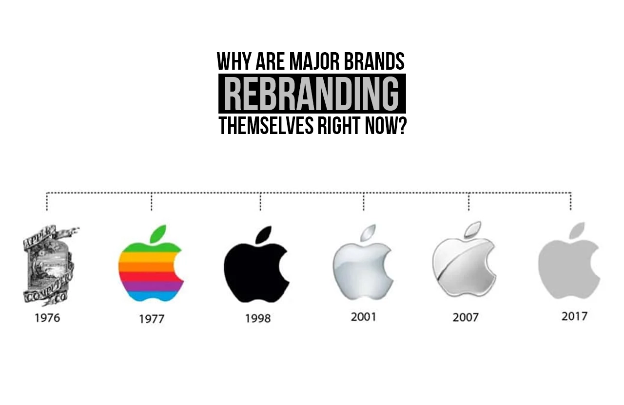
In the space of just a few years, some of the world’s most recognisable names have quietly — and sometimes dramatically — reinvented themselves. From tech giants softening their visual identities to fast-food chains overhauling decades-old mascots, a wave of branding design overhauls is sweeping across industries. The question is, why now? The answer lies at the intersection of culture, technology, and commerce — revealing how deeply a brand’s visual language shapes its relationship with the world.
The Shifting Landscape of Consumer Expectations
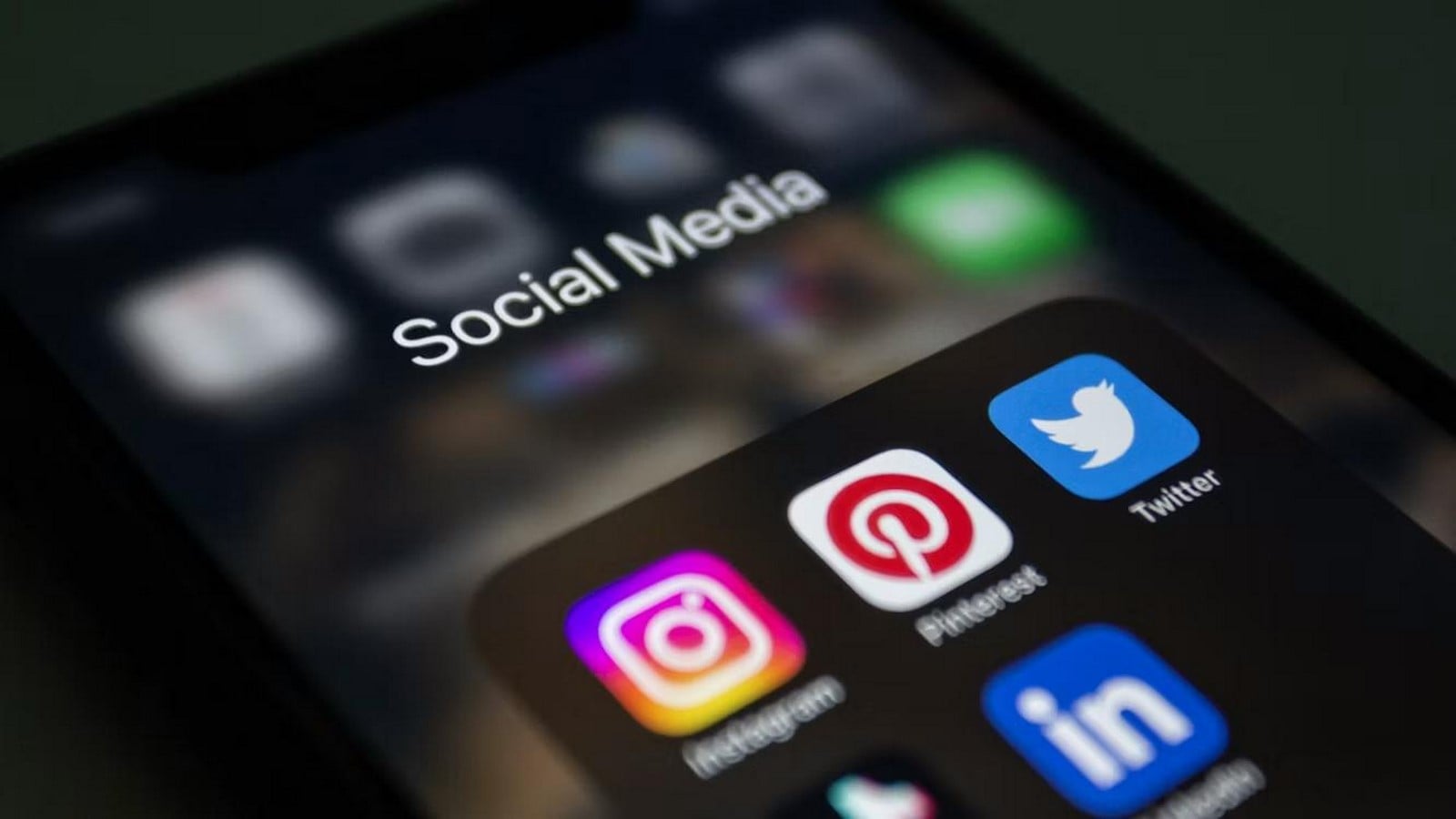
Modern consumers are not passive observers of a brand — they are active participants in its story. A generation raised on social media has developed a sharp sensitivity to authenticity, and outdated branding design can signal stagnation just as clearly as an ageing product line. Audiences today expect brands to reflect their own evolving values: sustainability, inclusivity, mental well-being, and social responsibility.
When a brand’s visual identity no longer mirrors the community it serves, that disconnect erodes trust. Organisations are acutely aware that a logo, colour palette, or typeface is not mere decoration — it is a condensed promise. Redesigning that promise is, in many cases, a direct response to audiences who have changed and who demand that the brands they patronise change with them.
Digital Platforms Are Rewriting the Rules of Branding Design
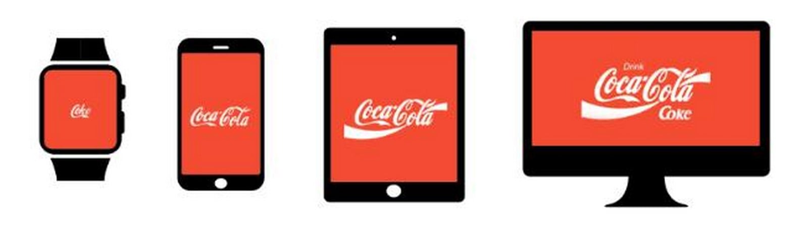
Perhaps no single force has accelerated rebranding more than the proliferation of digital touchpoints. A logo designed in 1985 for a billboard or a printed tin cannot always survive a 32-pixel favicon, a dark-mode app icon, or an Instagram story. Contemporary branding design must be ‘scalable’ and ‘adaptive’, functioning flawlessly across the full spectrum, from a smartwatch display to a large-format exhibition banner.
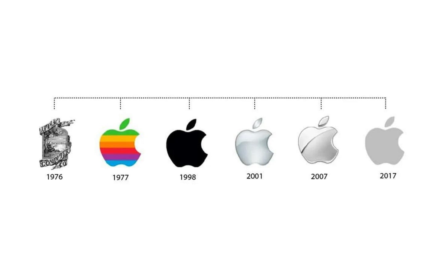
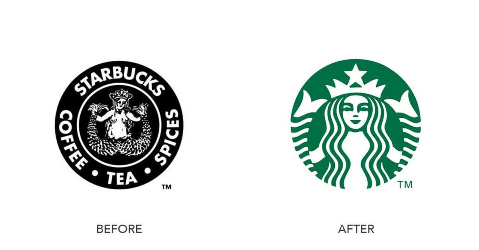
This has prompted many organisations to strip back complexity. Serifs are dropped in favour of clean sans-serif fonts. Gradients and drop shadows give way to flat, geometric forms. The result is an aesthetic trend sometimes called ‘reductive modernism’ in visual identity, a deliberate paring-down that prioritises legibility and versatility over ornamentation.
Responsive Identity Systems
Leading design agencies now speak of ‘responsive identity systems’ rather than fixed logos. A brand may have a full lockup for its website header, a condensed monogram for its app, and a simplified symbol for embossing on physical products — all part of a cohesive but flexible visual ecosystem. This approach to branding design treats identity as a living system rather than a static artefact.
Cultural Moments Are Catalysts for Change
The period since 2020 has been defined by upheaval: a global pandemic, intensified conversations around racial equality, the climate emergency, and rapid geopolitical shifts. Each of these moments placed brands under an uncomfortable spotlight. Companies that had traded on legacies rooted in outdated or exclusionary ideas found themselves facing a choice: evolve or become liabilities. Thoughtful branding design became a mechanism for signalling — sincerely or otherwise — that an organisation had listened and was prepared to change.
Several well-documented cases illustrate this. Long-standing food and beverage brands retired mascots with roots in racial stereotyping. Sports franchises shed names deemed offensive to indigenous communities. Insurance companies and financial institutions softened aggressive visual languages to appear more empathetic during a period of widespread economic anxiety. In each instance, the rebrand was as much a cultural statement as a commercial one.
Business Transformation Demands Visual Transformation
Beyond culture and technology, many rebrands are simply honest reflections of business evolution. A company that began as a brick-and-mortar retailer and has become primarily an e-commerce platform is, in a genuine sense, a different entity. Carrying forward an old logo suggests continuity with a model that no longer exists. Strategic branding design bridges the narrative gap between what a company was and what it has become.
Mergers and acquisitions present another common trigger. When two organisations with distinct identities combine, a new visual language must be forged that acknowledges both legacies while establishing a coherent forward-facing persona. Similarly, companies entering new markets — whether geographic or demographic — frequently discover that the assumptions embedded in their existing branding do not translate.
The Risks and Rewards of Rebranding
Rebranding is not without risk. History is littered with cautionary tales of organisations that abandoned beloved visual equities and paid a steep commercial price. Gap’s ill-fated 2010 logo change lasted less than a week before the company reversed course under public pressure. Tropicana’s 2009 packaging redesign reportedly contributed to a significant sales decline in its first weeks. These examples underline that branding design is never merely an aesthetic exercise — it is a negotiation with an audience that has formed deep emotional associations.
Successful rebrands tend to share certain qualities. They are grounded in genuine strategic rationale rather than trend-chasing. They are executed with rigorous research, often involving extensive consumer consultation. They are introduced with considered communication strategies that explain the change and invite audiences to come along for the journey. And crucially, they evolve the identity rather than erase it — preserving the threads of recognition that have been built over years whilst projecting a credible new chapter.
The Role of Design Studios and Agencies
Behind most significant rebrands is a partnership between an organisation and a specialist design studio or agency. These collaborations can unfold over months or even years, involving identity research, competitor audits, stakeholder workshops, and iterative creative development. The process is rarely linear, and the final design — however simple it may appear — typically emerges from thousands of decisions about proportion, spacing, colour, and meaning.
Sustainability and the Ethics of Branding Design
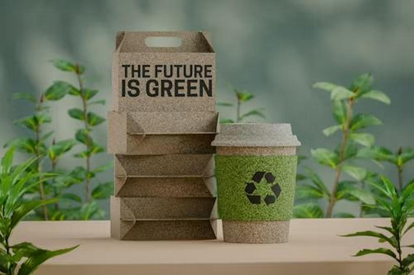
A notable recent trend in branding design is the incorporation of environmental ethics directly into visual identity. Brands are moving away from glossy, high-contrast palettes towards earthy, muted tones that signal organic credibility. Packaging design has shifted towards minimalism, partly for aesthetic reasons and partly to reduce material use. Typography choices increasingly favour typefaces with histories tied to craft and human touch rather than corporate precision.
This is sometimes described as ‘greenwashing’ when not backed by substantive operational change — and consumers and regulators have grown adept at identifying the difference. Organisations that use redesign to signal values they have not yet embodied risk a credibility collapse far more damaging than the original problem. The most admired rebrands are those in which the visual evolution is the outward expression of a genuine internal transformation.
What This Means for the Future of Branding
The current wave of rebranding is unlikely to slow. If anything, the pace of change in culture, technology, and commerce means that the lifespan of any given visual identity may continue to shorten. Brands are being forced to think of branding design not as a capital project undertaken every decade but as an ongoing, living discipline. The emergence of artificial intelligence in design tooling, real-time brand monitoring, and highly personalised digital experiences will only accelerate this shift.
Designers and brand strategists will need to balance two seemingly opposing imperatives: the need for consistency and recognition on one hand, and the capacity for adaptation and relevance on the other. The organisations that navigate this tension successfully will not simply have better-looking logos — they will have stronger, more resilient relationships with the audiences they serve.
Major brands are rebranding right now because the world has changed — and is continuing to change — at a pace that makes visual inertia a liability. Consumer expectations have evolved, digital platforms demand adaptive identities, cultural conversations are reshaping what is acceptable, and business models are in constant flux. In each of these contexts, branding design functions as the most immediate and legible signal of an organisation’s awareness of and responsiveness to the world around it. Done thoughtfully, a rebrand is not an act of abandonment but of maturity — a public acknowledgement that identity is not fixed, but earned, again and again, in dialogue with the people who care about it most.
References:
- Millward Brown (2023). ‘BrandZ Top 100 Most Valuable Global Brands’. [online]. Available at: www.brandz.com [Accessed: June 2025].
- Interbrand (2024). ‘Best Global Brands Report’. [online]. Available at: www.interbrand.com/best-global-brands [Accessed: June 2025].
- Johnson, R. and Patel, S. (2022). ‘The Strategic Imperative of Brand Identity Refresh’. Journal of Brand Management, Volume 29 (3), pp. 210–228.
- Wheeler, A. (2018). ‘Designing Brand Identity: An Essential Guide for the Whole Branding Team’. 5th ed. Hoboken: Wiley.
- Olins, W. (2008). ‘The Brand Handbook’. London: Thames & Hudson.
- Campaign (2024). ‘Why Major Brands Are Rebranding in 2024’. [online]. Available at: www.campaignlive.co.uk [Accessed: June 2025].