UX Design examples in Japan – The Japanese are accustomed to live in a clumsy and chaotic information environment. In Japan, there is a significant difference in the design of digital and non-digital items. Emotional involvement isn’t solely a digital phenomenon.
- Non-digital product design in Japan: Simple, Sophisticated, and Minimal.
- Japanese digital product design: the complexity and volume of information provided overwhelm them.

In Japan, the new and the old, the innovative and the traditional, the unique and the conservative coexist. The new and the ancient, the creative and the traditional, the distinctive and the conservative coexist in Japan. Japan’s product design is another example of UX design excellence, both in terms of aesthetics and utility. Japan has a lengthy culture of gift-giving that has influenced packaging and product design. Gifts were wrapped in straw, bamboo, leaves, and paper long before commercial materials like plastic and cardboard were invented. Although the materials have changed, the essential qualities of Japanese design – harmony, care, and utility – remain at the heart of these works.
Harmony in Design | UX Design Examples
Experiential packaging is frequently used in creative package designs. Including interactive aspects in the product’s initial encounter, which opens up a whole new world of immersive possibilities. The capacity to generate a sense of harmony between the goods and the consumer is a common source of Japanese design originality. Every time the product is utilised, the delight of properly aligned boxes occurs.
The capacity to build a Functionality & Sense of Usability between the items and the consumer exemplifies the Supremacy of Japanese Product Packaging Design. Take a look at the bento box below; this isn’t your typical bento box. This bento box eliminates the need for microwaves to keep meals warm. This is convenient in the form of food in a box.
The image of bento boxes and origami is ubiquitous in Japanese packaging, so the design isn’t just about how it appears, but also about how it feels in the hands and how the consumer interacts with the product, as well as what feeling they experience during the usage and consuming process. Pedchenko, Ksenia
Another example of design harmony. Japanese rice crackers and Swedish cookie packaging.

The hexagonal design, which was inspired by nature, symbolises communication and balance. With mountains, winds blowing, rivers running, and tea and rice fields, nature is also the source of inspiration for the design. The cookie box doubles as a serving tray and a protective container for the cookies – Saiki.
Designing for the Differently-abled
For many multinational businesses, designing for usability in healthcare packaging has been a matter of discussion. It goes beyond specialised markets in Japan, where brands design daily items with many users of varied skills in mind.
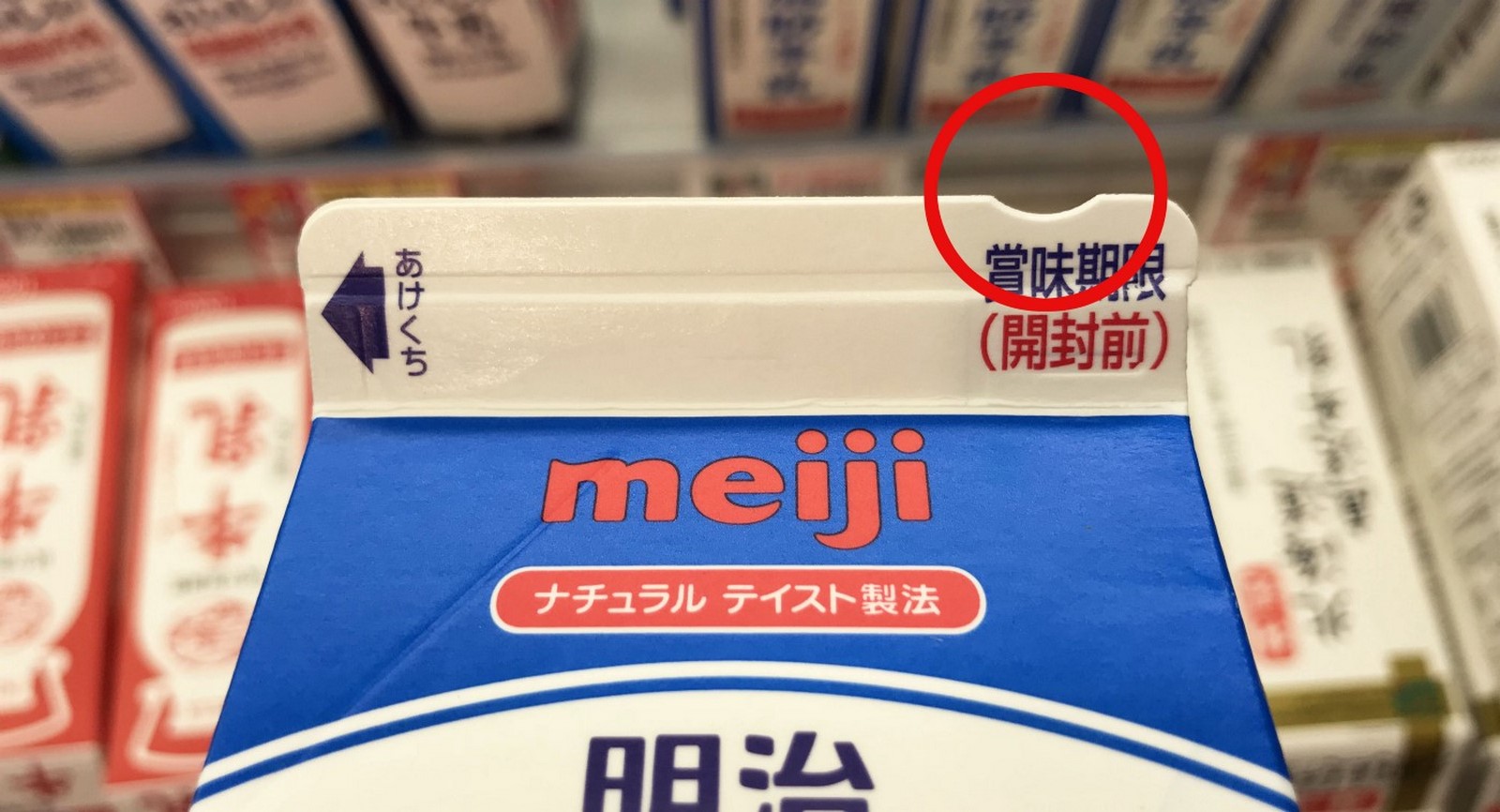
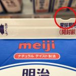
Milk containers have a distinctive depression on the top of the carton to help visually challenged customers distinguish pure whole milk from other drinks packaged in the same way. Simple considerations like these may have a significant influence on the user’s experience.
Considering how many solutions are human-proof rather than human-shaped (intended to make encounters easy, enjoyable, and even magical) (built in a way to make them impossibly complex and confusing) — Wipro Digita is a Wipro company.

The term “accessible design” refers to a design that takes into account the needs of persons whose physical, mental, or environmental limitations limit their ability to function.
“Universal Design” seeks to broaden the scope of conventional design principles to include individuals of all ages and abilities, but it does so at the level of generality, thus it does not meet all of the unique demands of any given impairment.
The chip on the beverage’s package indicates that it is made entirely of milk. On the box of other dairy products, there are no chips. Another advantage of the chip is that it allows individuals who cannot see to rapidly determine which side of the box to open. Through the language of design, this implies Harmony and Empathy for the users, and the Japanese are going to great lengths to achieve this.
Minimalism and Maximalism
Walking down the aisles of a Tokyo supermarket, people are distracted by the bright, glistening confectionery patterns screamed at them from the shelf. This is a great contrast to Muji’s clean, monotone colours. This design duality serves as a reminder that while we can’t be everything at once, we may appreciate the various parts of our personalities via our goods.
A minimalist design is intended to produce a packaging that enhances the product. The most crucial elements should be highlighted in this form of packaging design. – Designed by Inkbot
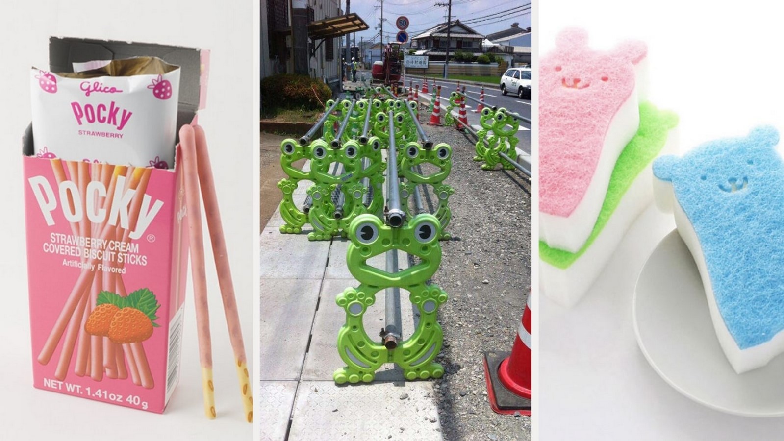
Another example of individuality in design is Japan’s “kawaii” culture. On anything from construction signs to stationery, the logo may be found all around the city.
Visibility of System Status | UX Design Examples
When exploring the web, Japanese individuals often depend on information rather than design aesthetics. The more data there is, the more reliable it is. As a result, Japanese websites have a lot of content and very little white space. The layout structure and how Japanese users browse is determined by their alphabets. As a result, Japanese websites are brimming with information, and even on the streets or wherever you go, you’ll be bombarded with a deluge of data to comprehend.
The Japanese construct digital menus in a fairly efficient manner, using Jakob’s Nielsen guidelines. Visibility of System Status is the first law of heuristics.
It relates to how well the system’s state is communicated to its users. Within a reasonable period, systems should keep consumers informed about what is happening through feedback.
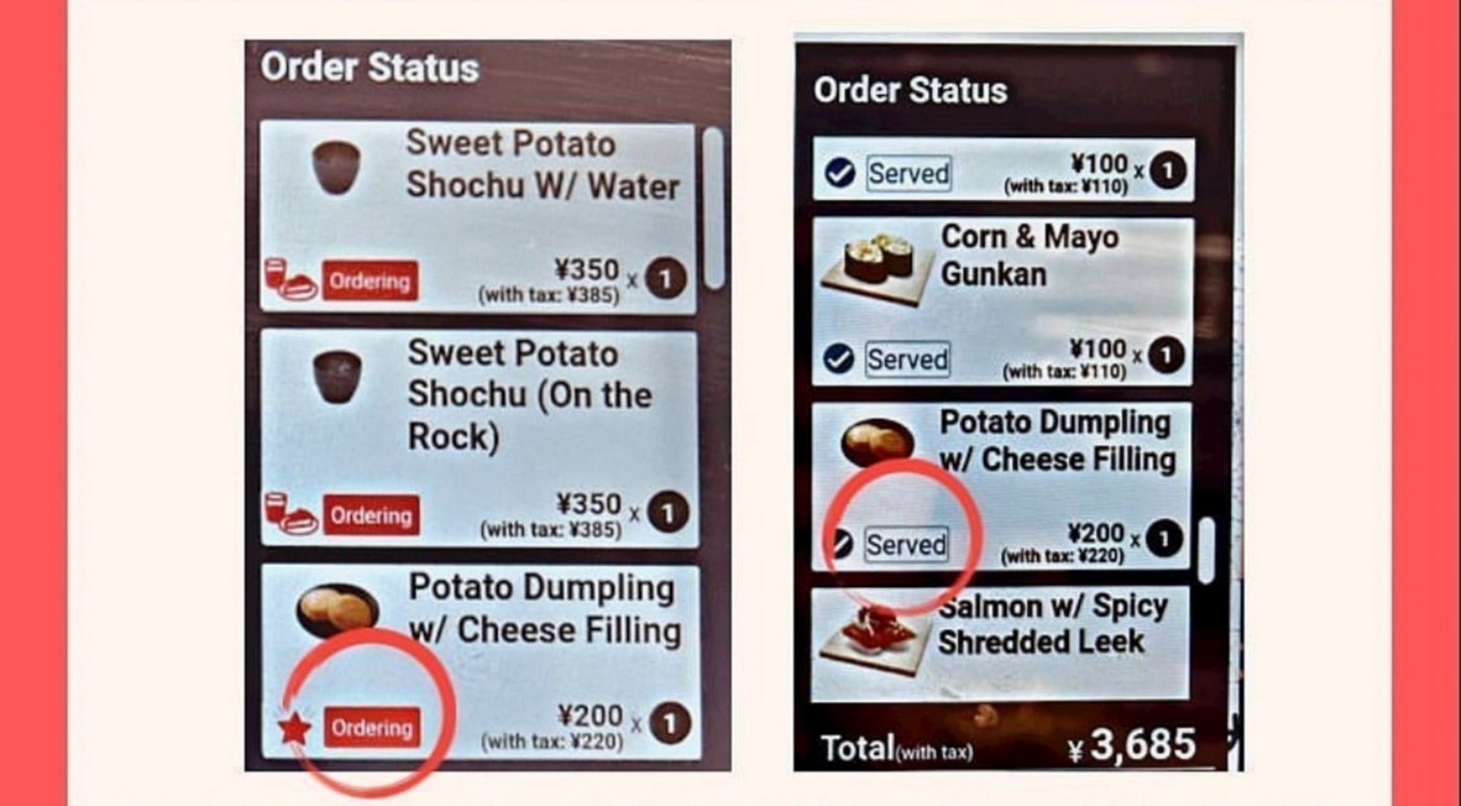
One example is a sushi restaurant where the digital menu presented attributes of Visibility of System Status by indicating the precise status of the order so that customers could estimate their wait time.
Amazing Product Designs are all around us, yet we seldom notice them since they mix in so well with our daily lives. Good UX design is so natural that it’s almost imperceptible. People don’t value anything if it’s not apparent, which is why it’s our responsibility as UX designers to recognise the value in good and terrible designs and learn how to incorporate them when creating for users.