The Camponesa unit in Barueri, a municipality in the metropolitan region of São Paulo, a homemade food restaurant that has parmigiana as its main dish, was the first with an architecture idealized to interpret its history of good quality, genuine cuisine for all the family.
Project Name: A Camponesa Restaurant
Studio Name: Memola Estudio
One of the challenges was to assert the privileged location of the new restaurant, at Iguatemi Alphaville Shopping, without relegating the attributes of the brand to the background, originating from an emporium with a snack bar opened in 1998 on the edge of the Castelo Branco Highway, in the municipality of Pardinho, interior of São Paulo, but which has evolved into a busy restaurant frequented by a wide and varied public.
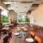
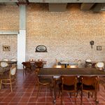
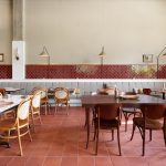
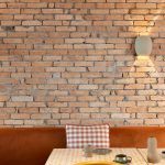
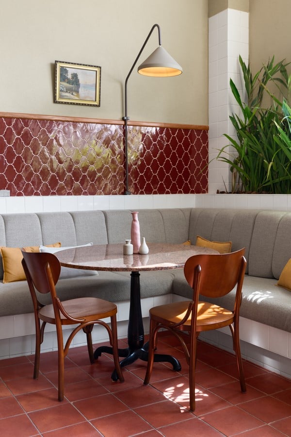
The conceptual axes of the project revolve around the ideas of home-made, countryside food, made with good quality ingredients and with simplicity at the service of excellence, architecturally translated into the chromatic palette where red stands out in earthy and crimson tones, as well as the predominance natural materials such as wood and exposed brick. The floor of the new restaurant, therefore, assumes a strategic role because of its long extension and visibility, covered with square red ceramic throughout the public hall. The demolitions of the pre-existing walls gave rise to the environment’s L-shaped plan, which surrounds the kitchen and the functional spaces restricted to employees, on the ground floor and mezzanine, preceded by a waiting room connected to the shopping center through wooden and glass frames and with sliding door.
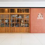
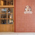
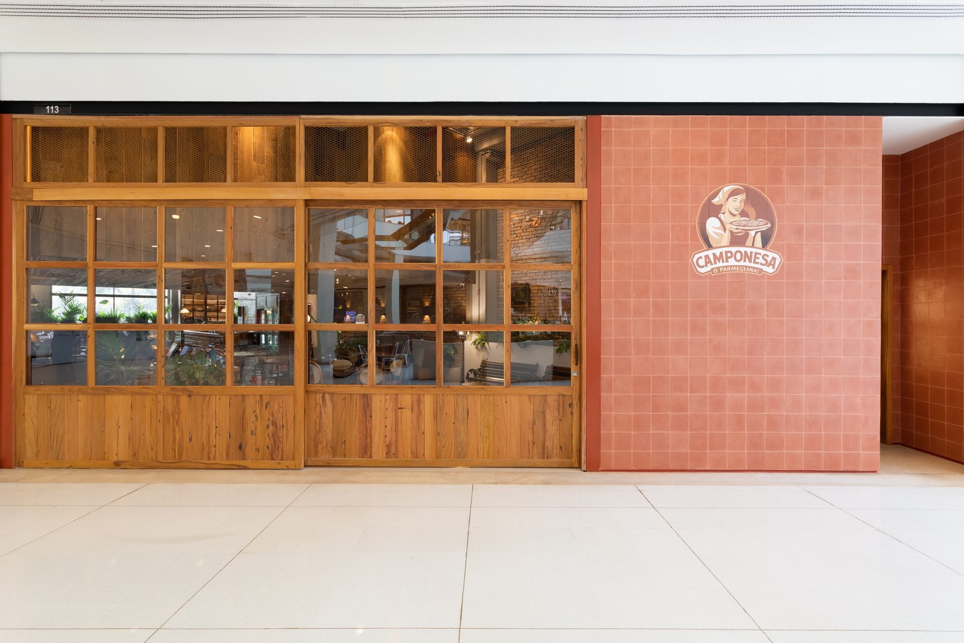
The hydraulic tile applied to the facade of this entrance area is similar in shape and color to the ceramic tile on the floor, although with a different texture, and the brand’s logo was painted over it in a reduced-scale rereading of the large sign that signals the restaurant on the road. The set allows for ample viewing of the interiors but has an aesthetic reminiscent of farmhouses, modulated in glazed frames, at half height, and with perforated screen, at the top. In addition to being an element of the Peasant’s identity, it is also a reference to the popular culture of signaling commercial establishments using this technique.
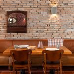
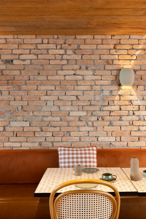
Opposed to the red floor, the ceiling is a secondary viewing surface, except in the section near the entrance where the double height is interrupted by the presence of the mezzanine. Their presence was transformed into an element of interest in the project by covering the suspended volume with demolition wood boards, creating a more intimate ambience in the front section of the restaurant.
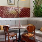
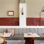
In the hall itself, there are a series of covering patterns derived from the project’s palette and coordinated with the layout, whose diversity adjusts the large size of the space to the feeling of welcoming. The wall coverings, therefore, assume a prominent role, demarcating the fixed sofas through the application of a strip at half height, inspired by traditional farmhouses but with a visual (crimson color and delicate line) in tune with the architectural identity. The strip changes color to white in the section between the two windows on the rear façade, in order to collaborate with the reflection of the natural light incident on the interiors and to emphasize the presence of the planters, and then returns to assume the crimson color, highlighting pieces of furniture and mining objects.
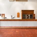
The new boundary walls of the large kitchen, made with drywall, were covered with half exposed brick, except at the back of the bar, which plays a leading role in the interiors, both functionally and symbolically. If the kitchen is separated from the public, it is the point of contact with the restaurant’s backstage, and its large dimension at the same time emphasizes the frequency of family and groups and is emphasized by the linearity of the counter, its wooden frames and the reflections of the light on the white and shiny tile. Finally, the chairs, similar to the red floor, are integrating visual elements, with two types of movable seats.