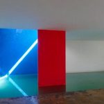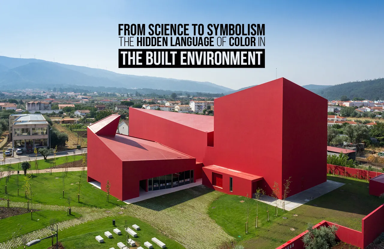
Colour can be perceived as a responsibility towards creating a sequence of subconscious stimuli between the built and natural environment. Therefore, this interpersonal relationship can evoke a perpetual question of how colour can be intertwined in architecture. Does it have a significant role to play in the understanding of the built space and the user? According to Pereira (2018), Israel Pedrosa states that “a colourful sensation is produced by the nuances of light refracted or reflected by a material…”. This statement exertion of visual understanding, can be perceived as the materiality used in the building, playing an equally pivotal function in reflecting the colour in its truest essence. Moreso, colour can be claimed as a visual stimulus in reflecting various facets of society, time periods, and culture. This can cause colour woven with different architectural elements to be comprehended in a complex manner or sometimes contradictory to quintessential beliefs.
For instance, Roman architecture is historically considered to have a monochromatic colour palette. However, the latest discoveries reveal that certain statues and sculptures were glorified with bright colour tones to pass on the tradition from the Greek precedent. Imparting the colour theory, various seminal architects, over the years, have also embedded the design philosophy in shaping a space.
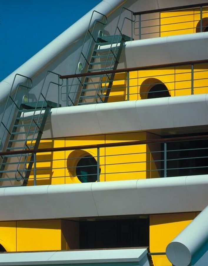
One of the examples includes Michael Wilford, alongside his partner James Stirling. His volumetric designs in the forms of art museums, libraries, educational institutions, and other public buildings utilise colour as a key element in enhancing the dimension of their intended purpose.
Truly Interdependent?
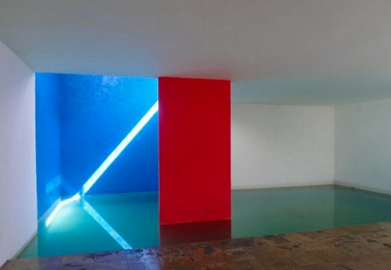
Therefore, colour can represent a specific detail within a building or showcase a certain volume. Spatial illusions, such as a darker tonality of the ceiling, can indicate a lower space, whereas the monotonous coloured walls across the room can be perceived as much longer or bigger (Pereira, 2018). However, colours do not exist without the projection of light. As Israel Pedrosa refers to his written book ‘De Cor à Cor Inexistente’ quoted in Pereira (2018), “colour has no material existence: it is only the sensation produced by certain nervous organizations under the action of light…”. Therefore, the interdependency between colour and light creates a certain feeling for the user experiencing the space.
Sto HQ- Colour Challenging Conventions?
Moreover, the documentation of this idea is on various platforms, including ‘Building in Colour’, which is produced by Sto, further instigating the tonality of design for the future generation of architects. Furthermore, the documentary engulfs into the intricate process, challenges, and precautionary measures during the design process of colour. Also, the peer reviews of fellow architects and former collaborations featured in the documentary elevate the idea of built environment experimentation (ArchDaily, 2023).
The scope of this colour utilisation in architecture includes the preservation of the idea, weaving into future generations. Subsequently, the visual documentation of this structure in various media further allows for historical studies of buildings, given the age of demolition and deterioration. For instance, Sto has taken the initiative of partnering with the London Design Festival in showcasing the case study through a photography exhibition and documentary. An event that spanned from September 18-22, 2023, it allowed architects to comprehend the convergence of design and colour in a contemporary architectural sense (ArchDaily, 2023).
References:
- ArchDaily. (2023). Color in Architecture as a Powerful Communication Tool. [online] _© https://www.archdaily.com/1005741/color-in-architecture-as-a-powerful-communication-tool.
- ArchDaily. (2023). Lina’s Red: Explore the Use of the Color as Prominent Element in Lina Bo Bardi’s Works. [online] _© https://www.archdaily.com/1005415/linas-red-explore-the-use-of-the-color-as-prominent-element-in-lina-bo-bardis-works.
- Pereira, M. (2018). The Role of Color in Architecture: Visual Effects and Psychological Stimuli. [online] ArchDaily_© https://www.archdaily.com/895498/the-role-of-color-in-architecture-visual-effects-and-psychological-stimuli.