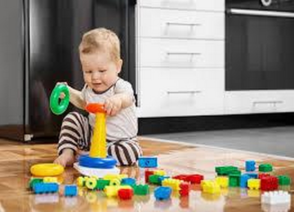
Children are such busybodies; every place needs to be explored, every object to be touched and felt. Exploration is a large part of a child’s play. Colours become one of the first elements a child picks during play. The child starts picking cues from colour as early in childhood as possible. Architecture gives children a full range of sensory experiences, which aids in their learning activities. Pattern recognition through colours is one of the activities involved in the preschool plays. But it is a much more interesting perspective to see architecture as a more important physical dimension to teach and regulate the cognitive development of children using the medium of colours.
Colours: It is a pathway
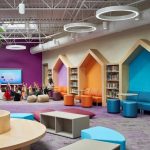
Architecture strives to convey a variety of meanings in each context, but in all or most of them, color becomes one of the most important features. If you take a child to the kindergarten for the first time, all the colours speak a different language to them. It can be the bright-hued doors, furniture, and play pieces. A kindergarten uses vibrant hues to draw the child’s attention.
The idea of accent colours becomes crucial in the interiors of a kindergarten. The colours draw attention and also become a navigation tool. The change in colours drastically aids the children in differentiating space without much difficulty.
Colour guide
Colours can be differentiated as warmer and cooler colours based on the emotions and thoughts they invoke. Red, yellow, and orange are some warmer colours that demand instant attention when used in the right proportions. Whereas colours, like blue and green, are calmer tones that soothe. Subtle colours are used to show common spaces like corridors, but in areas of the play, food involves pop colours to bring focus. It also needs to be noted that usage of too many vibrant colours can be overwhelming and distracting as well, sticking with the colour palettes which are balanced yet invoking becomes the key.
Emotional Landscapes through colours
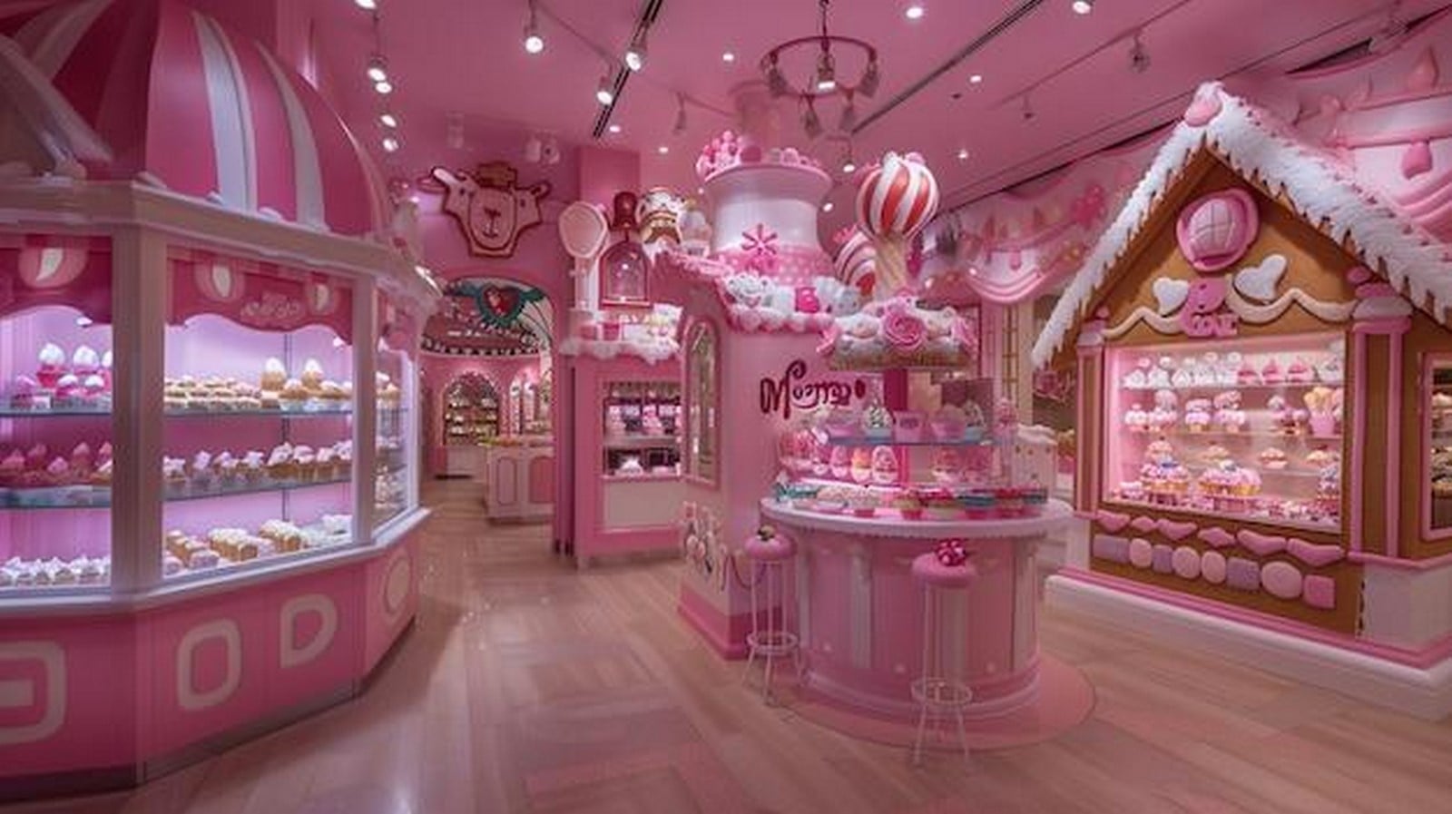
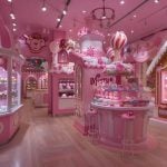
If you recollect the candy store you visited as a child, the compassionate pinks will wave a hello to you. Similarly, the colour red is commonly seen in fast food places. These attract instant attention and enlarge the appetite as well. The interiors of a children’s hospital use subtle shades of blues as they are calming and ease the
The earthy tones, like brown and green, are considered soothing as they remind the human brain of the nature connection. Childhood becomes a dictionary for the colours one experiences in adult life. It also depends on childhood memories as to how one would perceive a particular colour. Similarly, a yellow school bus signifies the cheery excitement, safety, and visibility as some of its attributes. It becomes a very strong association in one’s mind over the years. Similarly, the colour black of a chalkboard becomes an association with a learning space. A child’s brain forms a roadmap for each colour and repeats it throughout adulthood as well. This gives us insights as to why certain colours feel safe, happy, and comforting while others invoke fear.
Colours and Imagination: Fuel for Creativity
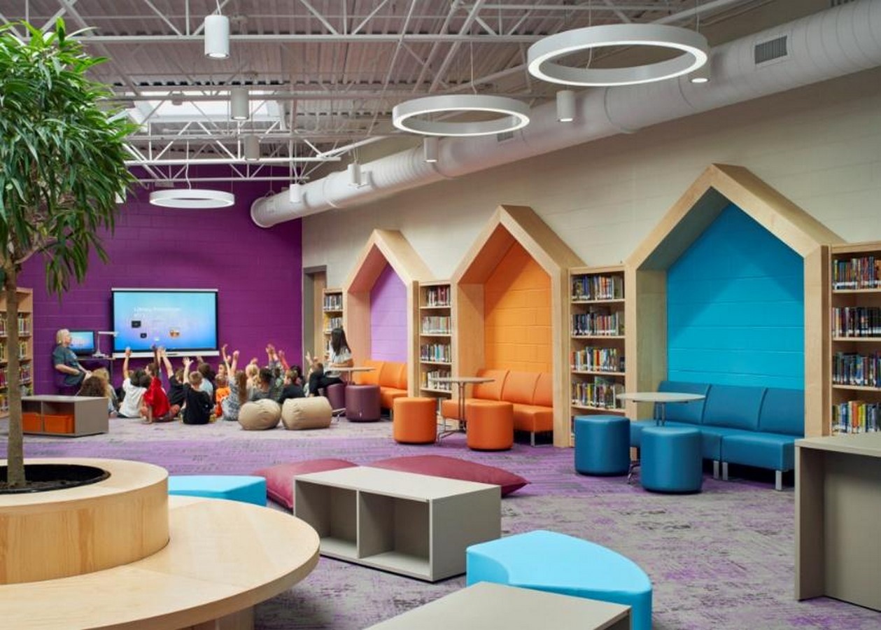
Every child learns to explore the world through its creative colours in the form of a painting. These help children articulate the world around them in a creative manner. Colour-coding the spaces and having themed spaces inspires and makes the children curious. When a library is coded in different ways, the child learns to navigate it without the need for words or direction. The design becomes more intuitive in approach. The same conceptual thinking could be used in the learning activities as well. Suppose a science lab is to be made interesting and understandable, transforming the walls and the interiors to tell the story of the interstellar, making the learning a play as well.
Inclusivity and spaces
Not all the colours make the same impact; colours used in larger proportions can stimulate the children. Especially in the case of neurologically diverse children, colours can make the space more overwhelming for them. Being mindful of understanding the needs and paying attention to smaller details is quite essential to tackle this matter.
Another factor to take into consideration is cultural diversity. Colour red could signify prosperity in one culture, but can also be read as a warning in most scenarios. These colours could convey otherwise and cause inconveniences. Colours with subtler tone, with accent colours in required areas, do the trick of making the place playful and yet retain the idea of balance as well.
Colours: An endless possibility
Just like how everyone’s childhood sparks endless possibilities and creativity, colours should spark the creative areas and, at the same time, ensure a safe and comfortable feeling as well. Colours in a space can make the place a remarkable element in one’s memories or an overwhelming memory; it takes the understanding of a thoughtful designer to understand their user group.
Colours are unique and personal yet have a universal appeal as well. Colours throbbing in each element have to sum up to tell the story it intends. Understanding the colour psychology helps the designer to design a space that is suitable for the function it is to serve. And it is essential to let the colours be a possibility of the range of emotions one needs to invoke, rather than create a lifeless space.