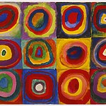
Colour is a power which directly influences the soul. – Wassily Kandinsky
To capture the essence of colour’s profound impact on our emotions and well-being. Although there is a general correlation between colour and emotion in many factors of our lives, it is solid within architecture. Beyond just being aesthetically captivating, colour is used strategically in architecture to create surroundings that affect our interactions, emotions, and perceptions. This piece delves into the charming area of colour psychology in architecture, examining how it alters spaces and impacts.
The Essence of Color Psychology
Colour psychology examines approaches to distinctive hues that affect our emotional and intellectual responses. It encompasses the idea that hues can evoke particular emotions and behaviours in individuals. This intellectual phenomenon is not arbitrary but deeply rooted in our evolutionary records, cultural upbringing, and personal experiences.
Colors are divided into warm and cool categories, each with its particular characteristics:
Warm Colors: Red, orange, and yellow are related to warmth, energy, and stimulation. They can create a feeling of pleasure and liveliness.
Cool Colors: Blue, green, and purple are calming and tranquil. These colours evoke emotions of relaxation and serenity.
The Role of Color in Architecture
Architecture using colour is a lot more than simply ornamental. It also has how a room feels, features, and is perceived. Let us check out the numerous features that colour serves in the architectural layout:

Mood and Atmosphere
Colour can set the mood and surroundings of space. For instance, a colourful and energetic shade scheme, with the dominant use of warm hues like red and orange, might be suitable for a café or an innovative workspace, fostering an active and dynamic environment. Conversely, a serene and calming area, such as a spa or meditation centre, may benefit from a groovy colour palette comprising blues, vegetables, rest and introspection.
Spatial Perception
The use of colour can considerably affect how we perceive space. Light shades make a room experience more spacious, even as darker colours can create a sense of cosiness and intimacy. Architects regularly use color to govern the period in small or oddly shaped regions.
Visual Hierarchy
Architects use color to establish a visual hierarchy in a construction. They might probably use bold, contrasting colorings to attract attention to key factors, which include entrances or focal elements even as using extra diffused shades for tons fewer essential regions. This no longer simply aids in wayfinding but also creates a visually attractive and prepared vicinity.
Cultural Significance
Colors can keep profound cultural and symbolic connotations. Understanding cultural sensitivity is essential to architectural design. Specific colors can explicit unique cultural issues, and their appropriate use can enhance the general format’s elegance and efficacy.
Creating Emotionally Resonant Spaces
Architects, interior designers, and psychologists regularly collaborate to create emotionally resonant areas through colors. These spaces are designed to elicit specific emotional responses from their occupants. Here are some examples:

Spaces for Education
Color psychology is used in schools and other educational institutions to improve the learning environment. While serene colours in study spaces and libraries stimulate attention, warm, inviting colours in classrooms may foster creativity and focus.
Healing Environments
In healthcare structures, the significance of colour is clear in creating restoration environments. Hospitals regularly rent soothing and comforting hues, such as smooth blues and greens, to lessen patient stress and tension. Studies have shown that these colorings can lead to quicker restoration instances and accelerated affected person pride.
Workspaces
In office architecture, the choice of colors can significantly impact employee productivity and well-being. Incorporating colours that stimulate creativity and energy in collaborative areas and calming colours in private workspaces can create a balanced and productive work environment.
Case Studies: Architectural Marvels Utilizing Color Psychology
Several architectural marvels around the world correctly harness the strength of shade psychology. For example:
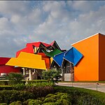
Biomuseo, Panamas by Frank Gehry

The Biomuseo, or Museum of Biodiversity, is a colourful Panama museum designed by Gehry. Its bright colors, hot reds and oranges, create anticipation and exhilaration, setting the tone for engaging enjoyment. The museum’s excellent hues aid in wayfinding, making it clean for visitors to navigate the gap. The colours also mirror Panama’s unique biodiversity, representing the numerous ecosystems observed within the United States of America and the interplay of different environments, from lush rainforests to pristine beaches.
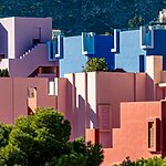
La Muralla Roja, Spain:
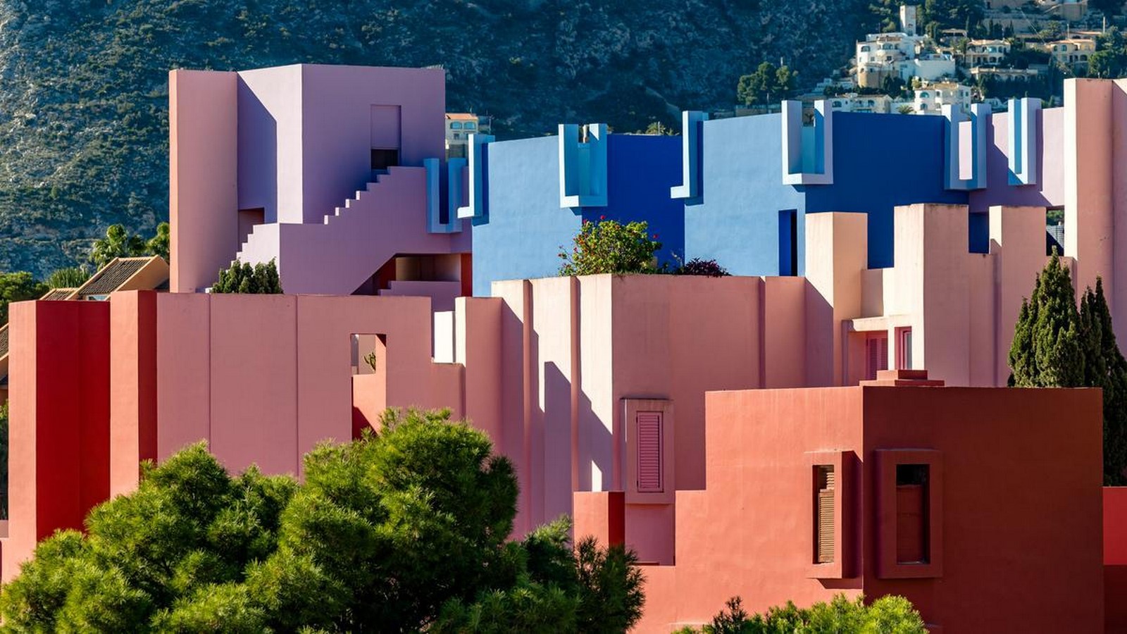
This residential complex built by Ricardo Bofill features a bold color scheme of terracotta, pink, and red. In addition to being aesthetically striking, the colors evoke strong feelings in people, giving them the impression that they are residing in a piece of art.
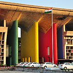
High Court Building, Chandigarh by Le Corbusier:
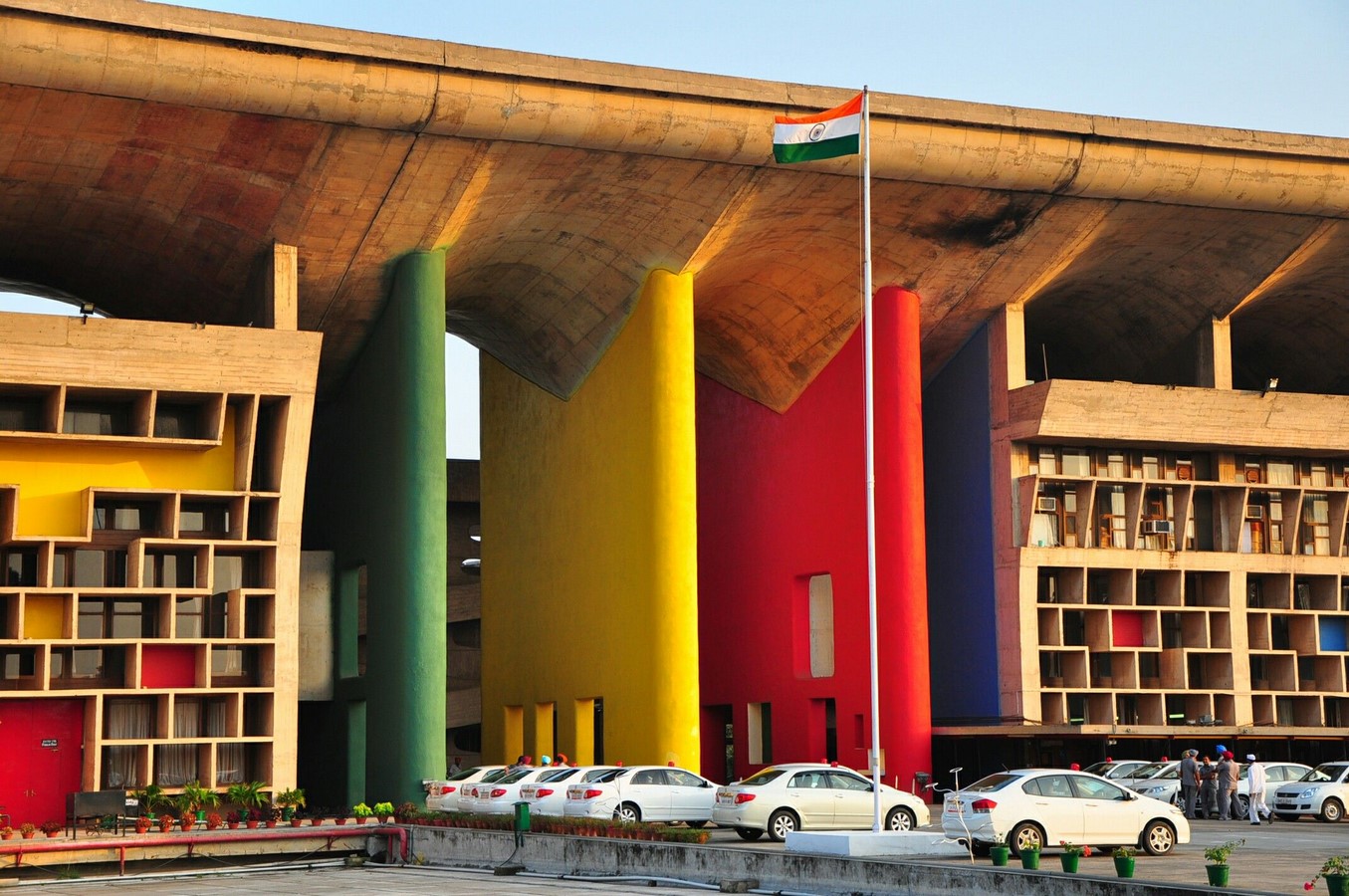
Le Corbusier’s High Court Building uses a strategic and profound color palette to convey professionalism, neutrality, and objectivity. The predominantly grey and white colours convey a sense of fairness and justice, while bold, contrasting colours like red and yellow guide occupants and aid in decision-making. The colors red and yellow, deeply embedded in Indian culture, evoke a sense of identity and cultural significance. The monochromatic palette symbolizes the authority and impartiality expected from a high court, while the Indian tricolour (saffron, white, and green) symbolizes India’s cultural and national identity.
The Future of Color Psychology in Architecture
As technology and studies in colour psychology continue to enhance, the future of shade in structure looks promising. The integration of smart lighting fixture systems allows for dynamic and adaptable color schemes that could reply to the wishes and options of the occupants. Moreover, sustainable and green colouration options will likely gain prominence as architects and designers prioritize environmental responsibility.
Conclusion
Color psychology in structure is an effective tool that enables designers to convert areas into emotionally resonant environments. By information on the profound impact of colors on human feelings, architects can create areas that inspire, comfort, and increase the lives of their occupants. Whether it is a healing environment in a health facility or a colorful workspace in an office, the use of color in structure holds the capacity to shape our experiences and leave a long-lasting effect on our well-being.
References:
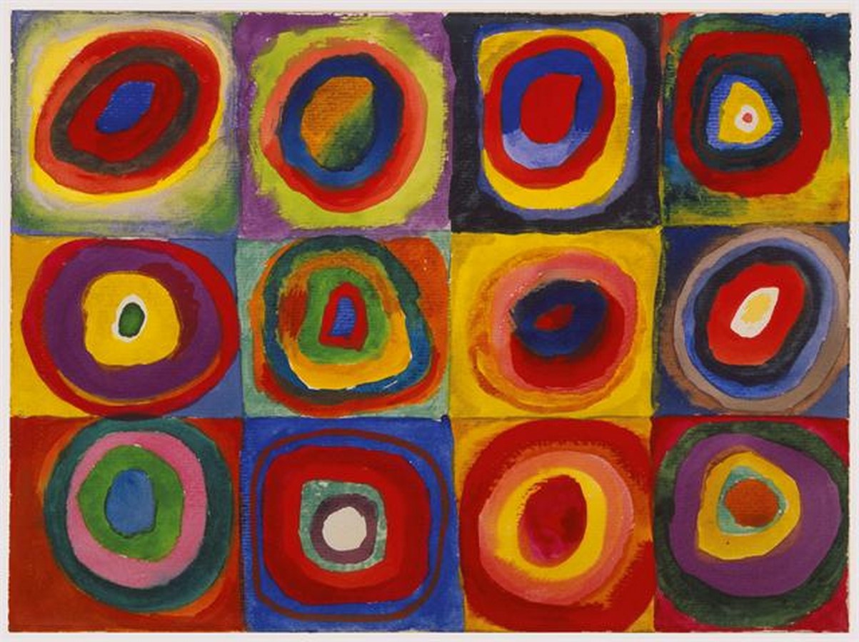
Kandinsky, W. (1970) Color study: Squares with concentric circles, c.1913 – Wassily Kandinsky, www.wikiart.org. Available at: https://www.wikiart.org/en/wassily-kandinsky/color-study-squares-with-concentric-circles-1913
Colour psychology: The marvel of colours in architecture (no date) www.surfacesreporter.com. Available at: https://surfacesreporter.com/articles/133801/colour-psychology-the-marvel-of-colours-in-architecture
Ltd, T.S. (2020) The perception of color in architecture, Medium. Available at: https://medium.com/studiotmd/the-perception-of-color-in-architecture-cf360676776c
Color in architecture – more than just decoration (no date) Archinect. Available at: https://archinect.com/features/article/53292622/color-in-architecture-more-than-just-decoration
(No date) Impact of color on human behavior case -interior space – researchgate. Available at: https://www.researchgate.net/publication/368339395_Impact_of_Color_on_Human_Behavior_Case_-Interior_Space
Biomuseo (2023) Wikipedia. Available at: https://en.wikipedia.org/wiki/Biomuseo
Case study on Chandigarh (no date) Scribd. Available at: https://www.scribd.com/presentation/461220332/CASE-STUDY-ON-CHANDIGARH-pptx