From the prehistoric periods, colour has always been an important part of human evolution. Colour is one of the basic elements of visual perception. Humans perceive the colours of the environment as information. (Jaglarz, 2023)
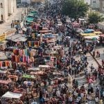
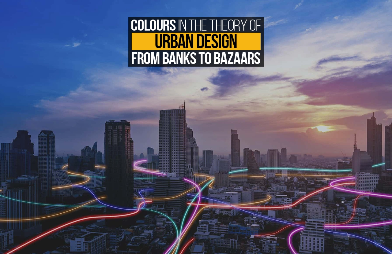
While experiencing an urban environment we often undermine the significance of a major component of design and that is, the colours. The colours in any urban environment are not just confined to mere aesthetics, rather, they govern human behaviour. Beneath the visual surfaces of storefronts, commercial facades, transit lines lie a calculated architecture of visual cues specifically designed to manipulate spatial decisions of the users. The subdued greys used in the central banking systems to the vibrant traditional hues of a Shanivar bazaar, planners utilize chromatic strategies as silent mechanisms of spatial governance.
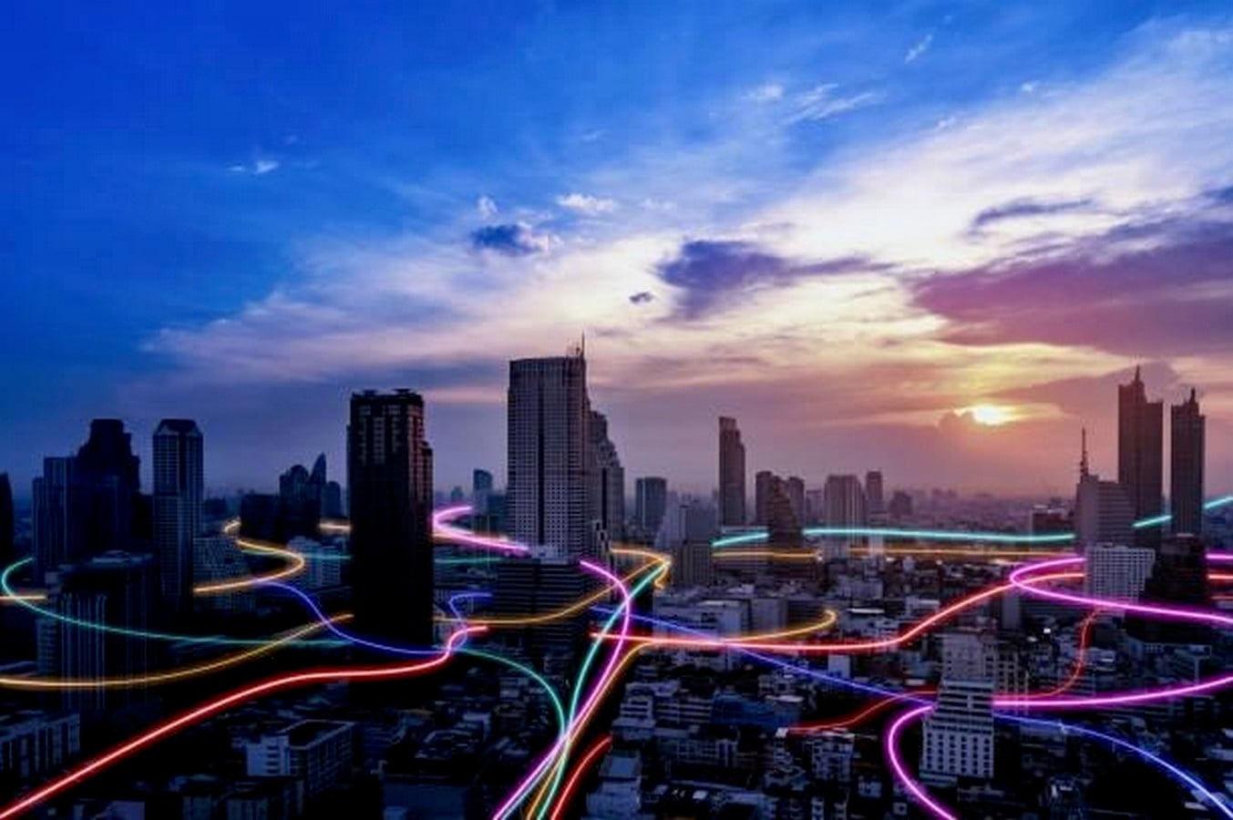
Urban planners analyse the implications and behavioural patterns of users by playing with the colours and their attributes such as hue, luminance and saturation. Furthermore, utilising and employing these patterns in different ratios architects and planners can transform city streetscapes into active arenas for human cognition. This unique factor of human perception helps designers easily distinguish the ambience of different spaces just by using colours.
The psychology of Spatial Colour
The human psyche is greatly influenced by colours; they can completely change a user’s perspective about urban spaces as the human brain reacts differently to individual colours. It also affects human emotions, health, well-being and energy. Hence, colours can be an efficient means of therapy and treatment. Environmental colours affect humans in both physiological and psychological manners. Colours when perceived by humans trigger various immediate neurological reactions. Warm and highly saturated hues increase autonomic nervous system arousal; it elevates the heart rate and generates the feeling of alertness. Similarly, cool and desaturated hues create power physiological arousal and steady focus.
Moreover, when architectural or urban theories are discussed, colour in general is termed as a language of spatial symbols. Human senses are seamlessly aligned to visual perceptions more than any other sense and hence, they perceive colours before form or texture in a built environment. Bright and darker colour palettes catch immediate attention of a viewer before the soft pastels. But, these receding colours such as cool blues, dark slate and muted greens visually push the surface backward, creating a perception of depth restraint or expanse. (Jaglarz, 2023)
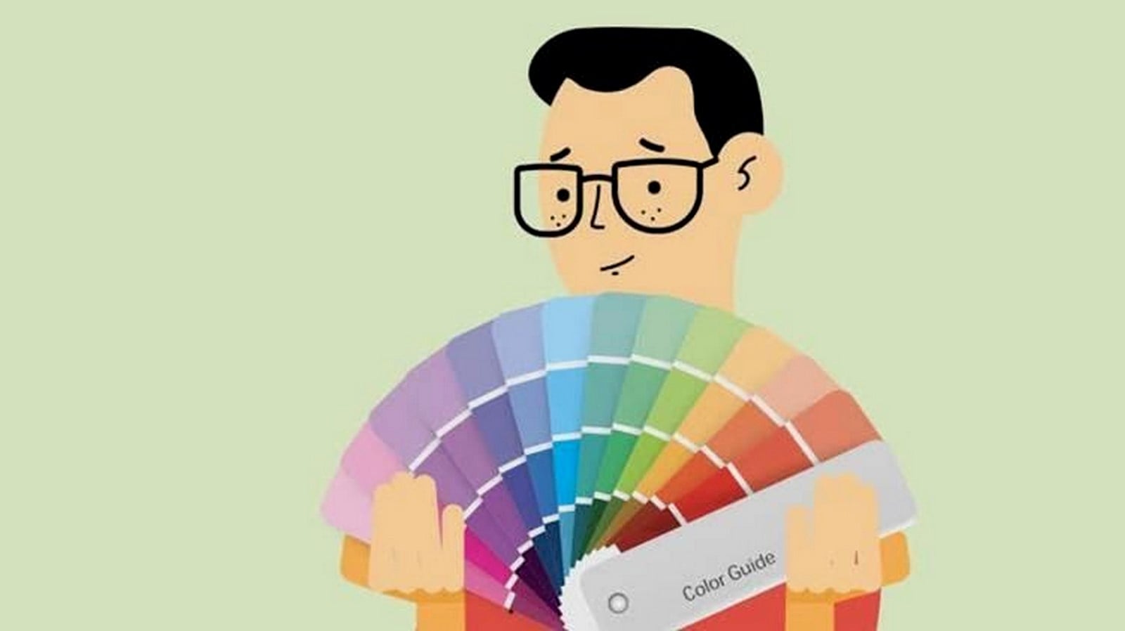
Urban Colours : The Ultimate Catalysts
Whenever colours are discussed in urban design, chromatic choices are always associated with the typology of a particular project. For example, in a financial district or government hub, colours are silently calibrated to project performance, sober authority and safety. Low saturation palettes such as cool tones consisting of the slate greys, deep blues, bronze and natural stone colours are all heavily relied upon by institutional architecture. (Mahnke, 1996)
It can be observed that financial institutions worldwide, ranging from high rise central reserve buildings to the small retail banking branches rely on the shades of blue as it is associated with reliability, institutional continuity and it also reduces anxiety. This way architects and planners use this colour to lower the heart rate and cognitive strain on the users like investors and industrialists of the spaces creating a balanced environment during the high- stake financial transactions.
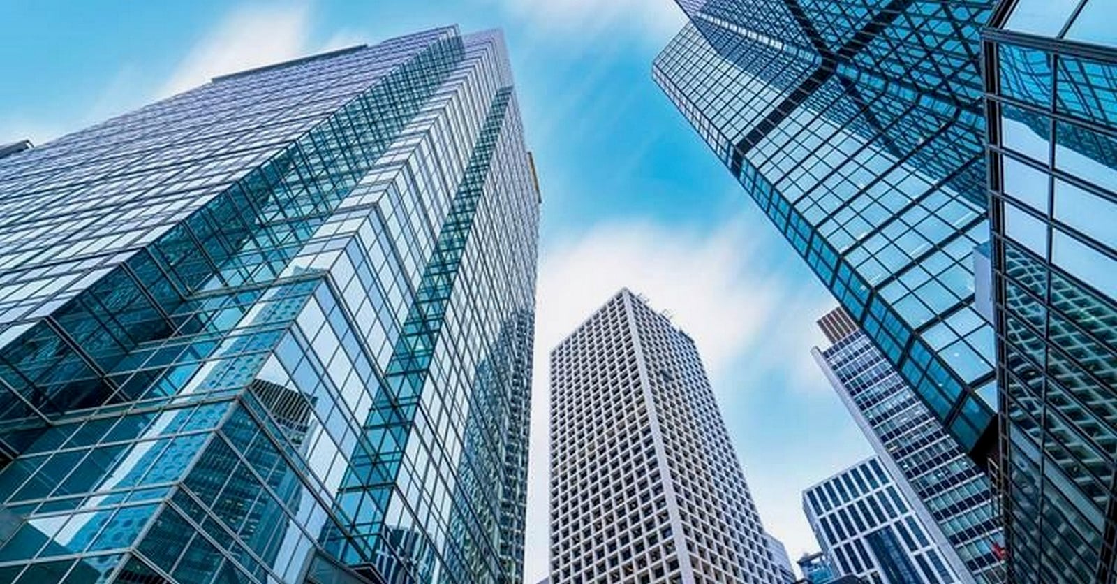
Other institutional buildings such as courthouses, corporate headquarters, municipal centres all rely on natural stone finishes, granite, marble and limestone are few of the preferred materials. These finishes are often complemented by muted metallic trims. If one dives deeper into environmental psychology, they can observe how these achromatic and low-chroma colours communicate permanence and impartiality. With the absence of highly saturated and aggressive chromatics, the chaotic human reactions are controlled in these buildings and it also establishes a quiet atmosphere. (Mahnke, 1996)
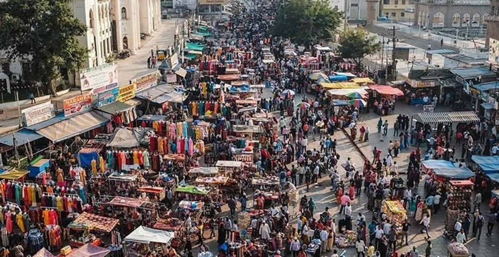
The ultimate paradox of colours in urban planning can be observed when these institutional buildings are compared with the structures at the end of the urban spectrum; the open-air markets, historical bazaars and high-density commercial strips. These areas rely on colours to achieve the opposite of what can be observed in institutional buildings and that is ‘chaos’.
Colour is leveraged here to maximize sensory stimulation, accelerate foot movements and provoke impulsive behaviour. The designers rely on the high- saturation warm colours such as red, orange, yellow to trigger visual reactions, rapid attention. It also helps in stimulating appetite and creates a unique physiological sense of intimacy. (Mahnke, 1996) In bustling markets of India and abroad, fairs, Durga Puja or Ganesh Chaturthi pandals, the saturated textiles, painted awnings, vibrant spices form a high- contrast visual landscape that keep the users in an active space both visually and mentally affecting their decision making. The commercial districts tend to balance attraction with circulation. Overly dense clusters of high saturation colours often create a visual friction. These promote shoppers to keep moving through the heavily packed corridors rather than lingering indefinitely in one spot. The dynamic properties of these bazaars maintain rapid turnover and steady pedestrian flow though the small and narrow urban alleys
An efficient tool of urban design
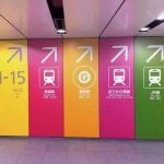
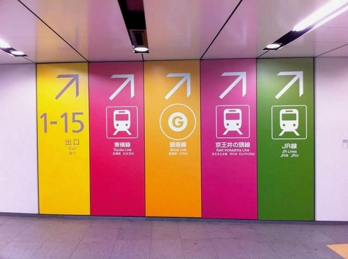
Apart from the emotional arousal it creates in the minds of the users, colours are an efficient tool used by the planners to establish wayfinding and even for functional zoning.
One fine example of such representation is the Metropolitan subway network of Tokyo, Japan. It houses the most ubiquitous application of color-coded wayfinding. This was achieved by assigning distinct primary and secondary colours to individual transit lines and stations. This minute detailing in design allowed the commuters to process complex route decisions non-verbally and efficiently.
Research in spatial cognition and urban planning also concludes that interior and exterior colour coding can reduce navigation errors and it also helps the pedestrians to explore complex and unfamiliar structures with much ease. Color-coded zoning functions as a mental structure, helping individuals segment large-scale urban spaces into legible, manageable domains. (Wiedenbauer, 2009)
The urban colour theory is not just a decorative element; it serves as an active system variable in environmental design. It is a tool that balances the trustworthy blues of institutional buildings and the high arousal reds of the commercial bazaars. With the urban environments getting denser and more complex, colours act as a highly functional tool to maintain building legibility, health and psychology of public spaces.
References:
Jaglarz, A., 2023. Perception of Color in Architecture and Urban Space. MDPI Open Access Journals.
Mahnke, F. H., 1996. Color, Environment, and Human Response. s.l.:John Wiley & Sons.
Wiedenbauer, P. J.-O. &., 2009. Wayfinding Performance in and the Spatial Knowledge of a Color-coded Building for Adults and Children. Taylor and Francis online.