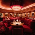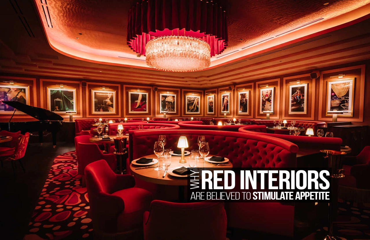
Walk into a restaurant with deep red walls, warm lighting, and rich wooden furniture, and you may notice something interesting: you suddenly feel more ready to eat. The colour red has long been associated with food, energy, warmth, and excitement. From fast-food restaurants to traditional dining spaces, red frequently appears in interiors designed to make people feel more engaged and, supposedly, more hungry.
But why does red have this effect? Is it actually capable of stimulating appetite, or is the connection between red and food simply a clever design tradition that has developed over time? The answer lies somewhere between psychology, biology, culture, and the way we experience spaces.
The Psychology Behind the Colour Red
Red is one of the most visually powerful colours. Unlike softer shades that may create a feeling of calm or relaxation, red tends to demand attention. It is bold, energetic, and emotionally intense. When we see it, our brains immediately register it as something important.
This heightened sense of attention can influence the way we experience a space. In an interior, red can create a sense of excitement and activity. Rather than encouraging people to sit quietly and withdraw, it can make an environment feel more lively and social. This is especially useful in restaurants, cafés, and dining areas where the atmosphere is meant to encourage interaction.
Red is also strongly connected to emotions such as passion, desire, excitement, and warmth. These emotional associations can affect the way food is perceived. A meal served in a space filled with warm, intense colours may feel more indulgent and exciting than the same meal served in a cold or colourless environment.
Red and the Human Body
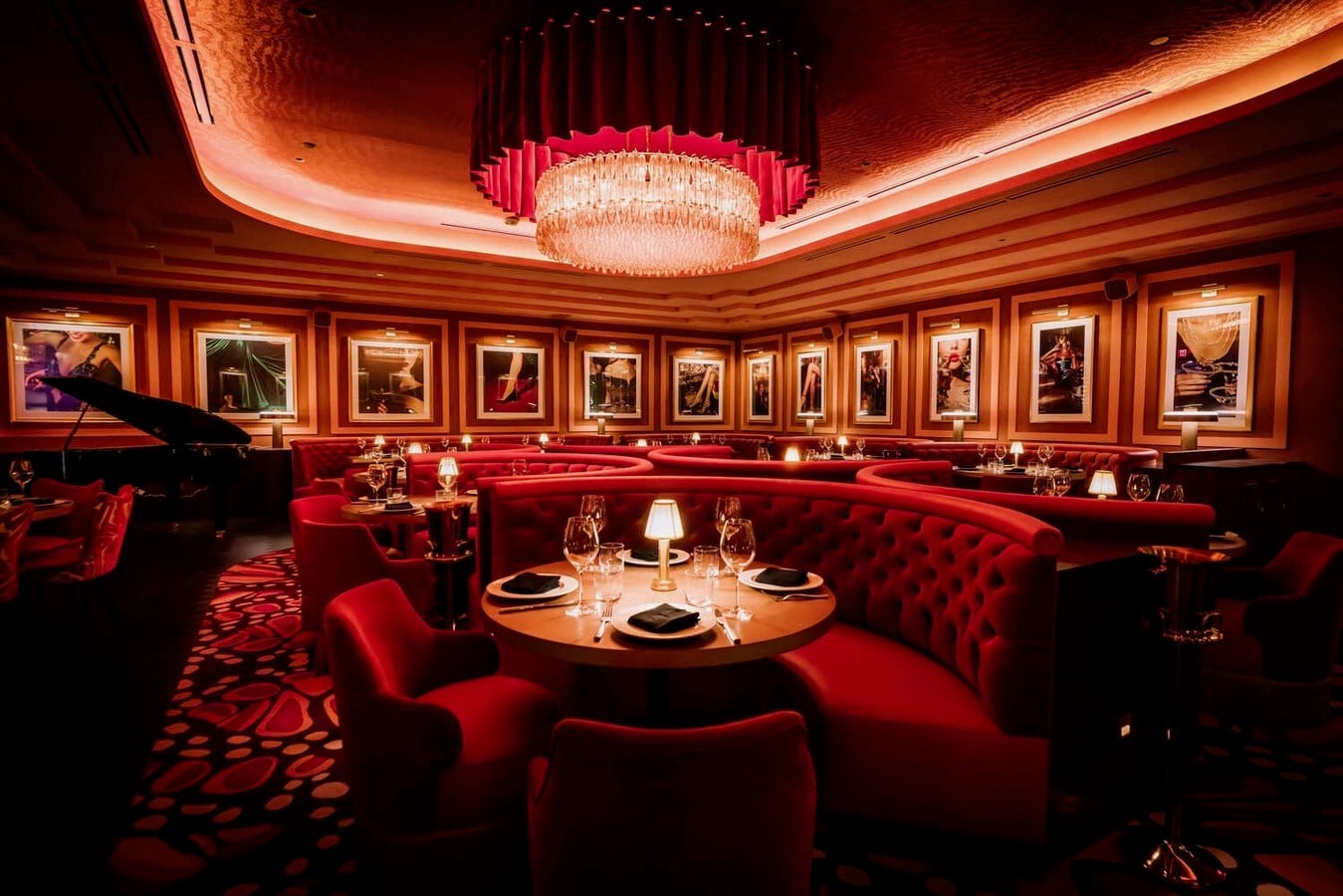
One of the most common explanations for red stimulating appetite is its possible effect on the body’s physical responses. Red is often associated with energy and stimulation. It can make people feel more alert and activated, unlike colours such as blue or grey, which are often perceived as calmer and more subdued.
This does not mean that simply looking at a red wall will instantly make someone hungry. The relationship is much more subtle than that. Colour influences the atmosphere of a space, and atmosphere can influence mood, behaviour, and even how we respond to food.
When people feel energised and emotionally engaged, they may also be more receptive to sensory experiences. Food is, after all, a highly sensory experience. Taste, smell, texture, colour, and atmosphere all work together. The environment surrounding a meal can contribute to how enjoyable and memorable that meal feels.
Why Red Appears So Often in Restaurants
The connection between red and appetite is particularly visible in the food industry. Many well-known fast-food brands have used red in their logos, interiors, packaging, and advertising for decades. This is not entirely accidental.
Red is highly visible and easy to notice, which makes it useful for attracting attention. In busy streets filled with signs, shops, and advertisements, a strong red logo can immediately stand out. Once inside, red interiors can create a sense of energy and movement.
Restaurants also often want to create an environment that feels lively rather than overly slow or formal. Bright or intense colours can contribute to this atmosphere. In some cases, red may even encourage customers to feel more energetic and less inclined to stay for long periods of time. This is particularly useful in fast-food restaurants where quick turnover is important.
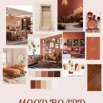
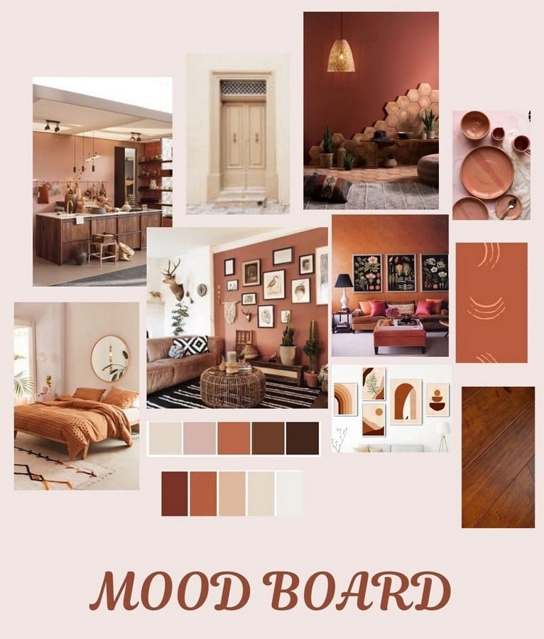
However, the way red is used makes a major difference. A bright, highly saturated red covering every surface can quickly become overwhelming. A darker burgundy, terracotta, rust, or muted red can create an entirely different feeling — one that is intimate, sophisticated, and warm
The Connection Between Red and Food in Nature
Another reason red may be associated with appetite is its connection to food itself. Many naturally ripe fruits and vegetables appear in shades of red. Apples, strawberries, cherries, tomatoes, red peppers, and watermelons are all visually associated with freshness and ripeness.
Humans have developed strong visual associations between certain colours and the foods we eat. Red can suggest sweetness, ripeness, richness, and flavour. A red tomato looks more appetising than a green one because its colour tells us that it is ready to eat.
This connection may explain why red works particularly well in food-related environments. The colour already exists in our mental understanding of food. Seeing red around a dining space can subtly reinforce the idea of eating, even when the colour itself is not directly related to the food being served.
Of course, this association is not universal. Colour meanings change across cultures and individuals. A colour that feels warm and appetising to one person may feel overwhelming or uncomfortable to another.
Red Interiors Can Influence More Than Hunger
The effect of red in interiors goes beyond appetite. It can change the entire character of a room.
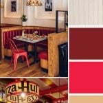
A small amount of red can act as an accent, drawing attention to a particular area. Red chairs, pendant lights, artwork, or decorative objects can create visual focus. In a restaurant, this could mean directing attention towards the bar, a central dining area, or even a display of food.
Using red on walls can make a space feel warmer and more intimate. Dark reds can create a sense of luxury and richness, especially when combined with materials such as wood, brass, stone, or leather. Meanwhile, brighter reds can make a space feel youthful, energetic, and playful.
The choice of shade is therefore extremely important. A restaurant serving fine dining may use wine red or burgundy to create a sense of elegance. A casual café might use coral or terracotta to create warmth. A fast-food restaurant may choose a brighter red to create energy and visibility.
The Importance of Balance
Despite its reputation as an appetite-stimulating colour, red needs to be used carefully. Because it is visually intense, too much red can make a space feel stressful, aggressive, or overwhelming.
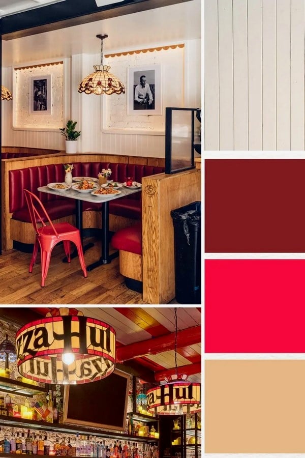
This is why many successful interiors use red alongside neutral colours. White, cream, beige, grey, black, and natural wood can soften its intensity. Materials also play an important role. A glossy red surface may feel modern and energetic, while a textured red fabric may feel warm and luxurious.
Lighting can change the colour completely. Warm lighting can make red appear richer and more inviting, while cool white lighting may make it appear sharper and more intense.
Good interior design is rarely about one colour acting alone. It is about how colour interacts with light, material, proportion, furniture, and human behaviour.
A Colour That Creates an Experience
The belief that red stimulates appetite is not simply about making people hungry. Red creates an emotional environment. It can make a restaurant feel energetic, warm, dramatic, intimate, or exciting depending on how it is used.
Ultimately, the relationship between colour and appetite is influenced by many factors. Personal experiences, cultural associations, lighting, the type of food being served, and the overall design of a space all play a role.
Still, the continued presence of red in restaurants around the world is not a coincidence. Its ability to attract attention, create energy, and connect with ideas of warmth and food makes it a powerful design tool.
Perhaps the real reason red interiors are believed to stimulate appetite is not because red directly controls our hunger, but because it changes the way we feel. And when a space makes us feel excited, comfortable, engaged, and ready to experience something, food can become part of that experience in a much more powerful way.