Richard Rogers is best known for such pioneering buildings as the Centre Pompidou in Paris, the headquarters for Lloyd’s of London, the European Court of Human Rights in Strasbourg, and the Millennium Dome in London. His practice Richard Rogers Partnership (RRP)—was founded in 1977 but over time evolved and in 2007 the decision was made to rename the firm to Rogers Stirk Harbour + Partners to reflect the vital contributions of Graham Stirk, designer of the iconic Leadenhall Building, and Ivan Harbour, designer of the Stirling prize-winning West London Maggie’s Centre.
RSHP’s design work is led by its studio in London, but the staff works globally across projects, and project offices on the ground ensure that close attention to detail is maintained during the design process. Together, they represent the inherent continuity and consistency of the philosophy which the practice applies to all its work. In total, RSHP employs a little over 200 staff including specialist support teams who offer in-house graphic design, visualization, film, and communications services.
A deep belief in the importance of sustainability has underscored the firm’s work since the early days, and recent and ongoing projects such as the extension to the London School of Economics, the New Cancer Centre at Guy’s Hospital, International Towers Sydney, and the extension to the British Museum exemplify this belief with a range of environmental features built into the fabric of the building.
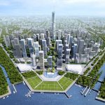
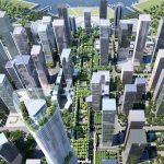
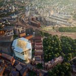
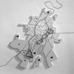
1. Urban Living Room, Qianhai
This master plan will be formed by Richard Rogers in an area of reclaimed land and will comprise a sky-garden that links directly to several public transport hubs, as well as to a major public space at the water’s edge to be known as the ‘Performance Park.’ This scheme will contain an Opera House and an International Financial Exchange Centre and will directly link the city back to Qianhai Bay. To the east, the city’s edge is crowned with a tower, forming a distinctive landmark within the urban landscape.
The Urban Living Room is made up of four individual character areas; the ‘Trading Plaza, ‘High-Rise Cluster,’ ‘Transport Hub’ and the ‘Performance Park’ – each zone tells a story and has a distinctive personality. The Urban Living Room is a unique part of a city that will globally position Qianhai as a destination. Easily recognizable, it forms a landmark that will become synonymous with Qianhai, a landmark to be known and recognized throughout the world.
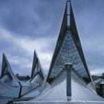
2. Antwerp Law Courts, Belgium
The site for the law courts is at the Bolivarplaats, on the southern edge of Antwerp’s central area, where the urban fabric is broken by a massive motorway interchange, cutting off the boulevard that leads into the city. The concept for the new law courts for the city of Antwerp is to design a new gateway building for the city, one without monumentality but with a roof form generated from perspective lines and inspired by Flemish paintings of barges passing along countryside canals.
The scheme inverts the traditional arrangement of a law court by placing hearing rooms and public space at the top of the building ensuring abundant daylight and views across the city. The private spaces below face onto courtyards that provide quiet and naturally lit spaces contributing to a calming environment. The Law Courts extend to incorporate connections to parks, bridges, and road networks, allowing clear views from the street and developing the city skyline. This building designed by Richard Rogers is a key inspiration to the master plan for the city’s Nieuw Zuid (New South) which the team has developed with the City of Antwerp.
A low-energy services strategy is fundamental to this project – natural light is used to optimum effect, natural ventilation is supplemented by low-velocity ventilation for the hearing rooms, and rainwater is recycled.
The building, straddling a major highway, looks out to a large area of parkland – the design creates ‘fingers’ of landscaped that extend right into the heart of the building. The landscape is configured and planted to shield the building from the noise and pollution of the motorway.
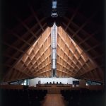
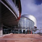
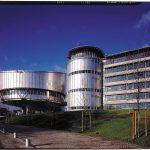
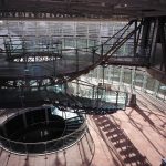
3. European Court of Human Rights, France
In terms of considering the client’s brief for the site, the very nature of the Court’s business suggests that its premises should be welcoming and humane while preserving an appropriate dignity. Protecting and enhancing the quality of the site was another prime objective, while the economy of operations and the creation of a ‘natural’ environment was equally important.
The basic diagram of the scheme was tested to the limits during the design process – particularly as a result of the collapse of the Communist Bloc by the late 1980s/early 1990s – resulting in the building’s office provision growing to some 50 percent and areas of public space by 25 percent.
The two main departments of the European Court, the Court itself and the Commission occupy two circular chambers at the head of the building which is clad in stainless steel with secondary structural elements picked out in bright red. The entrance hall is filled with natural light and offers visitors views across the river and the ‘tail’ of the building is divided into two parts containing offices, administration, and the judges’ chambers.
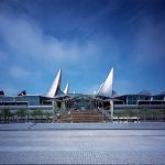
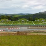
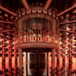
4. The Macallan Distillery and Visitor Experience, Speyside, UK
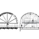
Dug into the naturally sloping contours of the site the building has a minimal visual impact on the landscape. The soft undulating roof speaks to the hills of the surrounding countryside yet the man-made and engineered forms of the uniform peaks reflect the industrial production cells contained within.
Arranged over a series of five cells the form of the roof reflects the parts of the distillery. The building includes a flexible visitor center (covered by the one taller roof crest), three still houses and a mash house. The visitor experience starts with an introduction to The Macallanin an exhibition and gallery area, before progressing through a sequence of spaces that follow the production story of the whiskey. Natural materials – local stone, timber, and the living meadow roof – as well as the landscaping design, not only evoke the environment and ingredients of whiskey production but also serve to provide an atmospheric journey for the visitor.
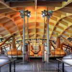
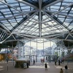
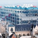
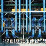
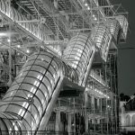
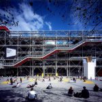
5. Centre Pompidou by Richard Rogers
The site for the Centre Pompidou is located in the Centre of Paris, within one kilometer of Notre Dame Cathedral and the Louvre Museum. The Pompidou Centre designed by Richard Rogers was planned as a key connection in the renewal of the historic heart of the capital.
The notion of flexibility is extended to every component of the building; the Centre was to act as ‘an ever-changing framework, a Meccano kit, a climbing frame for the old and the young’. Conceived as a well-serviced shed, the building contains a series of uniform spaces supported externally by a free-standing structural frame, the whole capable of change in plan, section, and elevation, able to absorb the unforeseen requirements of the future.
The lower level of the building contains large public areas such as the theatre, shops, reception, and street-level café. Above, vast open floors house galleries, outdoor terraces, and administrative areas. Finally, the top floor accommodates a restaurant, experimental cinema, and temporary exhibitions, all of which could be open late into the night, bringing life and activity to the square during the evening. Half the site was left unbuilt to make way for a square of civic proportions which could be used for a wide variety of community uses including markets, exhibitions, performances, circuses, games, buskers, and so on.
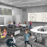
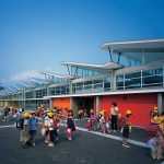
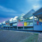
6. Minami Yamashiro Elementary School
Set into a steep hillside, the project designed by Richard Rogers is arranged as two buildings, one stepping down from the other and characterized by an elegant undulating roof. This form allows for a series of roof lights that bring daylight deep into the heart of the building. Inside a large common hall acts as the focus of activities with two levels of flexible classroom spaces arranged around it. Bright wall colors within the grid frame are coded for children and adults, defining different areas and functions.
The heart of the school would be a large, linear common hall that would mediate between the outdoor playing fields and two levels of flexible classroom spaces.
Three spatial types: classrooms, special spaces (such as a library, art and science facilities), and neutral spaces (such as the multi-function hall) are arranged to create an environment that works both as a school by day and community facility in the evening.
7. Oriel by Richard Rogers
The scheme comprises eight floors and a ground area of 41,000sqm. It is conceived as a pair of linear buildings, enveloping an oasis, like a pair of hands embracing the Haven. The hands protect the entrances and Haven itself from the busy urban environment.
At the upper levels, terraced gardens are protected by a tree-like canopy. These outdoor spaces are available for everyone to use. The canopy is intended to give the project a unique identity, making the outdoor space semi-enclosed so that the area is protected from rain, with natural heating for year-round use. This roof also diffuses direct sunlight from the south to prevent shadows that can cause discomfort for the partially sighted.
As a public building, Oriel engages with and makes a positive contribution to the urban realm around it, with the inclusion of two squares at the southwest and northeast, one predominantly for patients and the public, the other for staff. These squares provide the two key entrances to Oriel and connect the scheme with its surroundings, allowing the rest of the St. Pancras Hospital site to be developed coherently.
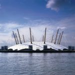
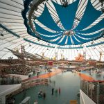
8. The Millennium Dome
The Millennium Experience was widely seen as an event in the mould of the 1951 Festival of Britain and was proposed as the central celebratory event of a nationwide festival to celebrate the millennium.
The ultimate inspiration for the Dome was a great sky, a cosmos under which all events take place – the radial lines and circles of the high-tensile roof structure recall the celestial reference grid of astronomical maps throughout the ages.
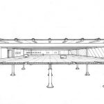
This huge structure offers 100,000 square meters (1,000,000 square feet) of flexible exhibition space. It measures 365 meters (1,200 feet) in diameter, with a circumference of one kilometer (0.6 miles) and a maximum height of 50 meters (165 feet), and is large enough to accommodate 13 Royal Albert Halls. The Dome itself is suspended from a series of 12 100-meter- (330-feet-) tall steel masts, held in place by more than 70 kilometers (43 miles) of high-strength steel cable that, in turn, support the Teflon-coated glass-fiber roof.
9. The Zip-Up House
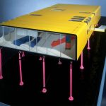
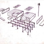
Originally designed in response to a competition for innovation in domestic architecture, the Zip-Up House, and later development of it, Zip-Up 2, was Richard Rogers’ first speculative exploration of what a modern house could be like, free of the constraints of traditional methods of construction. Though never fully realized, it was a model for the house that Richard Rogers built for his parents in Wimbledon.
Following Charles and Ray Eames’ own house in California assembled in 1949 like a kit of parts from prefabricated components, the Zip-Up House would have been based on mass-produced parts. It was designed to use panels originally intended for refrigerated trucks. Its windows were made by automotive industry manufacturers for use in buses, sealed with neoprene zips.
It would have offered excellent insulation and rapid construction at a low cost. Extending the house with extra modules would have been a simple process. The interior, with no fixed structural walls to contend with, would have been equally adaptable.
Running costs would also be minimized – the structural panels giving insulation value seven times that of a traditional house of the 1970s so that a three-bedroom house could be heated by no more than a three-kilowatt heater.
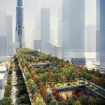
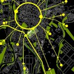
10. Alta Velocidad Master Plan
This master plan for Valladolid by Richard Rogers, winner of international competition, was to guide the growth of this city over the next 25 years, transforming it into a more sustainable city, one that could act as a model for other European cities. The trigger for this ‘re-orientation’ of the city was a major civil engineering project initiated by the Ministerio de Fomento (Ministry of Public Works) to bury 6 km of railway tracks in a tunnel under the city that previously sliced through the city.
RSHP proposed a chain of parks that would, in time, create the armature for a gradual ‘greening’ of the entire city center. Building on an existing and elegant pedestrian axis that connects the train station with the Plaza Mayor, these two axes establish a framework that, via multiple smaller-scale improvements, permit the gradual weaving together of the parks and plazas that dot the city center and link them with large open spaces at the city limits, resulting in a city-wide network of open spaces, pedestrian routes, cycle routes, and public transportation links. The by-line adopted for the project was ‘Connections and Re-connections’.
This green ‘trelliswork’ plan superimposes a new urban structure on a city that previously lacked coherence.
A key component around which the plan hinged is a new transport interchange which brings together the new AVE station, local (wide gauge) trains, the regional bus station, local bus routes and the new segregated transport corridor that runs along the greenway in the center portion of the corridor, fanning out to form a big ‘X’ and linking the four corners of the city with its center.
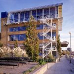
11. Thames Wharf Studios
The site was a redundant industrial complex, containing some good early 20th-century warehouses but cluttered with oil tanks and other temporary structures, and completely inaccessible to the public. The conversion of the warehouses is unfussy and economical, with existing features retained wherever possible and new elements designed to a frankly industrial aesthetic and painted in primary colors.
The strategy used by Richard Rogers was to divide the site between a new-build residential scheme and a development of offices, studios, and light-industrial space housed in the existing warehouses, one block of which was earmarked as office space for the practice.
The garden courtyard forms the centerpiece of the scheme – an attractive public space linked to a riverside walkway. The River Café, founded by Rogers’ wife Ruth and her partner Rose Gray, enjoys views across the garden to the river beyond. A double-height entrance lobby is another key intervention, creating an informal gallery for key architectural models. A recent addition has been a new mezzanine kitchen above the reception area – providing home-made lunches for the RRP staff and popular as an informal meeting place throughout the day.
12. Merano by Richard Rogers
Merano designed by Richard Rogers offers high-quality, mixed-use development, including apartments, offices, and a café. The three stepped bays that make up the building are in contrast to the existing monotonous ‘wall’ of dilapidated developments that occupy this area.
The east-west orientation of the site dictated the layout of the apartments. By placing the vertical circulation core in the center of the eastern elevation, bedrooms and winter gardens can be placed on either side of it to benefit from morning sunlight and living spaces, on the western side of the building, can enjoy views of the river and sunsets in the evening. The different uses of space within the building are arranged vertically: commercial office spaces occupy the three floors above the café and public piazza and 46 dwellings (a mix of private and affordable units) take up the upper levels.
The structure of the building is a simple concrete frame with steel bracing used to provide stability. This allows for the east and west façades to be primarily glass, creating a lightweight, transparent envelope and enables open and flexible floor plates. Balconies and winter gardens are formed of a lightweight steel structure with color applied to the soffits and flank walls, which brighten the exterior in contrast to the building’s monochromatic surroundings.
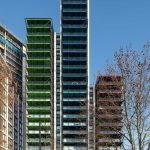
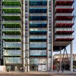
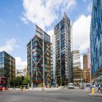
13. Neo Bankside
NEO Bankside designed by Richard Rogers comprises 217 residential units in four buildings ranging from 12 to 24 storeys. These four hexagonal pavilions have been arranged to provide residents with generous accommodation, stunning views, and maximum daylight. The steel and glass pavilions take their cues from the immediate context.
The overall design hints at the former industrial heritage of the area during the 19th and 20th centuries, responding in a contemporary language that reinterprets the coloration and materials of the local architectural character. The oxide reds of the Winter Gardens echo those of Tate Modern and nearby Blackfriars Bridge, while the exterior’s timber-clad panels and window louvers give the building a warm, residential feeling.
The pavilions’ distinctive external bracing system has removed the need for internal structural walls and created highly flexible spaces inside the apartments. Located outside of the cladding plane as a distinct and legible system the bracing gives a greater richness and depth to the façade and provides a scaling device that helps unify the micro-scale of the cladding with the macro scale of the buildings. Interestingly, the dramatic appearance of the bracing and nodes has become a selling point, with many buyers requesting apartments with nodes outside their windows.
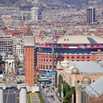
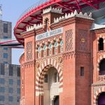
14. Las Arenas by Richard Rogers
The original 19th-century bullring was raised above the levels of the surrounding streets with ramps and stairs within the surrounding plinth providing access. However, the redevelopment by Richard Rogers re-establishes a new, open public realm around the base of the building providing level access to a wide range of retail facilities and connections with the existing metro station and neighboring Parc Joan Miró.
The Forum building follows the typical, historic street alignment of the Pla Cerda grid pattern of streets which are typical of the 19th century Barcelona streetscape.
A communications tower reinforces the presence of the bullring and – at its base – provides direct access from the metro station Espanya to the building. The multi-functional area within the dome and the restaurants around its perimeter can be accessed from this elevated public space.
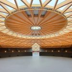
The most spectacular aspect of the intervention, however, is the inclusion of a 100-meter-diameter habitable ‘dish’ with a 76-meter-diameter domed roof, floating over the façade of the bullring. Structurally independent from the main building it provides flexible, column-free spaces beneath the dome (as well as below on level 4). This covered ‘plaza in the sky’ incorporates large terraces around the perimeter with space for cafes and restaurants, providing stunning views over the city.
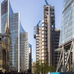
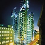
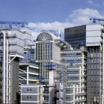
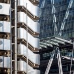
15. Lloyd’s of London by Richard Rogers
Flexibility is a key concept in the design of Lloyd’s of London and the provision of uninterrupted trading space – known as The Room – is a necessity. From this need, the form of the building is set, allocating all renewable elements required by a complicated office building to the extremity of the floor plate, and giving the central plan the flexibility to act as a space-efficient, single marketplace. The necessary maintenance and replacement of moving parts can then be accommodated without disruption to the day-to-day underwriting process in The Room, and their positioning provides legibility and scale to the façade.
The concept is of ‘Served and Servant’ spaces, in which servant zones such as stairs, lifts, bathrooms, and mechanical services stand freely in concentrated towers outside the mass of the building, creating a highly expressive and legible structure and lending an immediate sense of order and hierarchy. The servant spaces also make optimum use of the irregular site and offer a system in which the building can be changed to respond to needs over time within a controlled framework. Broadly allocated zones, defined by movement and levels, mean that areas can adapt without disrupting business.