

 for tv intro themes")
As the number of streaming devices and shows is peaking at infinite options nowadays, our attention span to decide is rolling down too. The need to grab on to the viewers, make them stick to the screen for a stretched span is the sustenance formula. What are the features that offer this? The unique storyline, cast, background scores, set design, and ultimately the factor of relatability.
The opening credits are something we all remember despite finishing the series. The catchy tune, or the images that roll in. The opening credits intend to give the viewer a peek into what is up for them, a repetitive reminder to set them in the central mode-humor, thrill, serious, spooky, royalty, grey shade, and so on. Let us dive into some examples where they have dealt with the intro theme with the tools of architecture and design.
The Paper Bank
We’ve seen the global takeover of the Spanish crime drama “Lacasa de Papel” or “Money heist”. It involves a heist worked out in the Royal Mint of Spain. The need to put this idea very early on is achieved by documenting the paper model of the same building. It’s a metaphorical take on paper translating to money. The emptiness of the large volumes puts the feel of isolation and helplessness in bold. Several building components are layered with the stamps of photos, document reports, calculations connected to the character. The flickering lights, the red highlight around the vault being the ultimate goal to achieve brings in the pressure of spontaneous decisions.
Establishing the decisions of the character inside a finite space is brought about by setting definite peripheral boundaries to space. The final stance brings in the front elevation of the bank establishing the fact that money rules overall.


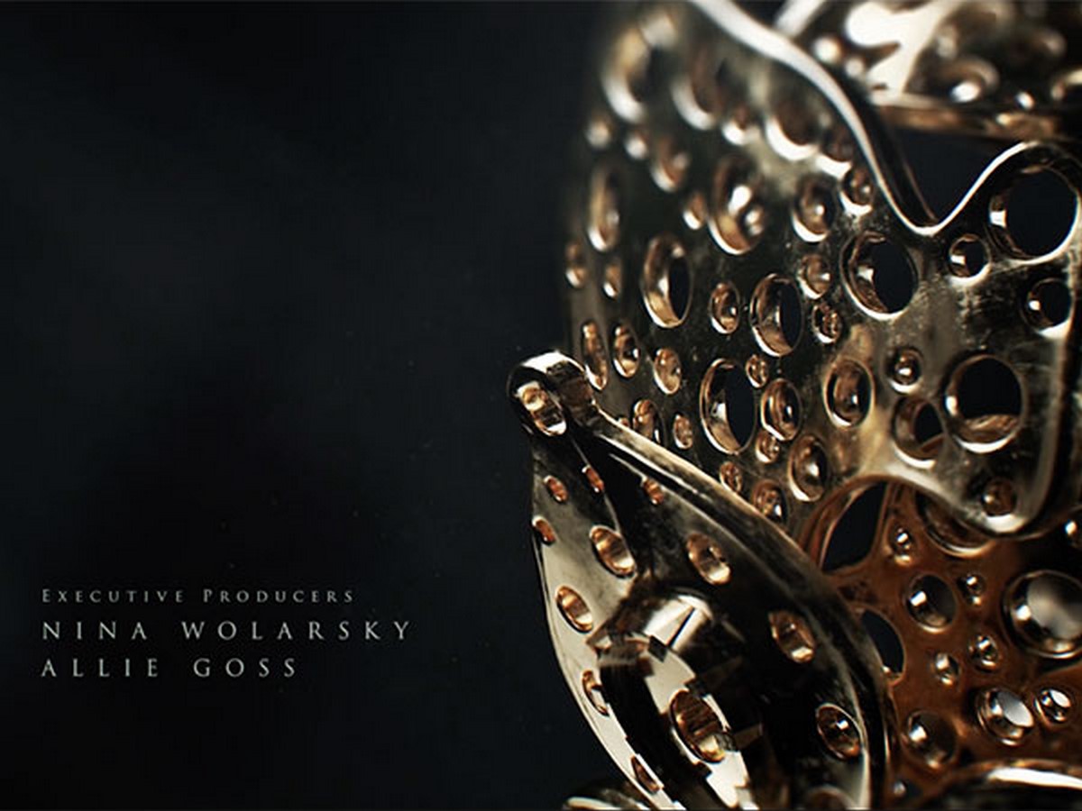
The Royal Symphony
The opening credits of “The Crown” bring artistic shots of the formation of the crown starting with the initial moulding of gold. The fragility it holds, with a closer look, brings in the intricacy that is not particularly observed when seen from a distance. A parallel relation to the Queen’s personality. The intertwining and the adding of layers coming from various unidentified sources address the depth of complexity it involves in keeping up the order of the state. The process seems slow but crucial.
At last, the silhouette of the crown shines in the dark background, the jewel shining hinting at the statement that “ the crown must always win”
The decay of humanity
One of the earliest shows to make acclaimed credit scenes was the “ True Detective”. A show that focuses on the corruptive system of the state and how several crimes move far ahead without repercussion, the frames show broken images of blurred lines of landscape inscribed with human figurines. They have used ultra still motion capture and low poly mesh to compile all the clips. Many images are taken from the maker’s photography books.
Patrick Clair, the creative director brings in the images of Louisiana and the glitching of the superimposed materials. The losing threads of disconnectivity with the reality, the system is indicated by falling apart via missing pieces to be put together to form a mosaic.
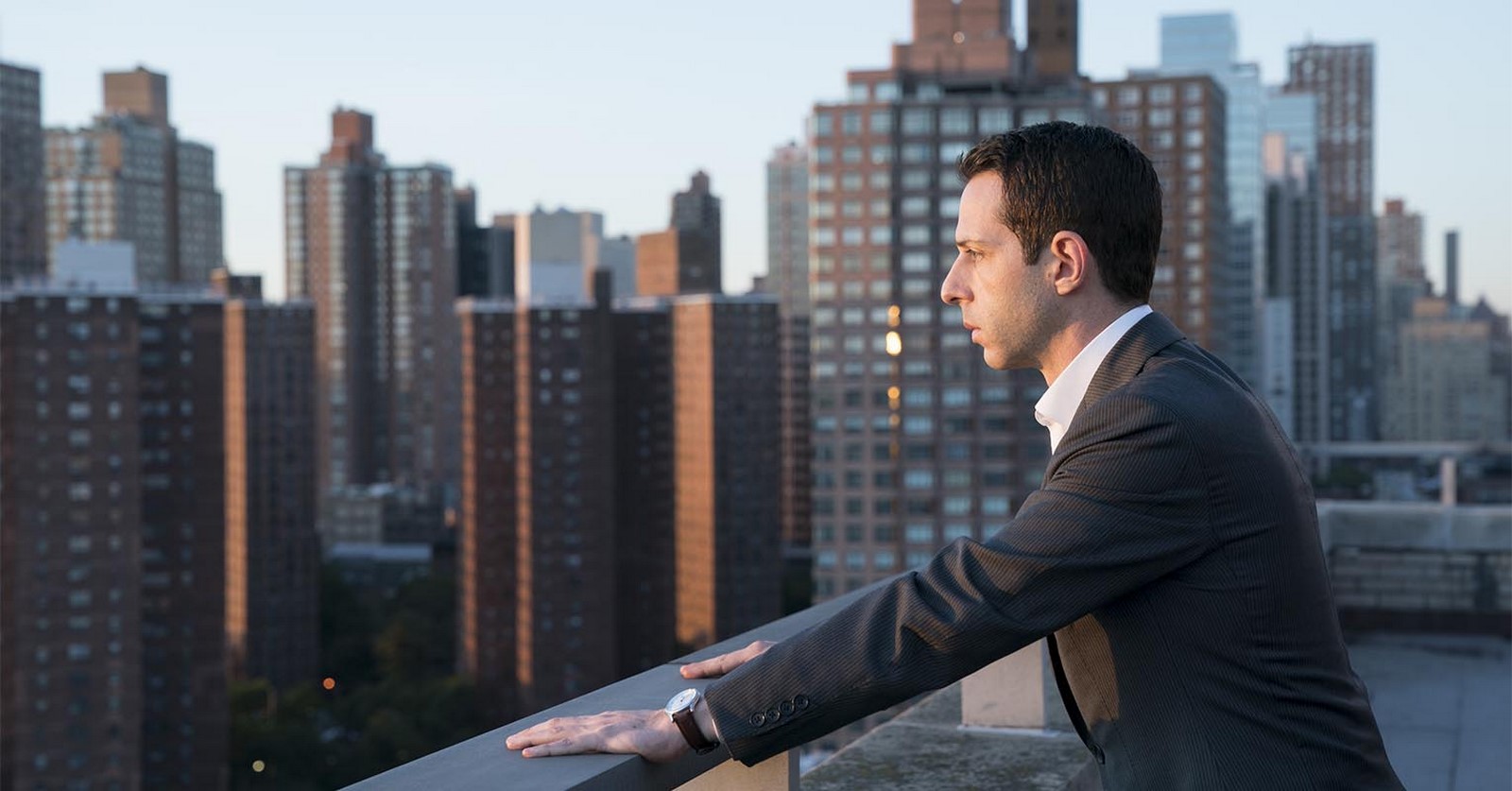
Complications of Hierarchy
The need to exhibit dominance, build the stability of the exterior façade while coping with the growing nemesis while coping with the dysfunctionality of a family pretty much sums up the core of the series. In the intro, we see two parallel narrations of different periods gelling in. The first, shows the Victorian mansion the family grows up in, the vast estate and the outdoor activities they took part in. Later on, we see the busy nightlife of New York City, the famous skyline and viewpoints from their company-owned ATN building looking at the empire state building.
This indicates there is always a ladder to grow up, something that doesn’t involve content settlement. We often see the siblings staring right up or down to facing their backs to the camera on both the scenarios overlooking something distant. This might hint at the loneliness they feel internally or the need to stand by without dependency. Something as simple as the dining table, and their placements leading to the appearance of the word succession is a well planned visual aid to the wordplay.
With the above cases, we can understand how the capture of spaces can accelerate the emotions and pave way for the story to unfold. There are innumerable heads that go into making something that lasts a minute or two. The creative drive which may look small in contribution comparison makes a lot of difference in trying to hold back the engagement from episode to episode. So next time you start a series, make sure to look back at what the opening credits tried to hint at!
Link to videos
https://www.youtube.com/watch?v=77PsqaWzwG0
https://www.youtube.com/watch?v=FxXRkqXfhYM
https://www.youtube.com/watch?v=EQ9ftKMWTW4
https://www.youtube.com/watch?v=9ElPgb2WLow


