Usage of colours in architecture brings forward various meanings, covering aesthetic preferences, human psychology and symbology. Colours affect our lives and convey our energy and character. This makes the colour combination possibilities essential for design. From coloured construction materials to textures, the look and feel of each colour are of great importance to create an excellent ambience for a structure.
Psychology of Color | Colour in Architecture
Colours can take on different meanings regarding the historical, cultural or artistic period. Colours are essential to each user’s experience of the space— associating it with psychology, symbolism and mysticism. The association can be used along with the volume and shape of the room.
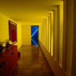
Colour can visually mimic or distort certain aspects of space. For example, using a dark colour for the ceiling would create a feeling of lowered height. Moreover, if colour is applied to the central wall, it gives the idea of spatial shortening, while colouring all the walls provides us with the perception that the space is longer than it is.
The following ideas have been developed while considering the psychology of the colours. Blue is symbolised as a colour which transmits the feeling of positivity, confidence, and security, while yellow portrays optimism, curiosity and delight. Red is often used to show energy, excitement, and impulse, but to evoke calmness, tranquillity and serenity, the chosen colour is green.
Planning a colour scheme
Three components must be considered for planning a colour scheme, which are:
- Walls, Floors, and Ceilings: People are more comfortable when a room has a light ceiling, medium-coloured walls, and dark floors—that symbolise the sky, foliage, and earth, respectively.
- Proportions of the Room: Using dark colours or complementary colour schemes can subdue the largeness of a room. Meanwhile, if a room is small, using light colours or monochromatic colour schemes can make it appear larger.
- Balance of Solid and Voids: This is determined by the light entering the room. Using dark colours can subdue the lighting effect if it is above the desired comfort level, while light colours can suppress the result if the lighting effect is less than the desired level.
Usage of colors in architecture and interior design
Colour is an expressive component in architecture and interior design, and a building’s character can be highlighted by its use. The colours of buildings influence our perception of the structure— especially in residential and commercial buildings.
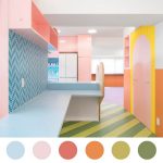
Colours impact how we feel about living and working in those spaces when used in interiors. The colours used can be vibrant or soothing, depending on how we perceive them. Colour additionally fills in an aesthetic need, acknowledging the impact of the spaces.

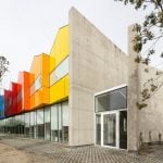
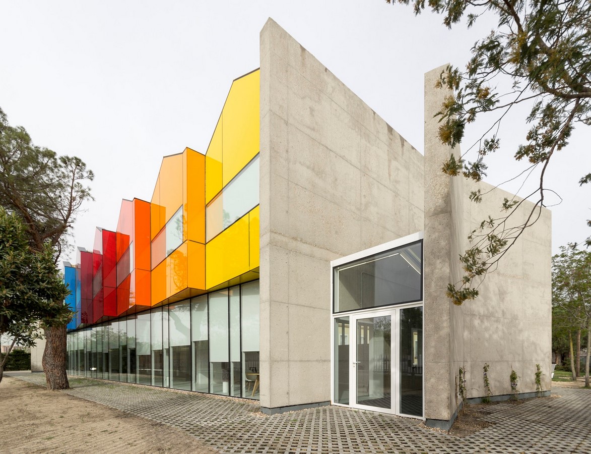
Colours are carefully chosen for the facade as well. The colour concept for the facade depends on whether the building would merge with the surroundings. If a structure has to blend in with the surroundings, tones of nature are used like greens, light browns, and blues. However, if the building has to stand out, bright colours, like yellow, red, and orange, help isolate the building.
Colour is based on personal preference, with each person having a unique colour palette. This influences how individuals react to their surroundings— whether joyful, calm or stressed. Choosing a colour scheme can also depend upon the project typology. Residential areas utilise monochromatic or analogous colour schemes. Health centres use soothing colours with a bit of warmth, like off-whites and browns. Hotels and restaurants use a bright colour scheme to provide stimulating effects, like red, yellow, and orange with complimentary colours. However, dull colours might hint at anxiety, challenges in focus and discernment issues, which is why they’re rarely used.
Utilisation of colour in architecture and interior design | Colour in Architecture
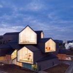
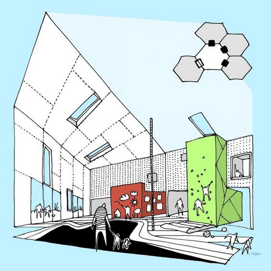
Lucinahaven Toulov Childcare, Denmark (CEBRA)
The day-care centre in Taulov is an institution which brought forward a distinctive design deriving from functional demands. The hexagon plan is organised like a daisy, in which the central activity room is the ‘yellow stamen’ while the petals around it are group rooms and staff facilities. This brings a feeling of closeness and encourages social interaction amongst children.
To make the building child-friendly, the architects gave each hexagon its own colour to make the building look like a group of easily recognisable houses. The play areas were given a saturated yet contrasting colour palette to ignite children’s imagination. The colour palette of the dining area was selected to minimise excitement by having minimal contrast. Reading areas utilised darker colours to distinguish them from the play areas and encourage children to keep quiet. Meanwhile, the sleeping area’s colour scheme minimised hue and saturation to minimise visual noise and instigate calmness.
Constantly, we are surrounded by different environments and their colours. Our brains perceive these colours, draw conclusions and set our expectations for the place. When colour is utilised in architecture and interior design, it isn’t just for the aesthetics but rather to create comfort— and what better way than using colours to bring forward that message?
References:
- Online sources
Citations for websites:
Victor Delaqua (2022). The Importance of Color Palettes in Architectural Design. [online] Available at: https://www.archdaily.com/942031/the-importance-of-color-palettes-in-architectural-design [Accessed 27 Jul. 2022].
Matheus Pereira (2018). The Role of Color in Architecture: Visual Effects and Psychological Stimuli. [online] ArchDaily. Available at: https://www.archdaily.com/895498/the-role-of-color-in-architecture-visual-effects-and-psychological-stimuli [Accessed 27 Jul. 2022].
Anon, (n.d.). Application of Colors in Architecture – Archistudent. [online] Available at: https://archistudent.net/application-of-colors-in-architecture/ [Accessed 27 Jul. 2022].
ArchDaily. (2010). Lucinahaven Toulov Childcare / CEBRA. [online] Available at: https://www.archdaily.com/46255/lucinahaven-toulov-childcare-cebra [Accessed 31 Jul. 2022].
Archello. (n.d.). Lucinahaven | CEBRA. [online] Available at: https://archello.com/project/lucinahaven [Accessed 31 Jul. 2022].
- Images/visual mediums
Citations for images/photographs – Print or Online:
Abaton, H. (2018). Fundação Esther Koplowitz para Pacientes com Paralisia Cerebral. [Photograph].
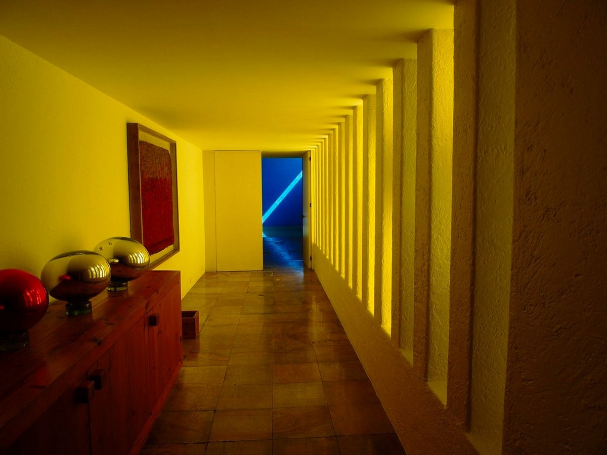
Barragan, L. (2018). Residential Corridor. [Photograph].
Vranovsky, J. (2022). Color Palettes in Interiors. [Photograph].
CEBRA. (2009). View of Lucinahaven Toulov Childcare. [Photograph].
- Other source types
Citations for dissertations:
Panja, I. (2020). Colour in Architecture. Bachelors level. ITM School of Architecture and Town Planning.