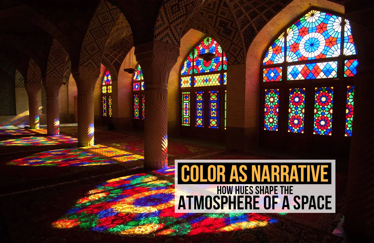
Forget everything you think you know about painting. That hue isn’t a passive background choice; it’s the architect’s secret weapon. Color is the most powerful, cheapest, and fastest way to lie about volume, control temperature, and dictate human emotion without saying a word. It operates as a dual narrative: a visual story it tells the eye, and a physical story it tells the molecules of the room. A mediocre design chooses a pretty color; a master design chooses a color that performs.
The Thermal Reality and the Aesthetic Promise
The perception of a room’s comfort is an intense negotiation between how it looks and how it manages heat. Architects skillfully guide this experience through color.
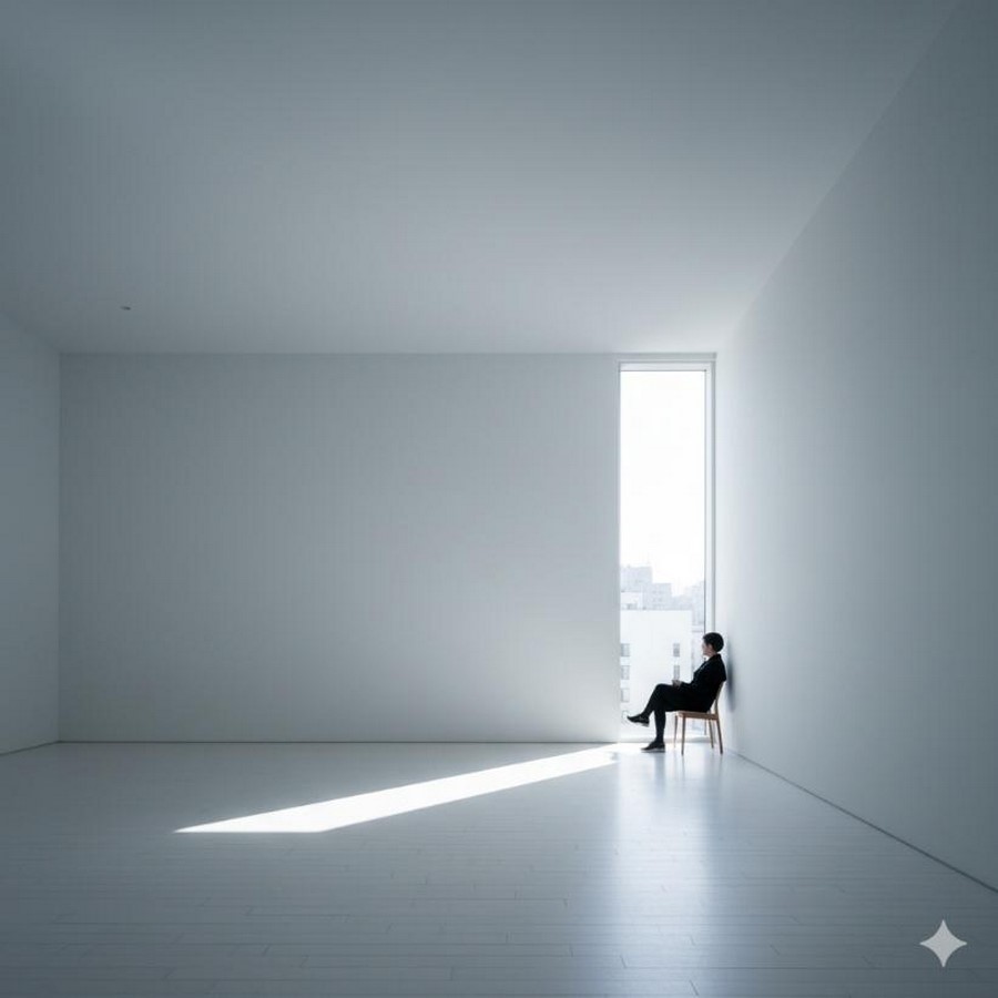
Take the narrative of light colors, the whites, the cool pastels. Visually, they scream cleanliness, endless space, and pristine calm. They are the heroes of small, crowded urban spaces, pushing the walls out and lifting the ceiling high. But why do they achieve this effect so effortlessly? Because they are brutally efficient thermal reflectors. They reject incoming light and heat energy so aggressively that they keep the surface cool and the room energetically neutral. The physical reality of solar rejection perfectly validates the aesthetic narrative of coolness and spaciousness. The surface is honest; it looks cool because it is cool.
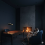
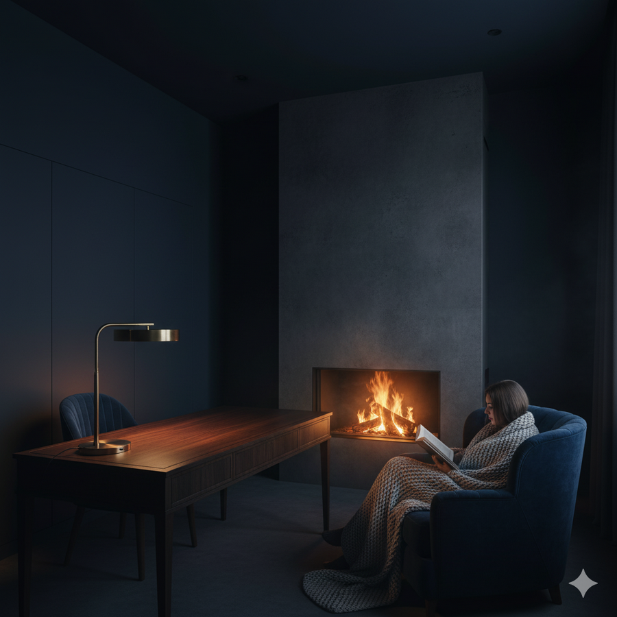
Now flip the script to the narrative of dark colors, the deep blues, blacks, and saturated jewel tones. Aesthetically, they narrate intimacy, sophistication, and powerful compression. They wrap around you, creating a cinematic, almost magnetic enclosure. But their performance truth is that they are relentless thermal absorbers. They capture nearly every wavelength of light and turn it into stored heat. This is a crucial distinction: in a cozy winter cabin, this absorption is honest; the dark walls trap and radiate warmth, fulfilling the narrative of comfort. However, if that same dark hue is used on a lightweight wall in a scorching tropical kitchen, it becomes an aesthetic lie. It looks moody and cool, but the relentless heat gain from the absorbent surface makes the space feel suffocating. The architect’s challenge is to ensure the color’s thermal action supports the desired aesthetic emotion.
The Cultural Contract: Survival Narratives
The most compelling proof that color is functional storytelling comes from centuries of regional survival architecture. In these settings, the palette wasn’t chosen by a trend forecaster; it was chosen by climate.
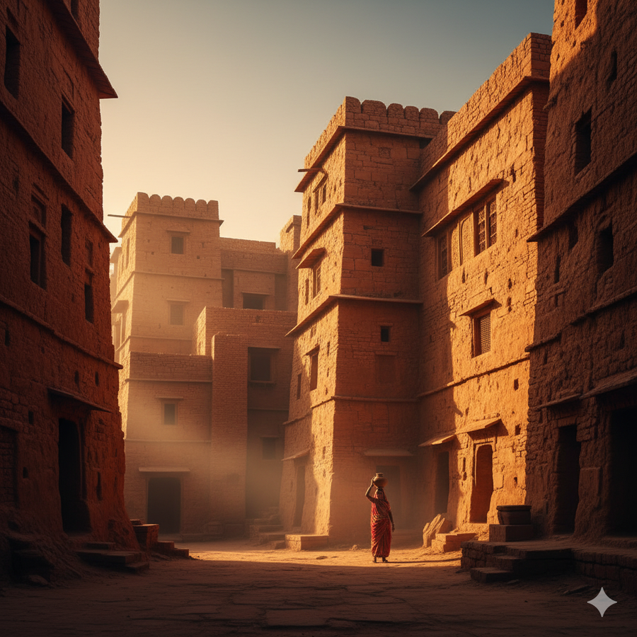
Look at the dense, earthy architecture of South Asia, specifically the use of terracotta and ochre in parts of India. Aesthetically, these hues are a visual manifesto of authenticity and being rooted; the structure is literally colored by the very earth it stands on. Thermally, these dark, rich colors are heavy energy absorbers, but they are applied to incredibly thick, massive walls. This isn’t a mistake; it’s genius. The color absorbs the day’s heat and holds it in the mass, delaying the heat’s journey until the cool night. The thick walls then release that warmth back into the cool evening air. The aesthetic narrative of earthiness and permanence is therefore inseparable from the climate control strategy of thermal delay.
Contrast this with the sharp, defensive colors of high-altitude construction, such as the white-washed monasteries of Nepal. Aesthetically, the white symbolizes purity, spiritual clarity, and austerity. Thermally, the brilliant white coating serves a critical, protective function: in the face of intense, unmitigated Himalayan sunlight, the white aggressively reflects the damaging UV radiation, keeping the interior safe and cool during the day. The color choice narrates both the monastic value of purity and the non-negotiable physical necessity of solar defense. It is functional storytelling at its most direct.

Color as Temporal Pacer: Manipulating Time and Flow
Because color manages energy, it is fundamentally an invisible tool for manipulating the user’s experience of time and motion within a building. The hue is the architect’s stopwatch.
A room designed with deep, highly absorbing colors slows time down. The walls feel heavy, settled, and constant, creating constant energy inertia. This fosters a narrative of contemplation, history, and permanence, subtly compelling inhabitants to linger and move with a deliberate pace. It is the perfect atmosphere for a reading room or a private office where deep thinking is required.
Conversely, a room saturated with reflecting, light colors speeds time up. The air feels constantly dynamic and immediate because the surfaces are not holding onto energy; they are constantly bouncing it around. This creates a narrative of transience, efficiency, and instantaneity, defining fast-paced, high-turnover spaces like retail checkout lines or transit hubs. You are energetically discouraged from settling in.
The Final Narrative: Commanding the Atmosphere
The architect’s ultimate command over the atmosphere is executed through this dual-level thinking. Color is used to define not just mood, but a function.
When a designer uses a saturated, powerful color to highlight a single architectural element, a steel beam, a recessed niche, or a door frame, that color creates a narrative of focal density. It is energetically “louder” than the surroundings, demanding the eye’s attention and directing the flow of traffic. The color acts as a vibrational beacon, overriding the physical reality of the neutral materials around it to define the room’s hierarchy.
To truly master color is to stop seeing it as a finishing touch and start seeing it as a dynamic, energetic system. It is the silent, pervasive element that shapes the user’s subconscious journey, telling them whether to slow down or speed up, whether to feel warm or cool, and whether the room is expansive or intimate. The hues are the scripts, and the walls are the silent, constant communicators.
To continue challenging the norm, we could now explore the narrative power of non-color, the calculated use of transparent materials (glass, resin) to tell a story of absence and immediacy.