Historians assert that the study of colour and its incorporation into various fields dates back thousands of years—the earliest recorded theories of colour originate from the Greek civilization.
Evolution of Colour:
Alkmaion of Croton, a Pythagorean physician, is believed to be one of the earliest sources for the theory of perception. In his works, he questions, “How does the eye see? It sees through the water surrounding it (dia to peris hydrates).”
Aristotle, Plato, and Democritus were Greek philosophers who devised various theories of colour and its perception based on music, astronomy, universal harmony, and Pythagoras’s teachings. The ancient Greek colour theory was largely inspired by the four-colour system of white, yellow, red, and black and its relation to the basic elements in nature, grounded in concepts of polarity and complementation. During this particular Greek era, perception became a distinct function of the human mind, which was thoroughly investigated, leading to intriguing theories and further discoveries.
The Greek philosopher Democritus theorised that the characteristics of atoms in an object create visible colours and the energy surrounding it. Another philosopher, Plato, posited that the eye transmitted rays of vision towards objects, which also radiated rays of colour.
However, Aristotle rejected these theories of the eye. His colour system included red, yellow, violet, green, blue, white, and black. During this era, various philosophers developed many differing theories on colour, most of which were dismissed by their colleagues.
From the 8th to 14th centuries, Arabic-Islamic scholars drifted from the theories of Aristotle to make their discoveries in colour. Scholars such as Al-Kindi, and Lbn-al Haythem came to the conclusion that light was a necessity for seeing colours, not the rays from the eyes.
The father of modern optics, Ibn al-Haythem experimented with light and glass spheres and observed the bending of light rays into different colours. He observed that the blue rays bend the most and the red rays bend the least.
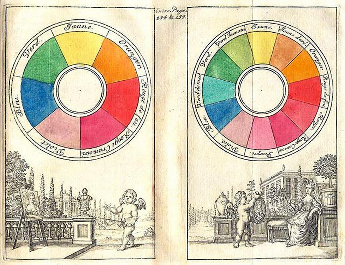
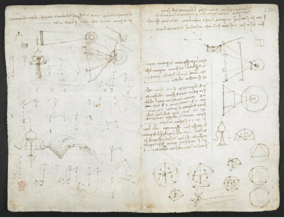
Leonardo Da Vinci, an artist from the Renaissance period developed an interest in colour theory from a more practical perspective. He examined the complexities of physical materials such as the pigments, light and the various complexities of colour. In his basic primaries, he listed six colours; white, yellow, green, blue, red and black. He included green in his primaries during the initial stages of his study to later conclude it to be a secondary colour.
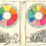
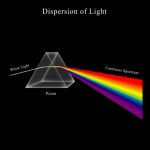
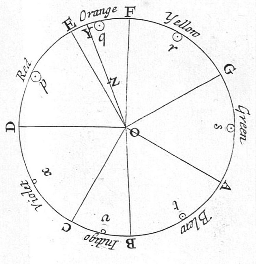
In 1672, Sir Isaac Newton developed the first colour wheel. It was based on colour-hue relationships and the experiment with light and prisms. His publication, “Opticks” documents his discoveries in the recognition of the visible spectrum and the colours (VIBGYOR)- Violet, Indigo, Blue, Green, Yellow, Orange and Red.
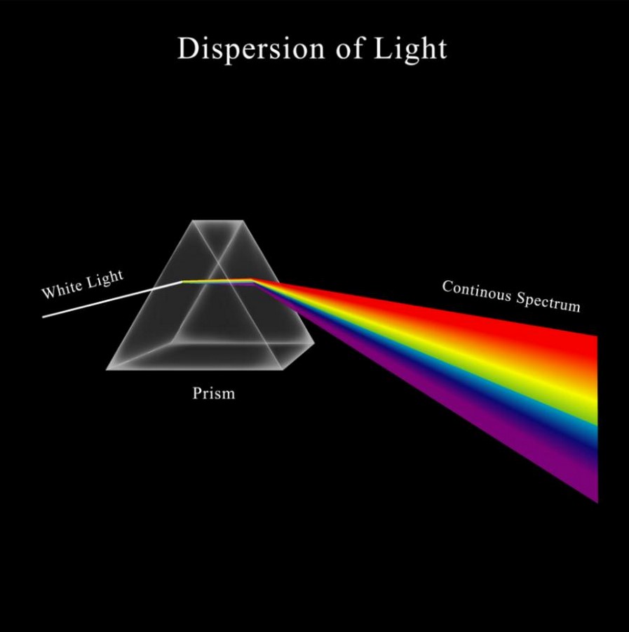
The Continuous Light Spectrum:
The understanding of how white light unfurls into the spectrum of colours is essential for designers to use it to its full potential and breathe life into their work. The phenomenon of all wavelengths coming together to make up white light is the Continuous light spectrum. This is visible when white light is passed through a prism displaying a rainbow band of colours.
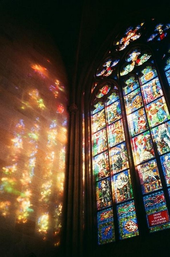
Throughout history, the manipulation of light has been a cornerstone in art and architecture. The prime example of this phenomenon is the stained-glass windows in the cathedrals of the Gothic era. The light spectrum has heavily influenced design decisions and therefore eventually shaped the evolution of styles.
Chiaroscuro:
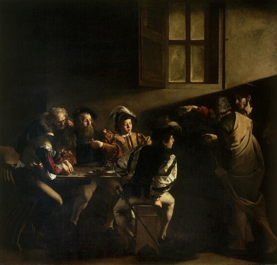
During the Renaissance period, a concept named Chiaroscuro emerged. It was initially a technique rooted in painting and drawing. It is the play of light and shadow used to create depth and add dimension to the art form. This phenomenon has influenced art, film, photography, interior design and architecture. Artist Caravaggio mastered this technique to garner focus on certain elements in his work and to bring out a certain essence in the user’s visualization of his art. An example of this concept in his work is “The Calling of Saint Matthew.”
An important era recognized for the experimentation and exploration of the aesthetics of colour and its subjective perception in varied contexts was during the Bauhaus period. The Bauhaus period lasted till 1933 but its impact remains to date.
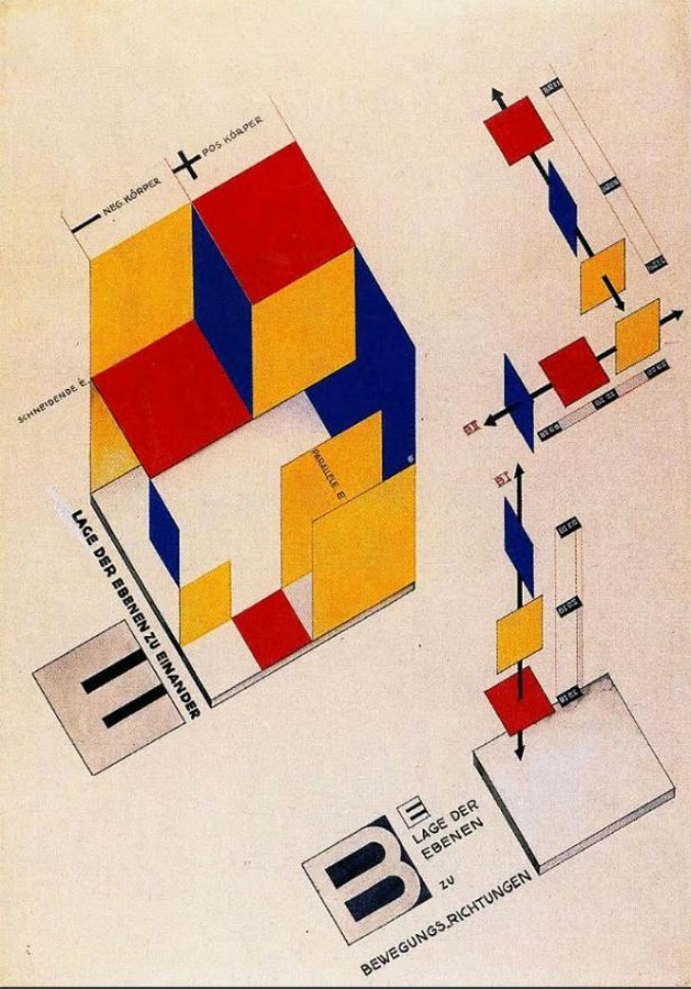
Josef and Anni Albers, Johannes Itten, Wassily Kandinsky etc were some of the few professors who taught at the Bauhaus school. They had their ideas and perspectives on colour aesthetics and different teaching methods as well. A famous example from this period is the Bauhaus Cradle by Peter Kelly. It uses primary colours; Red, yellow, blue and the associated secondary and tertiary colours. It soon became the foundation for the curriculum for the Bauhaus school and all institutes influenced by the Bauhaus movement.

Modern Design:
Today, in the modern design era, designers and architects use light and colour to make spaces look larger and more inviting to their users. Industry designers keep the light spectrum in mind and develop futuristic products that help enhance spaces according to their function.
Cooler coloured light(blue) has been demonstrated to increase employees’ span of attention, create an optimistic mood and help reduce eye strain. On the contrary, warmer coloured light (yellow) helps in making the user feel more intimate, personal and cosy in a space.
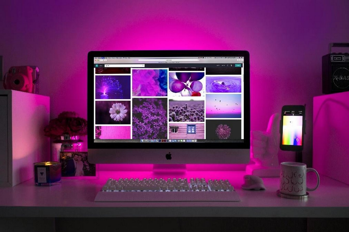
Colour, practically as well as symbolically can attract attention or signal action through connotations. The psychological impact colour has on human beings is immense and not something one can ignore. Different tones and hues evoke a varied spectrum of feelings, from excitement to calmness, joy to sorrow etc. Designers aim to create a connection between a person and a space by selecting specific colours of the spectrum that align with the mood that the artist intends to deliver.
For example, websites that cater to children’s goods and activities have a vibrant set of colours to reflect their nature of playfulness and high-energy mood. Whereas a website for yoga uses soothing, subtle and cooler colours as the aim is to engage the user in feeling relaxed and calm.

Therefore, it is safe to say that colour plays a crucial role and is a masterstroke tool if used right in attaining hierarchy in design. The right colour choices help improve the user’s mood, readability and how he/she reacts to the environment. High contrast combinations like black text on a white background or vice-versa make the text easily legible.
To a designer’s toolkit, colour is a powerful tool. It is a language that breaks barriers of borders, cultures, and colour and has a profound impact on human perception and overall experience. Colour plays a pivotal role in shaping user interaction and emotions. It is used to communicate information and to guide the user. More than mere decoration, it is used to make the user feel a certain sense of being.