Typography is the art and technique of organizing letters and text to make the type comprehensible and aesthetically appealing. It is crucial to how humans portray and understand information in a visually rich environment. Typography refers to the process of styling, arranging, and appearance formation of letters, numerals, and symbols. Deciding on tactics such as typefaces, point sizes, line lengths, line spacing (leading), letter-spacing(tracking), adjusting space between pairs of letters (kerning), x-height, and vertical proportions, character variability, width, height and color contrast serves as part of the type arrangement procedure. Typography brings writing to life, making it vibrant and lively. Typography should instruct and guide people, enhance readability and accessibility, and provide a positive user experience. Good typography helps to achieve a strong visual hierarchy, graphic balance, and the desired tone of the product. Typography is all around us and in today’s world it is the core for brand making and marketing. It can be seen in advertisements- newspapers and magazines, information signs and billboards, posters, brochures and flyers, book covers, packaging and labeling, logos, architectural lettering, inscriptions, etc. In modern times of digital media and entertainment, typography is everything. Minimalist design can be beneficial for its affordability, environmental friendliness, and easy accessibility. Prioritizing the basics in a body of work is at the heart of minimalism in design. It embraces the maxim “less is more” and emphasizes simplicity. Minimalism in visual art focuses on functionality, using clean, simple lines, and a limited color palette. Compositions are given room to breathe with ample white space such that each element has a place and a purpose. Minimalism is fundamentally about designers emphasizing a subject’s or the object’s primary qualities. Minimalist design is gaining popularity as a result of its elegant simplicity and ability to stand out.

Approaches to minimalist typography
In minimalist design typography, clean and straightforward typefaces are preferred to elegantly convey the desired message. Sans-serif typefaces are frequently employed because of their streamlined and understated appearance, such as Helvetica, Futura, or FF DIN. Minimalist design lessens the cognitive burden and improves usability by eliminating extraneous components. It streamlines interactions, offering a seamless experience and allowing consumers to concentrate on the primary functionality or content. This strategy offers a seamless experience by letting consumers concentrate on the primary functionality or content.
Essential information, such as headlines, taglines, or calls-to-action, can be emphasized by using different font sizes, styles, and weights, guiding the viewer’s attention systematically. A well-constructed visual hierarchy reinforces the lasting effect of the content, ensuring that the most vital message is not muddled in the visual clutter. Font size, spacing, and color contrast are crucial parameters to ensure simplicity in reading, especially for digital content where viewers have a relatively short time to comprehend the message.

Techniques for minimalist typography
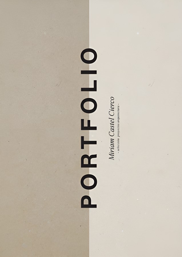
Using limited fonts and combining a Sans Serif with a Serif
To maintain uniformity and a tidy aesthetic look, one must opt to choose just a few fonts. Combining a sans-serif and a serif font often creates pleasing contrast while maintaining simplicity. Sans-serif fonts are inherently more streamlined and simple as they lack the minuscule lines or flourishes at the ends of characters called serifs. They usually have a modern design and are simpler to read. For instance, Bell Gothic with a combination of Sabon is better than Bell Gothic with Trade Gothic.
Avoiding the use of geometric fonts within the same classification
Combining typefaces of the same classification but from distinct typeface, families can quickly lead to conflict. Without proper attention, their conflicting personalities may not complement each other and result in a typographic mismatch. For example, using slab serifs for both heading and body creates unsightly tension than mixing slab and transitional serifs. Fonts with simple geometric shapes can enhance the minimalist aesthetic. They frequently adhere well to minimalist design concepts because of their clear lines and contemporary feel.
Assigning distinct roles and embracing fonts weights
“Designing and adhering to a role-based scheme for each font or typeface is an effective way to combine multiple fonts from various typefaces. The reader’s eye can be led around your design by using distinct distinctions in font weights in addition to size variations. This contrast imparts the design an additional dimension and appeal to the eye. Typefaces have distinct characteristics, and mistaking their suitability for a specific work can be problematic. Adding another typeface that is poorly chosen to the mix compounds the issue. It just doesn’t work well to combine two mixed-mood fonts like Souvenir, which is whimsical, informal, a bit aloof, and very lovely, with Franklin Gothic Bold, which is stern, solid, strong, but with a refined sense of elegance and mission.
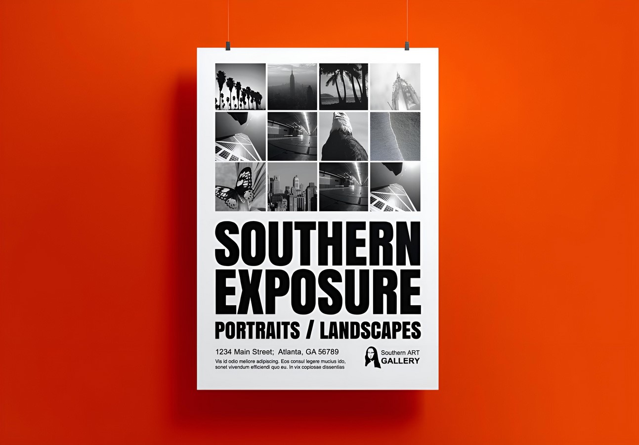
Limited color palette by emphasizing white space
Only a few complementary colors are used for the palette. Monochromatic or similar color palettes are frequently used in minimalist designs to preserve a feeling of simplicity. Minimalist designs have relied on a limited color palette, often made up of two or three hues. Utilizing monochromatic tones of gray and introducing a distinct color tone as an accent or link is another strategy. The accent color could also be used to signify specific elements or actions. Monochromatic or similar color palettes are frequently used in minimalist designs to preserve a feeling of simplicity. Including plenty of whitespace or blank space around and inside the text facilitates the creation of a visual breathing room and makes the information stand out.
Aligning text elements and exploring negative space
To make a layout that is neat and organized, precise alignment (left, center, right, or justified) should be used. To retain a feeling of rhythm throughout the design, the constant vertical spacing between text parts can be maintained. A sleek and well-organized appearance is facilitated by proper alignment. When designing minimalistically, negative space can be just as significant as the text itself such that intriguing forms can be created by intentionally utilizing the negative space or aligning text with adjacent items.
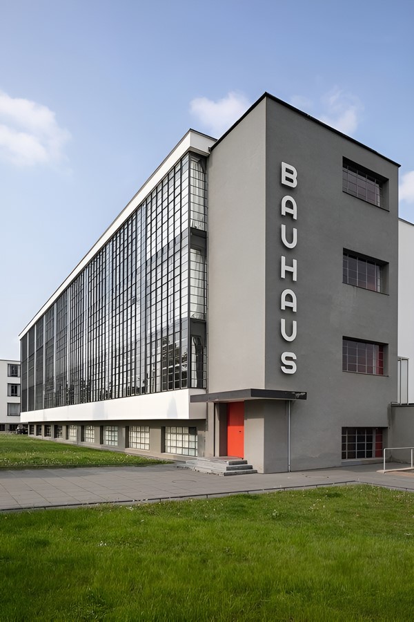
Typography and Architecture
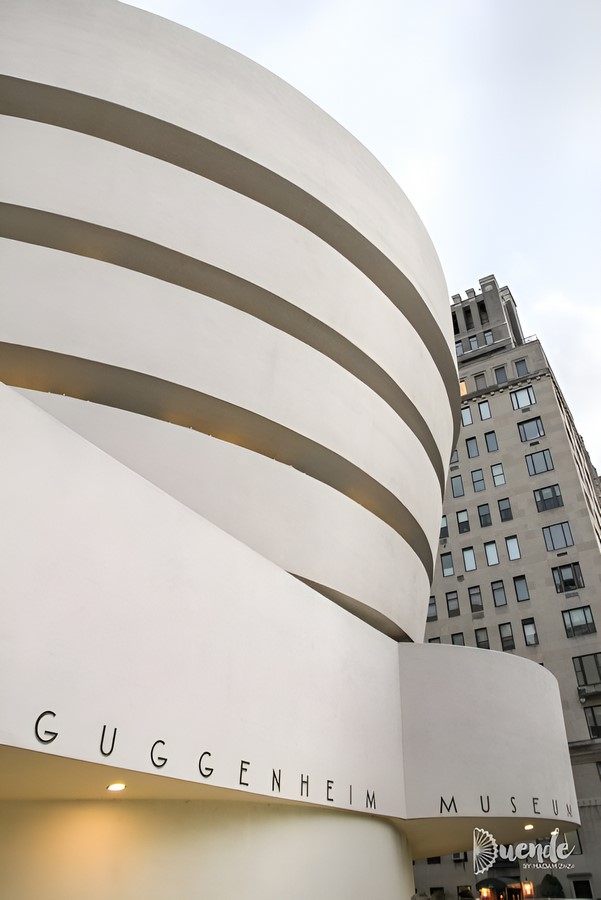
Architectural lettering is used on all blueprints, drawings, and designs in the design and architecture sectors. The block letters used in this type of architectural handwriting are easily readable by everyone. Architects developed this handwriting style centuries ago to ensure that all writing on blueprints was consistently readable. Using architectural letters can help us avoid costly errors. brought on by misinterpreting data. If not mandatory, practicing architectural lettering is typically included in the curriculum of all architecture and design education programs. Architectural lettering is an integral part of all architecture and design education programs, ensuring that texts in architectural documents use minimalist fonts that are consistent, properly sized, and weighted. It creates an appropriate hierarchy and assures they are understandable to all parties.
As a visual depiction of a design concept, project, or proposal, presentation boards are essential in architectural school life and profession. These boards act as an effective means of communicating concepts and persuasion for stakeholders. Presentation boards use typography in conjunction with graphics and photographs. When used effectively, it improves visual storytelling and builds a coherent and engaging story.
For architects, typography serves as a significant source of inspiration as they experiment with novel shapes, patterns, and textures. Typography is used as decorative elements on surfaces, such as interior walls or building facades. Surface patterns and textures are inspired by typography. In-building signage and wayfinding, both heavily rely on typography. Typography can be employed in architectural design as part of environmental graphics. It can be used to provide data, tell stories, or improve the atmosphere generally in a space. Architects use typography to reflect the identity or branding of the company or institution using the building in commercial or public settings. This fusion develops a distinct and recognizable architectural language while supporting the brand’s image. In historical or restoration initiatives, engraving or carving typography onto the surfaces of buildings brings back old craftsmanship and fosters a sense of heritage and craftsmanship.
References:
Anon, (2019). Architecture and Typography | Blueprint South Dakota. [online] Available at: https://blueprintsouthdakota.com/2019/04/architecture-and-typography/
Shriftu, S. (2023). The Rise of Minimalist Design: Embracing Simplicity in a Complex World. [online] Medium. Available at: https://medium.com/@studiiashriftu/the-rise-of-minimalist-design-embracing-simplicity-in-a-complex-world-d24336138baf.
www.linkedin.com. (n.d.). Typography in Advertising: Creating Visual Hierarchy and Memorable Brand Experiences. [online] Available at: https://www.linkedin.com/pulse/typography-advertising-creating-visual-hierarchy-memorable-kambli
Bonneville, D. (2010). Best Practices Of Combining Typefaces. [online] Smashing Magazine. Available at: https://www.smashingmagazine.com/2010/11/best-practices-of-combining-typefaces/.