Choosing two tone kitchen cabinets offers a way to add personality to a kitchen without making the design feel busy. By combining two complementary colors or finishes, homeowners can create visual interest, highlight architectural features, and give an existing layout a fresh look.
The challenge is finding the right balance. A combination that looks beautiful on a paint swatch might feel overwhelming once it covers an entire wall of cabinets. The most successful designs consider where each finish belongs, how it works with the room’s lighting, and what other materials are already in place.
Whether you’re planning a complete remodel or simply updating your cabinet finishes, these practical tips can help you create a two-tone kitchen that feels cohesive and comfortable.
Start With a Light-and-Dark Cabinet Combination
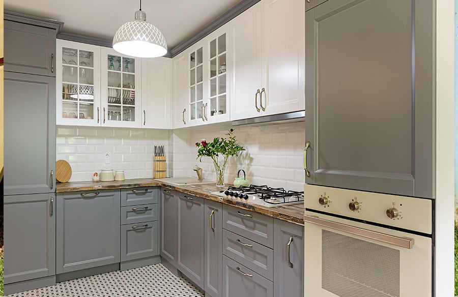
One of the easiest ways to introduce two-tone cabinetry is to use lighter finishes on upper cabinets and darker colors below.
White, cream, or pale gray upper cabinets can keep the room feeling open, while navy, charcoal, or deep green lower cabinets add contrast and visual weight. This arrangement works particularly well in smaller kitchens, where a continuous row of dark upper cabinets could make the space feel more enclosed.
For example, warm white uppers paired with muted navy lowers create a noticeable contrast without requiring bold colors throughout the room.
The placement matters just as much as the colors themselves. Keeping the darker finish below counter height helps ground the design, while the lighter cabinets maintain a sense of openness at eye level.
If you’re unsure about the combination, photograph your kitchen and use a simple editing tool to mock up the two colors. Seeing them in their intended positions can reveal whether the contrast feels balanced before you order materials or buy paint.
Mix Natural Wood With Painted Cabinets for a Softer Look
Two-tone cabinets don’t have to rely on contrasting paint colors. Combining natural wood grains and textures with painted cabinet doors can create a warmer, more understated result.
Consider pairing natural oak lower cabinets with soft cream uppers. The wood adds warmth without creating the sharp contrast of black and white. Alternatively, walnut cabinetry can complement muted green or warm gray finishes for a richer palette.
Pay attention to the undertones in both materials. A golden-toned oak may look more harmonious beside a warm off-white than a cool, blue-based gray.
Before committing, place a wood sample beside your chosen paint color and compare them against the flooring. If all three have competing undertones, the finished kitchen may feel less connected than you intended.
Make the Kitchen Island Your Statement Piece
If you like the idea of two-tone cabinets but aren’t ready to introduce contrasting finishes throughout the room, start with the island.
A different colored island creates a natural focal point without being overwhelming. It can also be a practical option for homeowners updating an existing kitchen, particularly when the surrounding cabinetry is still in good condition.
For example, a forest green island surrounded by warm white cabinets can introduce color without dominating the space.
The key is to make the island feel connected to the rest of the room.
One simple technique is to repeat a small element of its finish elsewhere. A wood island might complement wooden bar stools or open shelving, while a navy island could connect with subtle blue details in a backsplash.
You don’t need to repeat the color everywhere. A few carefully chosen connections are usually more effective than matching every accessory.
Choose Countertops and Backsplashes That Connect Both Finishes
Cabinet colors may be the starting point, but countertops and backsplashes play an important role in bringing a two-tone kitchen together.
A countertop that works with both cabinet finishes can act as a visual bridge. For example, a white or lightly veined stone-look surface can complement navy lower cabinets while blending naturally with white uppers.
If you’re combining wood and painted cabinetry, consider a countertop with subtle warm veining or a neutral surface that doesn’t compete with the wood grain.
Backsplashes can help establish balance, too. When the cabinets provide plenty of contrast, a simple tile in a consistent color often works better than a highly patterned design.
Try arranging samples of both cabinet finishes, your countertop, and your backsplash together before making a final decision. Look at the combination as a group rather than choosing each material separately.
Use Cabinet Hardware to Tie the Design Together
Hardware may be a small detail, but it can make contrasting cabinets feel like part of one intentional design.
Using the same handle or knob finish across both cabinet colors creates consistency, even when the cabinetry itself looks quite different.
Brushed brass, for example, can complement warm wood tones and deep green cabinets. Brushed nickel often works well with cooler grays and blues, while matte black can provide a clean, modern finish against lighter cabinetry.
That doesn’t mean every metal finish in the kitchen must match. Faucets, lighting, and cabinet hardware can vary, provided the combinations feel deliberate.
If you’re deciding between hardware finishes, order a sample handle and hold it against both cabinet colors. A finish that looks attractive against white cabinetry may appear very different against dark green or walnut.
Test Cabinet Colors in Your Kitchen’s Actual Lighting
Lighting can dramatically change how cabinet finishes appear, making it one of the most important considerations when planning a two-tone kitchen.
A dark blue cabinet might look rich and balanced in a bright showroom but appear almost black in a kitchen with limited daylight. Similarly, a warm white can take on a yellowish appearance under certain artificial lights.
Before committing to your palette, test the finishes in the room itself.
Paint sample boards rather than applying several small patches directly to the cabinets. Move the boards around the kitchen and view them in morning light, afternoon light, and under your usual evening lighting.
Place the samples vertically, since cabinet doors reflect light differently from horizontal countertops.
It’s also worth checking the colors beside existing flooring and wall finishes. These larger surfaces can influence how the cabinet colors appear, even if you aren’t planning to change them.
In a kitchen with limited natural light, lighter upper cabinets and warm neutrals may help preserve an open feeling. Rooms with generous daylight can often accommodate stronger contrasts, although the final choice should still reflect the atmosphere you want to create.
Keep the Color Placement Simple and Consistent
Once you’ve chosen your colors, decide exactly where each finish will appear.
A clear arrangement helps two-tone cabinetry look intentional rather than pieced together.
For most kitchens, one of three approaches provides a reliable starting point:
- Light uppers and dark lowers: A practical arrangement for creating contrast while keeping the upper half of the room visually open.
- Neutral perimeter cabinets with a contrasting island: A good choice when you want a focal point without changing every cabinet.
- Painted cabinets paired with natural wood: An effective way to introduce warmth, texture, and subtle contrast.
Try to avoid switching finishes repeatedly between unrelated cabinets. For instance, alternating dark and light doors across the same run can make the layout feel fragmented.
Instead, use the kitchen’s natural divisions, such as the island, upper and lower cabinet runs, or a distinct wall of cabinetry, to establish where one finish ends and the other begins.
A useful final check is to look at the kitchen from the adjoining room or main entrance. If your eye moves comfortably through the space and there’s a clear focal point, the color placement is likely working.
Create a Kitchen That Feels Balanced and Personal
Two-tone cabinetry can make a kitchen feel more distinctive without requiring an elaborate color scheme. The most effective combinations use contrast with purpose, whether that’s grounding a room with darker lower cabinets, adding warmth through natural wood, or highlighting an island with a statement finish.
Before making your final decision, consider the room as a whole. Cabinet placement, natural light, countertops, flooring, and hardware all influence how the two finishes work together.
By testing materials in your own space and keeping the color arrangement consistent, you can create a kitchen that feels thoughtfully designed, welcoming, and suited to everyday life.