Red is often associated with hunger. At the same time, a study published in Appetite found that people drinking from red-labeled cups consumed 44% less than those drinking from blue-labeled cups. In a similar way, people who were served pretzels on red plates ate fewer than those given on blue or white plates. Whenever people were served on red tableware, it appeared to suppress their appetite.
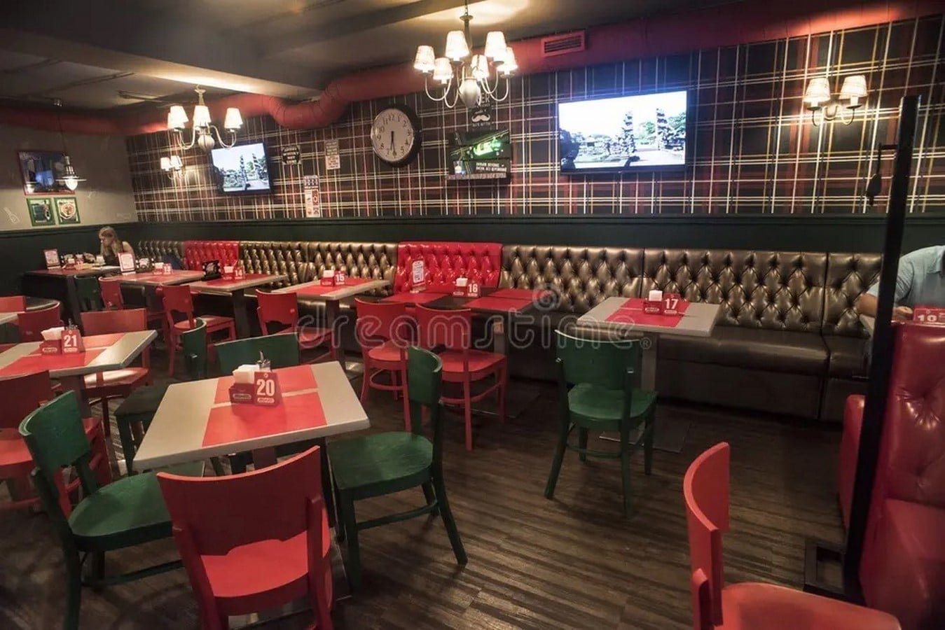
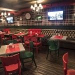
So why do many quick-service restaurants (QSRs), includingMcDonald’s, KFC, Pizza Hut, and Wendy’s predominantly feature red in their logos, branding and interiors?
Because red walls do work. They just don’t work have the same effect when the color is used on tableware.
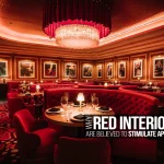
In 2025, a team led by Courtney Szocs published four experiments in the Journal of Consumer Psychology. The research found that, when the ambient color was red, i.e, the surroundings were painted / included red, it made both children and adult to significantly choose high-calorie, indulgent foods. The effect was observed consistently across lab studies, online experiements, and even in a school cafeteria.
Red is not the only color out there which influences people. There are many other colors too that does different other things to humans subconsciously.
This article explores how different colors influence the choices people make, the emotions they associate with spaces, and how these insights can be applied in interior design.
Why We Prefer Certain Colours in Interior Design
As the example of red shows, colours do not always produce the same response. How people react to a colour depends not only on the colour itself but also on where it is used, the experiences they associate with it, and the cultural meanings attached to it. Understanding these factors is essential when using colour in interior design.
One of the most widely accepted explanations for why people prefer certain colours is the Ecological Valence Theory, proposed by Stephen Palmer and Karen Schloss in 2010. The theory suggests that people tend to like colours they associate with positive experiences and dislike those linked to negative ones.
For example, blue is one of the world’s most preferred colours because it reminds many people of clear skies and clean water, often creating feelings of calm and comfort. These emotions in turn give a sense of security, safety and stability. Hence you can see it mostly used in banks. In contrast, dull olive tones are generally less preferred because they are more often associated with decay or other unpleasant natural experiences.
The researchers found that these associations explained nearly 80% of the differences in people’s colour preferences, showing that our experiences play a major role in how we perceive colour.
For architects and interior designers, this means there is no single colour palette that guarantees the same response in every project. A colour’s impact depends on the people using the space, its purpose, and the cultural context.
For example, white is often associated with cleanliness and simplicity in hospitals, but in many parts of South and East Asia it is traditionally linked to mourning. Likewise, red can encourage people to choose more indulgent foods when used in restaurant interiors, yet reduce consumption when used on plates or cups.
Rather than relying on generic colour psychology charts, architects and interior designers should use colour as a design tool rather than a universal formula. The most effective colour palettes are those that respond to the building’s function, its users, and the cultural context, creating spaces that feel appropriate, meaningful, and memorable.
Using Colour in Interior Design to Change Spatial Perception
Designers often use lighter colours to make interiors feel larger and darker colours to create a greater sense of enclosure.
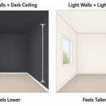
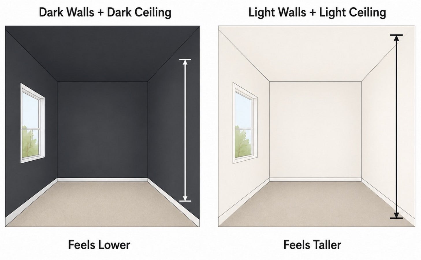
A common recommendation is to paint ceilings lighter than the walls to make a room appear taller. While this advice is widespread, a 2011 study by Daniel Oberfeld and Heiko Hecht found that the brightness of both the ceiling and the walls has a greater impact on how tall a room feels. Their experiments showed that a light ceiling combined with light-coloured walls creates a stronger impression of height.
Conversely, darker ceilings and walls reduce the perceived height of a space, creating a more enclosed and intimate atmosphere.
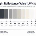
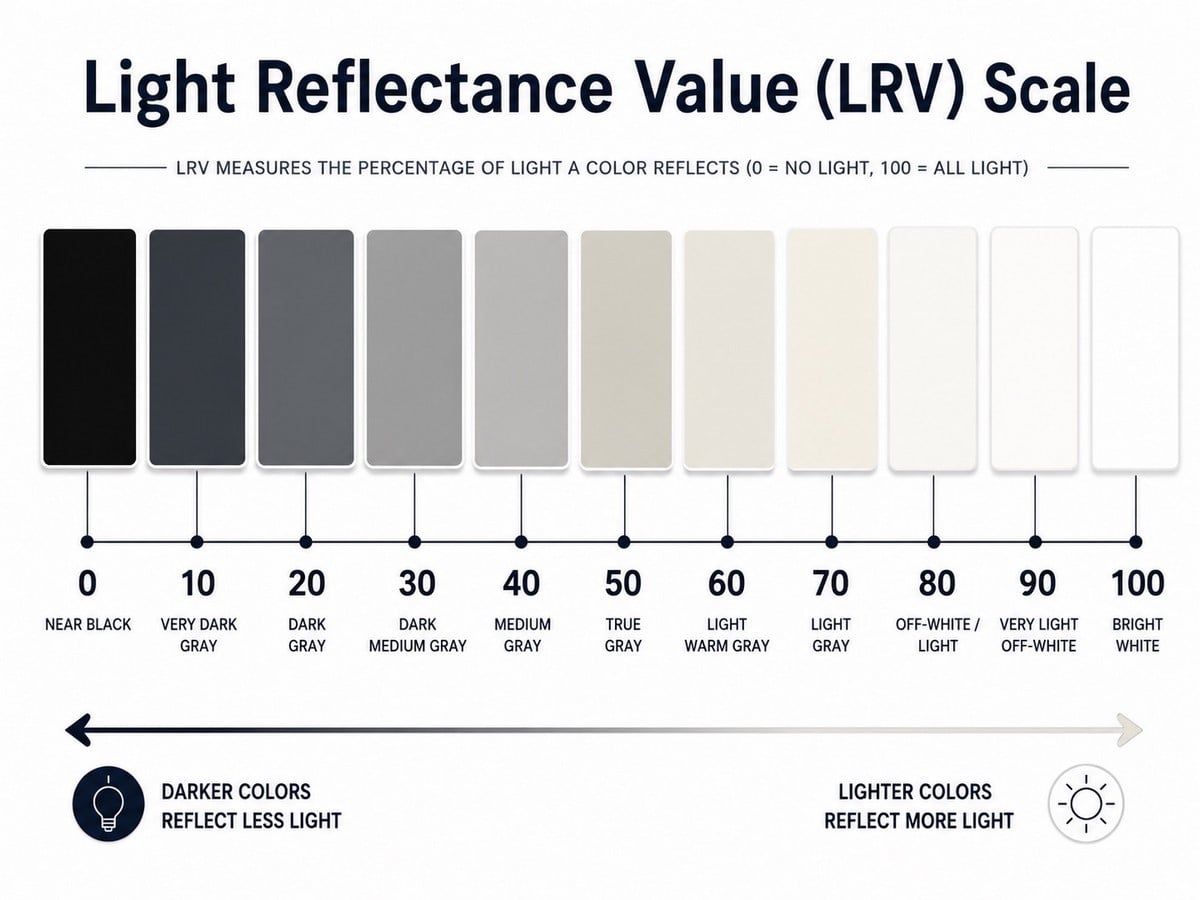
To apply this in practice, architects and interior designers often use Light Reflectance Value (LRV). LRV measures how much light a colour reflects, using a scale from 0 to 100. Colours with a high LRV (above 70 ) reflect light, and make interiors feel brighter and more spacious, while colours with a low LRV(below 30) absorb light, and create a darker, more intimate atmosphere.

| Note: Values between 50 and 70 are commonly used for primary wall finishes because they balance brightness with depth. Finishes below 20 are typically best reserved for accents or spaces where a darker atmosphere is intentional. |
Unlike paint names, which vary widely between manufacturers, LRV provides an objective way to compare colours. Referring to this value during specification allows designers to predict how a colour will perform in a space instead of solely relying on appearance under showroom lighting.
Using Colour Palettes in Interior Design
By combining colours in different ways, architects and interior designers can create contrast, establish hierarchy, improve wayfinding, or evoke a specific atmosphere.
-
Complementary Colour Palettes
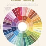
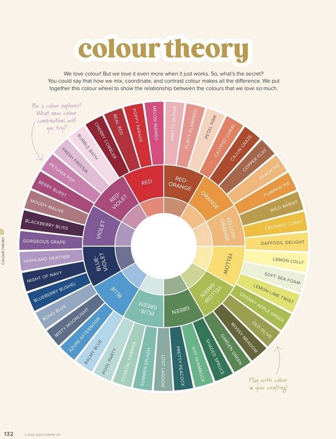
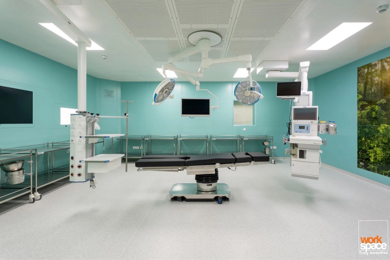
Complementary palettes combine colours that sit opposite each other on the colour wheel. Their strong contrast naturally draws attention, making them ideal for highlighting feature walls, entrances, reception desks, or statement furniture. Because of their visual intensity, they are most effective when used as accents instead of painting the whole room.
A well-known example is the operating theatre. In 1914, American surgeon Harry Sherman introduced green operating rooms after recognising that white interiors created excessive glare under surgical lighting. Green, which sits opposite red on the colour wheel, helped reduce visual fatigue caused by prolonged exposure to blood and improved the visibility of fine details. This principle continues to influence the design of operating theatres today.
2. Analogous Colour Palettes
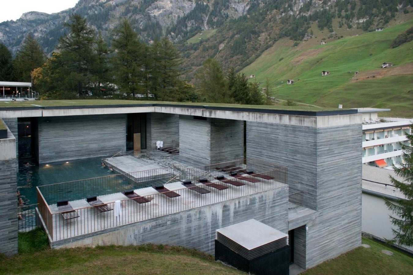
Analogous palettes combine neighbouring colours on the colour wheel, creating a smooth and cohesive appearance. Since there is little contrast between the colours, they help create calm and relaxing environments, making them suitable for bedrooms, spas, wellness centres, and hospitality interiors.
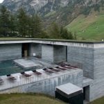
Peter Zumthor’s Therme Vals demonstrates this approach through a restrained palette of grey-green tones, where variations in light, water, and material create visual interest.
3. Monochromatic Colour Palettes
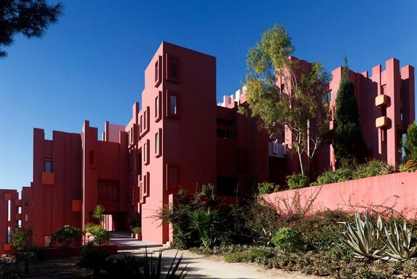
Monochromatic palettes use different shades, tints, and tones of a single colour. Since there is no contrast between different hues, the design relies on texture, materials, lighting, and shadow to create depth. When used carefully, monochromatic palettes produce interiors that feel unified and visually refined.
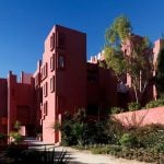
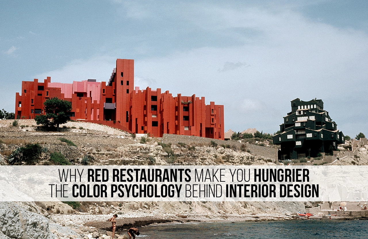
Ricardo Bofill’s La Muralla Roja uses variations of red and pink throughout much of the complex while introducing blue in circulation spaces to distinguish them from residential areas.
4. Triadic Colour Palettes
Triadic palettes combine three colours that are evenly spaced on the colour wheel. They create vibrant and balanced interiors but require careful proportioning to avoid overwhelming the space. A common guideline is the 60-30-10 rule, where approximately 60% of the visible surfaces use the dominant colour, 30% use a secondary colour, and the remaining 10% are reserved for accent colours.
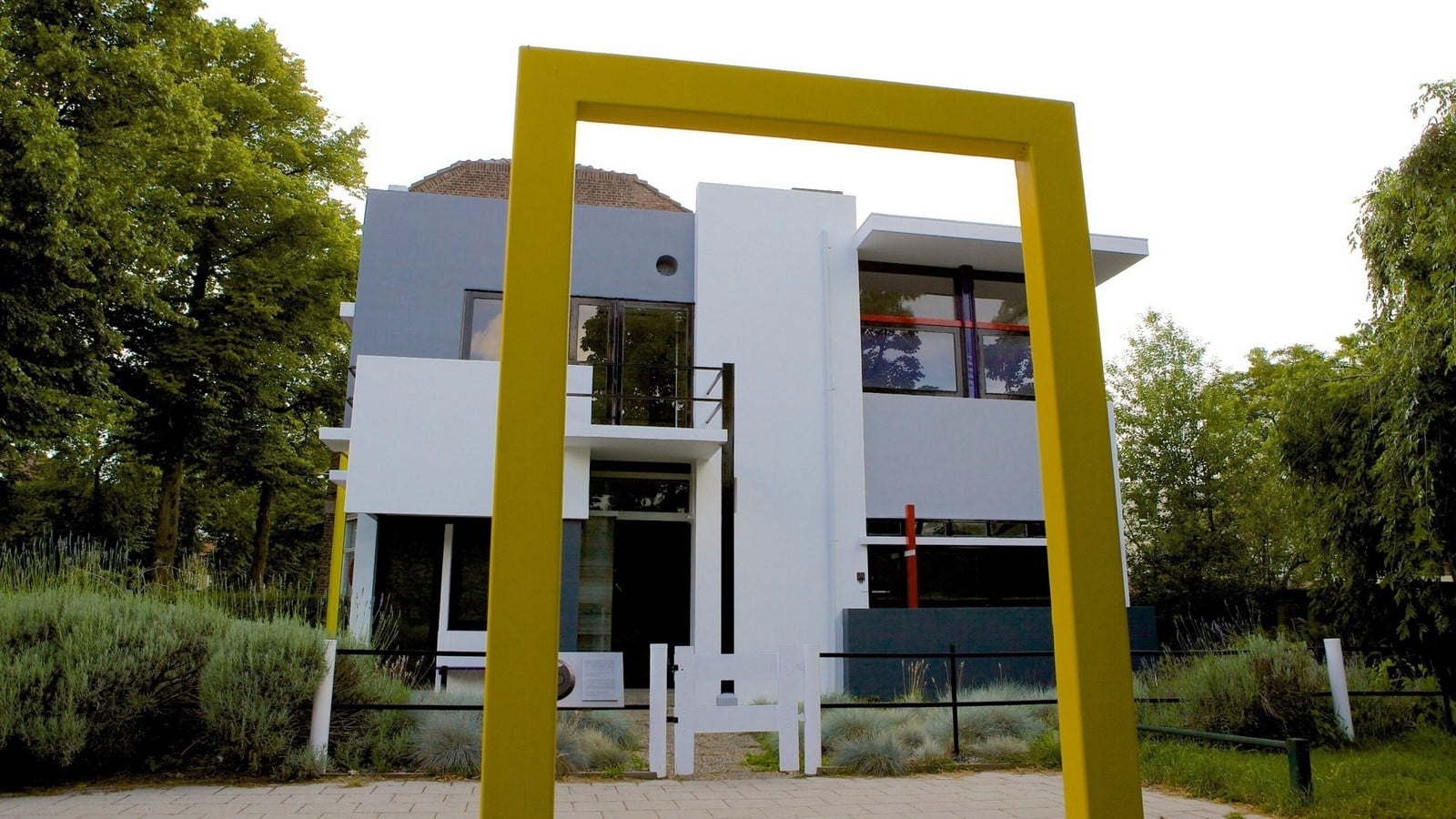
The Rietveld Schröder House in Utrecht is a well-known example of a triadic palette, using red, yellow, and blue to define architectural planes and reinforce the building’s spatial composition.
Using Colour to Define Different Spaces
Colour can help organise spaces based on how they are used. Different activities require different environments, and subtle colour choices can reinforce their purpose.
For spaces that demand concentration and attention to detail, such as quality control areas, proofreading rooms, or focused workspaces, red accents can help support alertness. In contrast, blue and green tones are often better suited to brainstorming rooms, design studios, or collaborative spaces where creativity and open thinking are encouraged. This approach is supported by a 2009 study by Ravi Mehta and Rui Zhu, which found that red improved performance on detail-oriented tasks, while blue encouraged more creative thinking.
However, colour should not be expected to solve every design challenge. Warm colours may make a room feel psychologically warmer and cool colours may make it feel fresher, but they do not significantly change the actual temperature of a space.
Thermal comfort should always be achieved through ventilation, insulation, daylight, and HVAC design, with colour used only to influence perception.
Beyond Paint: Materials, Undertones, and Finish
Paint is only one part of a colour palette. Materials, undertones, and surface finishes all influence how colour is experienced within a space.
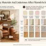
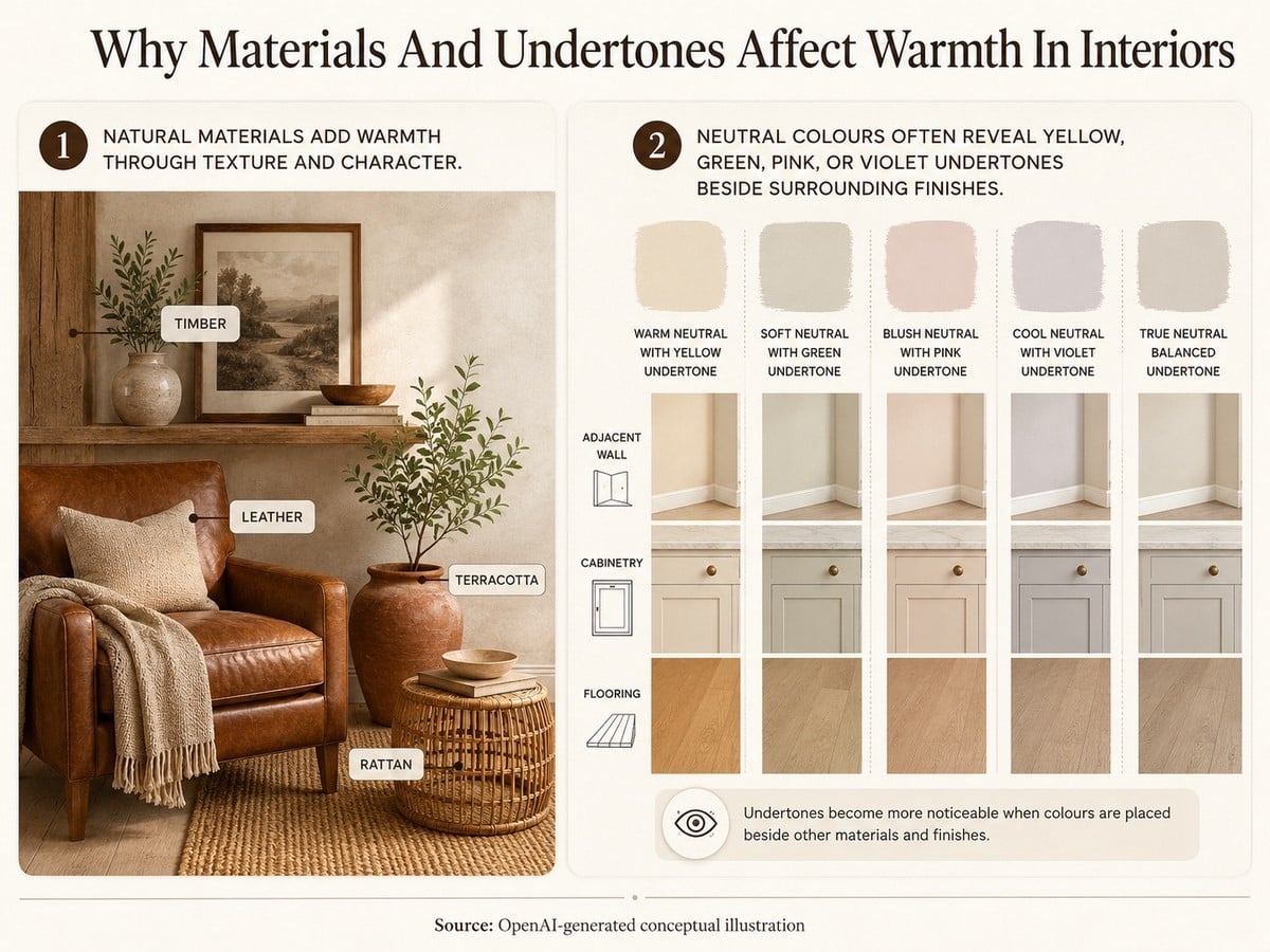
Natural materials such as timber, leather, terracotta, and rattan often create a greater sense of warmth than paint alone because their texture and character add depth to the interior. Similarly, neutral colours are rarely truly neutral. Most contain subtle undertones of yellow, green, pink, or violet, which can become noticeable when placed next to flooring, cabinetry, or adjacent walls.
The choice of finish also affects the final appearance of a colour. Matte finishes absorb and soften light, producing a more consistent look, while satin and semi-gloss finishes reflect more light, making colours appear brighter and highlighting both surrounding colours and surface imperfections.
Considering these factors during material and finish selection helps ensure that the final interior performs as intended, not just on a paint sample but in the completed space.
Specify Colour and Light Together
Colour should never be selected in isolation. The same paint can look completely different depending on the amount, direction, and colour of light in a space. Natural daylight, artificial lighting, and even the time of day influence how colours are perceived.
For this reason, architects and interior designers should evaluate colour and lighting together rather than treating them as separate decisions. Large paint samples should always be tested on the actual walls, under the lighting conditions in which the space will be used. A colour that appears neutral in a showroom may look warmer, cooler, lighter, or darker once installed.
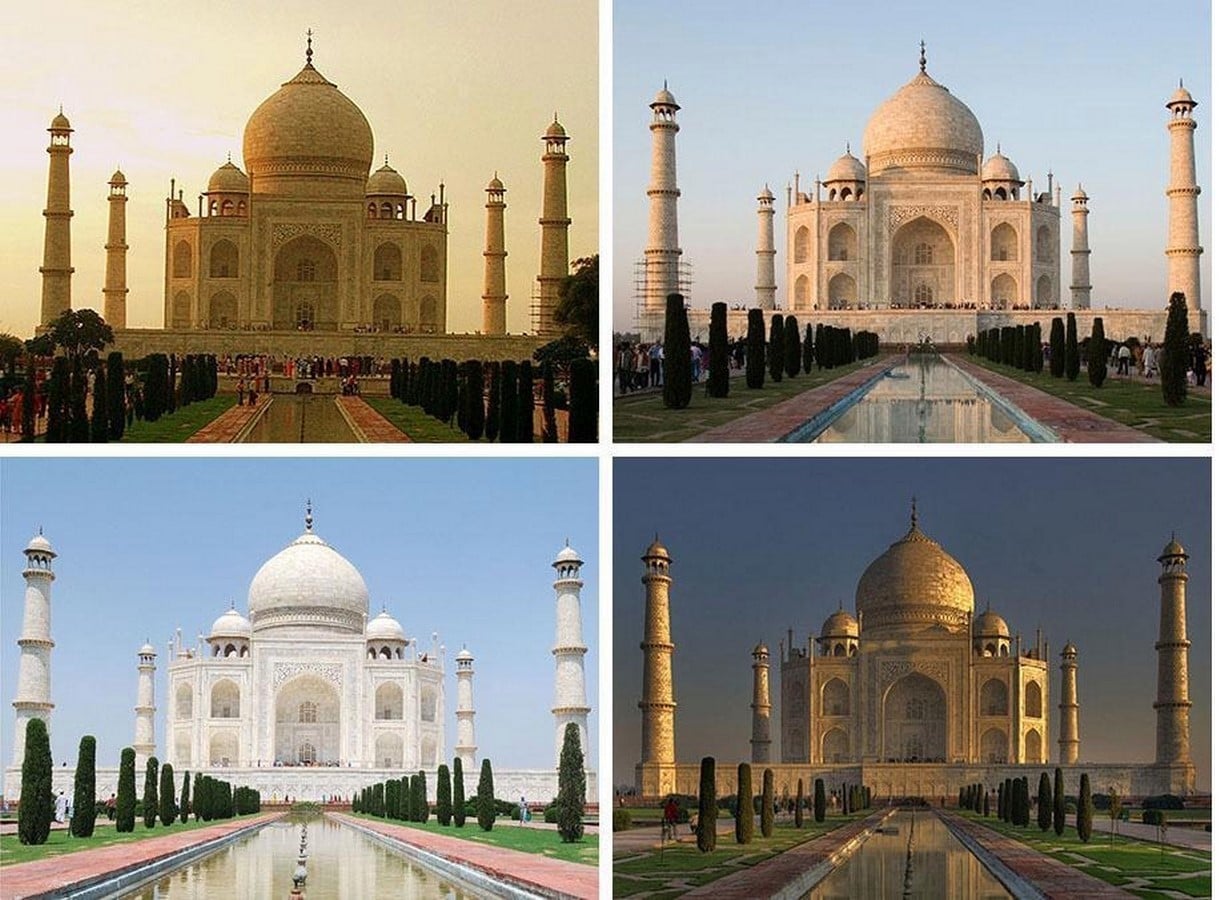
The Taj Mahal is a well-known example of this effect. Built from a single type of white marble, it appears pink at sunrise, bright white during the day, and golden at sunset. The material does not change, but the light falling on it changes.
The same principle applies to interior spaces. Colour does not work alone; its impact depends on the surrounding light, materials, and context. The opening example of the red restaurant illustrates this perfectly. The colour itself does not make people hungry. Instead, it shapes expectations and influences how people experience the space.
Ultimately, successful interior design is not about choosing the “right” colour. It is about selecting colours that support the purpose of the space, respond to its users, and work harmoniously with light and materials.
Good interior design is making a claim that the room can back up.
References:
- Genschow, O., Reutner, L. and Wänke, M. (2012). The color red reduces snack food and soft drink intake. Appetite, 58(2), pp.699–702. doi:10.1016/j.appet.2011.12.023.
- Szocs, C., Abell, A., Ruzeviciute, R., Kim, Y. and Biswas, D. (2024). Contextual effects of color on food choices: Red ambient color induces indulgence. Journal of Consumer Psychology, [online] 35(4), pp.602–616. doi:10.1002/jcpy.1445.
- Palmer, S.E. and Schloss, K.B. (2010). An ecological valence theory of human color preference. Proceedings of the National Academy of Sciences, [online] 107(19), pp.8877–8882. doi:10.1073/pnas.0906172107.
- Oberfeld, D. and Hecht, H. (2011). Fashion Versus Perception: The Impact of Surface Lightness on the Perceived Dimensions of Interior Space. Human Factors: The Journal of the Human Factors and Ergonomics Society, 53(3), pp.284–298. doi:10.1177/0018720811407331.
- Matchthatpaint.com. (2026). LRV Explained: What Light Reflectance Value Means for Paint | MatchThatPaint. [online] Available at: https://matchthatpaint.com/guides/lrv-explained/ [Accessed 26 July 2026].