In the world of design, the intangible aspects of life are often reflected through spaces. The Devil Wears Prada, directed by David Frankel in 2006, beautifully captures this idea through proper spatial planning, lighting that reflects the hierarchy of the characters. For architects and designers, it gives the idea of how a design and form of space guide the emotion on the screen.
The film shows the transformative journey of a journalist, Andy, at a fashion magazine, through the design of spaces she inhabits. It shows how the power of architecture and the spatial arrangement of spaces reflect the character’s change of lifestyle. Every small detail, from proper geometry in the office to the bold lighting in the runway, plays a role in shaping the film. The interplay of lighting, materials, and proportion allows viewers to experience the narrative visually.
City As Character
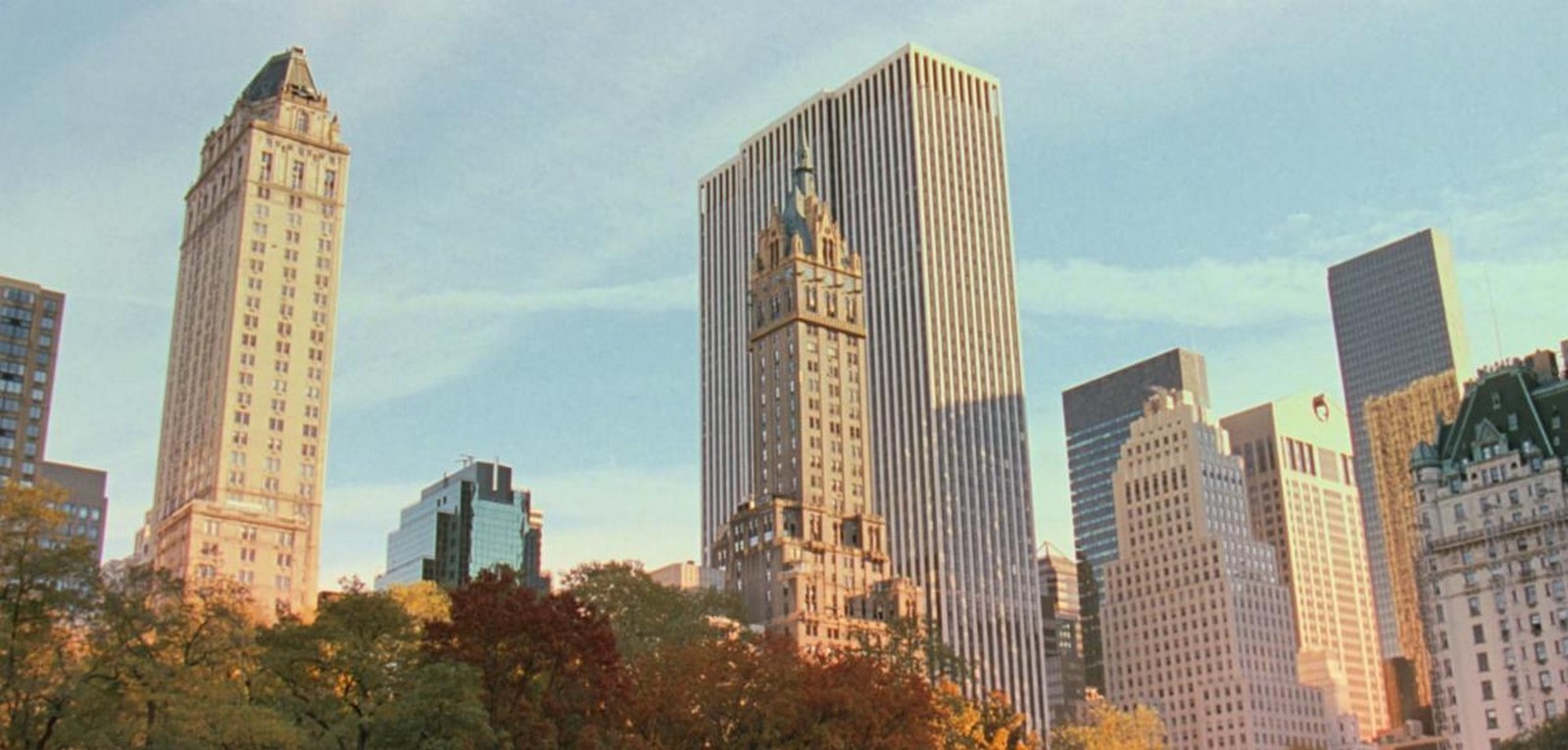
The film is shot in New York City, which itself brings out the character that shapes the story, reflects the working culture, and mirrors the ambitions of the people who inhabit it. The vertical skyscrapers and urban movement symbolize power, hierarchy, and ambition. The high-end shops on the bustling streets contribute to the theme that showcases a constant effort to stand out. The large glass-faced office buildings, open plans, and streetscape show the spirit of city work life. The cityscape of New York perfectly blends in with the film’s narrative. The city’s skyline not only acts as a backdrop but as an important feature that reflects the energy and chasing ambition portrayed in the film.
Personal Space
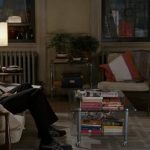
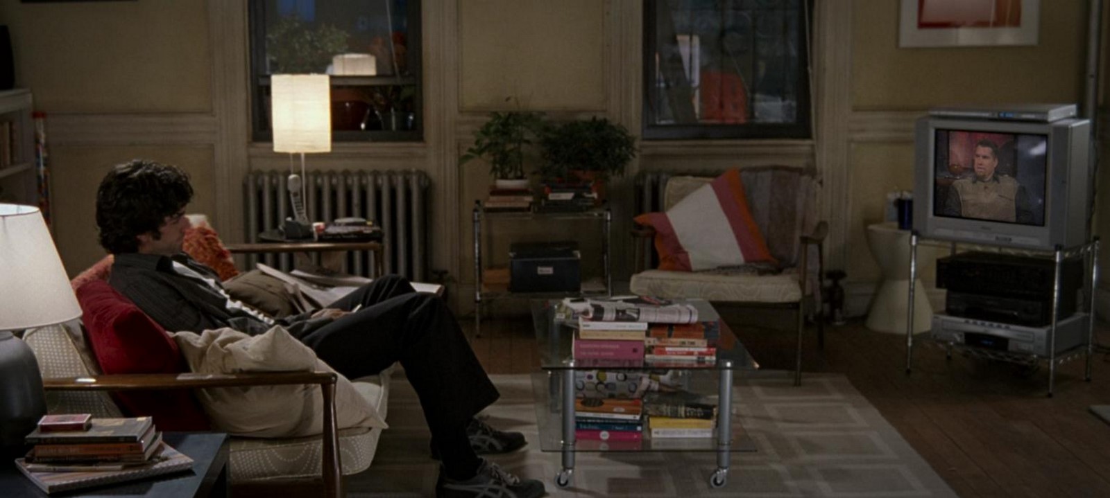
Andy’s apartment architecturally reflects how she inhabits it. The room is small and compact, with no such high-end furniture or aesthetic appeal. The materials and spatial arrangement of the room show practicality over luxury. It defines the character and struggling phase of every young professional in New York. The neutral tones of the interior reflect the grounded nature of the character. Small window openings and a warm artificial light create an intimate and homely environment. The compact layout and furnishings also reflect her focus on functionality. Overall, these elements not only portray the simplicity of her living but also demonstrate the struggling phase of the character’s early career.
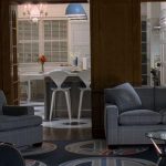
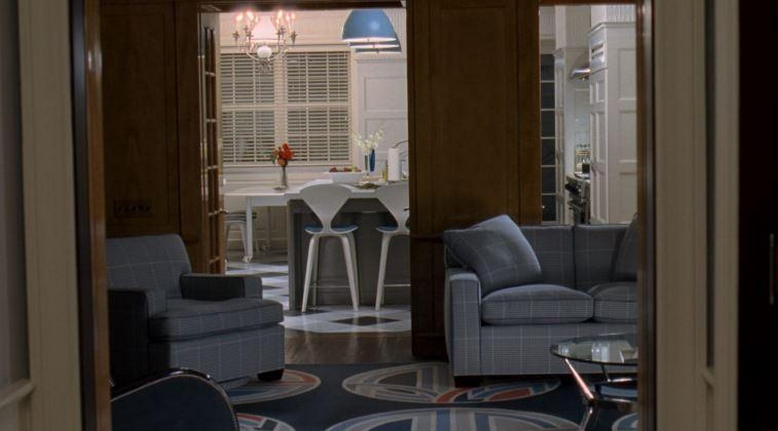
Whereas the editor-in-chief, Miranda, has a house that reflects sophisticated, modern design. The furniture is well-proportioned and thoughtfully laid out. The materials are high-end and aesthetically pleasing, which describes Miranda’s nature of seeking perfection in everything. The spatial planning of space leads from one room to another with precise alignment, emphasizing her authoritative character. The paneled wooden walls and geometric-patterned rugs reflect elegance. Clean lines, symmetry, and layered lighting give a sense of control.
Office Hierarchy And Space Planning
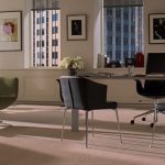
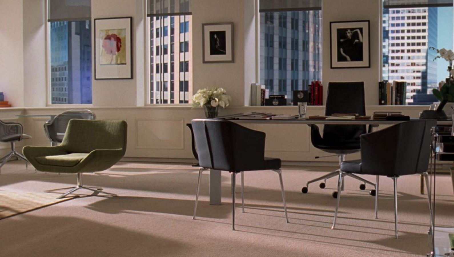
The spatial planning at the Runway magazine office shows the hierarchy and power of the characters through the space they inhabit. The editor-in-chief’s office showcases modern, sophisticated interior style with high-quality furnishing, large windows for an ample amount of natural light that offer a view of the skyscrapers of New York City. It also links her with the scale of the high-rise itself. The office is strategically placed at the end of the corridor, showing a sense of authority and hierarchy among others. This office space looks quieter, refined, and visually controlled, showing her dominance in the office. It’d design shows precision and elegance. The color palette is neutral yet commanding.
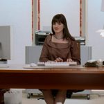
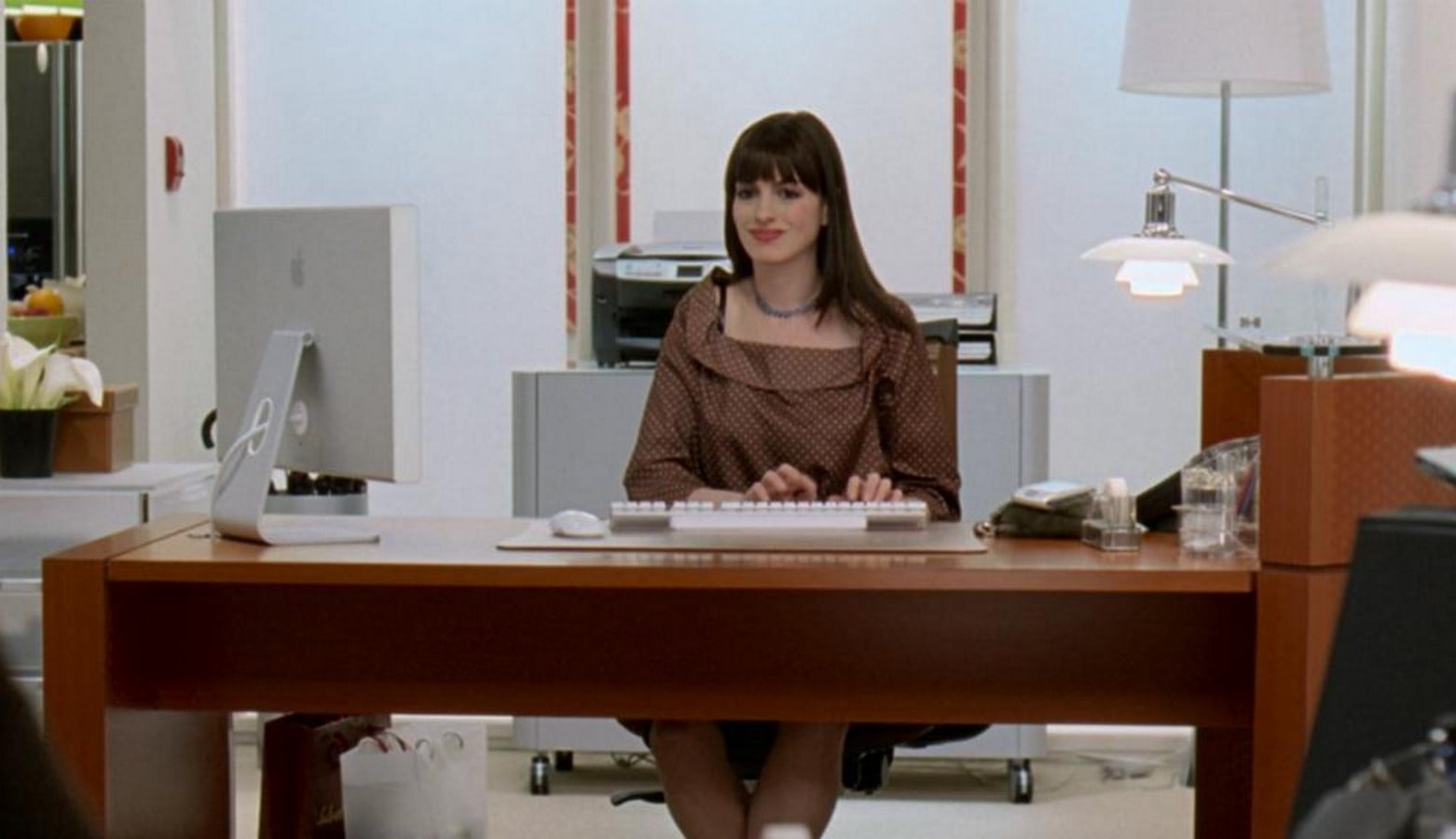
In contrast, Andy’s workspace is comparatively small with only a desk and a chair, reflecting her position in the office. The furniture is not of high quality, and the space is confined. The rectilinear geometry of the desk shows discipline and a structured workspace for employees in the office. Instead of being placed in a separate room, the workstation is positioned openly within the office space, which portrays the hierarchy of office spaces. This shows how a simple layout and design of space can reflect one’s role and identity in the office.
Overall, The Devil Wears Prada demonstrates how the architecture and spatial planning of a space are not only the backdrop of the film, but help to display the character’s nature and lifestyle. From the cityscape to the apartments, every layout, material, and lighting plays a crucial role in guiding the viewers to perceive the character’s journey. Spaces are not just functional; they carry narrative, emotions, and character. Every design tells a story about how an individual experiences it. The film invites the designers to see beyond aesthetics and how spaces can define character and feelings.
References:
The devil wears prada (film) (no date) Wikipedia. Available at:https://en.wikipedia.org/wiki/The_Devil_Wears_Prada_(film) (Accessed: 10 October 2025).
The devil wears prada (2006) Strem.io. Available at: : https://www.strem.io/s/movie/the-devil-wears-prada-0458352 (Accessed: 10 October 2025).