


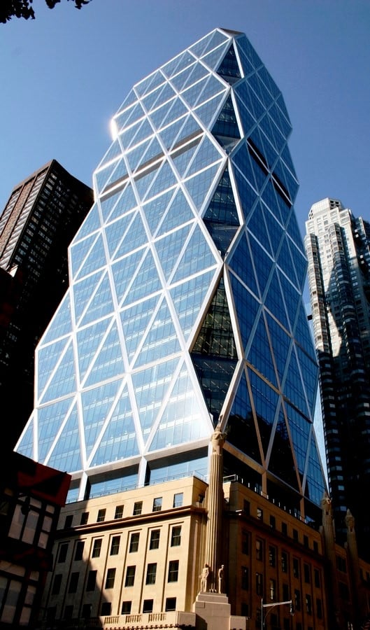
A building whose cleaning mechanism costs $3 million, can be green in many ways. A testimony to this is the Hearst Tower, a massive 46 story building with an unusual combination of stone cast base building, 6 stories high, and a 40-story high glass and steel framed diagrid giant on top. The building was designed by Sir Norman Foster and constructed by Turner constructions for $500 million. The original base of the tower designed by Joseph Urban and George B’s post and sons has been preserved as a landmark and the new tower added on top has been built 80 years after it was put off due to the great depression. The building houses all the offices of Hearst Corporation like cosmopolitan, Marie Claire, Harper’s Bazaar, Esquire, etc. making it the world headquarters of the conglomerate.
What makes Hearst Tower special?

Apart from the jagged glass facade that makes it looks space-aged and its renowned architect panel, the building is said to be one of the greenest skyscrapers in the world. Its integration of user-friendly design and low energy consumption rate is so seamless, that it makes the building’s design a success both economically and statistically.
Green aspects of the building
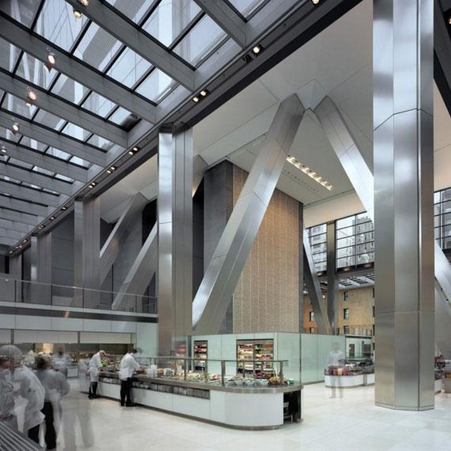
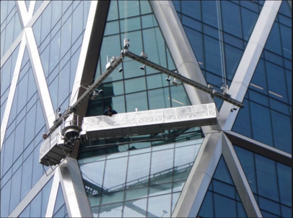
To start with, the building’s exoskeleton, the steel frame is 85% recycled material and the building as a whole uses 26% less energy than the minimum standards for New York. The building uses radiant cooling systems which uses polyethylene pipes running beneath the floors that use recycled rainwater collected from the roof that is sent to the basement and is also used to water the plants and the staggering water sculpture in the atrium called the ‘Icefall’ with a backdrop of ‘Riverline’s’, a 21m fresco painting by Richard Long. The water sculpture is another means to cool the temperature in and around the atrium creating a microclimate and helping in cutting down on the mechanical cooling systems. The fact that the building is LEED-certified can be proven by another design aspect in the atrium, the heat conductive flooring material and the open plan of the atrium that lets in enough light during the day, cutting off the requirement of any mechanical means and as night falls the light sensors on the ceiling activates the mechanical ones appropriately.
Offices and other facilities
The internal plaza is a ten storey atrium space and café whose shell is the original masonry facade with its windows. The old Hearst employees have claimed to feel the same connection they had with the old base building because of these windows. Apart from the magazine and corporate offices the building also houses a modern broadcast studio, a lavish fitness center, a 340 seater corporate café, an executive corporate and dining center, a photography center, a 168 seat theatre, a ‘Good Housekeeping’ research facility’ and other exhibition spaces, all housed in the 856,000ft² office space.
Structural aspects
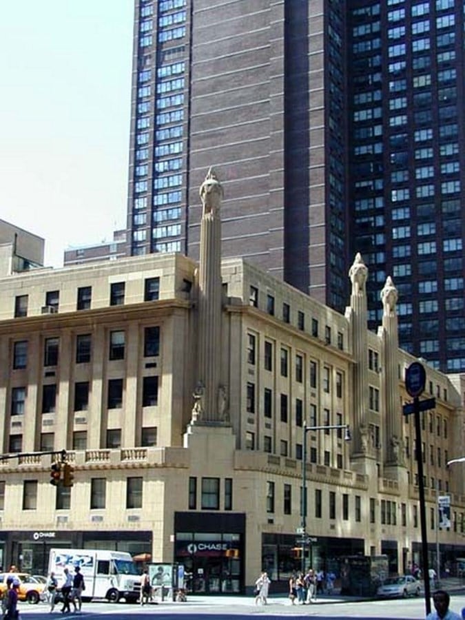
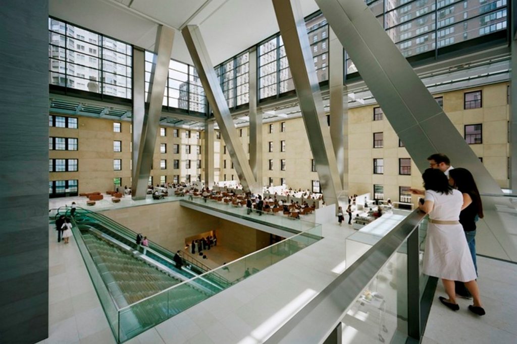
The tower rests on top of the 40,000 sq.ft plinth base of the old building. Then retro columns, balustrades and, the other historic elements of the masonry base were preserved and worked on while improvising the new tower that represented a link between the old and the new.
As this transition from the base building happens through a glass skirt between the two pieces of the puzzle, light floods the lower part making it look like a glass balloon lifting the base effortlessly.
The cut edges of the jagged facade are named the ‘birds mouth’ because of its resemblance to the bird. The building at its inception was intended to be of Art Deco style, but after the long haul of almost 80 years, the designers met their nemesis, time, and all the retrofitting they had to do to the original design that was named as the Magazine Building. The transition between the masonry construction and the steel-framed construction had to delicately handled for it to look seamless and almost invisible.
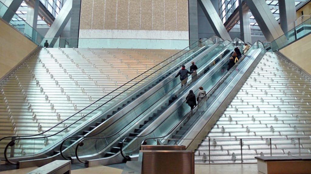
Some struggles end up having becoming beautiful creations if the right amount of thought and creativity is put into it. Proving this, the escalator that traverses through the water sculpture was one such struggle. The escalator was the transition from the base building to the tower and there was not enough space between the entrance of the building and the tower’s starting to place the escalator and hence its diagonal path which ended being a unique design along with the icefall. Another challenge was the design of yet another tower in new york city. Any architect would dream of erecting a superstructure marking its place in the skyline, but Hearst Tower was smaller than its counterparts and wouldn’t make the iconic New York skyline. Hence the Diagrid facade that made it visually distinctive and ended burning a hole through corporations pockets a little less in saving the construction and material cost.
A structure of this scale, in an iconic city such as New York, has to be out there in terms of technological advancements, socially normative, and must strive hard to not be an eyesore amongst the skyline. The Hearst tower checks every mark on the list and extends the list by also being an environmentally responsible hybrid giant.


