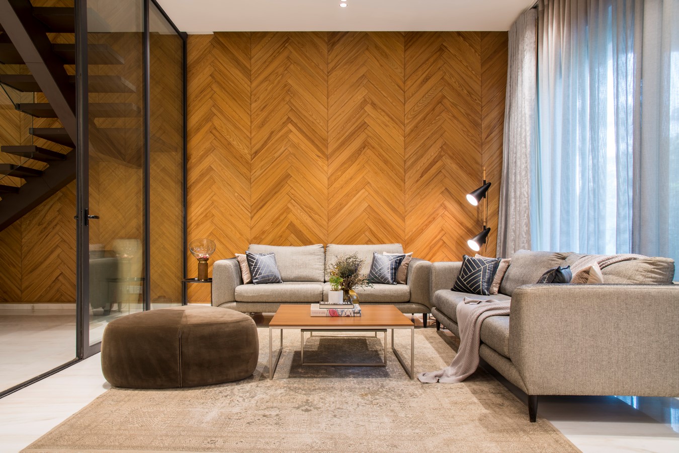
Colour is an essential aspect of architectural design, and it plays a vital role in defining the mood, character, and identity of a building. Colours have the power to evoke emotions, create visual interest, and impact the overall user experience. When used skillfully, colour schemes can enhance the beauty and functionality of a space, making it more inviting and inspiring. Gagandeep Kapila, the founder of Workshop for Metropolitan Architecture (WMA), seizes this opportunity to showcase how diverse color schemes can create a more captivating design, with playful nuances.
Project Name: The Future of Luxury Living Trends and Predictions for High-End Residential Design
Studio Name: Workshop for Metropolitan Architecture

Architects and designers use a variety of colour schemes to create harmonious and balanced designs. A colour scheme refers to the combination of colours used in a design, and it usually includes a primary, secondary, and tertiary colour. The primary colour is the dominant colour, while the secondary and tertiary colours are used to complement and contrast the primary colour.
One of the most common colour schemes used in architectural design is the monochromatic scheme, which involves using different shades and tones of a single colour. This creates a harmonious and subtle effect, and it works well in minimalist and modern designs. For example, an all-white building with shades of grey and black can create a sleek and sophisticated look, while an all-blue building with different shades can evoke a sense of calm and tranquillity.
Another popular colour scheme is the complementary scheme, which involves using two colours that are opposite each other on the colour wheel. This creates a high-contrast and vibrant effect, and it can be used to draw attention to specific elements of a building. For example, a building with a blue and orange colour scheme can create a dynamic and energetic feel, while a building with a red and green colour scheme can evoke a sense of balance and harmony.
The analogous colour scheme involves using colours that are adjacent to each other on the colour wheel. This creates a soft and subtle effect, and it can be used to create a warm and inviting atmosphere. For example, a building with a yellow, orange, and red colour scheme can create a cozy and welcoming feel, while a building with a blue and green colour scheme can evoke a sense of relaxation and serenity.
In addition to these traditional colour schemes, architects and designers also experiment with unconventional colour combinations to create unique and innovative designs. For example, pastel colours, metallic finishes, and bold patterns can add an unexpected and playful element to a space. These unconventional colour combinations can create a memorable and distinctive identity for a place and make it stand out in a crowded architectural landscape.
In conclusion, colour schemes play a critical role in elevating architectural design. They have the power to evoke emotions, create appealing sights, and impact the overall user experience. Whether it is a monochromatic, complementary, analogous, or unconventional colour scheme, architects and designers must carefully consider the colours they use to create a harmonious and balanced design that reflects the identity and purpose of the space.