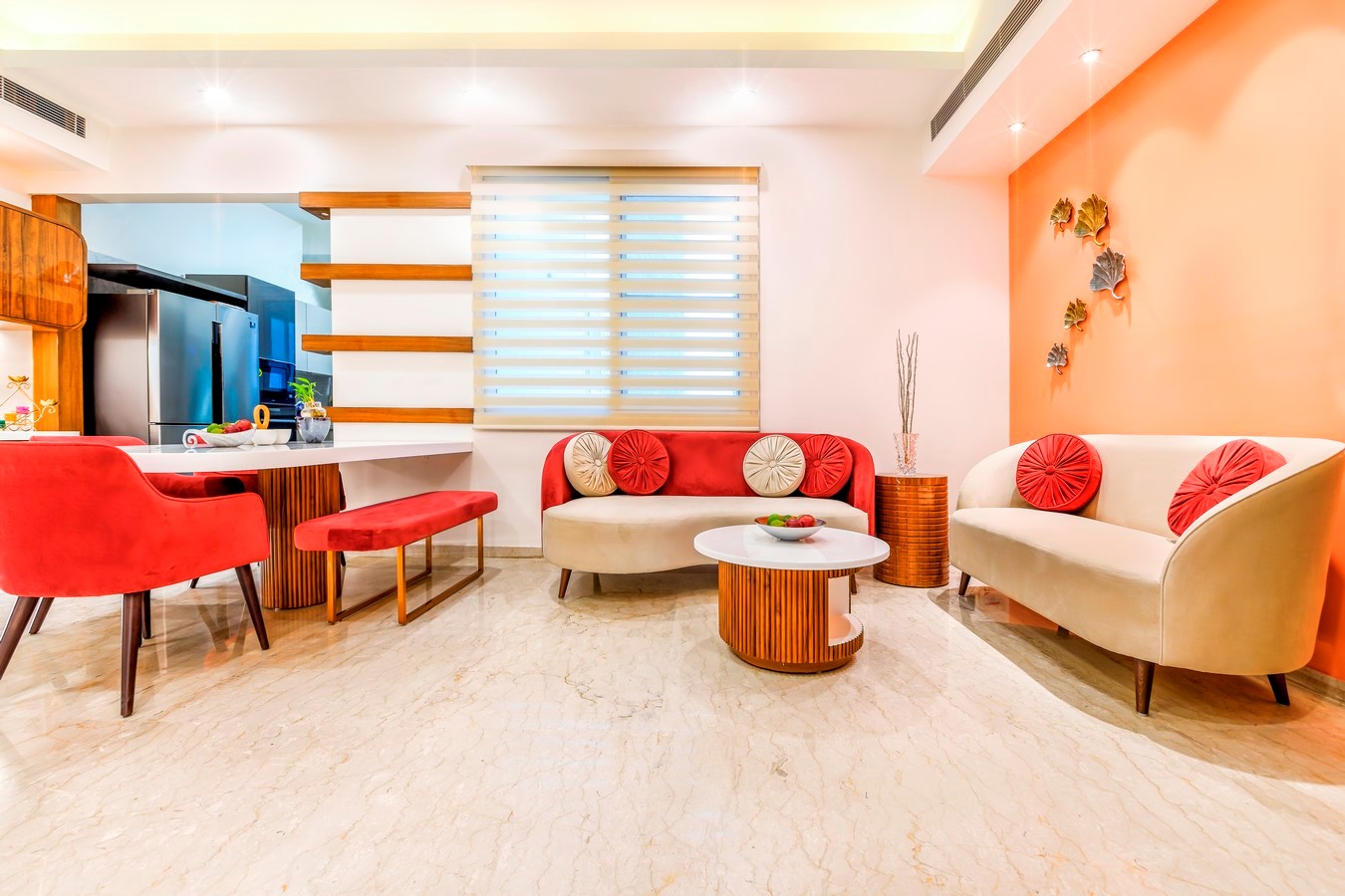
The design started with the scratch idea of using the PANTONE colour of the year 2019 ” Living Coral” as the starting point for the scheme. It is described by Pantone as an “animating and life-affirming coral hue with a golden undertone that energizes and enlivens with a softer edge”.
Residence at Prateek Edifice, Noida (Completion : January, 2020)
Client : Mr. Vineet Sehgal
Interior Design & Execution : Studio Meraki
Design Team : Shweta Kaw, Mujahid Saifi, Rochi, Hirokjyoti
Furniture : Home Ettu, Walnut Interiors, Paras Timber
Photography : Visuary
Client Brief :
The client brief for this apartment was not a very complicated or elaborate one as his main concerns were extremely simple and honest. The family looked for a house to be effortless, comforting, tranquil and non cluttered. There was no stress on any kind of over indulgence or opulence in any form and only a cheerful vibe and an up gradation in their overall quality of life was the sole expectation with the minimum amount of intervention in a restricted budget. The existing four bedroom apartment had an abundance of daylight and ventilation through huge fenestrations also enabling majestic views of the skyline due to its location on the seventeenth floor of the building. Hence, there was an enormous potential in the already well oriented, spacious, breezy and day lit house that made the design soar high in its value.
Concept Note :
“Sociable and spirited, the engaging nature of Pantone 16-1546 Living Coral welcomes and encourages lighthearted activity,” said the company.
This vibrant shade of golden orange is meant to reflect the “innate need for optimism and joyful pursuits” as a response to social media and digital technology. In reaction to the onslaught of digital technology and social media increasingly embedding into our daily life, there is a need to seek authentic and immersive experiences that enable connection and intimacy.
Hence the combination of blue and coral colours reflecting the underwater life were taken as the foremost brushes for this new canvas encompassing the soothing aura of nature to thrive in this minimalistic abode.
Design Process :
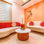
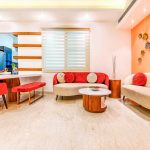
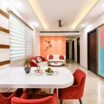
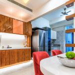
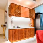
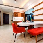
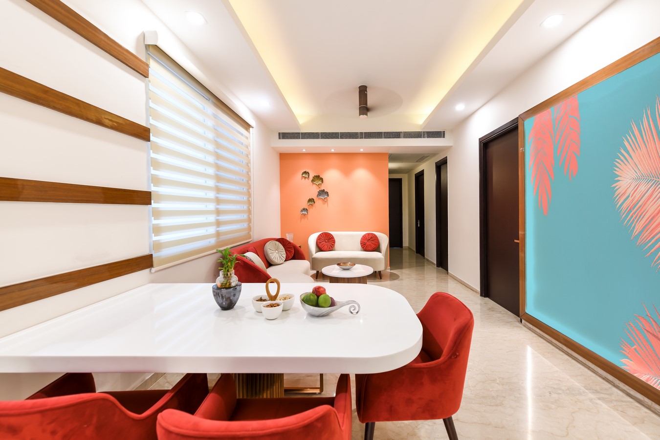
Translating this concept into the interior envelope started with focusing on the first visible wall from the entrance to be immersed in the soothing coral theme and then designing the overall furniture around it in softer & curvaceous forms with tones of beige and red in combination for the Dining and Lounge area. Planters used as screens and artwork further complemented the need for calming the mind and creating a refuge for oneself. Light blue undertones would enhance the coral theme and balance the scheme in the form of strokes of water colour depicting the sky and water in the form of a huge artwork on the adjacent complementary wall.
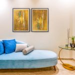
The Living Room is finished with an amalgamation of furniture in different shades of blue along with yellow hues on walls/paintings to enhance the warmth of the space as well as to create a vibrant atmosphere in the company of orange pendant lights. Acting in full support is an elegant wooden leaf shaped artwork along with a lotus flower shaped floor lamp in an attempt to bring in more adaptations of natural forms to have a positive psychological impact on human mind.
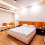
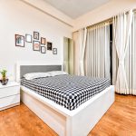
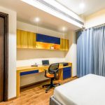
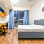
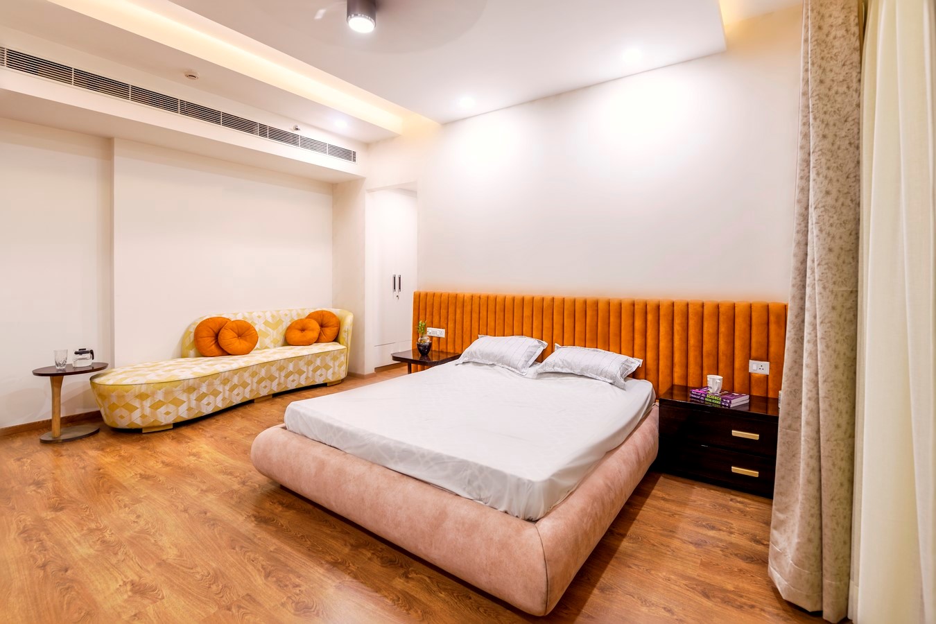
All the bedrooms are also in perfect harmony with wooden flooring, paired with colours like golden, blue, beige and white. The furniture design is carefully supple, smoothed, appealing to the eye with a sense of relief and contentment.