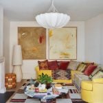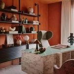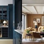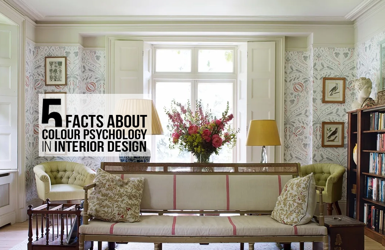
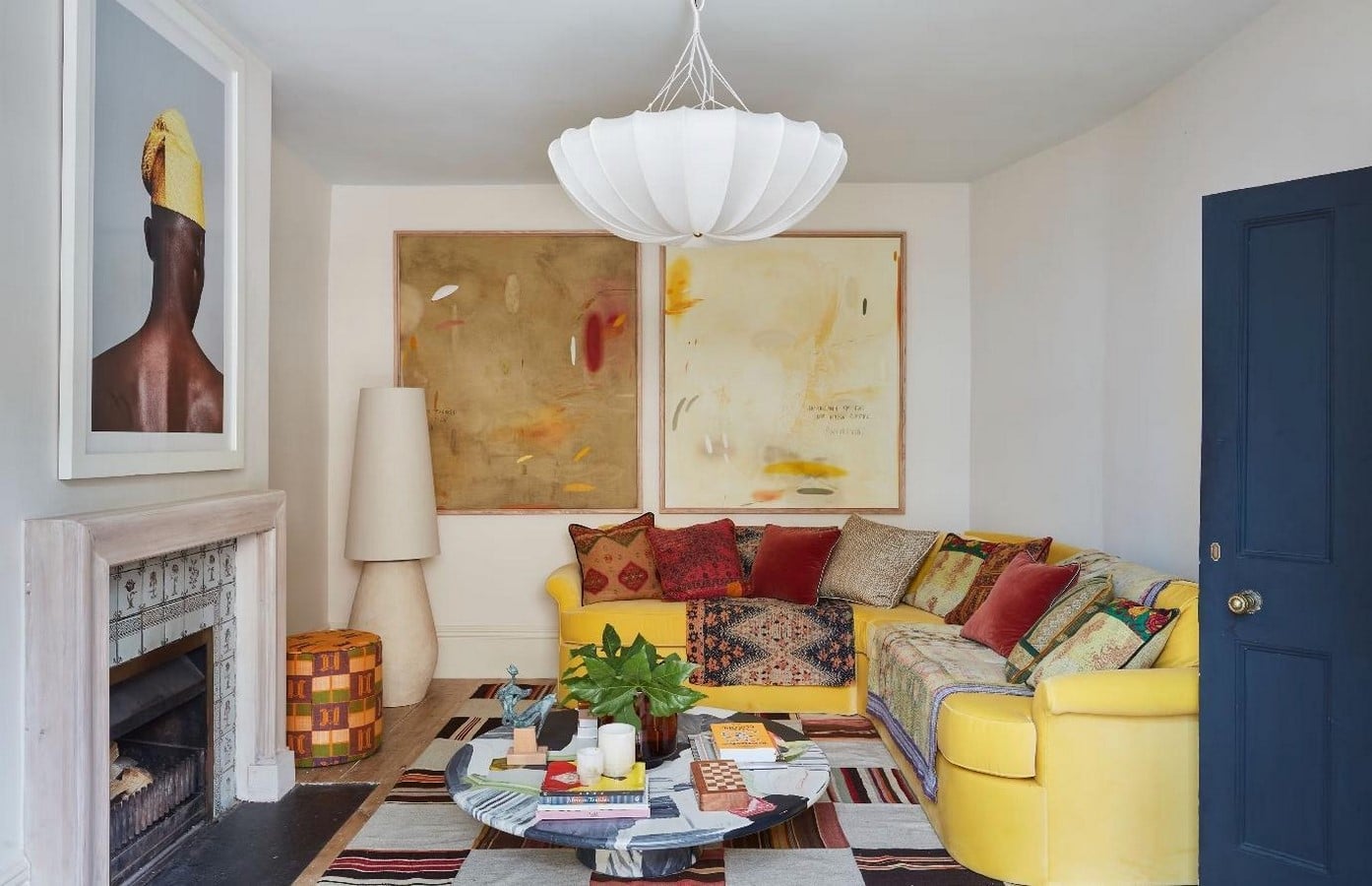
A room can change without anything in it moving. A blue wall can make the atmosphere feel quieter and more intimate, whereas a warm yellow can bring energy into an otherwise ordinary corner. Colour has always played a powerful, if often overlooked, role in interior design. It can make a ceiling appear higher or a corridor seem to stretch further than it actually does. What may look like a simple aesthetic choice can quietly influence how a room is experienced.
“Colours like features, follow the changes of the emotion” – Pablo Picasso.
Colour psychology in interior design explores how colour influences the way people perceive, experience, and respond to interior spaces. Beyond decoration, colour can affect the atmosphere of a room, alter perceptions of scale and temperature, and influence feelings such as calmness, energy, and comfort. As interiors become increasingly focused on wellbeing and user experience, understanding colour has become an important part of design decision-making. Thoughtful colour selection can therefore transform a space, creating environments that support specific emotional and functional needs.
Here are five facts that reveal just how much colour can change the way an interior is seen and felt.
-
Colour Temperature Shapes Our Perception of Space:
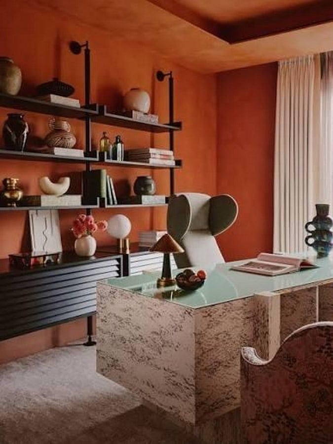
Warm hues such as reds, oranges, and yellows tend to visually advance towards the viewer, while cooler shades like blues, greens, and violets seem to recede, creating an impression of greater distance (Mahnke, 1996). The effect is rooted in the way the human eye responds to different wavelengths of light. Longer wavelengths associated with reds focus slightly behind the retina, while shorter blue wavelengths focus slightly in front of it, contributing to a subtle perception of proximity and depth (Küller et al., 2006).
For designers, this perceptual shift becomes a useful spatial tool. A small or windowless room can feel more open when dressed in cool tones, while a larger space can be made more intimate through a warmer palette. The approach is particularly evident in hospitality interiors, where restaurants often embrace warm palettes to draw spaces inward.
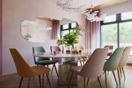
London-based Sophie Ashby and her practice, Studio Ashby, offer a contemporary example of this approach. Their interiors frequently layer rich, enveloping colours with tactile materials, allowing generously proportioned rooms to feel warm and lived-in rather than cavernous. Here, colour subtly reshapes how the space is experienced.
2. Blue Produces the Most Consistent Calming Effect
Among all hues studied in environmental psychology, blue demonstrates the most cross-culturally stable association with calmness. Research has linked blue environments to reduced heart rate and lowered blood pressure, effects that persist across differing cultural and demographic groups more reliably than almost any other colour (Küller et al., 2009; Elliot and Maier, 2014). This physiological consistency explains blue’s dominance in bedrooms, healthcare interiors, and wellness-oriented spaces, where a slowing of the autonomic nervous system is a design objective in itself.
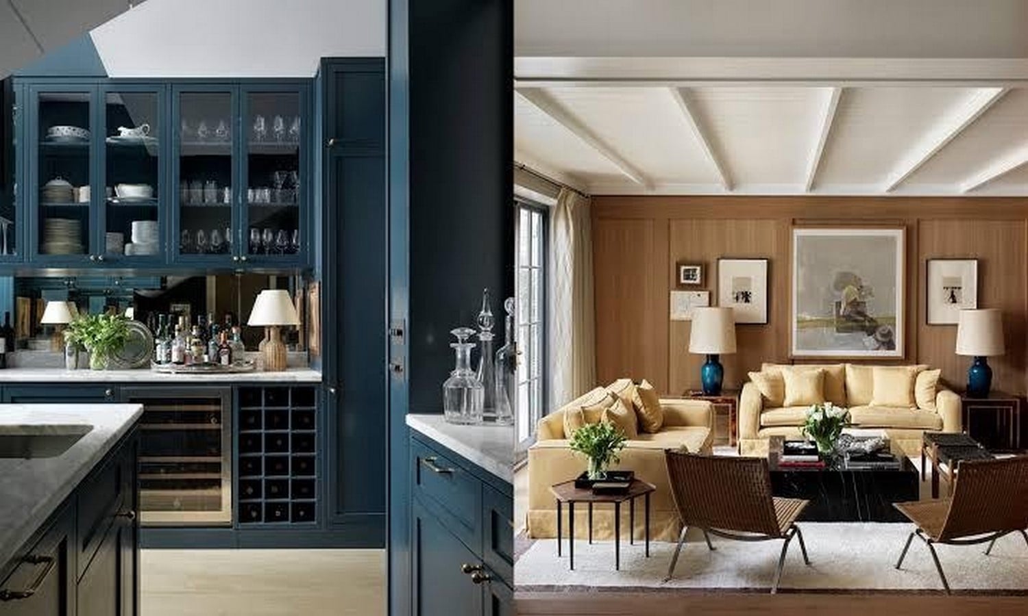
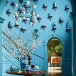
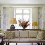
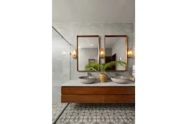
This is a notable departure from most colour associations, which are heavily culturally mediated. Blue’s calming effect appears to draw on a more fundamental, possibly evolutionary association with clear skies and clean water that transcends the symbolic overlays a given culture applies to other hues (Elliot and Maier, 2014). De Rosee Sa, known for restrained, tonal schemes built around soft blues, greys, and muted neutrals, exemplifies how a low-saturation palette can produce a serene atmosphere.
3. Red Energises the Space; Overdo Becomes Overwhelming
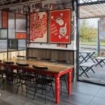
Few colours command attention as quickly as red. Its visual intensity is associated with heightened arousal, alertness and appetite, making it a natural choice for environments designed around food, energy and quick decision-making. The connection is particularly visible in fast-food branding, where chains such as McDonald’s, KFC and Wendy’s have long incorporated bold reds into their logos, signage and interiors. In restaurants, red can create a sense of immediacy and energy, making spaces feel lively and encouraging quicker movement through high-volume dining environments (Singh, 2006).
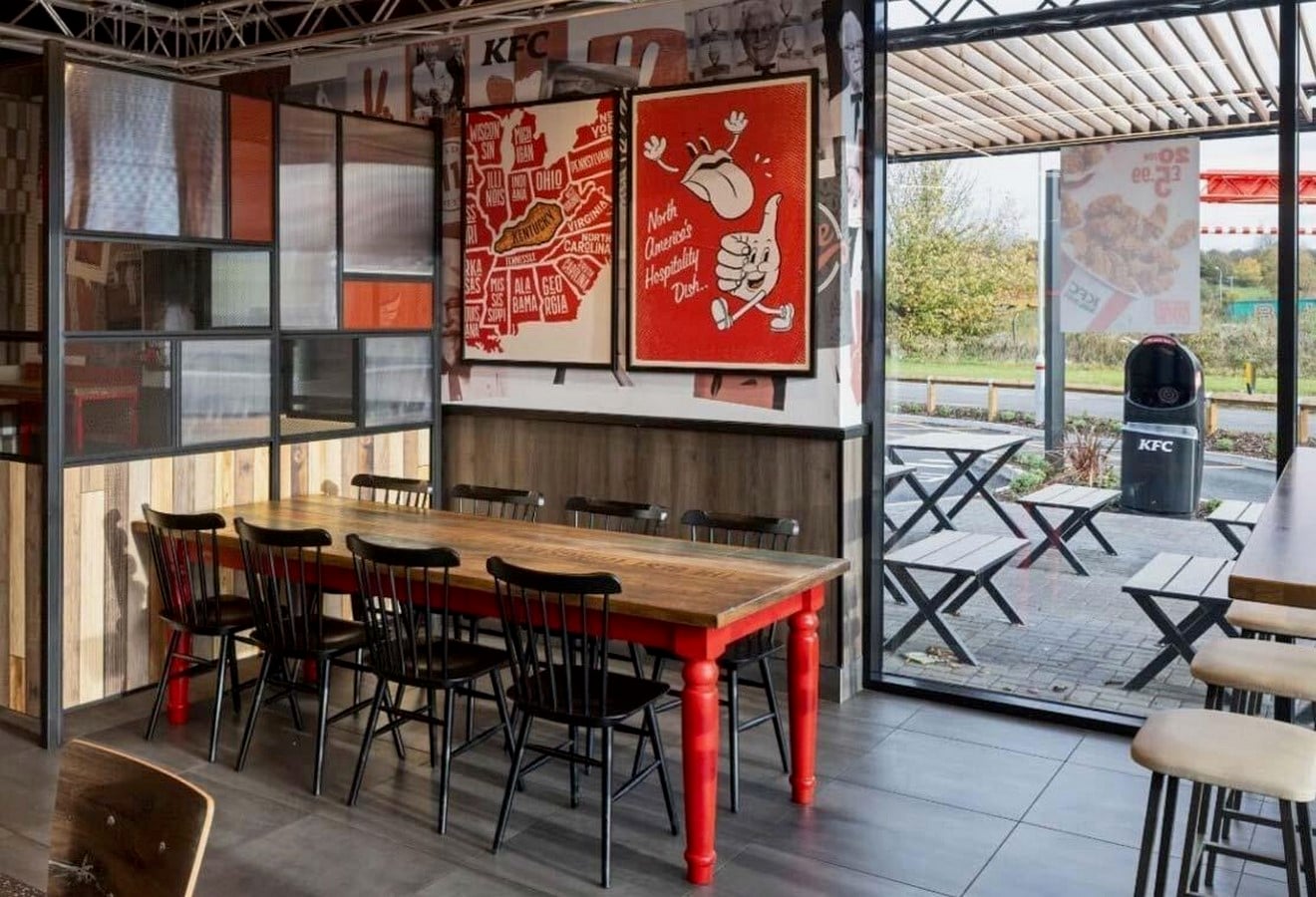
But the same intensity that makes red effective can become tiring when experienced for too long. Research into colour and arousal suggests that prolonged exposure to highly saturated red environments may contribute to feelings of tension and anxiety, making it less suitable as a dominant colour in spaces intended for prolonged occupancy (Elliot and Maier, 2014).
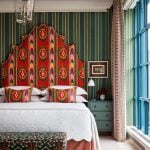
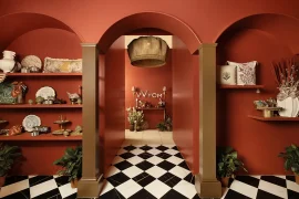
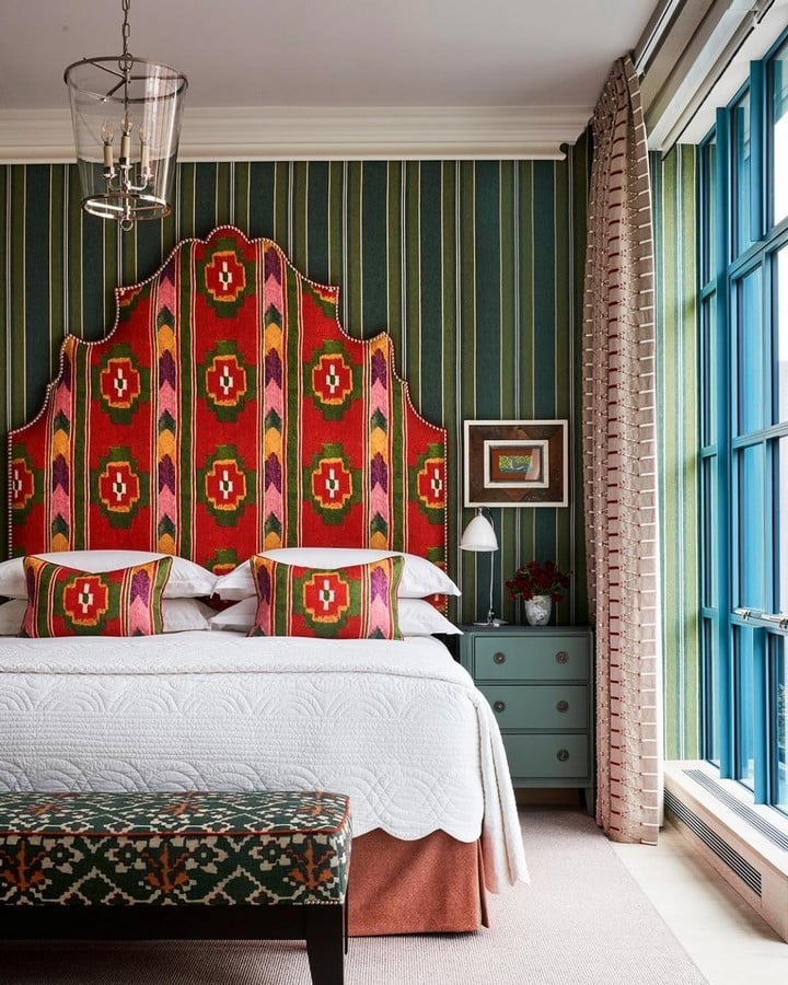
Interior designers therefore tend to use red strategically rather than continuously. A crimson armchair, patterned curtain, artwork or feature wall can inject energy into a room without allowing the colour to overwhelm the entire environment. This approach is evident in the work of Kit Kemp Design Studio, where saturated reds, pinks and vivid patterns frequently appear as expressive accents within eclectic interiors. Against a more varied backdrop, red becomes playful and theatrical rather than an atmosphere that demands constant attention.
4. Colour Meaning is Cultural, not Universal
Colour influences how interiors are perceived, but its emotional and symbolic associations are shaped by cultural context. In India, colour choices often draw from traditions, materials, crafts and regional design practices, making their interpretation particularly context-dependent.
White is widely used in contemporary Indian interiors to create a sense of cleanliness, openness and simplicity, while also carrying traditional associations with mourning. Red, commonly seen in textiles, furnishings and festive interiors, can introduce warmth and visual energy, while its associations with celebration and prosperity add another layer of meaning. Yellow and saffron similarly appear in interiors through textiles, artwork and decorative elements, bringing associations of warmth, tradition and spirituality.
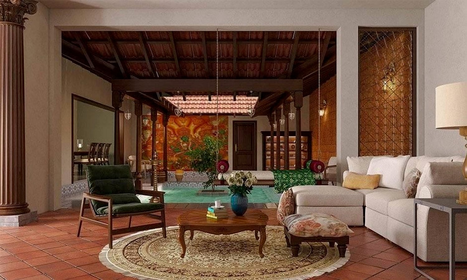
For interior designers, understanding these associations can help create spaces that feel appropriate to their users and setting. A colour selected purely for its visual or psychological effect may communicate differently depending on the cultural context in which it is experienced. This becomes particularly relevant in hospitality, residential and institutional interiors where design needs to respond to diverse users.
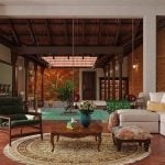
Indian interiors also demonstrate how colour can connect contemporary design with local materials and craft traditions. Rather than treating colour as a universal formula, designers can consider its relationship with the architecture, materials, context and people who occupy the space. In this sense, colour becomes not only a visual element, but an important part of creating a contextually responsive interior.
5. Saturation and Lightness Shape Emotional Response as Much as Hue
A common oversimplification in popular colour psychology is to treat hue – “green,” “blue,” “red” as the primary determinant of emotional effect. In practice, saturation and lightness (value) are equally significant. (Valdez and Mehrabian, 1994).
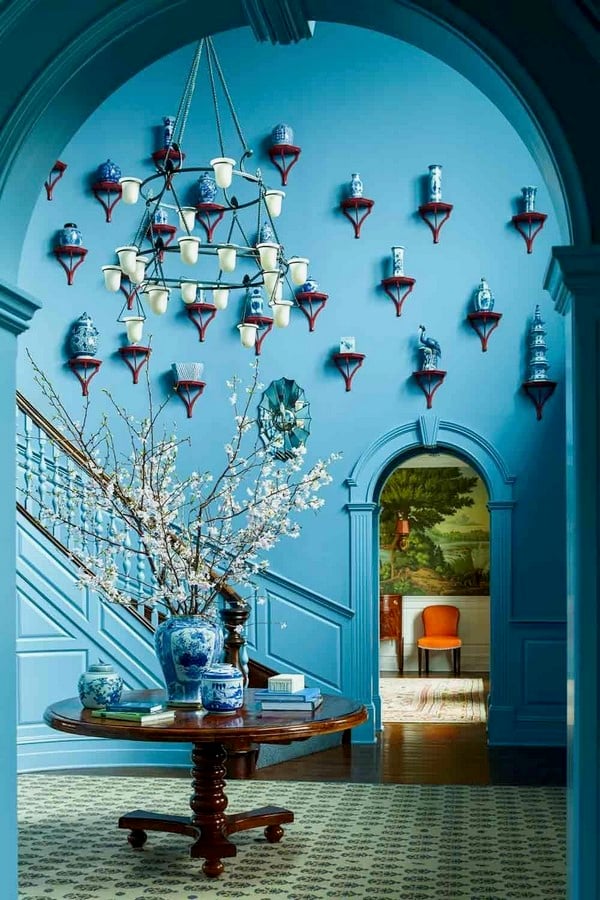
This is why contemporary colour psychology increasingly considers a colour’s full HSL profile rather than treating hue in isolation. The contrast between two English-inspired design practices illustrates the point. Katie Ridder Inc. is known for confident, highly saturated colour-blocking, using bold blues, oranges, and greens at near-full intensity to create interiors that feel energetic, expressive, and maximalist. By contrast, Max Rollitt often works with muted, earthy, antique-informed versions of similar hues, resulting in spaces that feel quieter, warmer, and more heritage-led. The comparison demonstrates that the psychological and spatial impact of colour depends also on how its saturation and lightness are calibrated. For interior designers, specifying “blue” or “green” is therefore only the starting point; its intensity and tonal depth can determine whether the resulting space feels calming or stimulating, intimate or expansive, refined or overwhelming.
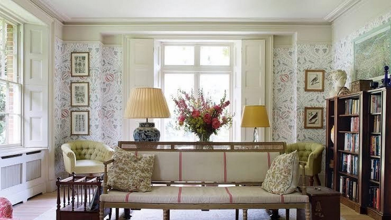
Colour psychology offers interior designers a body of evidence-based principles rather than a set of arbitrary conventions. Warm and cool hues measurably alter perceived spatial scale. Blue exerts a rare, cross-culturally consistent calming effect; on the other hand, red’s stimulating properties are powerful but time-limited before they tip into discomfort. Treated with this level of nuance, colour becomes one of the most cost-effective and psychologically powerful tools available to a designer capable of shaping mood, behaviour, and spatial perception long before a single piece of furniture is placed.
References:
- Elliot, A.J. and Maier, M.A. (2014) ‘Colour psychology: effects of perceiving colour on psychological functioning in humans’, Annual Review of Psychology, 65, pp. 95–120.
- Küller, R., Ballal, S., Laike, T., Mikellides, B. and Tonello, G. (2006) ‘The impact of light and colour on psychological mood: a cross-cultural study of indoor work environments’, Ergonomics, 49(14), pp. 1496–1507.
- Küller, R., Mikellides, B. and Janssens, J. (2009) ‘Colour, arousal, and performance—a comparison of three experiments’, Colour Research & Application, 34(2), pp. 141–152.
- Mahnke, F.H. (1996) Colour, environment, and human response. New York: Van Nostrand Reinhold.
- Singh, S. (2006) ‘Impact of colour on marketing’, Management Decision, 44(6), pp. 783–789.
- Valdez, P. and Mehrabian, A. (1994) ‘Effects of colour on emotions’, Journal of Experimental Psychology: General, 123(4), pp. 394–409