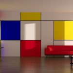
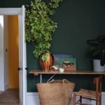
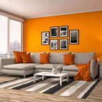
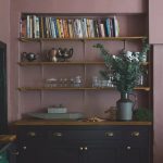
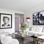
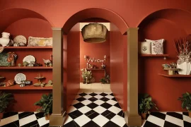
The process of perceiving colour and its subsequent impact on emotions is intricately connected to how the human eye perceives light rays and how the brain processes visual information. As the human eye perceives the light rays of the visuals we see, neurons in our brain create the image of the visual seen. However, the story does not end here. Stimuli are associated with this perception and extend into the realm of emotions.
Another important aspect of perceiving a colour apart from the human eye is the white light from the sun. White light from the sun comprises all seven rainbow colours (violet, indigo, blue, green, yellow, orange, and red), and everything around us, including ourselves, reflects or absorbs white light in varying degrees. Colour is nothing but the shattered light that is reflected or transmitted.
There can be no colour without light. Otherwise, the human eye cannot sense it. For example, at night, everything seems drab and dreary. This is because the absence of an adequate amount of light degrades the colour intensity of everything around us. On gloomy dark days, people are unproductive, stressed, and unhappy. On the contrary, people are happy on sunny days because the sunshine amplifies all the colours around us, creating a lively mood.
Colours have a physiological impact on human emotions and behaviour. Designers may create harmonious and engaging spaces that make a lasting impression on inhabitants by considering the influence of colours.
Colour Theory
Colour theory is a centuries-old idea based on the colour wheel, which organises colours in an ordered manner. The primary colours (red, blue, and yellow) are evenly spaced on the colour wheel, while secondary colours (green, orange, and purple) are created by combining the primaries. Blending primary and secondary colours yield tertiary colours. Designers may choose visually appealing and harmonious colour schemes by utilising the colour wheel.

A colour wheel may generate an innovative and beautiful colour mix within a design. This is referred to as colour harmony. Harmonious colour schemes are aesthetically balanced and attractive to the eye. To establish harmony, colour combinations such as complementary colours (opposite each other on the colour wheel), analogous colours (adjacent to each other on the colour wheel), monochromatic schemes (different shades and tints of a single colour), split complementary, triadic, and tetradic may be employed.
Colour value, which relates to the brightness or darkness of a colour, is another essential aspect of colour theory. It controls a colour’s brightness or intensity and may be changed by adding white or black, known as tinting and shading, respectively.
The colour value is critical for generating contrast, establishing hierarchy, and increasing visual appeal in a design. High contrast between bright and dark values has a powerful visual effect and may be used to call attention to or highlight focal points in interior space. On the other hand, low contrast and a small range of values may provide a more subtle and coherent visual impact.
Another important factor to be considered by interior designers is the
Hue: The actual colour
Value: The relative lightness or darkness of a colour or hue.
Chroma: The purity of a colour. When a pure hue is mixed with black, white, grey, or any other color, its purity and strength are reduced.

Paul Klee used hue value chroma to create his painting, indicating their importance.
Colour Psychology
An Interior Designer, Agnes Bourne, says, ‘Consider colour as three-dimensional from the beginning. Colour should provide hints about what you will encounter in a given environment. Colour is the first thing you observe and the last thing you take when you leave (Bourne, 2015).’
In interior designing, colour psychology is understanding how colour affects human emotions and behaviour. Colour psychology investigates how various colours may trigger distinct emotional reactions in people. People feel peaceful when surrounded by calm colours such as blue or green. A person feels energised and enthusiastic when surrounded by robust, colourful tones such as red, maroon, or orange. Similarly, neutral colours like white and grey help individuals feel calm.
Colour psychology is based on the scientific influence of various hues of each colour on the human brain. Although the colours’ impact seems identical, research reveals that everyone reacts differently to regular colour palettes. While colour perceptions differ between cultures and personal experiences, some patterns emerge.
Colour Psychology in Interior Design
Here are some of the most important colours and their psychological effects:
Red
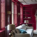
Red is associated with energy, passion, love, and intensity. It provokes strong emotions. It elicits intense emotions. The colour, particularly in red living rooms, may energy both the mind and the body. It is one of the most noticeable colours in the spectrum due to its large wavelength. According to research, red may raise the heart rate, leading to stimulating appetite, making it suitable for dining areas; thus, most of the food chains and restaurants have a bit of red interiors. However, excessive use of red may evoke feelings of aggression or restlessness.
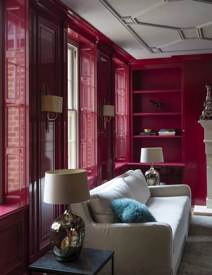
‘According to 2009 research published in Science, cognitive psychologists believe that working in red rooms makes individuals more precise and cautious,’ Jude explains.
Red is also associated with emotions of domination, power, and prestige. This is a great colour for home offices or study places.
Blue
Blue is often associated with peace, tranquillity, and stability. It can produce a serene and relaxing atmosphere, making it suitable for bedrooms and relaxation areas. According to Jude Stewart, design writer and author of ROY G. BIV: An Extremely Surprising Book About Colour, a Travelodge study of 2,000 U.K. families examined how bedroom colour influences sleep quality and duration. Blue was the clear winner: blue-drenched sleepers snooze for an average of seven hours and 52 minutes. Darker blues may offer an air of refinement and formality.

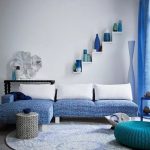
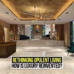
Blue and white is a relaxing mix that creates a quiet atmosphere in this opulent living room. With white as your background, you may use numerous blue tones as accents, ranging from mild colours to deep tones.
Yellow
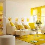
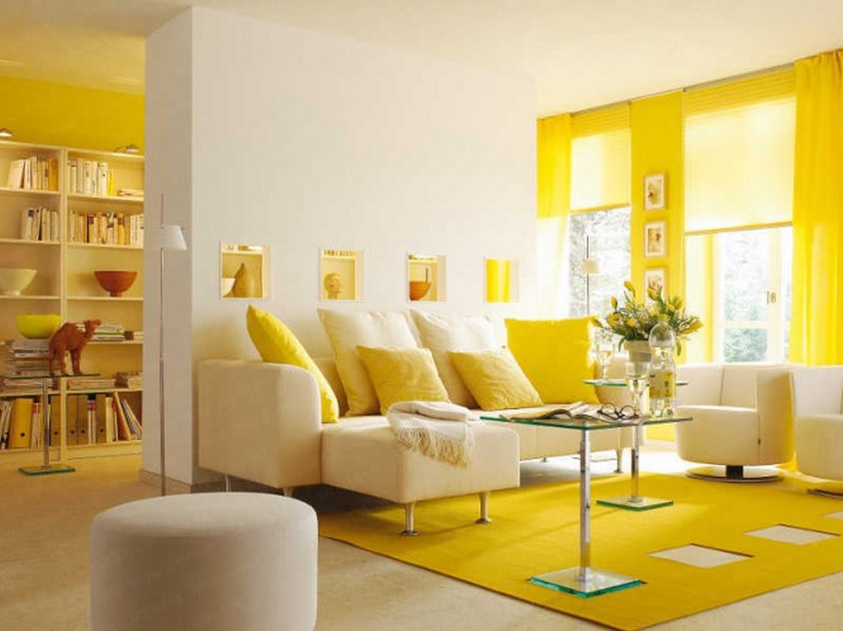
Yellow is known for its cheerful and uplifting qualities. It can promote optimism and creativity, making it a great choice for spaces where people gather, such as living rooms or kitchens. Although most tints of yellow are uplifting, dull yellow colours evoke feelings of dread, degradation, and illness. It is better to use yellow in vibrant colours throughout the home. However, use it cautiously since yellow might cause overwhelming emotions. A fully yellow room might raise blood pressure due to the overly hopeful effect. Because the brain links elevated blood pressure with emotions of rage, individuals lose their cool without provocation.
Green
Green represents nature and has a soothing and refreshing effect in the interior spaces. It’s not an accident that most people who live in cities go to the country on weekends and holidays. They do this to bond with nature and subconsciously take in the green to relax and feel better. It is associated with harmony, balance, and growth. Green can create a relaxing atmosphere in bedrooms, offices, or areas dedicated to wellness and meditation.
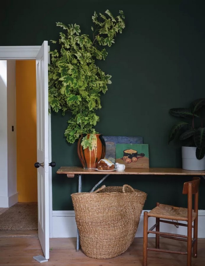
However, green is a very versatile colour. Different shades of green elicit various emotions. While bright and aqua green is soothing, dark green relates to greed and envy. Olive green, on the other hand, is often associated with serenity and harmony.
Orange
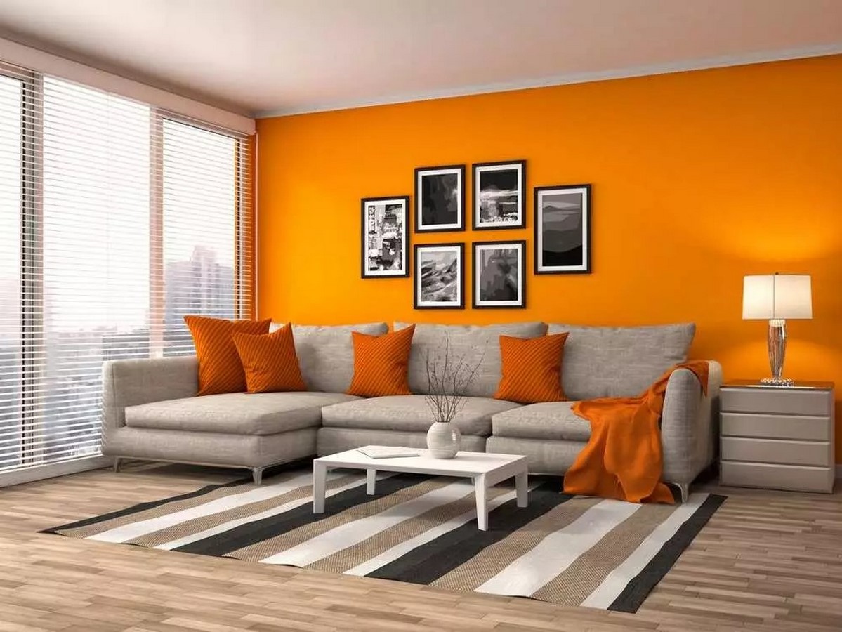
The orange colour is stimulating because of its high levels of energy and warmth. It may be an accent colour to inject fun and humour into any setting. Orange is said to be a creatively stimulating colour in the workplace. If the colour is bright, like the fruit’s, its warmth may stimulate you. It is a great alternative to yellow in any space, especially in bathrooms and kitchens, where its sunny disposition and ability to make guests feel at home shine. However, too much orange can overwhelm or create a sense of restlessness.
Purple
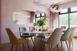
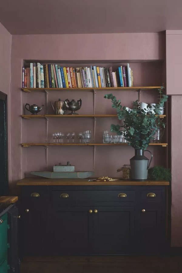
Purple is often linked with lavishness, creativity, and enlightenment. Lighter shades may be soothing; darker ones can be lavish and mysterious. It is often seen in rooms meant for rest and reflection.
Neutrals
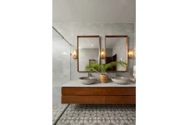
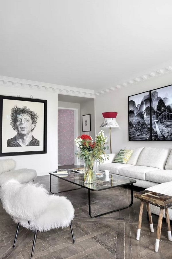
White, grey, and beige are examples of neutral colours. They provide feelings of equilibrium, adaptability, and timeliness. Neutrals may act as a background for other colours, enabling accent colours to shine and stand out.
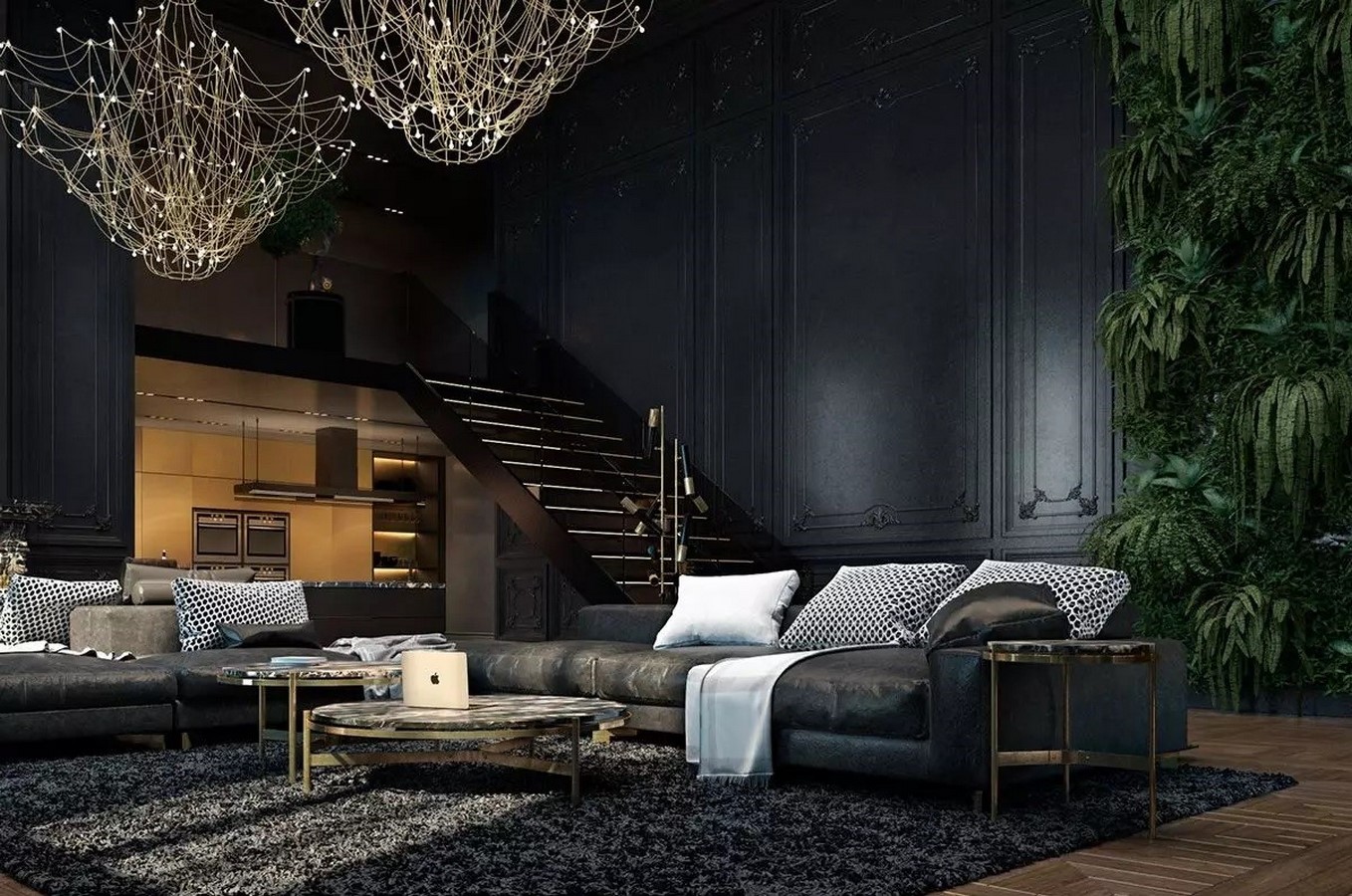
Black
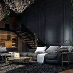
Black is a timeless, classic, classy, and adaptable colour that never goes out of style. Too much black, on the other hand, might be overwhelming. When applied correctly, a home design with black colour creates visual masterpieces.
Colour is important in interior design because it creates an atmosphere, inspires emotions, and establishes brand identification. Understanding colour theory and psychology enables interior designers to successfully employ colours to create the desired ambience and express precise messages inside a place. Furthermore, considering the requirements and tastes of clients, interior designers can implement particular colours in the spaces. Designers may create harmonious and engaging spaces that create a lasting impression on inhabitants by considering the psychological influence of colour.
References:
- Basic color theory (no date) Colormatters.com. Available at: https://www.colormatters.com/color-and-design/basic-color-theory.
- Decker, K. (2022) “The fundamentals of understanding color theory,” 99designs, 20 November. Available at: https://99designs.com/blog/tips/the-7-step-guide-to-understanding-color-theory/
- Hue Value Chroma (no date) Sensationalcolor.com. Available at: https://www.sensationalcolor.com/hue-value-chroma/.
- Maheshwari, A. S. (2022) Want to feel instantly better? These theories of color psychology in interior design will make everything more happy, livingetc.com. Livingetc. Available at: https://www.livingetc.com/advice/color-psychology-in-interior-design.
- Portillo, M. (2010) Color planning for interiors: An integrated approach to color in designed spaces. 1st ed. Chichester, England: John Wiley & Sons.
- uhomeweb (2015) Colour theory 101, Urbanhome. Available at: https://www.urbanhomeinteriordesign.com/color-theory-101/.