1. Introduction: Moving Art from Afterthought to Design Catalyst
In many residential projects, art arrives last. The joinery is installed, the stone is sealed and the upholstery is delivered, and only then does someone ask what should go on the walls. The result is predictable: art chosen to fill a gap rather than to shape a space, sized to whatever wall happens to be left.
The most accomplished luxury interiors reverse that sequence. They treat artwork as a design catalyst, a fixed point established early that informs spatial rhythm, the colour palette and the emotional register of each room. A significant canvas can settle the proportions of a living room as decisively as a fireplace or a window. A sculpture can define circulation through a foyer as clearly as a wall.
The gap between mass-market decoration and genuine luxury interior art curation lies less in budget than in intent and technical rigour. Decorative hanging asks whether a piece looks pleasant on the wall. Curation asks how the work relates to the architecture, how it will be lit, how it will be protected, and how it will hold its value over decades.
This guide addresses those questions in turn: proportion and placement mechanics, colour strategy, room-by-room curation, three-dimensional and textile work, museum-grade lighting and acoustics, archival preservation, structural mounting, and the administration of a collection.
2. Dimensional Precision: Essential Proportions and Placement Mechanics
Scale is where most interiors fail with art, and where trained eyes notice first. A work that is too small for its wall reads as timid. One that is too large overwhelms the furniture it is meant to complement. A few established ratios remove most of the guesswork, and they underpin the strategic role of art placement in interior architecture.
2.1 The two-thirds to three-quarters furniture ratio
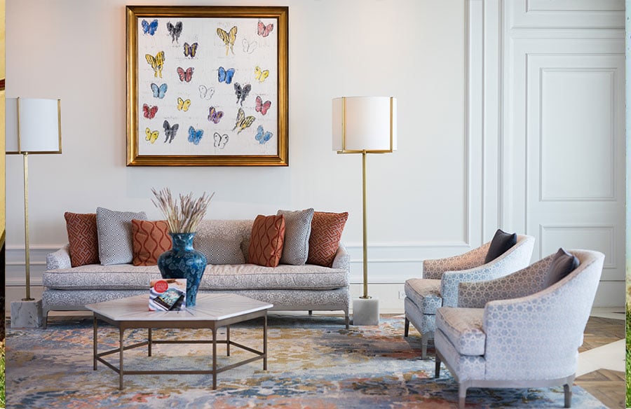
The most widely applied of the art placement rules in interior design is the two-thirds to three-quarters ratio. An artwork, or a grouping of works, hung above a significant piece of furniture should span roughly 66% to 75% of that furniture’s width.
Applied to a 200 cm (approximately 80 in) sofa, the wall art sizing ratio over the sofa calls for a single canvas or composed group measuring about 133 cm to 150 cm (roughly 53 to 60 in) across. The same logic governs headboards, consoles, sideboards and dining credenzas. The furniture and the art should read as one composition, with the furniture as its base.
Where there is no furniture, as on a feature wall or at the end of a corridor, the ratio shifts to the wall itself. A single work occupying around 60% to 70% of the usable wall area tends to feel intentional rather than incidental.
2.2 Sightline heights and vertical clearance
Museums and commercial galleries hang works so that their centre sits at approximately 145 cm to 152 cm (57 to 60 in) from the finished floor. That is the eye level of an average standing adult. In residential settings, this eye level art hanging height is a reliable starting point for any wall viewed while standing, such as halls, foyers and stairwells.
Above furniture, the governing measurement becomes vertical clearance. A gap of 15 cm to 25 cm (6 to 10 in) between the top of the furniture and the bottom of the frame keeps the two visually connected. Where a room is primarily experienced seated, as in dining rooms, libraries and snugs, the centreline can sit slightly lower to suit the seated eye.
2.3 Salon-style hanging and oversized canvases for grand volumes
Double-height living rooms, stairwells and gallery halls pose a different challenge. Holding the 145 cm centreline in such spaces can leave a work stranded at the base of a vast wall, while raising it disconnects it from the people in the room.
Two strategies resolve this. The first is the large-scale canvas for high ceilings: a single work, often vertical, whose size answers the volume of the room while its lower edge stays within comfortable sightlines. The second is the salon-style gallery wall, a dense grid or cluster rising towards the ceiling, descended from the historic Paris Salon. It gives a tall wall a unified field of interest.
In both cases, consistency is what separates a luxury result from a cluttered one. That means disciplined spacing, a clear outer boundary and a coherent framing language.
3. Colour Palette Architecture: Curation-First Design Strategies
The conventional approach, choosing paint and fabrics first and then hunting for art that matches, produces interiors that feel coordinated but rarely memorable. A curation-first strategy inverts the hierarchy and lets the artwork set the terms.
3.1 Establishing artwork as the room’s primary mood board
When a key piece is acquired early in a project, ideally during design development rather than styling, it can act as a living mood board for the room. Its dominant hues, undertones and contrast levels become references for decisions that are expensive to reverse.
Those decisions include the warmth of a wall white, the veining of a natural stone slab, the stain of a timber floor and the weave of custom upholstery. A muted landscape with ochre and grey-green undertones might steer a scheme towards limestone, washed oak and linen. A saturated contemporary abstract could justify deeper joinery tones or a single bold accent elsewhere in the room.
This also answers a common client question, whether to buy the art first or match it to the decor. Where the project allows, art first produces the more cohesive result.
3.2 Harmonising accent hues across textiles, finishes and framing
Colour matching furniture to artwork is most effective when it is selective. The aim is to extract two or three undertones from the work and distribute them through the room. Typical carriers are cushions and throws, a rug, window treatments, and small objects such as ceramics or books.
The danger is over-matching. When every cushion repeats the painting’s exact red, the room takes on a showroom quality that feels styled rather than lived in. Varying the shade and saturation of each echo keeps the relationship legible without becoming literal.
Framing belongs in this palette too. A frame is the junction between artwork and architecture, and its finish should respond to both. Natural oak can connect a work to timber floors and joinery. Blackened steel or a dark lacquer can tie it to window frames and hardware, while a gilded frame can introduce warmth into a cool, minimal envelope.
4. Room-by-Room Curation: Aligning Art Energy with Spatial Function
Each room in a home has a different function, a different pace and a different relationship with the people moving through it. A room-by-room approach to art decoration matches the energy of each work to the way its space is used.
4.1 Foyers and entrance halls: establishing first impressions
The foyer is the home’s opening statement and the threshold between public and private. It is typically experienced on foot and in passing, which suits works that make an immediate impression.
A dramatic contemporary canvas on the axis of the front door, or a sculpture on a pedestal at the centre of a generous hall, sets the narrative identity of the house within seconds. Because foyers are viewed standing, the 145 cm centreline applies cleanly. Lighting here should be deliberate, since the space is often seen at night by arriving guests.
4.2 Living and great rooms: statement pieces and focal points
Living rooms carry the largest walls and the longest periods of occupation, so they can hold the most demanding works. Large-scale abstract canvases and high-contrast paintings suit these spaces, as do works composed to anchor a fireplace mantel. Kolkata studio A Square Designs shows how far this can be taken in its art-filled residential interiors.
The key decision is the focal point architectural anchor: which wall the room should face. If a fireplace or a view already claims that role, the major work should support it rather than compete. Placing the statement piece on the wall opposite a picture window, for example, gives the room two balanced points of attention.
4.3 Main suites and bedrooms: soothing tones and serene narratives
The bedroom asks for the opposite of the living room. It is a space for rest, and art here should lower the room’s energy rather than raise it.
Calming botanical prints, muted seascapes, soft colour-field abstracts and organic landscapes are the natural vocabulary. Contrast should be restrained and subject matter quiet. The wall opposite the bed deserves particular care, as it frames both the first and last view of each day.
4.4 Dining spaces and kitchens: epicurean themes and conversation
Dining rooms are experienced seated, often for hours and usually in conversation. They suit works with narrative depth that reward a long look, such as still-life oils, vintage French café scenes and food-and-wine subjects, or strong contemporary pieces that start a discussion.
Placement in kitchens and open-plan dining areas must account for heat, steam and grease. Works should be kept well clear of cooktops, ovens and dishwashers. Glazed or sealed pieces are a sensible choice for anything within range of cooking.
4.5 Transitional and unexpected spaces: powder rooms, hallways and nooks
Some of the most memorable moments in a curated home occur where they are least expected. A small framed drawing in a powder room, a pair of etchings in a butler’s pantry or a single photograph at the turn of a stair creates a sense of discovery as people move through the house.
These intimate spaces suit small-format works viewed at close range, where detail and technique can be appreciated. Powder rooms with showers or poor ventilation need the same moisture caution as kitchens. Hallways, by contrast, can carry a sequenced series that unfolds along the route.
5. Three-Dimensional Artistry: Sculpture, Fibre and Mixed Media
A collection confined to flat, framed works on walls uses only part of what art can do in an interior. Three-dimensional and textile works occupy space rather than covering it. They change how a room is navigated and how it feels to the touch, and they cast shadows that shift through the day.
5.1 Free-standing pedestal sculpture and kinetic art
Free-standing sculpture in bronze, carved stone, blown glass or ceramic works as architecture at a smaller scale. Positioned on a plinth in a foyer, at the end of a vista or in the bend of a staircase, it can terminate a sightline as effectively as a window or doorway.
Placement depends on circulation. A sculpture should be seen in the round where possible, with enough clearance on every side for it to be walked around rather than squeezed past. Kinetic works, which move with air currents or mechanisms, add a temporal dimension and are best placed where their motion can be watched from a seat.
Pedestals deserve as much design attention as the works they carry. Their height, material and footprint should relate to the piece and to the surrounding joinery. Where children, pets or heavy foot traffic are present, discreet museum putty or a concealed fixing secures the work.
5.2 Wall-mounted textile art, tapestries and relief sculpture
Textile wall hangings and sculptural reliefs bring something flat canvases cannot: physical depth and visual warmth. Woven fibre art, contemporary tapestries and hand-knotted panels soften the hard planes of minimal architecture, introducing texture that changes under raking light.
Relief sculptures in timber, plaster, metal or stone sit between painting and sculpture. They work particularly well in long galleries and corridors, where oblique views reveal their depth.
Biophilic textures extend this approach to the architecture itself, as these examples of biophilic interior design show. Reclaimed wood, malachite, travertine and other materials with natural pattern can be treated almost as artworks in their own right, framed by the room rather than hung on it.
5.3 Antique interplay: blending vintage artefacts with modern interiors
Some of the most compelling luxury interiors rely on contrast across time. A patinated brass vessel, a seventeenth-century engraving in an aged gilt frame or a weathered architectural fragment gains presence against a minimalist backdrop of white plaster and concrete.
The principle is juxtaposition with restraint. One or two antiquities in a contemporary room create tension and narrative, while a dozen tip the space into a period set. The comparison of a contemporary abstract with an impressionist landscape works the same way: placing distinct genres in dialogue makes each more legible.
6. Technical Engineering: Museum-Grade Lighting and Acoustic Control
A significant work under poor light is a significant work wasted. Lighting determines how accurately colour is perceived, how texture reads and, over time, how well the work survives. In hard-surfaced luxury interiors, acoustics shape how a room feels just as strongly.
6.1 CRI 95+ LED fixtures, beam spreads and colour temperature
The Colour Rendering Index (CRI) measures how faithfully a light source renders colour compared with a reference source. For art, a CRI of 95 or above is the accepted benchmark. A high R9 value, the component that measures saturated red, matters too, since reds and skin tones are the first to look muddy under poor LEDs.
Colour temperature sets the mood. A common approach in residential settings is to keep ambient lighting at a warm 2700K for comfort, while illuminating artwork at a slightly crisper 3000K. That small step in temperature lifts the work from its surroundings, much as a gallery separates the art from the room.
Beam spread should be matched to the work’s size, so light covers the artwork with minimal spill onto the surrounding wall. Modern LEDs emit negligible UV and far less heat than halogen, which also makes them the safer choice for sensitive pieces. Art lighting works best as the accent layer within a broader scheme of ambient, task and accent lighting.
6.2 Picture lights vs recessed adjustable framing projectors
Traditional brass picture lights, mounted on the frame or the wall above it, carry a residential, collected character. They suit libraries, studies and period interiors, though they can create a hotspot at the top of tall works.
Recessed framing projectors are the museum-grade alternative. These ceiling-mounted fixtures use adjustable shutters or templates to shape the beam precisely to the artwork’s edges, so the work appears to glow from within. Monopoint spotlights and adjustable downlights fall between the two in cost and precision. Aiming them at about 30 degrees from vertical generally avoids glare in the viewer’s eye line.
6.3 Acoustic dampening through textile and fibre art
Stone floors, glazing, plaster and high ceilings, the materials that define many luxury interiors, are acoustically reflective. Voices and footsteps carry, and large rooms can feel cold to be in.
Art offers an elegant remedy. Textile art, heavy tapestries and woven fibre works absorb sound reflections. Purpose-made acoustic art panels go further. These are printed fabric or micro-perforated acoustic canvas stretched over an absorbent core, and they perform as acoustic treatment while reading as artwork. Introducing even a few such pieces can noticeably reduce reverberation without any visible intervention in the architecture.
7. Preservation Architecture: Archival Framing and Climate Management
The features that make luxury homes desirable can be hostile to art: abundant glazing, open fireplaces and generous natural light. Preservation is the discipline of reconciling the two, and most of it is decided at the framing and design stage.
7.1 Museum glass, UV filtration and glare control
Ultraviolet light is the main cause of irreversible fading in paper, textiles and many pigments. Conservation-grade glazing filters most of it. Premium products such as Museum Glass®, made by Tru Vue, block up to 99% of UV while using anti-reflective coatings that make the glazing nearly invisible.
For large or heavy frames, and for works hung in high-traffic or child-occupied spaces, UV-filtering anti-reflective acrylic offers similar optical performance at a fraction of the weight and with far greater impact resistance.
7.2 Acid-free matting and reversible archival mounting
The materials that touch a work on paper matter as much as the glass in front of it. Standard mount board and backing release acids over time, causing the yellowing and brown “mat burn” visible on many older framed prints.
Archival framing specifies acid-free, 100% cotton rag matboard. It also calls for hinge mounting with Japanese tissue or linen and a wheat-starch paste, and an acid-free backing board. The governing principle is reversibility: everything should be removable by a conservator without harming the work.
7.3 Relative humidity, heat and solar exposure
Organic materials such as canvas, paper, timber stretchers and panels expand and contract as humidity changes. Repeated cycles cause cracking, cockling and flaking paint.
For fine art, relative humidity control usually targets a stable range of around 45% to 55%, and stability matters more than the exact figure. Modern HVAC systems with humidity control can maintain this in principal rooms.
Placement does the rest. Keep important works out of direct sun, away from fireplaces, radiators and heating vents, and off external walls that heat up or condense. Where sun is unavoidable, motorised shading, UV-filtering window films and low-E glazing reduce exposure without darkening the room.
8. Structural Integrity: Heavy Wall Mounting and White-Glove Logistics
Large-format canvases, stone reliefs and bronze wall pieces can weigh far more than a standard partition is designed to carry. Mounting them safely is an engineering question, and it is far easier to answer during construction than after.
8.1 French cleats, wall blocking and anchor specifications
Where a project is still at framing stage, the most valuable intervention is structural blocking. Sheets of 19 mm (3/4 in) plywood or solid timber noggins are fixed between studs behind the plasterboard, wherever major works are likely to hang. Blocking turns an entire zone of wall into a reliable fixing surface, which preserves flexibility for future rehanging.
The French cleat is the preferred hanging system for heavy art. It consists of two interlocking strips with matching 45-degree bevels, one fixed to the wall and one to the back of the work. The weight is spread along the full length of the cleat rather than concentrated on one or two points. The work is also drawn tight to the wall and held level. Aluminium cleats are standard for large framed canvases and stone panels.
On existing walls without blocking, heavy works should be fixed directly into studs, or into masonry with appropriately rated anchors. As a rule of thumb, anything over about 23 kg (50 lb) warrants a structural assessment before installation, and every fixing should be rated well above the load it carries.
8.2 Specialised art handling, transport and crating
The journey to the wall carries as much risk as the hanging itself. Significant works should move with fine art shippers rather than general removalists. That means climate-controlled vehicles, custom timber crating with shock-absorbing foam, and art handlers trained in museum practice.
Installation benefits from the same rigour. Laser levels, condition reports completed before and after the move, and photography of the work in situ all protect the collection and support any later insurance claim.
9. Collection Administration: Sourcing, Investment and Commissioning
At the luxury end of the market, art is both a design element and an asset. The way works are sourced, commissioned and documented shapes their aesthetic contribution and their long-term value.
9.1 Sourcing through galleries, secondary markets and digital platforms
Sourcing art for high-end homes typically draws on several channels at once.
- Primary galleries represent living artists and sell new work directly. They offer access to an artist’s trajectory and, often, the chance to reserve future pieces.
- Art advisory firms work on the client’s behalf across the whole market. They are useful for building a coherent collection rather than a series of individual purchases.
- Art fairs compress hundreds of galleries into a few days, making them efficient for comparison and discovery.
- The secondary market, through auction houses and private sales, is where established and historical works change hands.
- Online platforms have widened access to emerging artists internationally, and now provide credible provenance documentation.
Not every wall in a large home calls for an original. Secondary bedrooms, studies, guest wings and holiday homes are often better served by high-quality reproductions. Made-to-order print studios such as Wall Art Collective produce large-format canvas and framed prints sized to a specific wall. Designers also use them to test scale and colour in a space before committing to a major original.
9.2 Managing custom commissions: contracts, scale models and swatches
Custom fine art commissions for interior designers and private clients produce site-specific works conceived for a particular wall, light and palette. They also introduce project risk, which a clear process manages.
A sound commission agreement sets out dimensions, medium, palette, fee, payment milestones, timeline, and what happens if the work is not accepted. Before full production, artists typically present studies, scale maquettes or digital mock-ups. Testing pigment samples against the room’s actual upholstery, stone and paint under its real light avoids surprises at installation. Staged approvals at agreed milestones keep the artist’s freedom and the client’s expectations aligned.
9.3 Insurance, provenance and digital cataloguing
Standard home and contents policies often cap cover for individual artworks. Significant collections usually warrant a dedicated fine art insurance schedule or rider, supported by a professional appraisal that is updated periodically as values move.
Provenance is the documented chain of ownership, and it underpins both value and saleability. Each work should be accompanied by a Certificate of Authenticity (COA) where applicable, along with purchase records and exhibition or publication history. A digital catalogue records images, dimensions, condition reports, locations and documents, and makes insurance claims, estate planning and future sales far simpler.
10. Conclusion: Turning Living Spaces into Living Galleries
Designing luxury interiors with art is ultimately a question of sequence and rigour. When art is considered from the beginning, proportion gives each work its rightful scale, and colour strategy lets it shape the palette rather than follow it. Room-by-room curation matches each piece to how a space is lived in, while sculpture and textiles bring depth, texture and acoustic comfort.
Behind the scenes, the technical disciplines protect that investment. Museum-grade lighting reveals the work accurately, archival framing and climate control preserve it, and structural mounting keeps it safely on the wall. Careful administration secures its value for the next generation.
The result is a home that feels curated rather than decorated: personal, coherent and enduring. It is less a backdrop for art than a living gallery, built around it.
Frequently Asked Questions
What is the rule of thumb for sizing wall art over a sofa or bed?
The standard guide is the two-thirds to three-quarters ratio. Artwork above major furniture should span roughly 66% to 75% of the furniture’s width. A 200 cm (80 in) sofa, for example, suits a single work or grouping about 133 cm to 150 cm (53 to 60 in) across.
How high off the floor should wall art be hung?
Centre artwork at standard eye level, about 145 cm to 152 cm (57 to 60 in) from the finished floor to the centre of the image. Above a sofa, bedhead or sideboard, leave 15 cm to 25 cm (6 to 10 in) between the top of the furniture and the bottom of the frame.
Should you choose art to match the decor, or buy the art first?
Where possible, choose key works first and let them inform paint, stone, fabrics and rugs. When designing around existing furnishings, choose art that echoes two or three of the room’s dominant accent colours rather than matching them exactly.
How should fine art be lit in a luxury home without damaging it?
Use LED fixtures with a CRI of 95 or higher and a strong R9 value for accurate colour. Picture lights or recessed framing projectors at around 3000K suit most works. Quality LEDs emit negligible UV and little heat, which helps limit fading and drying over time.
How do I protect valuable artwork from sun damage and fading?
Frame works behind conservation glazing such as Museum Glass®, which blocks up to 99% of UV and reduces glare. Keep important pieces out of direct sun and away from heat sources. Maintain relative humidity at a stable 45% to 55%, and consider UV-filtering window film or motorised shading.
What art styles work best in bedrooms versus living rooms?
Living rooms and foyers suit high-energy, large-scale abstract, contemporary or sculptural statement pieces. Bedrooms call for calmer, low-contrast works such as muted botanicals, organic landscapes, seascapes and soft colour-field abstracts.
How do you hang heavy art or large wall sculptures safely?
Works over about 23 kg (50 lb) need structural support. In new builds, install plywood blocking behind the plasterboard during construction. On existing walls, fix into studs or masonry, and use an aluminium French cleat to spread the load evenly.
What is the difference between an original painting, a canvas print and a fine art print?
An original painting is a unique, hand-made work with physical brushwork and the highest investment value. A fine art print, often called a giclée, is a high-resolution pigment reproduction on archival paper or canvas, sometimes in a limited edition. A canvas print is a reproduction printed onto canvas and stretched over a frame, offering scale and texture at a far lower cost.