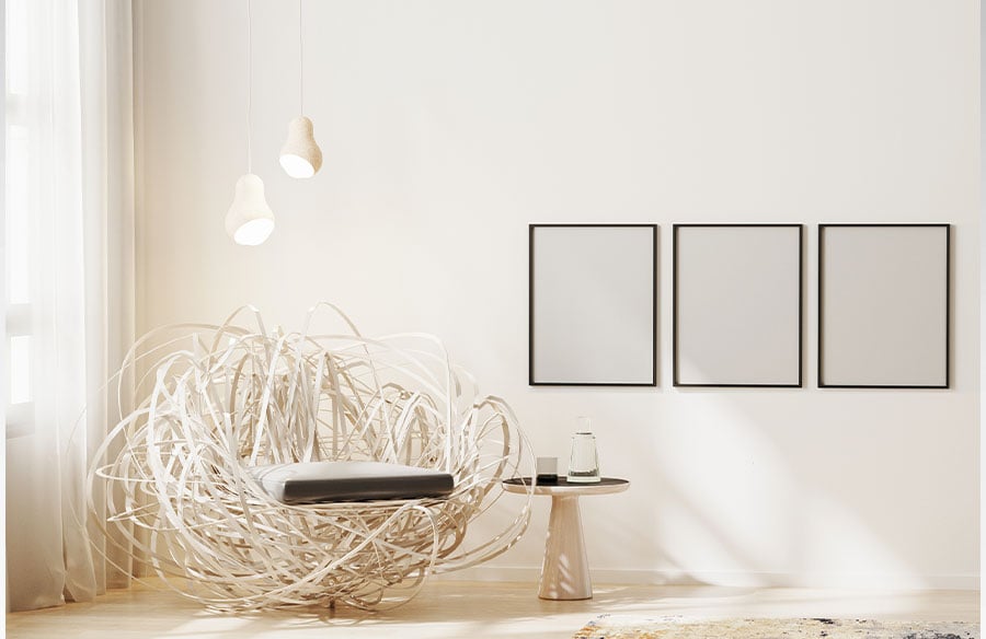
Proper art placement matters because it acts as a structural element that controls visual hierarchy. Hanging artwork correctly directs movement through a room and physically links your furnishings with the surrounding architecture. A well considered placement creates a cohesive space that feels intentional and perfectly proportioned.
I think people often treat putting pictures on walls as an afterthought. You buy a nice sofa and paint the walls and then just hammer a nail wherever it looks fine. But anyone looking for expert Picture Hanging Sydney knows that the exact positioning of a frame completely changes the geometry of a room. It shifts the focal point entirely.
It really is that simple.
When handled correctly art establishes a sense of order. The first object to attract the eye sets the tone for how the rest of the room is read by guests. Poor placement pulls attention away from beautiful architectural features.
Visual Balance and Proportion
Getting the scale right is usually where things go wrong for most DIY decorators. A tiny print floating above a massive three seater lounge looks completely ridiculous. The standard guideline is that artwork should span roughly two thirds to three quarters of the width of the furniture below it.
So if you have a 210 centimetre sofa you want the art to be around 140 to 160 centimetres wide. This stops the artwork from overpowering the room or looking completely lost on a massive blank wall. I have seen so many beautiful pieces ruined by bad proportion. It anchors the piece to the furniture beneath.
Sometimes you have to bend this rule slightly. Maybe the frame is exceptionally heavy or the ceiling is unusually low. But sticking to that math generally yields a balanced result. It is a solid baseline to work from when you are standing in a living room holding a tape measure and wondering what to do next.
A simple formula really helps here.
If art is significantly narrower than half the furniture width it tends to look like a floating postage stamp. If it is wider than the furniture it makes the sofa feel visually dwarfed. Balance is EVERYTHING when you are trying to make a room feel comfortable.
The Eye Level Principle
Museums and galleries use a very specific formula for hanging art. They centre their pieces at approximately 145 to 150 centimetres from the finished floor. This aligns perfectly with the average human sightline.
Bringing art down to true eye level makes a space feel professionally curated. I remember visiting the Art Gallery of NSW a few years ago and noticing how every single piece felt perfectly accessible. My neck never hurt. I spent hours walking through the exhibits and the consistency of that horizontal line kept everything grounded. Anyway that same principle applies to your hallway at home.
The biggest mistake people make is hanging things way too high. You end up craning your neck to look at a photograph. If you align the centre of each piece to that 145 centimetre mark you create a unified gallery line throughout the house.
Even if the ceiling height changes drastically between rooms that constant horizontal sightline stabilises the whole visual experience. It is a neat trick.
Curators and gallery consultants explain that centring artwork at this height creates a unified line through the home. Even when ceiling heights change that line stabilises the visual experience. The artwork was hung by the previous owners in my house at almost two metres high and it drove me absolutely crazy until I fixed it.
Integrating with Architecture
You have to adapt your placement to the structural features of the room. Wall mounted air conditioning units and bulkheads and strange alcoves all dictate where a frame can actually go.
Stairwells are notoriously difficult. You cannot just draw a straight horizontal line. The art has to stagger along the incline of the stairs following the handrail. Rooms with unusually low ceilings require a slight shift from the standard rules. You might hang things a fraction lower to prevent the room from feeling compressed.
Leaving a gap of 15 to 20 centimetres between the top of your furniture and the bottom of the frame is another crucial metric. This keeps the art visually connected to the sofa or console. If it floats too high it completely disconnects from the interior design.
Architects plan for art early in the build. They design specific niches and lighting to accomodate important pieces. We should probably apply that same level of forethought when decorating our own homes.
Working around windows and doors takes patience. Using awkward alcoves or negative space as opportunities for smaller intimate works is a great way to utilise strange architectural quirks.
Creating Cohesive Compositions
Gallery Walls are incredibly popular right now. Grouping multiple frames together brings order and harmony to complex interior designs.
You have to treat multiple frames as a single visual unit. Imagine an invisible rectangle around the entire cluster. You then align that large imaginary shape to your furniture and sightlines just like you would with one giant canvas. Consistent spacing is absolutely vital here.
Keep 2 to 3 centimetres between small frames. For larger pieces you might stretch that gap to 5 to 7 centimetres. Maintaining the exact same spacing horizontally and vertically helps the collection read as one cohesive unit. It stops the wall looking like a chaotic mess of random pictures.
I highly recommend laying everything out on the floor first. Measure the overall rectangle and mark the centre before you even think about drilling into the plaster.
It saves a lot of tears.
Who actually enjoys patching drywall? Nobody. That is why the floor layout method is so important. Once you get the spacing right on the rug you can transfer those measurements directly to the plasterboard.
Working Around Australian Home Features
Homes in Sydney often have massive sliding glass doors and huge amounts of natural light. Oversized canvases and large photographic prints demand careful placement in these spaces. They dominate the visual hierarchy and determine where the rest of the furniture goes.
You have to factor in UV exposure. Direct harsh sunlight will completely destroy sensitive materials and fade expensive prints. I always try to place important works on walls that receive indirect light. Adding controlled accent lighting highlights the work without causing reflections or heat damage.
We also have a lot of double brick and masonry walls in Australia. This completely changes how you mount things.
You cannot just use a simple adhesive hook on a rendered brick wall and expect it to hold a twenty kilogram mirror. Proper fixings suited to the specific wall type are non negotiable.
Designers in Australia are increasingly prioritising local artists and ethically sourced materials. Placement is used to respect the cultural significance of certain pieces and give prominent well lit positions to important works.
The Impact on Space Perception
Environmental psychology shows that curated art makes spaces feel welcoming and memorable. Studies link well chosen art with reduced stress in healthcare settings and workplaces.
In residential property marketing a staged home with strong art placement photographs infinitely better. Real estate agents often say it attracts more enquiry and contributes to faster sales. People walk into a room and instantly feel like the space is finished.
Art placement influences mood and wayfinding. A sequence of frames down a long hallway leads the eye and creates a welcoming first impression. It makes a narrow corridor feel like a deliberate gallery rather than just a passageway to the bedrooms.
The psychological dimension is fascinating.
We also need to consider the respectful display of First Nations artworks. These pieces hold significant cultural meaning. They deserve prominent and well lit positions rather than being treated as mere decorative background noise. It is about showing genuine respect for the artwork.
Why Hanging Systems Matter
Growing awareness of safety has placed more emphasis on weight ratings and proper hardware. Large glazed artworks pose a serious risk if they are incorrectly mounted.
Heavy works require heavy duty solutions. Sometimes traditional hooks are fine but rail or track systems offer way more flexibility. If you constantly rotate your collection a track system lets you move things around without destroying the plasterboard. You can easily pick up decent anchors from Bunnings if you know exactly what load rating you need.
Professional installation ensures precise alignment and safe load bearing. For complex arrangements or incredibly heavy mirrors it is definitely worth getting someone who knows what they are doing.
They use laser levels and proper templates. It guarantees a coherent aesthetic strategy across multiple rooms.
Safety should always come first. Especially in homes with young children where a falling frame could cause serious injury.
Final Thoughts
Art placement really bridges the gap between interior styling and structural architecture. It requires patience and a bit of mathematical precision.
I have spent hours staring at blank walls wondering if a frame should go two centimetres to the left. It sounds obsessive but those tiny adjustments completely alter the energy of a room. When you finally get that eye level exactly right the entire space just clicks into place.
Don’t rush the process. Take the time to measure your furniture and find that perfect 145 centimetre centreline. Your home will feel so much more grounded & intentional.
Hanging pictures is tedious work. But the payoff of walking into a room that feels perfectly balanced makes all that measuring worthwhile.