Architects talk about material honesty when a building lets its materials show what they are. Concrete looks like concrete, timber reads as timber, and steel is not painted to pretend it is something softer. The idea has quietly moved into product packaging. More small brands now want boxes and tubes that look like the board they are made from, carry only the finishes that earn their place, and can be recycled without a guessing game at the curb.
This is not a call to strip packaging bare. A box still has to protect the product, ship without damage and tell a customer what is inside. Material honesty is about choosing a structure and a surface on purpose, rather than covering a box in layers that hide what it is. Three common formats show how that works in practice.
Kraft Candle Boxes and the Beauty of Unbleached Board
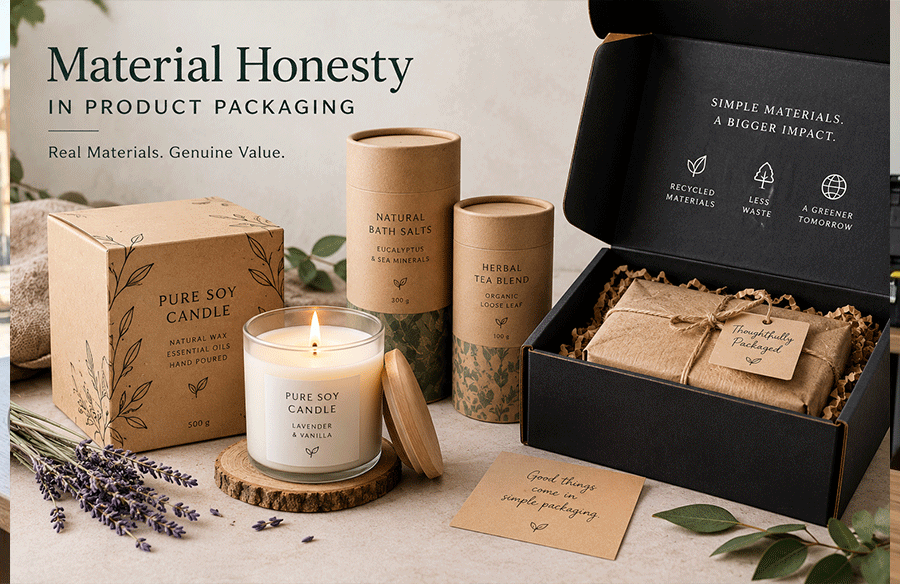
Kraft board is the clearest example of a material that looks better left alone. Its warm brown fibers say “paper” at a glance, and printing on it reads as ink on board rather than a glossy surface pretending to be something else. Candle makers took to it early, because a natural wax product sits comfortably in a natural-looking box.
Suppliers of kraft candle boxes describe boards made from 100% recycled and recyclable kraft in several thicknesses, chosen by the candle rather than by habit. Their published guide runs from 14pt for lightweight candles and display boxes, through 16pt as the most popular choice for standard jar candles, to 18pt for heavy two-wick jars and 24pt for premium rigid setup boxes. Box styles include tuck-end, lid and base, sleeve and mailer, with inserts in foam, cardboard or molded pulp to stop a jar from moving in transit.
What makes the kraft approach honest is restraint in finishing. A single color of ink, an embossed or debossed logo pressed into the board, or a water-based AQ coating keeps the box recognizably paper. Standard turnaround is 8 to 12 business days, and digital printing suits small runs under 200 units without plate setup. A brand can test a design on a short run before committing the whole line.
Cardboard Tubes Show Structure Instead of Hiding It
A tube is an unusually honest form. Its strength comes from its shape and its wall, not from added parts, and the round profile avoids the crushed corners that square boxes suffer in a courier van. The construction is visible in the rolled edge and the lid, and nothing about it needs disguising.
Makers of custom cardboard tube packaging explain the design logic plainly. The wall decides whether a tube survives handling, while the material decides how it looks and prints. Options include kraft-based paperboard, recycled board, multi-ply kraft with recycled layers, and uncoated brown board that is recyclable as paper. Lids come as rolled edges, straight cuts, tuck-in lids or lift-off telescoping lids, and internal foam or cardboard inserts can hold a product in place.
The honest choice for food is especially clear. The tube supplier’s guidance is that a liner is what makes a tube food safe, not the wall, which means the outer board can stay plain and recyclable while the inside does the protective work. Their standard minimum is 500 tubes, with smaller runs from 100 available at a higher per-piece cost. Brands that sell balms, deodorant sticks, dry snacks or rolled prints all use the same basic structure, sized to the product.
Black Mailer Boxes and the Case for a Single Color
At first glance a black box seems the opposite of material honesty, since the board is covered in ink. The principle still applies, though, because honesty is about intention rather than leaving everything brown. A black mailer printed in one solid color, with no extra layers, is a single, clear decision rather than a stack of effects.
Suppliers of custom black mailer boxes describe self-locking mailers in E-flute or B-flute corrugated boards, strong enough for shipping, e-commerce orders and subscription kits. All materials are recyclable, with FSC-certified variants available. Finishes include matte, gloss, spot UV and soft touch, and the minimum order starts at 100 units with a standard turnaround of 4 to 6 business days. Before a full run, brands can ask for a digital proof, a 3D preview or a physical sample.
The materially honest version of a black mailer is the restrained one. A matte black outside, a printed message on the inside of the lid, and nothing else lets the corrugated structure do the protecting and the color do the branding. It avoids laminates and adds films that make recycling harder, while still feeling premium when the box is opened.
Finishes That Earn Their Place
The honest approach does not ban finishes. It asks each one to justify itself. Embossing and debossing are the easiest to defend, because they shape the board itself rather than adding a separate layer. Foil stamping is a small, deliberate highlight when used on a single word or logo. Spot UV can protect brand text from scuffing on shelves.
The finishes worth questioning are the ones applied everywhere by default. A full gloss lamination over an entire box adds a plastic layer, changes how the board feels, and can complicate recycling. Plastic windows on a candle box let customers see the product but split the box into two materials. A good test is to ask whether the customer would miss the finish if it were gone. If not, it probably does not belong.
Designing Packaging That Tells the Truth About Itself
Material honesty in packaging comes down to a few questions asked early. What is the box made of, and does it look like that? What does each finish add, and could the board do the job alone? Can a customer recycle it without separating layers or guessing?
Kraft candle boxes answer with unbleached fibers and pressed logos. Cardboard tubes answer with a structure that shows its strength. Black mailers answer with one clear color on a recyclable corrugated base. Each of them also leaves out layers that only ever served the look, which keeps the packaging simpler to produce and simpler to recycle. As customers grow more aware of what goes into their bins, packaging that looks like what it is may be the most persuasive design choice a brand can make.