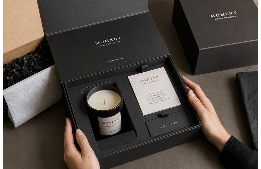
A well-made lid does not simply come off. It releases with a slight drag, holds for a fraction of a second and then gives way to a composed interior. The product may sit flush inside a dark insert, appear beneath folded tissue or arrive immediately in view. Before it has been switched on, worn, tasted or assembled, the customer has already formed an impression of its weight, order, fragility and intended value.
That impression begins with structure. Graphics identify the brand, but the package determines how the body encounters it: where the hands rest, which edge opens first, how much force is required and what appears at each stage.
For architects and spatial thinkers, the comparison is familiar. A package has thresholds, concealed zones, framed views and a route through which the user moves. Its few seconds of use form a miniature spatial sequence.
1. Unboxing as a Designed Sequence
Opening a package is rarely a single action. The customer sees the outer form, tests its weight, searches for an opening point, breaks a seal, releases a closure, discovers the product and then works out how to remove it.
Each movement supplies information.
A shallow sleeve that moves freely feels different from a dense two-piece box whose lid rises slowly on trapped air. A folding carton with a visible thumb notch signals efficiency. A concealed pull tab asks the user to pause. A magnetic flap creates a brief moment of resistance followed by a definite release.
The unboxing experience therefore has pace. That pace can be fast and direct, or slow and ceremonial, but it should feel intentional.
Pacing Is Part of the Message
Anticipation depends on controlled delay, yet delay can easily become obstruction. A snug lid may produce a measured reveal; an excessively tight lid causes the customer to shake or pull at the box. A tamper seal can reassure in a pharmaceutical or food context, while multiple hidden pieces of tape on a gift item feel careless.
Designers must distinguish deliberate resistance from accidental friction.
The correct rhythm also depends on the product. Revealing the whole object at once creates clarity and visual impact. Revealing one detail first may heighten curiosity. A complex product can benefit from staged access, with the primary object presented before its accessories, instructions or supporting components.
There is no universal formula for a premium unboxing experience. A slow reveal can feel luxurious in one category and unnecessarily theatrical in another.
Opening Cues Should Be Legible
A package should communicate how it expects to be handled. A thumb cut, ribbon pull, perforation or exposed edge can guide the hand without adding printed instructions.
When those cues are missing, users begin testing corners, turning the pack over or pulling at the wrong panel. The intended unboxing journey collapses because the structure has failed to explain itself.
Good opening cues are often quiet. They do not need to dominate the design. They simply make the next action understandable.
2. Structure Communicates Before Graphics Do
Imagine several packages stripped of logos, colour and typography. Much of their character would remain legible.
A two-piece rigid box suggests ceremony through thickness and the slow separation of lid and base. A magnetic closure produces a crisp, repeatable action that may feel technical or assured. A folding carton communicates lightness and efficiency. A corrugated mailer can express directness, while a drawer box turns access into a horizontal reveal.
A sleeve creates a different relationship between exterior and interior. The customer first removes an outer layer and then discovers a second object beneath it. Depending on proportion and material, that action may feel restrained, playful or unnecessarily elaborate.
Proportion carries meaning as well. A low, wide box behaves like a display plinth. A tall, narrow package may make a small object feel specialised or precious. Deep walls surrounding a tiny product can imply protection, but they can also expose waste.
Consumers do not interpret these features in isolation. Shape, surface, weight, opening style and internal presentation combine to create a broader impression of the brand.
Rigidity is frequently associated with value because it preserves geometry and alignment, but it is not automatically luxurious. A precisely engineered mailer may suit a technical direct-to-consumer brand better than a heavy wrapped box. Structure becomes persuasive when its logic matches the object. When it borrows another category’s codes without functional reason, it begins to feel like costume.
3. The Psychology of Reveal
The first interior view is one of the most controlled compositions in packaging design. The designer decides what occupies the centre, what remains hidden and how much information reaches the customer at once.
The insert functions almost like a floor plan. It determines hierarchy, distance, orientation and movement.
A centred product with an even border appears resolved. An offset product can feel dynamic when the remaining space contains an accessory or document. The same arrangement feels careless when the void serves no visible purpose.
The reveal sequence can be shaped through:
- the first element visible after opening;
- the amount of the product exposed at once;
- the order in which accessories or instructions appear;
- the use of tissue, sleeves, compartments or removable cards;
- the balance between immediate clarity and surprise.
These elements should not be treated as decorative layers. Each one changes the speed at which the customer understands the product.
Tissue, glassine, paper wraps and removable cards can mark transitions within the opening process. Used with restraint, a layer protects a delicate surface or separates the shipping experience from the moment of ownership. Used mechanically, it becomes theatre without purpose.
Surprise works best when it deepens understanding. A contrasting colour revealed beneath a sleeve can express brand personality. An accessory discovered at the moment it is needed can make the sequence feel intuitive. A hidden component that is difficult to find produces the opposite effect.
Restraint is equally important. Not every object requires several stages of concealment. Sometimes the strongest reveal is an immediate, uninterrupted view of the product.
4. Materials and Tactility
The hand often confirms or contradicts what the eye expects.
Paperboard flexes at score lines. Corrugated board reveals its utility through its edges and thickness. Rigid board holds its geometry under pressure. Uncoated kraft may suggest economy, natural fibre or workshop honesty, depending on its construction and print quality. A finely textured paper can imply craft, while a smooth, dense wrap may feel controlled and architectural.
Research into haptic information suggests that physical touch can influence how confidently consumers assess products and materials. The implication for packaging is straightforward: tactility is not an ornamental afterthought. It is one of the ways customers judge material character and construction quality.
Embossing and debossing create small topographies that catch light and invite the fingertip. Foil can sharpen a detail when concentrated in one area; spread across every surface, it loses contrast. Soft-touch finishes may create visual quiet, although scuffing, fingerprints and compatibility with recycling processes need to be considered during testing.
The weight of a material also affects interpretation. A thick board may communicate permanence, while a lighter structure may suggest efficiency. Neither is inherently superior. The appropriate choice depends on what the product needs to express and withstand.
Material selection is most convincing when it begins with handling, protection and disposal, then moves towards visual effect. Developing purpose-built packaging requires board grade, wall thickness, closure, insert and surface treatment to be considered as one structural system rather than applied separately to a generic container.
5. Designing the Product Fit
A product that rattles inside a visually refined box makes the entire presentation feel provisional. Movement suggests that dimensions were estimated, the insert was borrowed from another format or the package was designed around an approximate object rather than the object itself.
By contrast, controlled fit implies attention. It shows that the designer understood the product’s geometry, vulnerable areas and removal path.
Precision Without Obstruction
Precision does not mean clamping the product so tightly that it cannot be removed. Designers must allow for manufacturing tolerances, delicate finishes, finger access and lifting direction.
A ribbon may help beneath a dense object but become unnecessary fuss beneath a lightweight carton. A watch, bottle, device or piece of jewellery should leave its cavity without snagging, sudden release or pressure on a vulnerable component.
The principle becomes especially visible in packaging structures for luxury items, where a controlled lid fit and accurately cut insert may communicate more value than a crowded field of metallic decoration. The product should appear held, not buried.
Empty Space Is Never Neutral
Empty space can operate like a gallery margin, giving the object visual independence. It can also reveal poor right-sizing.
A few millimetres of consistent clearance may frame the product and make its shape easier to read. A large cavity filled with loose paper often makes the package feel inflated. The customer becomes aware that the container has been enlarged without a clear functional reason.
The insert should also remain stable during distribution. A carefully arranged product loses its impact if it arrives tilted, displaced or pressed against the lid.
Structural prototypes therefore need to be tested with the actual product. Protection, removal and visual alignment are not separate concerns. They are the same design problem viewed at different moments.
6. Designing for the Entire Brand Experience
Packaging structure should follow the product’s positioning, price, sales channel and intended user.
A retail pack must communicate on a shelf, withstand repeated handling and help customers compare options. An e-commerce package may be the customer’s first physical encounter with the brand, yet it must survive a distribution system that treats it as freight.
Before selecting a structure, designers should consider:
- the product’s price point and market position;
- retail, e-commerce or mixed distribution;
- protection and shipping requirements;
- the habits and expectations of the intended customer;
- what is likely to happen to the package after opening.
Sometimes one structure cannot perform every task elegantly. A protective outer shipper can absorb compression and impact while an inner pack controls presentation. In other cases, using the sales package as the shipper removes a layer and makes the arrival feel more direct.
The decision should come from testing rather than visual preference alone.
Brand personality is expressed through movement as much as appearance. A playful brand may use an unexpected fold, bright internal plane or reversible panel. A technical brand might favour indexed compartments, visible order and exact alignment. A handcrafted product may benefit from a structure that allows small material variations rather than pretending to be mechanically perfect.
Luxury should not be confused with difficulty. Clear opening cues, accessible tabs and reasonable force can feel more considered than a package that requires tools or repeated attempts.
Designers should watch real users open prototypes. Where do their fingers land? Do they rotate the pack? Which panel do they expect to move first? Do they immediately understand how to remove the product?
Those behaviours reveal whether the intended journey exists outside the drawing.
7. When Less Creates More Impact
Restrained packaging is not simply packaging with fewer graphics. It is a structure in which every layer, void, material and finish can justify its presence.
The result may be visually quiet, but it should still feel specific to the product.
Right-sizing reduces the volume that must be manufactured, stored and transported. It also removes the awkwardness of a small object drifting inside a large container.
The European Union’s Packaging and Packaging Waste Regulation reflects this direction by introducing requirements intended to reduce unnecessary packaging weight, volume and empty space. Regulation alone will not produce thoughtful design, but it reinforces a principle designers already recognise: excess material is not the same as added value.
Material labels do not settle the sustainability question either. A kraft appearance is not proof of low environmental impact. A recyclable board can become difficult to process when permanently combined with foam, magnets, plastic laminates or incompatible coatings.
Conversely, a slightly heavier structure that prevents product damage or operates within a credible reuse system may offer a more responsible outcome across its full life.
Minimalism succeeds when reduction improves clarity. It fails when every distinctive feature is removed and the package becomes generic.
The aim is not to make packaging visually empty. It is to remove elements that contribute neither protection, communication nor meaningful experience.
8. Designing Beyond the Opening Moment
The package may remain on a dressing table, store accessories, return through a reuse system, enter recycling or go directly into the bin. Each outcome changes the design brief.
Retain, Reuse or Recycle?
A durable box is not automatically a reusable box. Reuse requires a continuing purpose, suitable dimensions and construction that can survive repeated handling.
A so-called keepsake package that is too bulky or too specifically shaped may merely postpone disposal. Customers retain packaging when it fits naturally into their lives, not because a brand describes it as reusable.
For recyclable formats, disassembly should be understandable. Removable inserts, limited material combinations, clear separation points and concise disposal information can help.
Retained packaging needs hinges, closures and internal surfaces that withstand more than the initial opening. Storage packaging should accommodate the product after cables, refills or accessories become part of the owner’s routine.
Designing beyond the opening moment changes the aesthetic question. Instead of asking only how the package will appear in a launch photograph, the designer begins to ask how it will age, where it will live and what evidence of use it will carry.
Conclusion
Structural packaging design operates at the scale of the hand, but its logic is architectural. It establishes an approach, a threshold, a sequence and a final view.
Thickness communicates before copy is read. Resistance controls pace. Fit reveals whether object and container were conceived together. Empty space can frame the product or expose poor planning.
Memorable unboxing rarely depends on the greatest number of layers, finishes or decorative effects. It emerges from exact decisions: a lid that releases cleanly, a product that remains composed, an insert that guides without obstructing and materials that withstand close scrutiny.
Packaging does not decorate the brand’s promise. It makes that promise physical.