Colour theory is a conceptual framework used to understand how colours interact with each other and how they can be combined, contrasted, or harmonized in various visual contexts. It is an essential tool in design, art, and architecture and when used correctly in our built environment, can influence mood, perception, and behaviour.
The Colour Wheel
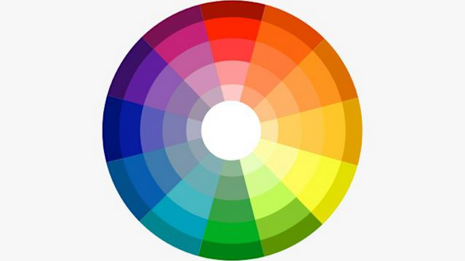
At the core of colour theory is the colour wheel, a circular representation of colours arranged according to their relationships. The wheel contains twelve main colours, split into three categories: primary, secondary, and tertiary. Primary colours, red, yellow, and blue, form the basis for creating all other hues. Secondary colours, orange, green, and purple, are combinations of the primary colours; orange = red + yellow, green = blue + yellow, and purple = blue + red. All other colours are tertiary, made by mixing a primary with a secondary.
Complimentary colours are directly opposite each other on the wheel, for example, red and green. When used together they have a high impact, as it creates a striking and contrasting aesthetic.
Colours that are found next to each other are called analogous. These colours harmonize well together as they share similar tones. They are often found in nature, for instance, blue and green, which can help give them a calming quality.
A triadic colour scheme is one made up of three colours that are equally spaced around the wheel, forming a triangle. This offers contrast while maintaining harmony and gives a dynamic and varied palette.
Colour Psychological
Colours can have an impact on our brain, affecting our mood, behaviour, and cognitive function.
Colours with a longer wavelength, warmer colours like red, orange, yellow, etc., stimulate an increase in energy and excitement. Cool colours such as blue, green, and purple have a shorter wavelength and increase concentration and focus as well as calmness and relaxation.
Our visual inputs make up eighty percent of our sensory impressions, so the use of materiality and colour in design is critically important. The principle of biophilic design (using humans’ innate connection to nature in design) is fairly well documented and starting to become more common in modern architecture. It therefore stands to reason that colours that are associated with nature, blue and green for example, may stimulate similar benefits that come from biophilic design. Connection to nature can improve cognitive function, reduce feelings of anxiety and depression, improve mood, sleep, focus, and concentration, as well as reducing feelings of loneliness. Colours that reflect this can therefore access this range of benefits.
Cultural Significance
There are many cultural implications of colour that designers should be aware of. These vary massively between different cultures, so what can be a colour used for celebration in one place can also be offensive somewhere else.
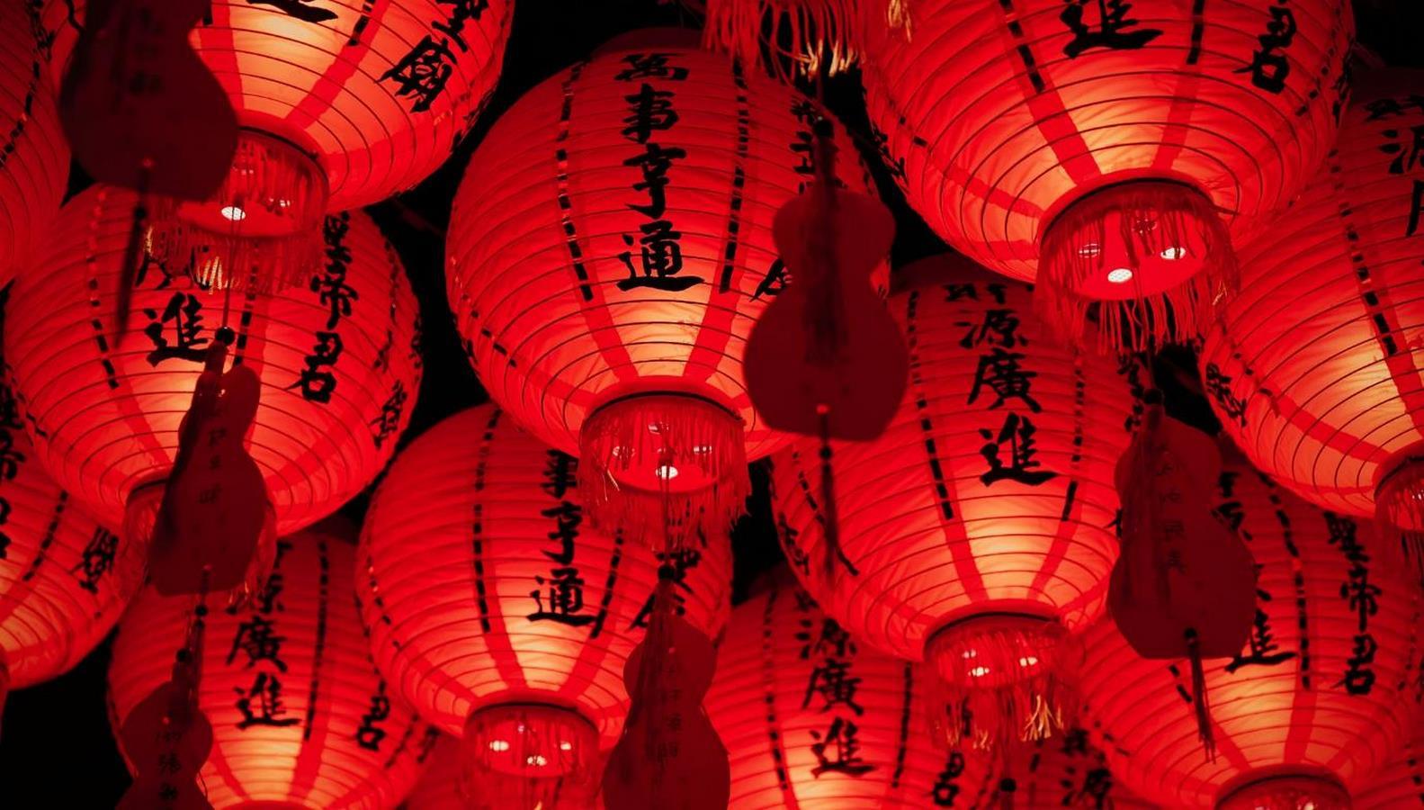
In South Africa, red is often associated with mourning, with many people choosing to wear a red item of clothing to funerals. In China, red is instead associated with celebration, energy, and prosperity.
Similarly, in Western cultures, white is a colour thought of as clean and pure, with it often being worn to weddings. In China, however, it is the colour of sorrow and is instead worn at funerals.
The cultural significance of colour is deeply ingrained in societal traditions, values, and beliefs. It can affect everything from personal identity, rituals, and religious practices to design choices, branding, and architecture. This means that there is high importance in the colours that designers choose, and what may work in one part of the world may have a completely different reaction elsewhere.
Sustainability
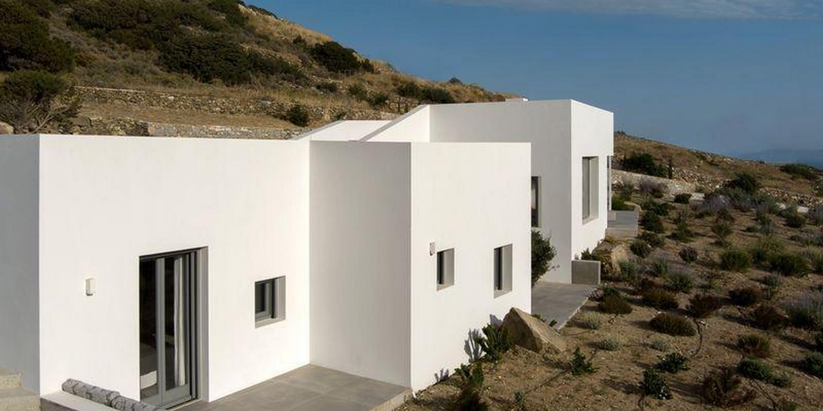
The use of colour in a building can significantly impact its energy usage, through how it absorbs and reflects heat and light. Light colours have a high albedo, meaning that they reflect more light than darker colours. Buildings can utilize light coloured materials in several ways. In hot climates, a light-coloured exterior can reflect sunlight meaning less heat is absorbed. This results in cooler temperatures indoors and less energy used on cooling methods. This can be seen in traditional architecture in places like the Mediterranean and the Middle East, where buildings are often whitewashed. Secondly, light colours can be used in interiors, to make the space brighter through the reflected sunlight. This again saves energy used for artificial lighting.
Dark colours have a low albedo, resulting in these materials absorbing more light. In cooler climates, using dark coloured surfaces means that they will heat up quickly, so it can reduce the heating requirements.
The colours in our environment greatly influence our emotions and mental processes. By exploring and utilizing the concepts of colour psychology—especially hues that encourage positive feelings such as relaxation, harmony, and creativity—designers can create spaces that improve emotional health and enhance productivity.