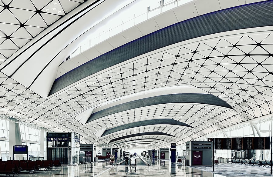
The first architectural decision most passengers notice at an airport isn’t the ceiling height, the terrazzo floor, or the sculptural roofline.
It’s whether the car in front of them stops moving.
Before anyone admires a terminal, the airport has already made them anxious, efficient, late, calm, confused, or quietly impressed. That experience begins at the curb: the place where luggage meets pavement, families split up, drivers hesitate, rideshares loop, buses idle, and signs have about three seconds to be understood.
Architects love the terminal because it photographs well. Passengers judge the airport earlier.
The curb is part of the building
Airport design is often discussed as if the terminal begins at the entrance doors. In practice, the building starts much farther out, somewhere around the first decision point: arrivals or departures, parking or drop-off, rental cars or rideshare, lane one or lane four. That outer ring is not a leftover traffic problem. It’s the first room of the airport, just without walls.
Good airport curb design understands that nobody arrives in an ideal state. One person is checking a boarding pass while another is watching the clock. A parent is trying to unload a stroller without blocking a taxi. A driver is reading overhead signs while a navigation app says something slightly different. The space has to work for people who are moving, distracted, and carrying too much.
That is why landside planning deserves the same design attention as the terminal hall. At busy airports, even a small ambiguity can multiply quickly. A confusing split in the road creates braking. Braking creates lane changes. Lane changes create honking. Honking creates the feeling that the airport is already failing, even if the gate area is beautiful.
Newark Liberty is a useful case because it sits inside a dense regional travel network where the airport is never just an airport. It is also a highway decision, a rail connection, a parking choice, and a timing calculation. A traveler comparing rail, pickup, and off-site parking near Newark Liberty International Airport is really making an architectural decision about how many moving parts they want to face before reaching the terminal doors.
The Federal Aviation Administration’s guidance on airport terminal planning treats terminal facilities as systems shaped by passenger processing, circulation, access, and future demand. That language matters. It pushes airport design away from the idea of a single iconic object and toward the harder reality of linked spaces, each one affecting the next.
A weak curb can sabotage a strong terminal. A graceful check-in hall does not feel graceful if reaching it requires three missed turns and a panicked stop in the wrong lane.
Movement has to be edited before it is designed
The curb is where airport circulation becomes personal. Inside the terminal, passengers tend to move in shared patterns: check-in, security, gate, baggage claim. Outside, the patterns are messier. Drivers are leaving, arriving, waiting, looping, merging, stopping, and trying not to get ticketed. Pedestrians are crossing between vehicles. Bags are rolling over joints in the pavement. Everyone has a different tolerance for uncertainty.
The common mistake is to treat more space as the solution. Wider roads, longer curbs, larger parking areas, more lanes. Sometimes that helps, but only if the choices are edited clearly. Too many options placed too close together can make a large airport feel smaller and more chaotic than it is.
Good execution usually looks quieter. The drop-off sequence is legible before the terminal appears. Parking entrances arrive before the curb conflict zone, not after a driver has already committed to the wrong lane. Pedestrian crossings are placed where people already want to walk, not where a site diagram looks tidy. Rideshare pickup is far enough from the main doors to reduce curb pressure, but not so remote that passengers feel punished for using it.
There is a useful parallel with urban design. A successful street is not simply a road with sidewalks attached. It is a negotiated space where visibility, speed, edge conditions, crossings, and human behavior all matter. RTF’s writing on airport design as a transportation space makes the broader point that airports sit between architecture, mobility, and urban development. The curb is where that overlap becomes obvious.
Think about a family arriving for a 7 a.m. flight. The driver wants the shortest stop possible. One passenger needs time to unload bags. Another is checking whether the terminal is correct. If the signage only becomes clear at the final fork, the design has already transferred stress to the user. If the curb has no forgiving pull-off zone, one slow unloading becomes a blockage. If pedestrian paths are hidden behind parked vehicles, the airport teaches people to improvise.
Improvisation is not always a sign of user error. Often, it is a sign that the design failed to predict ordinary behavior.
The best curbside environments do not require passengers to be unusually alert. They reduce the number of decisions made under pressure. They separate fast movement from slow movement. They let people pause without punishing everyone behind them. They make the correct action feel obvious, not because the signage is loud, but because the sequence is clear.
The terminal image can hide the real experience
Airports are increasingly marketed through interiors: daylight-filled halls, local food, public art, warm materials, clean seating, and destination branding. None of that is superficial. Terminals should feel humane. A long travel day is easier when the space has natural light, good acoustics, and places to sit without guarding an outlet like a scarce resource.
But airport architecture can become too image-led when the published story begins at the concourse. The passenger’s story rarely does.
A terminal can win praise for its interiors while still forcing passengers into clumsy arrival patterns outside. The reverse can also happen: a modest terminal can feel unusually competent if the approach, curb, signs, and thresholds are handled well. People forgive plainness faster than confusion.
This is where architecture criticism needs a wider frame. The quality of an airport should not be judged only by the drama of the roof or the elegance of the departures hall. The more useful question is: how many moments of avoidable friction does the airport remove?
A good curb removes the “Am I allowed to stop here?” moment. Good parking circulation removes the “Can I still get back to departures?” moment. Good wayfinding removes the “Did I just miss the only turn?” moment. Good pedestrian planning removes the small fear of walking between distracted drivers and idling cars with luggage in hand.
RTF’s coverage of innovative airport designs around the world shows how airports often become symbols of ambition, technology, and national identity. The curb is less glamorous, but it is where the symbolic airport meets the ordinary traveler. That ordinary contact point is where many projects either earn trust or spend it.
The airport that photographs well is not always the airport that works well at 5:30 p.m. in the rain.
Good airport design respects the tired passenger
Airport users are not a neutral design population. They are often tired, rushed, overloaded, unfamiliar with the site, and traveling with people who move at different speeds. Some are anxious flyers. Some are elderly. Some are trying to manage children, mobility devices, oversized bags, or language barriers. A curb designed around the confident, able-bodied, frequent traveler will fail a large share of real passengers.
This is why curb-to-terminal design should be judged through stress, not just capacity. Capacity asks how many vehicles or passengers can pass through a space. Stress asks what the space demands from people while they pass through it.
Can a first-time visitor understand the route without reading five signs at once? Can someone with heavy luggage reach the entrance without crossing unpredictable traffic? Can a driver make a mistake and recover without circling the entire airport? Can a passenger arriving by shuttle see the terminal entrance immediately, or do they have to infer it from where everyone else is walking?
These questions are practical, but they are also architectural. They concern sequence, edge, threshold, visibility, and scale. They are the same concerns architects bring to museums, campuses, hospitals, and civic buildings, only with more luggage and less patience.
Hospitals offer a useful comparison. The entrance experience matters because users arrive under emotional pressure. A confusing drop-off, hidden door, or unclear parking route can make the whole institution feel colder before anyone meets a doctor. Airports are different, but the emotional mechanics are similar. Before passengers enter the designed interior, they have already formed an opinion about whether the place is helping them.
Good airport design also respects the people who work there. Curbside staff, shuttle drivers, traffic officers, cleaners, wheelchair attendants, and airline workers experience the failures of the approach zone repeatedly. A passenger may endure a bad curb once. Staff absorb it all day. If a space depends on constant human correction, the design is underperforming.
The smartest airport improvements are often small and unglamorous: a clearer lane split, better lighting at a pedestrian crossing, a covered waiting area that actually aligns with pickup behavior, a sign placed earlier, a curb extension that handles peak demand, a parking exit that does not push drivers back into terminal frontage traffic. These moves rarely become the hero image, but they change the day.
They also age better than spectacle. A dramatic terminal gesture can date quickly. A well-edited arrival sequence keeps paying dividends every hour the airport is open.
Wrap-up takeaway
Airport architecture starts before the terminal because the passenger experience starts before the terminal. The curb, access road, parking sequence, shuttle stop, and pedestrian crossing are not secondary pieces around the “real” building. They are part of the building’s behavior. When those pieces are clear, the terminal feels calmer before anyone notices the materials or the ceiling. When they are confusing, even expensive architecture has to work uphill.