The lobby of an office building is a place where people transits and pass through; it is a ‘not-place’, almost by definition, as the airport waiting area, almost devoid of their own identity. It is an ‘object’ almost alien, home to people almost strangers or people who have closely job relationships.
Studio Name: anD studio + Motoelastico
Design Team: (anD studio) arch. Luca Villa + Ma Yoon Kyung
(Motoelastico team) arch. Marco Bruno + arch. Simone Carena + arch. Minji Kim
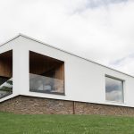
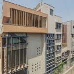
Area: South Korea
Year: 2014-2015
Location: Gyonggy-do, Anyang-si, Dongan-gu, Kwanyang dong, 813.
Consultants: architect June Ho Kim – architect Leroy Quentin
Photography Credits: Ulla Reimer photographer
Other Credits: Renderings Bruno Bassani
Author website url: http://www.andstudio.info
Client: Ohsung Paper Co. Ltd (OBIZTOWER)
Design Team:
anD – architecture natureDesign: architect Luca Villa
assistant Yoon Kyung Ma
Motoelastico Team:
architect Simone Carena
architect Marco Bruno
architect MinJi Kim
designer June Ho Kim
Architect Leroy Quentin
It is from this absence of relationships that we started the analysis in order to create a space that would have an own identity, more intimate, but that it would been also functional at the same time.
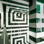
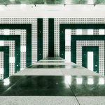
The first thought was to give continuity to the signs that bring from outside to inside, through a set of paths drawn on the floor such as to indicate direction, the accesses and waiting areas and a meeting point zone.
The idea from which we started seemed immediately relevant as the trend of the signs, who were outside in the direction of the entrance to the hall, were also what we wanted to became the starting point of the project and so they has been then up to the safe completion of the immediate conceptual result.
The flooring outside had to lead us into the great Lobby hall through a strong and direct sign, in an empty space and where people usually only passes through it. The main idea was just be a design that could mend the gap and the strong connection between the two ‘non-places’.
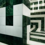
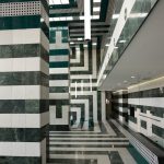
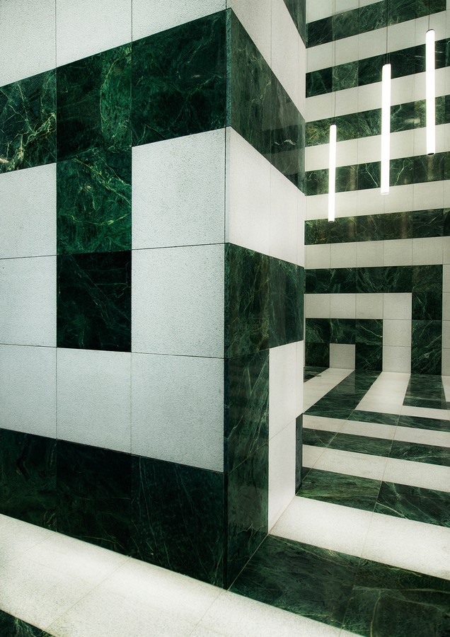
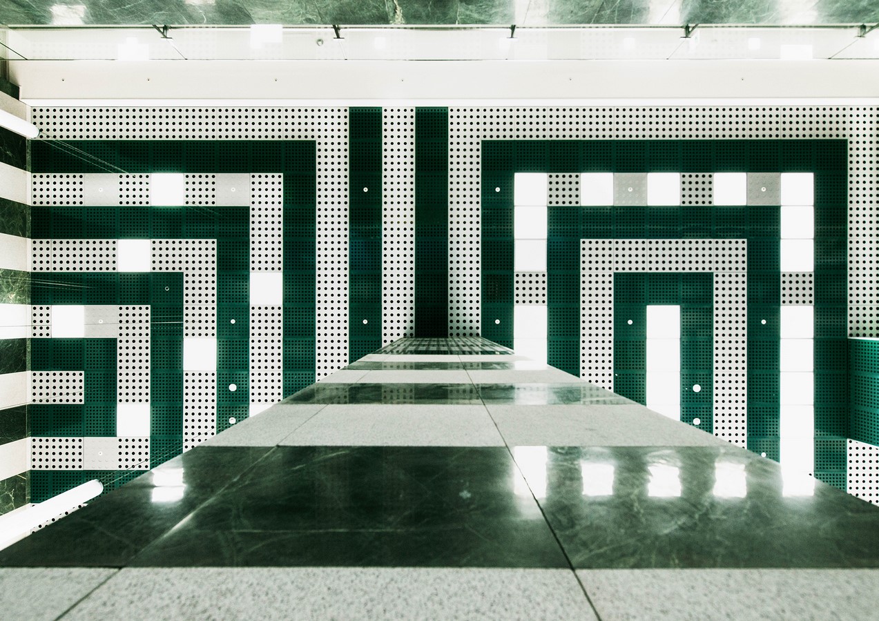
Our space, had to remember the history that we feel belong to our culture through the Renaissance and Siena, with its cathedral, and this would be our input charming and also the starting point, just because of its complexity and simplicity, at first with horizontal lines but it has to be also representative space, with its materials: marble and stone. The lines will join flooring with walls, pillars and ceiling by a geometric drawing. How to connect flooring, wall and ceiling would have been the reason of the project. The result has been achieved simply by combining two concepts only apparently different between them but that they had a single matrix, which gave birth to the result, allowing us to go further, and now all this seems like the only option and resolution of this enigma.
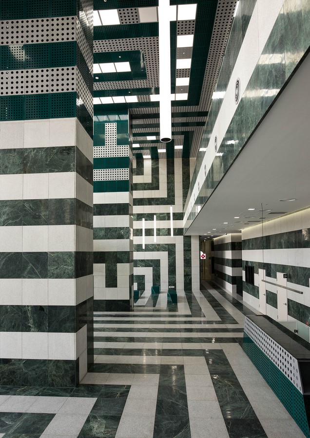
The concept was therefore to re-establish a relationship built through paths, emotions and touch sensations and about materials, lights and colors, contrasts and differences in quality and stone finishing, to emphasize differences, between stone and marble, between light and dark, between smooth and rough, shiny and matt, between gray and green.
It would been a place where simple geometries and materials, would not been only signs on the flooring, walls and ceiling, but they must have meaning inside them, stronger than a mere decoration. These spaces would have to suggest a meaning, not only transitory, they must have a direction, a route that would lead, almost forced, people to the outputs, to the elevators almost with empathy.
Our task was to redesign the space, at first, enriching it with an intrinsic value, as the required materials were, by their very nature rich, but it was culturally stronger. The modular 600×600 mm. was the starting point of the project, with stone tiles, metal and lighting apparatus together in a large symmetrical design.
All this has been possible by using metal panels with a laser cut design and modular dimensions of the holes; a material that it is lighter and economically viable for the ceiling also on the higher areas where there are the great pillars, looking for stubborn continuity of the stripes.
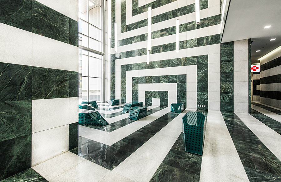
With the same metal sheets, we have added seats to one of the waiting areas, the same it been used for the info-desk. They are informal seats, positioned on the green marble lines on the floor with the intention to do not separate the seat by the ground, and giving continuity to the design, with an ergonomically compatible highness.
We believe that it been created a simple space, which comes out from one thought to the most complex, with a limited budget and a limited scope of action.
When it was almost completed interiors, were asked us to give a more accomplished design, from which we started supplementing with external flooring that goes all around the building; we wanted it to be the exact continuum of the interior, so we looked to continue it the design which it was only ideally, but now it could become concretely, with same design, size and color alternation used for interiors and this was the way to give it full meaning to the drawings on our the stripes to the floor.