Scroll, Scroll, Swipe! (pause) Wow! Interesting work. Nice presentation. Tap! Ah! Interesting ‘logo’ as well. Contact!
Now-a-days, this is how most of us are engaged, exploring and motivating ourselves through Social Media, and connecting with various other experts. Also a good and ‘fast’ medium to present our process and efforts, share our knowledge and receive feedback with various perspectives. So, while we plan to start our own project, the first step that usually makes sense to most of us is giving our work, our studio- an identity!
Logos is a term in Western psychology, philosophy derived from a Greek word variously meaning ‘opinion’, ‘word’, ‘discourse’ and so on. In short, it is a process of creating a visual identity for a ‘word’ which speaks about your ‘work’.
…the name defines our work; the logo describes us!
I believe, every ‘good’ designer knows that their ‘logo’ must “make sense”. Creative, minimalist, colorful, liberating, or just being logical; every ‘logo’ is thoughtful and reflects an individual’s personality. While, the process behind integration of forms, fonts, typefaces, colours and composition; makes all the difference!
Scroll, Scroll, Scroll! (pause) Wow! Interesting ‘logo’. Contact!…and this is how, with various opinions, I share with you- “The Thoughtful Logos of Architecture firms of India’.
1. Biome Environmental Solutions, Bengaluru
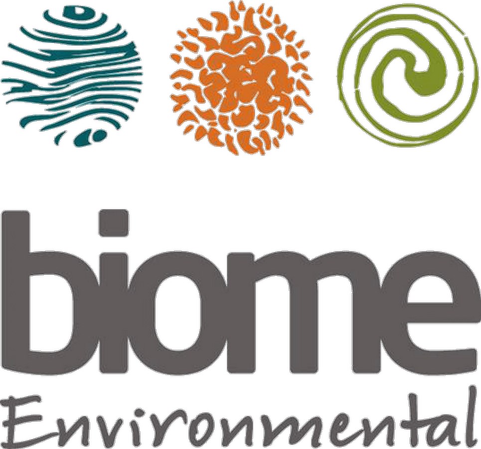
The ecologically and socially sensitive nature of Biome’s work, ensures to incorporate their vision of sustainability with the client’s aspirations for aesthetics, functionality, and budget.
Biome, the word translates to the ecology of a place. The Logo has three distinct orbs, the brown – representing earth, the blue water and the green ecology- the three being the focus areas of any project our practice undertakes.
-writes Ar. Sharath Nayak of Biome
2. Architecturebrio, Mumbai
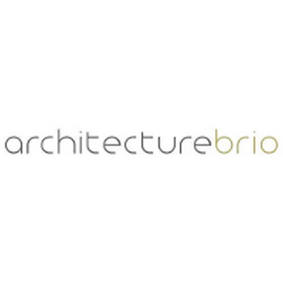
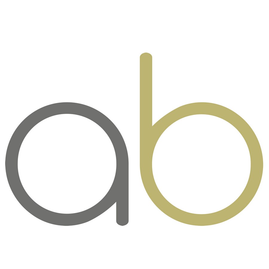
We chose the name of our design of our firm “architecture brio” in order to emphasise on the purpose of the firm: Architecture, and the kind of architecture we were set out to create: an architecture with “brio”. Brio is a Latin word that exists in Spanish, Italian and even in the English language. It stands for passion, rigour and commitment. We didn’t want to be defined by us and our personalities, but instead wanted to place the work itself to the forefront. The logo is therefore a straightforward name logo, spelling architecturebrio as one word.
The logo aims to reflect what brio stands for. The rounded but geometric style of the font reflects vigour but also dynamism and passion. The letter a, r, c, h, t, e, u, and b, all use a quarter or half of the letter “o”, which is a full circle, and in that sense create a dynamic rhythm in the name logo. Furthermore the letters are in small caps: we tend to be quite modest about our work.
The name logo uses only a difference in colour to separate the two words out of which it consists. The grey of “architecture” reflects a certain subtle seriousness, while the neutral ochre tone of “brio” speaks an earthy but optimistic language.
However the lengthy name logo turned out to become a deterrent in the world of social media where logo’s usually have to fit in a somewhat squarish or round frame. Therefore we shortened the name logo to “ab”, where the “a” and the “b” are a diagonal mirror image of each other, with the exception that the “b” has a longer leg. The visual symmetry is not pure and dogmatic, but is balanced and responds and adapts to its position in its visual context, much like the architecture that we have come to be known for.
-writes Ar. Robert Verrijt of architecturebrio
3. THOUGHT PARALLELS, Kozhikode, Kerala
Built on it’s individuality, ‘Thought Parallels’ believes sustainable design as the right thing to do ethically creating richer and powerful architecture.
Thoughts, the lines running parallel is the general impression one get when you look at the logo. But in fact it’s a series of lines in constant change, some even intersecting each other, such lines create a pulse, a life so to speak. Thus, thought parallels.
-By Team, Thought Parallels
4. The Purple Ink Studio, Bengaluru
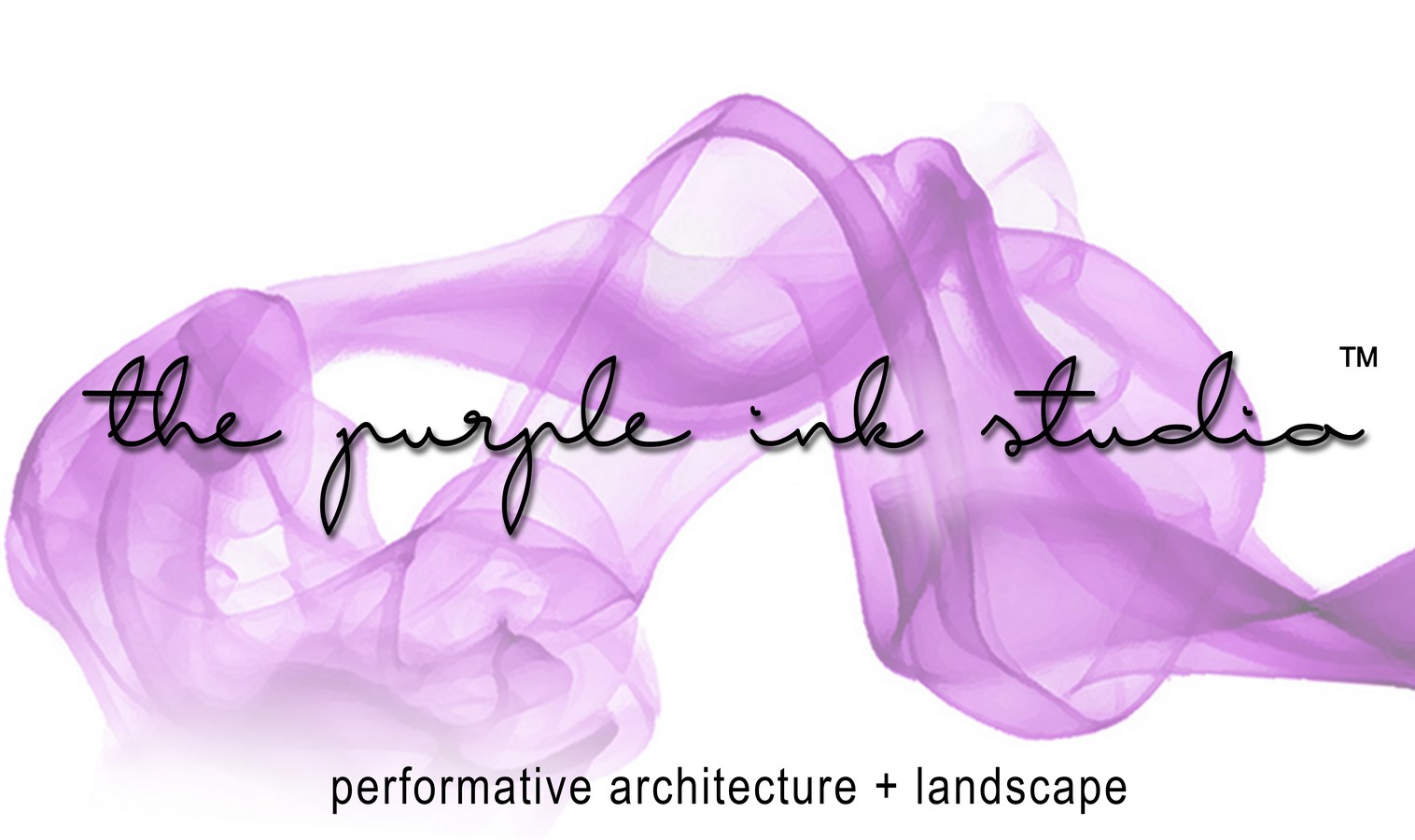
The design of the logo stems from the name of the studio. After brainstorming on the name, ‘the purple ink studio’ reverberated well since we envisioned our studio and work process to be collaborative, horizontal and a space that would allow us to explore and experiment in multi-disciplinary dimensions.
This idea of the studio reflects in the logo. The inclusion of smoke in purple and the font for the studio name make it characterful and expresses flexibility, warmth and the high-spirited work culture. The description of work – performative architecture + landscape is indicated in a formal font but is scaled down entirely in a lower case to add the subtle edge to the design.
-writes Ar. Akshay Heranjal of The Purple Ink Studio
5. MYVN Architecture, Bengaluru
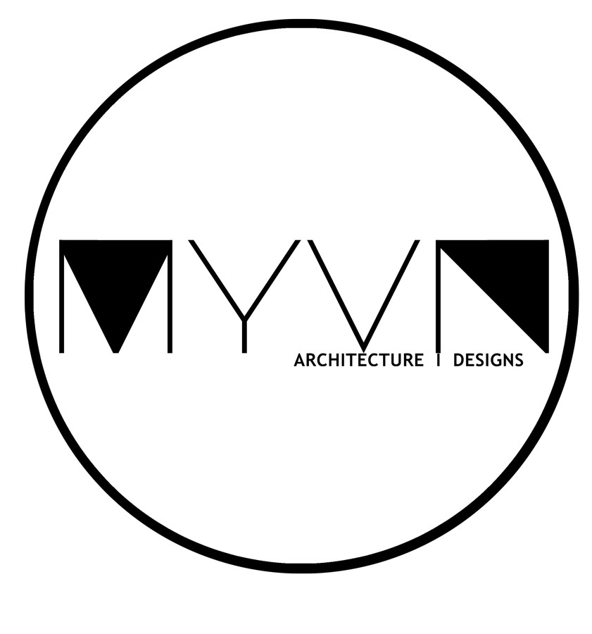
The name MYVN is an abstract of a Tamil word MaYaVaN (மாயவன்) which means magician or illustrator. From the graphical aspects, each letter in the logo is formed by subtraction of a square, M and N seems to be organised with a solidity whereas Y and N is disorganised with voids.
As the firm focuses on design with a strong belief in fundamentals of design philosophies and processes, at the same time exploring the contemporary tools and build that helps bring new perspectives to the basics, the logo is a derivative of old printing and wax seal stamp design while doing justice with the design context; designing with the constructive lines within the circle of the context. The logo is designed with the flexibility to keep up with the pace of the growth of the firm, the idea is to evolve the logo every 5 years expressing the change in the firm while rooted to its earlier stage.
-writes Kunika of MYVN Architects
6. Triple O Studio, Chennai
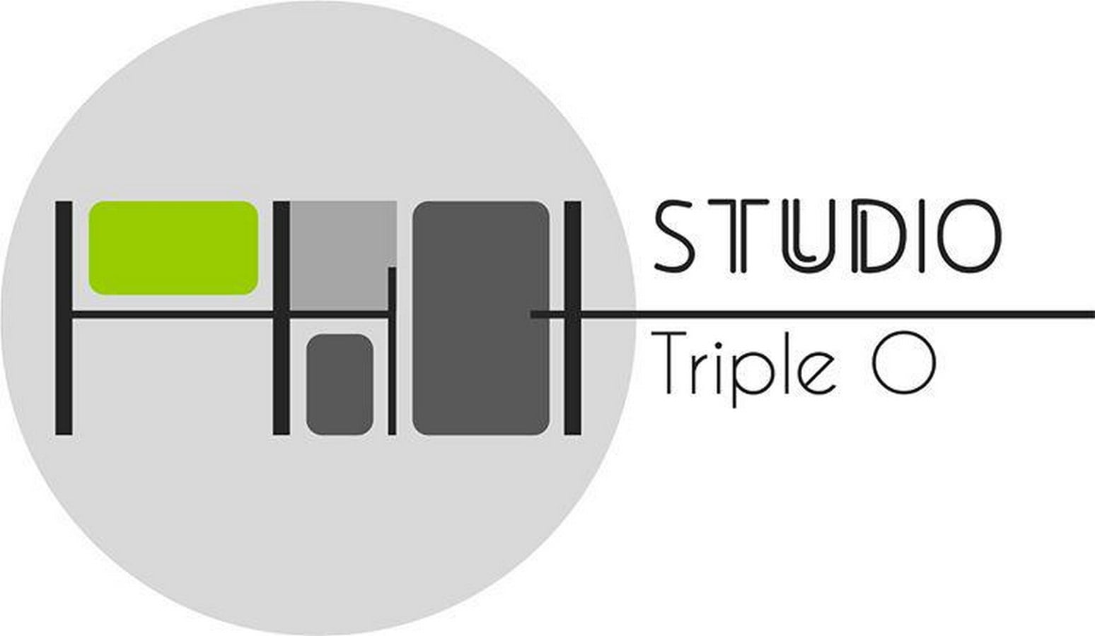
The Triple O – Logo is inspired by a cross-section of our space, highlighting all the different areas we work out of.
What better way to pay tribute to an architects’ studio by treating the point of departure as a very telling and relevant drawing. The drawing is apt because of the way the studio has expanded over time and thus creating new spaces at multi-various levels. We choose to use colour- what we call the ‘triple O green’ to draw focus to the core-studio area where a bulk of the design work happens and most of the crucial design decisions are made. The lime metaphorically extends beyond the logo to symbolize our growth as a studio– something that has been steady, sustainable, and one that strives to take us beyond our comfort zone.
-By Team, Triple O Studio
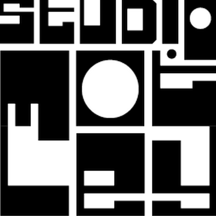
7. Studio i! , Surat
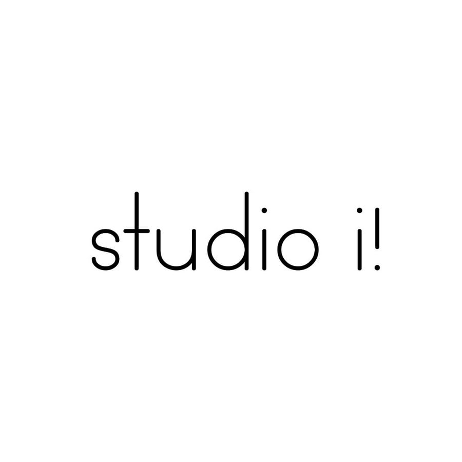
Our practice was founded by two Individuals Mitul Desai and Priyank Parmar. We came together in a very organic manner to fulfil one project we had on hand and from there it grew into more projects and eventually a full practice. Hence the two i
However, as architecture demands a wide range of experiences and skill sets we realized that these two individuals can bring quite opposing sets of skills required to fulfil architectural production. This is why the i are opposing in their orientation. i!
Lastly, Architecture has many pragmatic considerations but there always needs to be poetry embedded in it. The upside down i becomes an exclamation !. So unless there is an exclamation the architecture becomes mundane. Two self-similar i cannot sustain this promise.
To summarize I’d quote Oscar Wilde –
“The ordinary gives world its existence and the extraordinary gives it its value”
So the pragmatic and the poetic
The poised and the emotive
The Sane and the insane
The technical and the sensuous
Come together to form this practice and these roles keep getting exchanged .
To end the story, the written i! had great graphic value!! The visual was in fact the starting point of everyone getting excited by the name and the logo.
While we designed the logo ourselves it was graphically illustrated by Graphic Designer Vaishnavi Desai
-writes Ar. Mitul Desai of Studio i!
8. THUMBIMPRESSIONS, Surat
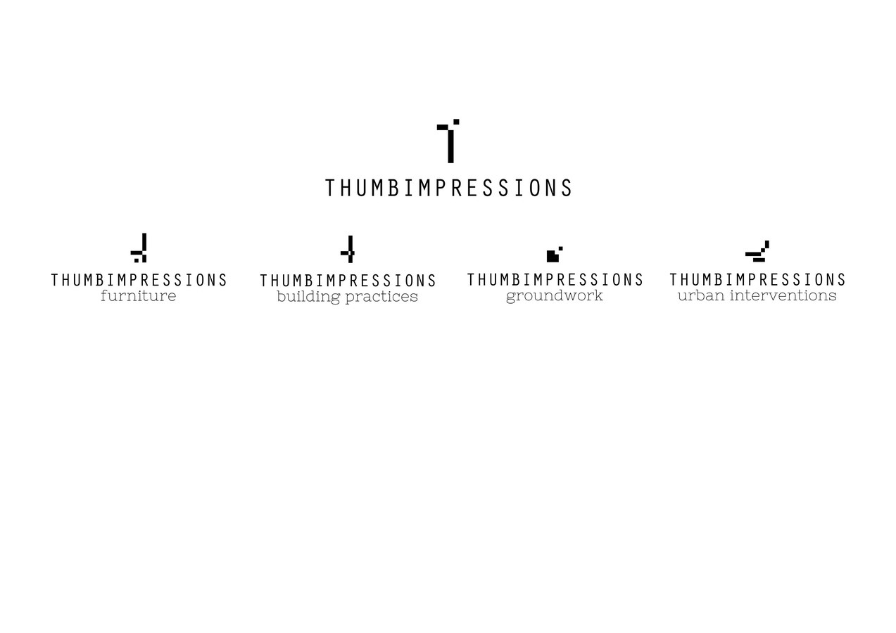
The brand thumbimpressions chose to have a non-static non-conformist logo to express the continuous process of arriving at a form instead of a definitive form itself. It is meant to compel the viewer to complete it for themselves instead of giving unvarying clarity. The gaps and connections between the three pixels are meant to defy clarity and assert a possibility of the arrival of meaning as a consequence of proximity and coexistence.
Designed by Sagar Shah with inputs from the thumbimpressions team, the logo stands for a collective spirit and identity. The pixels communicate multiple meanings like the possibility of reading it as an incomplete ‘t’ of thumbimpressions or the lower and longer pixel aligned to gravitation force, the upper one suggesting lightness and the in between one attempting to secure both. The idea of pixels were further explored for the sub logo based on the thematic area of work they pertain to.
-By Team, THUMBIMPRESSIONS
9. COMPARTMENT S4, Ahmedabad
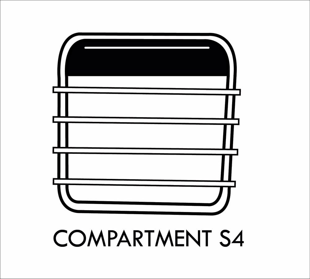
Compartment S4 is a collaborative practice of eight architects, all of us graduated from CEPT University in Ahmedabad and founded our practice with the intent of providing context-sensitive design solutions to varied urban and rural areas.
Having studied together, each of us belong to a similar school of thought but with diverse and complementing interests in writing, graphics, planning etc. Hence the name of our firm, Compartment S4, also originates from the time we used to sit together in a row arrangement during one of our studios in CEPT. It was one of our professors who began to call our seating arrangement as a Compartment of the train, the name stayed with us a group who was always seen together on campus.
The train window in our logo is derived from the name and is also symbolic of the many places we travel to for work, including the interiors of villages in Uttarakhand, Gujarat and other states. We hope to keep up to being a travelling studio making meaningful interventions for whichever part of the country requires it.
-By Manuni Patel of Compartment S4
10. LocalxSociety, Ahmedabad
We believe our duty as creative cooperative must respond from local scope, respecting the social context and the history behind; to the vision of the whole society and its challenges for incoming generations.
Whole cannot be considered without the parts. Our global goal has to be achieved starting from the minor modification of the element which will expand over a period of time to the part, and eventually, to the whole.
Hypothesis-
LOCAL as MICRO, subspace, locality, specific communities, rural areas, minorities, vernacular settlements, traditional techniques, heritage culture.
SOCIETY as MACRO, universe, global smart cities, connectivity and knowledge disclosure, new technologies & future sustainable solutions.
A x (local + local + local) = A (society) = A (local) + A (local) + A(local)
(Change of the set affects the parts, partial changes affect the set)
[local x society] = [society x local] (Commutative Property of Multiplication)
Local problem > Society’s response / Society’s problem > local response
-By Manuel M of LxS
11. d6thD design studio, Ahmedabad
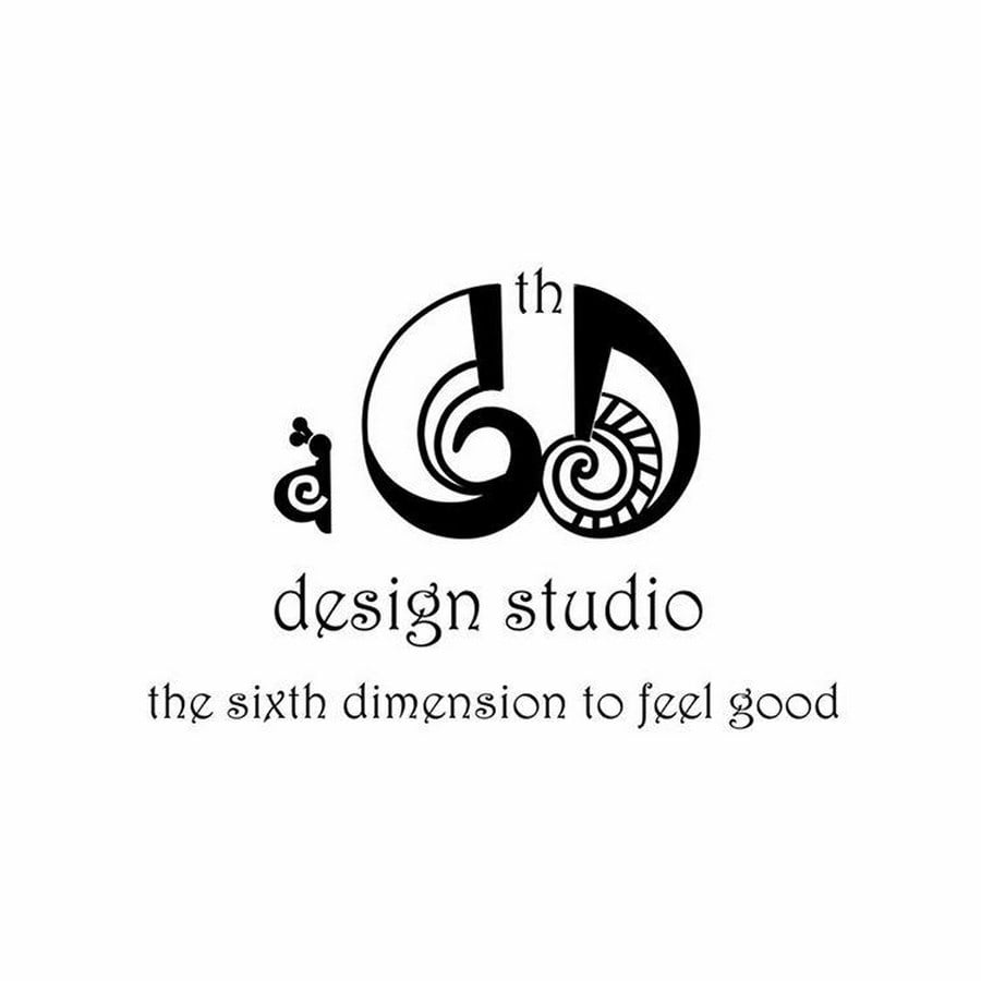
D 6th D means ‘The 6th dimension’. Now what is the 6th dimension? Any object or space can be measured in 3 Dimension but to feel good about it is 6thD. The 6th dimension is not restricted to measure the physical world but to explore the Feel Good Spaces. We are interested in exploring the ways in which spaces can create experiential happiness. We visualize the practice as a sheltered and collaborative place for reflection, where a community (including clients and other collaborators) can reflect on how to make life happy and feel good through architecture.
Our logo has been inspired by snail since what could be better than snail as a symbol of happiness. Contemporary men have represented snails in several forms of artistic expressions ranging from cartoons and animated movies to poems. Although snails are slow moving creatures and don’t have any legs, they always seem to be moving forwards with purpose somehow knowing exactly where they want to go. I mean have you ever seen an indecisive snail? The same way, d6thD is very focused about practicing vernacular architecture.
While snails don’t move very fast, they leave a trail of mucus behind the same way, we work very slowly we work at our own pace but we leave our marks behind and inspire others to walk on the trail of vernacular architecture for the betterment of society.
-By Ar. Himanshu Patel of d6thD Design Studio
12. M:OFA Studios, New Delhi
M:OFA in its full form, is Manifestation of Fluid Architecture, with the word ‘fluid’ taking center stage. Fluid here, refers to an open ended experimental approach to design, a democratic team structure and existence of free speech, when it comes to ideation within the studio. The bold letters of the font, the monochrome is synonymous with a clear, decisive thought process.
From FLUID it’s a build up into Architecture, to create architectural designs that imbibe this free spirit and in order to believe in it deeply and on a day today basis, for it to become from a manifesto to reality for everyone who is a part of this design philosophy, the word “Manifestation” is added. The colon after the ‘M‘ is a pause point, to reflect and to think, everytime when there is a new idea, to vet it, to use it responsibly so that whatever architecture that is created by MOFA is deeply rooted in its context, yet as fluid in its body and spirit that it can respond to the constant changes brought in by life that inhabits it.
The color green signifies the oath we undertook at its inception, to create “Architecture of Responsibility”, a resolve we undertake to not produce or work on projects of frivolity, of waste but, only those that help this world, humanity and environment at large.”
-By Ar. Manish Gulati of M:OFA Studios
13. ESSTEAM, Surat
Our name essteam is a combination of two words. The first part is ess. It is derived from the Latin word ‘esse’, which means ‘be’. This is the same word that leads to the word ‘essence’—the essence of our practice is to work as a team to achieve goals.
The second part is team. This word constantly reminds us that we are part of the whole, and it is only together that we can achieve. This leads to our mentality of being supportive, being responsible, and more as a team.
This logo was designed when we completed 10 years, and it represented a new chapter in the journey of ESSTEAM. The upper portion of the logo shows the zoomed view of a green leaf, which symbolises sustainability and nature. The lower portion of the logo shows the texture of grey concrete, which symbolises built form and human society.
We understand that design is a balance of nature and society. The wings on both sides of the centre part expresses how the firm is opening itself to reveal what it believes from inside. This was added in the previous version of the logo in 2013 along with some graphical refinements to emphasis and share its beliefs.
-By Ar. Nishith Jariwala of ESSTEAM
Last, but not least, I wish to share the logo of Studio Motley, Bangalore that has intrigued me, till date!
14. STUDIO MOTLEY, Bengaluru
Last year, when I received confirmation for my internship from Studio Motley, all I googled was ‘meaning of Motley’, and I quickly settled for what it told me, “incongruously varied in appearance or character; disparate”. By the end of internship, I felt how true this could be! It was indeed, ‘diverse’. The boldness in the logo reflects their bold use of details and materials in their every project.
Motley refers to the number of people that have to come together to create a work of architecture from the masons to the carpenters, craftsmen, to the clients and architects.
Our logo was designed by tacit design studio, Bangalore and our brief to them was that it should reflect this coming together of various people/forms and shapes and yet retain an essential simplicity. As tacit says “The inherent variety of the form of the letters took the shape of an identity that had expressed architectural representations of elevation, spaces and urban density.”
-By Ar. Kajal Gupta of Studio Motley
This is how various architectural practices are reflected on their logos. And this is what the founders have to say about their philosophy and meaning behind what we initially perceive- ‘logo’
Every ‘logo’ has a story behind it. Interesting one! What’s going to be your story?
P.S.- I would like to thank all the above mentioned firms to actively involve themselves, and support me through the process.