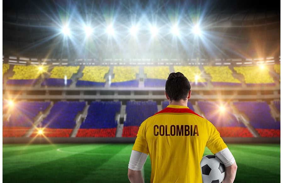
Football kits and stadiums are designed for the same audience and often speak the same visual language. Both carry a club’s colours, history and sense of place, and both have to work at very different scales, from a crest stitched on a chest to a facade seen from across a city. Kit designers regularly borrow from architecture: geometric patterns echo stadium roofs and facades, commemorative shirts mark the closing of historic grounds, and city-inspired third kits translate local buildings into graphic details. Seen through a design lens, a football shirt is a small piece of wearable architecture.
A stadium tells a club where it lives. A kit lets supporters carry that home.
Two Objects, One Identity
Architects and kit designers face a similar brief. They must express identity, respect tradition and still feel contemporary. A stadium needs to be recognisable on television and memorable in person. A shirt needs to be recognisable from the stands and personal enough that supporters want to wear it on an ordinary Tuesday.
Both also live with constraints. Stadiums answer to sightlines, crowd flow and safety regulations. Kits answer to league rules on colour clashes, sponsor placement and numbering. Good design in either field finds personality within those limits.
Highbury: When a Kit Honoured a Building
One of the clearest examples of architecture shaping a kit comes from Arsenal’s former home, Highbury. Its East and West Stands, designed in the Art Deco style in the 1930s, became some of the most admired football architecture in Britain, and the East Stand was later listed for its architectural significance. Organisations such as Historic England record and protect buildings of this kind, recognising that sporting venues can be part of a nation’s architectural heritage.
When Arsenal played its final season at Highbury in 2005–06, the club wore a redcurrant shirt echoing the colours worn in its first season there in 1913. The kit was not about a pattern on a wall. It was about a building’s lifespan, turned into something supporters could wear as a farewell.
Facades, Grids and Repeating Patterns
Modern stadium facades often rely on repetition: panels, ribs, lattices and cladding systems that create rhythm at large scale. Kit designers use similar tools in miniature.
| Architectural element | Kit design equivalent | Visual effect |
| Facade panels and cladding | Tonal geometric print | Texture without breaking the base colour |
| Roof trusses and ribs | Diagonal or linear pinstripes | Movement and direction |
| Brick and stone coursing | Fine horizontal patterns | Heritage and solidity |
| Lit facades | Contrasting trims and gradients | Energy and contrast |
| Arches and curves | Curved collar or panel lines | Softer, classical feel |
Munich’s Allianz Arena shows how light can become identity. Its inflated ETFE facade panels can glow in different colours, turning the whole building into a signal visible from far away. Kit designers pursue the same idea when a single contrasting trim or gradient makes a shirt instantly readable from the top tier.
Retro Shirts as Design Archive
Old kits offer a record of graphic design trends much as old buildings record architectural movements. Simple collared shirts of the 1960s and 1970s reflect a modernist restraint. Bold, geometric shirts of the late 1980s and early 1990s mirror the era’s appetite for colour and pattern. Cleaner, technical fabrics from the 2000s onward reflect a shift toward performance and engineered materials.
That is part of why classic football shirts remain so popular with collectors and designers. Like listed buildings, they preserve the visual language of a particular moment, and studying them reveals how typography, crest design and colour blocking have evolved over decades.
City Identity in Third Kits
Clubs increasingly use alternative and third kits to tell stories about their cities rather than repeating home colours. Designers draw on skylines, bridges, street grids, transport maps and local materials, translating them into subtle prints or colour palettes.
When done well, these kits work like good contextual architecture: they respond to place without becoming literal. A pattern that suggests a city’s ironwork or tiling can feel more sophisticated than a printed skyline.
Materials and Performance
Architecture and kit design have both been reshaped by material science. Stadiums use lightweight membranes, engineered timber and high-performance glazing. Kits use moisture-wicking synthetics, laser-cut ventilation and bonded seams.
In both cases, technical performance now influences appearance. Ventilation zones on a shirt create visible panels, just as structural decisions in a roof shape a stadium’s silhouette. Function and form increasingly develop together.
Design Lessons From Both Worlds
Designers in either field can take a few principles from the other:
- Work at multiple scales. A design should read from a distance and reward close inspection.
- Respect context. History and place give designs meaning.
- Use repetition carefully. Patterns create rhythm, but too much becomes noise.
- Let materials speak. Honest use of materials adds credibility.
- Design for emotion. Supporters remember how a ground or a shirt made them feel.
Common Pitfalls
Kits and stadiums both lose impact when designers:
- Chase trends that date quickly
- Ignore heritage in pursuit of novelty
- Overload surfaces with competing patterns
- Forget the viewer’s distance
- Treat identity as decoration rather than structure
Wearable Architecture
A football ground is where a club’s story unfolds. A football shirt is how supporters carry that story into the world. When kit designers look to architecture, and architects look to the colours and rituals of the game, both disciplines produce work that feels rooted, recognisable and lasting.
The best designs, on a pitch or on a skyline, are the ones people choose to keep.