This project involves a 160-room hotel operated by UDS under the theme of a “public house in the city.” The site is a minute’s walk from the Shibuya metro station exit, halfway up the slope from Shibuya (meaning “Shibu valley”) to Aoyama (meaning a “blue mountain”), literally the midpoint between the valley and the mountain. It has an atmosphere combining Shibuya and Aoyama, and there used to be a lovely cafe called On the Corner. In front of the site is Mitake Park. Here we set out to create a hotel with a welcoming public atmosphere that embraces people’s unrestrained behaviors and noises, echoing the park environment.
all day place shibuya
Mikkeller Kiosk Bar / ABOUT LIFE COFFEE BREWERS
Client: UDS Ltd., Mikkeller, ONIBUS COFFEE
Location: Shibuya-ku, Tokyo
Usage: Hotel / Beer bar / Cafe
Interior Design / Environmental Design: DDAA
Project Team: Daisuke Motogi / Kazuya Sumida / Taiga Mando
Developper: and co.,ltd.
Architectural Design: UDS Ltd.
Construction: Nakano Corporation
Interior Construction: seventh-code, BENEFIT LINE, SET UP
Graphic Design: Sitoh inc.
Room Art Curation: VOILLD
Planting::The Landscapers
Total floor area: 4242.16m²
Date of completion: April / 2022
Photo: Kenta Hasegawa
Meanwhile, our client gave us a keyword, “public house,” from which the word “pub” comes. In Japan, the word “pub” is only known as “pub,” so I was surprised to learn that the word comes from “public.” It was also an inspiring keyword that evoked the image of a hotel lobby actively extending outwards to the city. The hotel should not remain self-contained and closed on its grounds but should exude outwards, like public spaces or parks. Rather than simply designing a hotel that serves guests, we envisioned a hotel that becomes part of Shibuya’s everyday life and evokes a sense of daily life in Shibuya for travelers. Someone’s ordinary life is extraordinary for others. With this in mind, we set out to create a place where everyone enjoy Shibuya’s everyday life, including locals, travelers, and businesspeople.
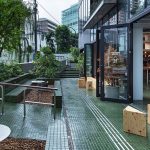
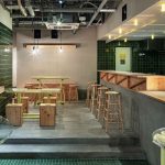
Instead of a grand hotel entrance, we wanted a more open and versatile front that people could use flexibly in multiple ways. Based on the straightforward reason that good ventilation would be essential in the post-Covid19 era, we decided to open all the doors. By opening the front to the city, the hotel can offer contents that people can access from outside and enjoy from spring to autumn, for example, ice cream shop, flower shop, etc., and they will exude into the city. We wanted to design an atmosphere that actively allows diverse conditions of use from morning to night for hotel users and people in the surrounding area.
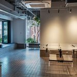
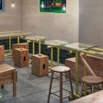
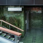
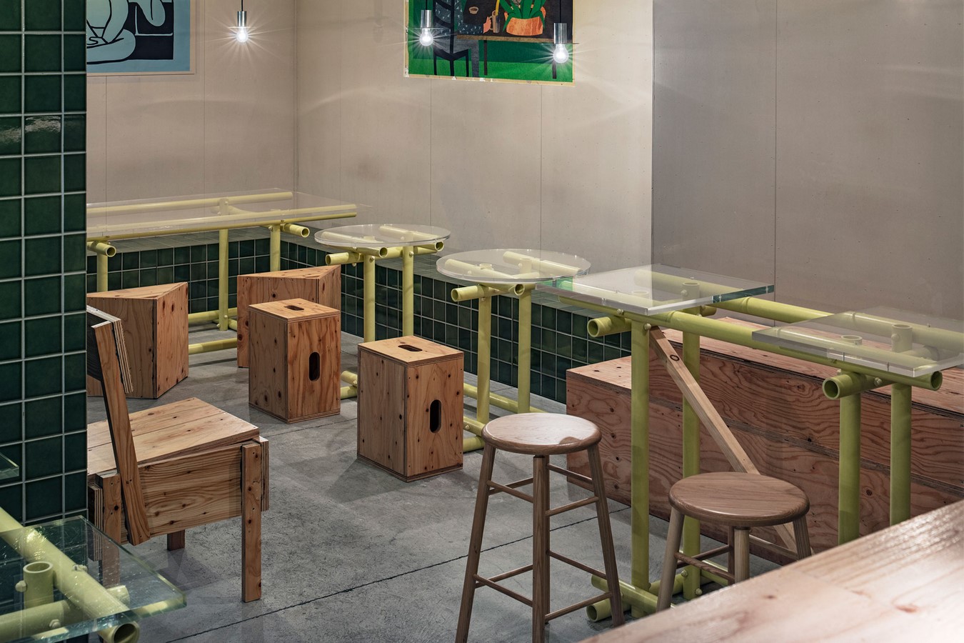
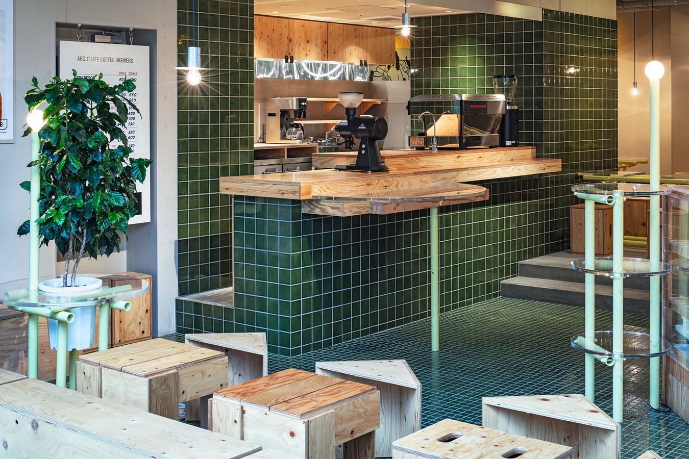
When we joined the project, they had planned the terrace on the first floor as a hotel entrance. We took advantage of the slope’s difference in elevation to place step benches, flower beds, and planting strips as much as possible. To make the boundary between the road and the hotel less conspicuous, we cast low concrete walls along the road boundary at a height that allows people to sit on it. These bench-like walls are thick enough to put coffee, beer, and even some dishes and lunch boxes. To create a scene where people can gather and hang out everywhere, we designed exterior elements, including railings, flower beds, and even the hotel sign, allowing people to put down their coffee or beer and have a good time there. Plants and trees will grow up and provide more shade in the summer.
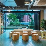
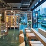
Our first instinct was that the outside atmosphere would be the key to this hotel, so we decided to use materials that would allow the open, park-like atmosphere to continue directly into the interior spaces. Given that the materials we could use were limited to those that could be used continuously from the terrace at the entrance to the interior, preferably to the bathrooms in the suites at the far end of the top floor, we finally decided to use tiles as the primary material.
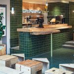
The tiles were custom-fired in Tajimi, Gifu Prefecture, and the color was adjusted using an original glaze. We chose green as the primary color because the unevenness of the color of the tiles produces a beautiful effect, the color does not suggest a strong meaning in itself as strongly as other colors, and it blends well with plants and trees. The client chose the Danish craft beer brand Mikkeller and the Japanese coffee shop About Life Coffee Brewers as the tenants to use the outside space on the first floor, and asked us to design a space that feels Japanese to Danish visitors and feels Danish to Japanese visitors. This green color is also used in Oribe ware, a type of Mino ware produced in the Tono region of Gifu Prefecture. It is a very typical Japanese color, even though the way we use it does not make it look that way.
Let me digress for a moment. Oribe ware was founded under the guidance of tea master Furuta Oribe, who, together with Sen no Rikyu, brought the tea ceremony to great perfection. Oribe is a great master of “mitate” along with Sen no Rikyu. Mitate is a way of looking at things not as what it is, but as something else. There are many anecdotes about Rikyu and Oribe, who took everyday objects and sublimated them into designs that no one had ever seen before by diverting from their original uses. For example, they carefully selected and used ordinary natsume (tea caddy for powdered green tea) called “machi-natsume,” sold everywhere and made by unknown craftspersons for tea ceremonies. They also used biku, fish baskets used by fishermen on the Katsura River in Kyoto, as flower baskets; they adapted narrow doorways of ships for tea room entrances, and so on. We can change the meaning or scenery that differs from the original meaning simply by changing the viewpoint or perspective. Someone’s everyday life becomes someone else’s extraordinary life simply by changing the viewpoint of the person experiencing it. In keeping with the hotel’s concept, our design is based on the idea of the “extraordinary use of everyday materials” throughout the hotel.
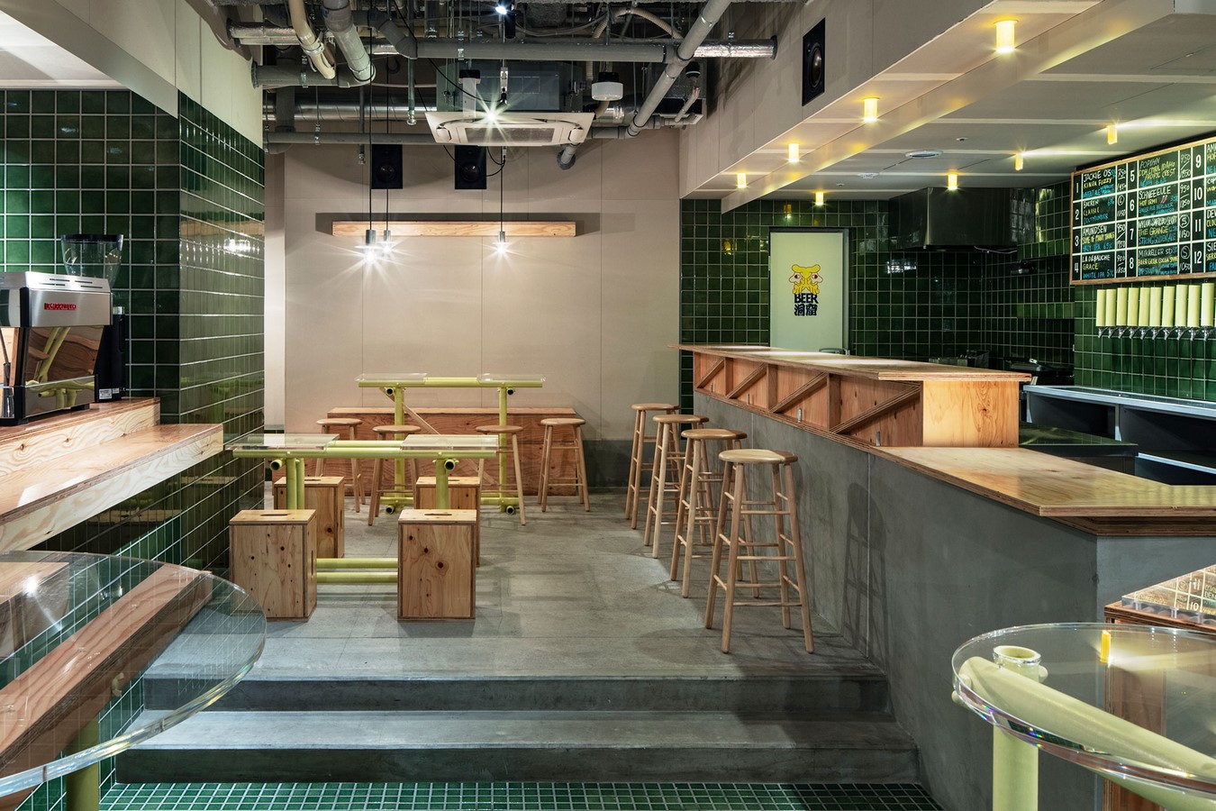
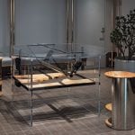
For example, we used melamine-faced plywood, a common material, for the hotel rooms. We often see this material in supermarkets, convenience stores, and commercial facilities. We designed everything in the rooms using only a single material, melamine-faced plywood with rough-cut edges exposed, which is not only cost-effective but also easy to clean and maintain. One of the reasons for leaving the rough-cut edges exposed is to use the same material throughout while planting some “noises” in advance to prevent it from becoming too neurotic about the quality. We also designed it to be as simple and easy to assemble as possible.
We designed all fixtures in the 160 rooms with a single material as much as possible to create a clean impression with few elements. The bed frames, desks, TV consoles, towel hangers, toilet paper holders, and lighting fixtures are all designed with melamine-faced plywood. We chose the color green to match the exterior tiles. All functions are integrated into the green furniture, making it easy to locate switches or cutlery and recognize where and what to do.
To consolidate as many functions as possible in a single location, we designed furniture pieces that combine two or more functions into a single form. A wash counter was elongated slightly to double as a desk. A bench to sit on and enjoy the night view of Shibuya doubles as a bed frame. A TV console, hanging bar, and a full-length mirror are integrated into a single fixture. We reduced the cost of materials and installation work by making furniture pieces that can play two, if not three, or more roles, while minimizing the number of elements appearing in a compact room.
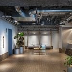
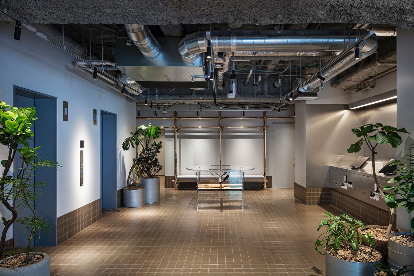
The reception area of this hotel is minimal for a 160-room hotel, thanks to the introduction of a self check-in counter. In addition, a round communication table, instead of an imposing reception counter, facilitates direct communication while eliminating the border between “here” and “there” or between “host” and “guest,” enabling staff and guests to work shoulder-to-shoulder to share travel plans and information.