Introduction: Why Wall Colours Shape the Entire Home Experience
The atmosphere of a modern home is not defined by furniture or decoration alone. One of the most influential yet underestimated elements is the way wall colours and paint finishes interact with light and space. These factors determine whether a room feels open or enclosed, warm or cool, calm or energetic.
In contemporary interior design, paint is no longer treated as a final decorative layer. It is a core design tool that shapes spatial perception, emotional response, and lighting behaviour. A carefully selected colour can make a compact room feel significantly larger, while the right finish can either soften or intensify visual impact.
However, colour alone is never the full story. Lighting conditions, surface preparation, and paint finish all work together to produce the final result. Understanding this relationship allows homeowners to design interiors that feel balanced, functional, and visually cohesive.
The Psychology of Wall Colours in Interior Spaces
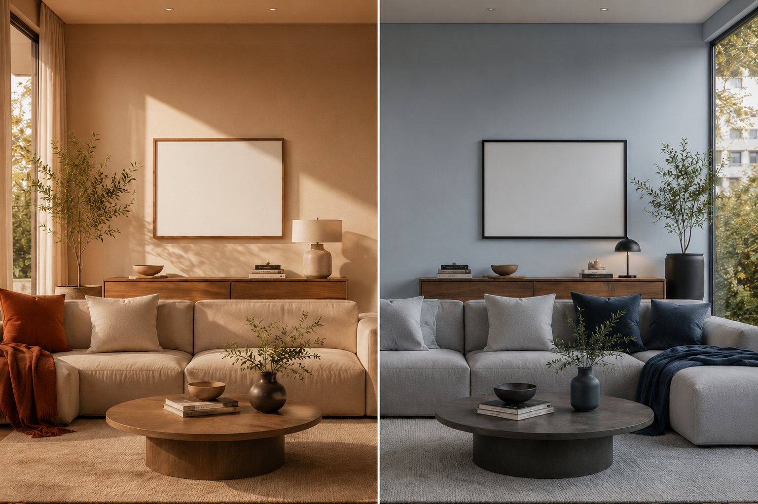
Wall colour directly influences how people experience a space. Human perception naturally associates certain tones with comfort, energy, calmness, or focus, which is why colour selection plays a critical role in interior design.
Neutral colours remain the foundation of modern homes because they offer flexibility and visual balance. Shades such as white, beige, and soft grey reflect light efficiently, creating a sense of openness and cleanliness. These tones also allow furniture and textures to become focal points without overwhelming the room.
Warm colours introduce emotional comfort and familiarity. Soft terracotta, muted peach, and warm off-whites create inviting environments, making them ideal for shared living spaces where relaxation and connection are important.
Cool colours such as muted blue, sage green, and cool grey encourage calmness and mental clarity. These shades are commonly used in bedrooms or private areas where relaxation and focus are priorities.
- Neutral tones enhance spatial openness and adaptability
- Warm tones create emotional comfort and warmth
- Cool tones support calmness and concentration
The choice of colour should always align with the function and emotional intent of the space.
How Paint Finishes Transform Light, Texture, and Space
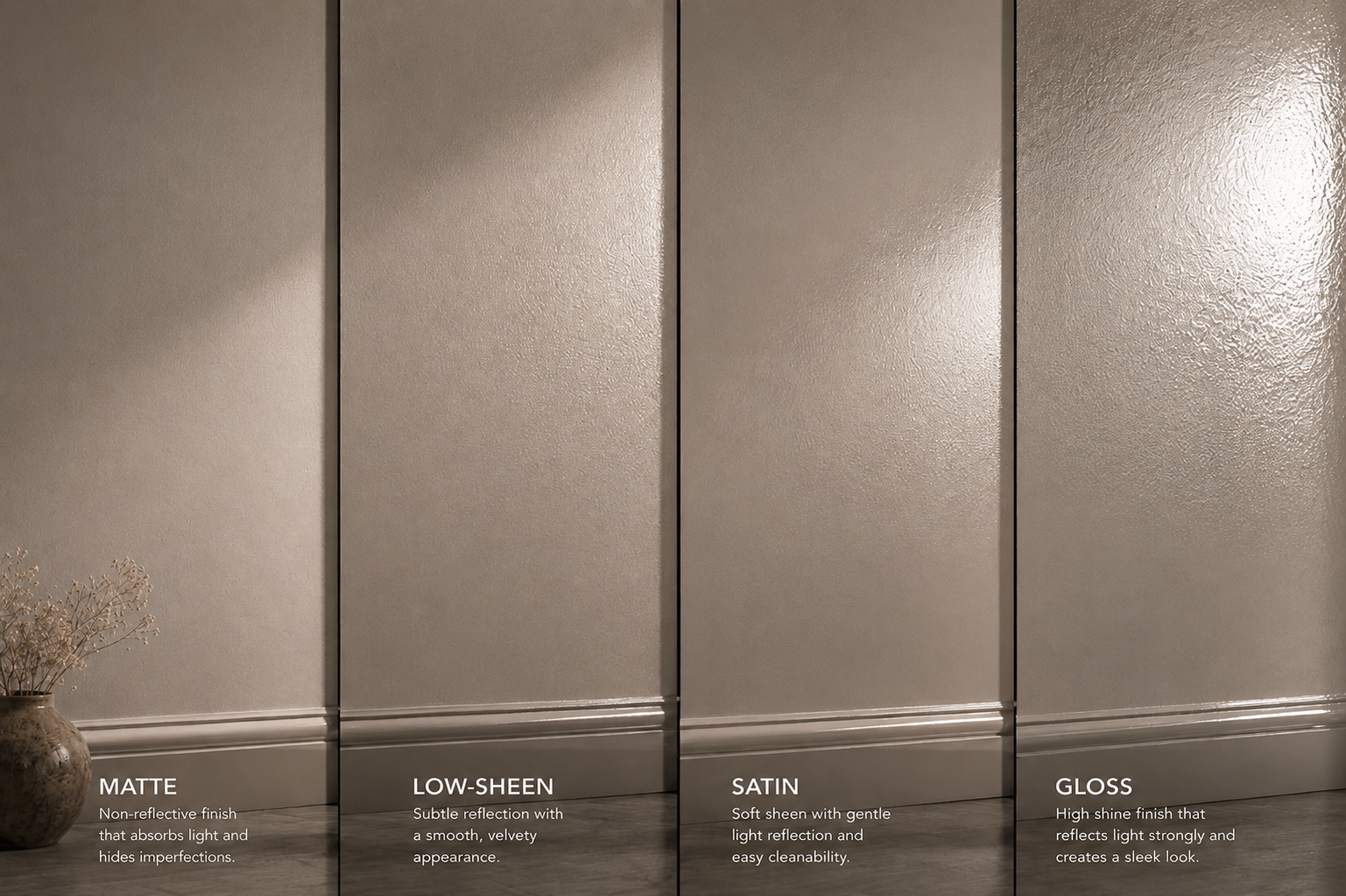
While colour determines mood, paint finish determines how that colour interacts with light and surface texture. This interaction directly affects how spacious or refined a room feels.
Matte finishes absorb light rather than reflect it, creating a soft, contemporary appearance. This makes them ideal for minimalist interiors and spaces that prefer subtle elegance. Matte also helps conceal surface imperfections, which is useful in older homes or uneven wall surfaces.
Low-sheen finishes offer a balanced solution between matte and satin. They provide a slight reflection that adds depth without creating glare, making them one of the most versatile choices in modern interiors.
Satin finishes introduce a gentle reflective quality that enhances colour richness and improves durability. These are commonly used in high-traffic areas where both aesthetics and practicality matter.
Gloss finishes reflect a high amount of light, creating bold visual impact. They are typically reserved for trims, doors, or decorative features rather than full wall surfaces.
Finish Comparison Overview
| Finish Type | Light Reflection | Durability | Best Use |
| Matte | Low | Medium | Bedrooms, ceilings |
| Low-Sheen | Medium-Low | Medium-High | Living areas |
| Satin | Medium | High | Kitchens, hallways |
| Gloss | High | Very High | Trims, accents |
Each finish changes how the same colour is perceived under different lighting conditions.
Lighting: The Hidden Factor That Changes Everything
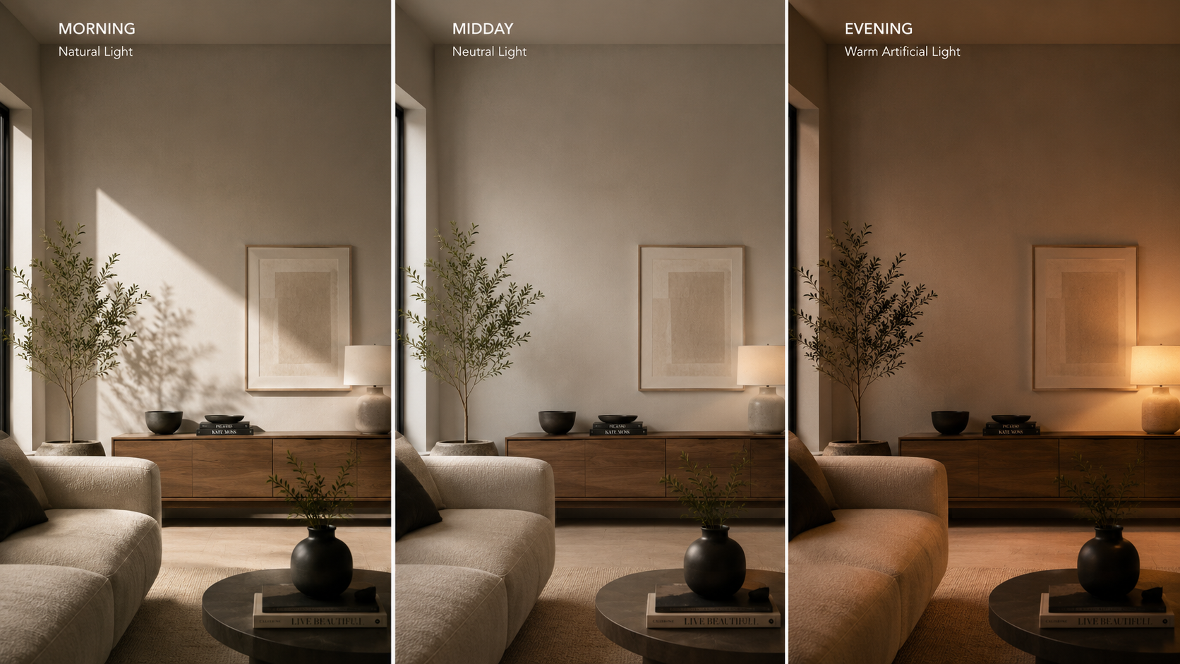
Lighting plays a defining role in how wall colours appear. Even the most carefully selected paint can look completely different depending on lighting conditions throughout the day.
Natural light changes in intensity and warmth from morning to evening. Morning light tends to be softer, midday light is more neutral and intense, and evening light introduces warmer golden tones. These variations continuously reshape how colours are perceived.
Room orientation also impacts colour behaviour. North-facing rooms often receive cooler light, while south-facing rooms may feel warmer depending on regional positioning. This affects whether a colour appears true to sample or slightly shifted in tone.
Artificial lighting further influences perception. Warm artificial lighting enhances reds, yellows, and earthy tones, creating a cosy atmosphere. Cool lighting enhances blues and greys, resulting in a crisper, more modern visual effect.
- Natural light shifts colour tone throughout the day
- Artificial lighting changes warmth and contrast
- Room orientation affects brightness and colour accuracy
Selecting paint without considering lighting often leads to unexpected results after application.
Surface Preparation: The Foundation of a High-Quality Finish
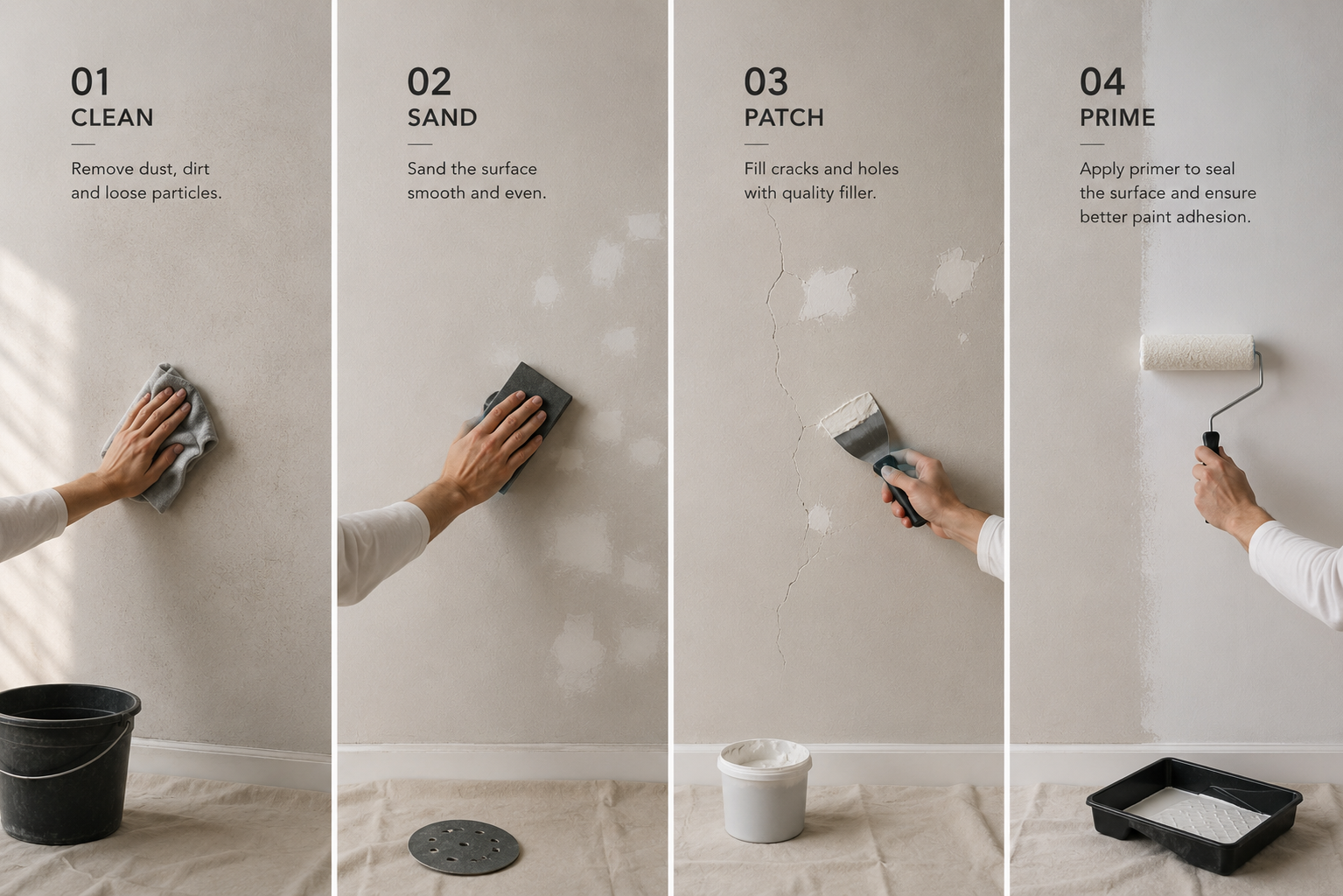
Surface preparation is one of the most critical yet overlooked aspects of painting. Even premium paint cannot perform well on poorly prepared surfaces.
Proper preparation ensures smooth application, strong adhesion, and long-lasting durability. Without it, issues such as peeling, uneven texture, and dull patches are more likely to occur.
Before selecting final colours, homeowners can follow an interior painting preparation guide to understand why cleaning, patching, sanding, and priming are essential before applying paint.
Typical preparation steps include cleaning the surface to remove dust and grease, repairing cracks and imperfections, sanding to ensure smoothness, and applying a primer to ensure uniform paint absorption.
- Cleaning improves adhesion
- Patching removes surface defects
- Sanding creates smooth application
- Priming ensures colour consistency and durability
Preparation directly determines how professional the final finish appears.
How Colour, Finish, and Lighting Work Together
The true impact of interior painting comes from the interaction between colour, finish, and lighting rather than any single element alone. These three components constantly influence one another.
For example, a matte white wall in natural light creates a soft, calm, modern aesthetic. The same white in a satin finish appears brighter and more reflective. Similarly, darker tones in matte finishes feel deep and cinematic, while satin finishes make them appear more polished and structured.
This demonstrates that paint selection should always be viewed as a system rather than an isolated choice.
- Colour defines emotional tone
- Finish controls surface texture and reflection
- Lighting determines final visual perception
When aligned correctly, these elements create interiors that feel intentional and cohesive.
Room-by-Room Application Guide
Different rooms require different painting strategies based on usage, lighting, and functionality.
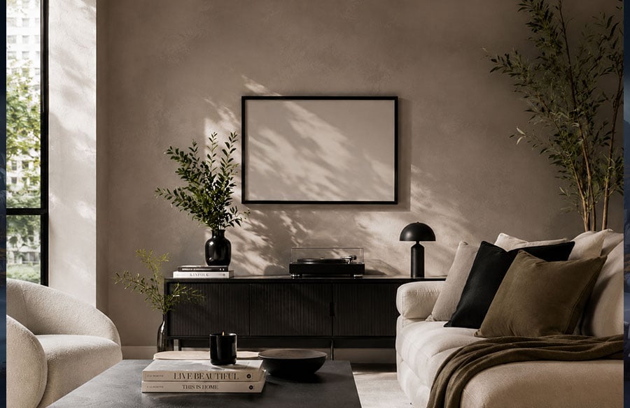
Living rooms typically benefit from neutral tones combined with low-sheen finishes. This combination creates a balanced environment suitable for relaxation and social interaction.
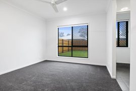
Bedrooms are best suited to matte finishes and softer colour palettes. These reduce visual stimulation and promote restfulness.
Kitchens require durable finishes, such as satin or semi-gloss, due to frequent cleaning. Lighter colours also help enhance brightness in functional cooking spaces.
Bathrooms perform well with moisture-resistant satin finishes and cool tones that support cleanliness and freshness.
- Living room: neutral + low-sheen for balance
- Bedroom: matte + soft tones for relaxation
- Kitchen: satin + light tones for durability
- Bathroom: satin + cool tones for hygiene
Each room benefits from a tailored approach rather than a uniform design choice.
Common Mistakes Homeowners Make
Many interior painting issues result from planning mistakes rather than paint quality. One of the most common errors is selecting colours without testing them under different lighting conditions.
Another frequent issue is ignoring surface preparation, which often leads to uneven finishes or reduced durability. Using high-gloss finishes on imperfect walls can also highlight flaws rather than hide them.
Dark colours are sometimes overused in small spaces, creating a visually compressed feeling. Additionally, failing to consider how a room is used often results in unsuitable colour and finish combinations.
- Not testing colours under multiple lighting conditions
- Skipping surface preparation steps
- Using gloss on uneven surfaces
- Overusing dark tones in small rooms
- Ignoring room function during selection
Avoiding these mistakes significantly improves design outcomes.
Professional Insight on Modern Interior Painting
Modern interior design focuses on long-term adaptability rather than short-term trends. Neutral base colours combined with layered accents allow spaces to evolve over time without requiring frequent repainting.
Professionals also emphasise the importance of testing samples on real walls under different lighting conditions before final application. This ensures consistency between expectation and outcome.
For homeowners looking for professional painting support across Melbourne, Call A Painter Melbourne provides interior and exterior painting services with a focus on preparation, clean finishes, and reliable workmanship.
Conclusion: Creating Balanced and Modern Interiors
Wall colours and finishes are powerful design tools that significantly influence how modern homes look and feel. When combined thoughtfully with lighting and proper surface preparation, they create interiors that are visually balanced, emotionally comfortable, and functionally effective.
A successful interior is not built on colour alone but on the harmony between colour, finish, and light, supported by proper preparation and design awareness. Understanding this relationship allows homeowners to create spaces that feel timeless, practical, and visually refined.
For homeowners planning a transformation with professional precision, Call A Painter Melbourne offers reliable painting services focused on clean finishes, careful preparation, and lasting results.
FAQ
What impact do wall colours have on modern interior design?
Wall colours directly influence how a space feels by affecting mood, brightness, and spatial perception. Light colours make rooms feel larger and more open, while darker tones create depth, warmth, and intimacy.
Which paint finish is best for modern homes?
Low-sheen and matte finishes are most commonly used in modern homes because they create a balanced, contemporary look. Matte works best for soft, calm spaces, while low-sheen offers durability and versatility.
How does lighting affect wall paint colour?
Lighting changes how paint appears throughout the day. Natural light shifts colour tone from warm to neutral, while artificial lighting can make colours appear warmer or cooler depending on bulb temperature.
Why is surface preparation important before painting walls?
Surface preparation ensures paint adheres properly and looks smooth. Cleaning, sanding, patching, and priming prevent peeling, uneven texture, and dull finishes, improving both durability and appearance.
Can the same wall colour look different in different rooms?
Yes, the same colour can look completely different depending on lighting, room size, and paint finish. A shade may appear brighter in a sunlit room and darker or warmer in low-light spaces.
What is the difference between matte and satin finishes?
Matte finishes absorb light for a soft, non-reflective look, while satin finishes reflect a small amount of light, making them more durable, easier to clean, and slightly more vibrant in appearance.