A small room does not have to look small. Its dimensions are fixed, but the way we read those dimensions depends on what catches the eye, where it sits, and how much of the surrounding wall remains visible. Wall art can make a compact interior feel calmer, taller, or more expansive without asking for another square foot of floor space. It can also do the opposite when its size or placement fights the room’s proportions.
Give the eye a place to land
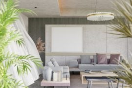
In a compact living room, several unrelated pictures scattered across different walls can make every surface compete for attention. A single, deliberate focal point gives the eye a clearer route through the space. Try placing a substantial piece above the sofa or on the wall visible from the doorway. From there, let the surrounding surfaces play a quieter role.
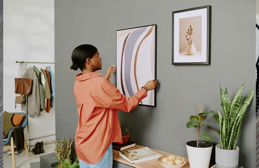
The aim is not simply to choose the largest artwork that will fit. Look at the piece together with the furniture beneath it. Art that is tiny beside a wide sofa can look stranded, while a very broad piece over a narrow console may make the console seem undersized. Photograph or paper templates on the wall can help test that relationship before any holes are made.
Use orientation to reinforce the room
The shape of an image can draw attention along a particular axis. A tall composition may emphasize the distance between a low piece of furniture and the ceiling. A landscape or panoramic composition can carry the eye across a short wall, making its horizontal extent more noticeable. Neither effect is guaranteed: the result depends on the wall’s actual proportions, the furniture, and the viewing position.
This is especially useful in awkward areas. A vertical work can give a narrow strip between a door and a window a purpose. A wider image may help connect the visual field above a compact dining bench. Instead of treating every blank patch as a place to fill, use the room’s existing lines as a guide.
Leave enough wall to frame the art
Negative space is part of the composition. A clear margin around an artwork lets its edges register and prevents the wall from feeling crowded. In a small interior, that breathing room can matter as much as the image itself. If a grouping is planned, think of the pieces as one arrangement with a shared boundary, rather than as several separate objects that each demand attention.
This also explains why fewer, better-placed works may feel more generous than a dense gallery wall. The goal is not minimalism for its own sake. It is to decide whether the room needs one strong visual anchor or a collection with a readable rhythm. A gallery wall can work beautifully when spacing, alignment, and a common color or subject hold it together.
Let color and light do some of the work
An artwork does not need to match every cushion and curtain. Repeating one or two tones from elsewhere in the room can create continuity, while a contrasting color can establish a focal point. A dark, highly detailed image on an already busy wall may feel heavier than a composition with open areas and a restrained palette. But contrast can also add welcome depth to a pale interior. What matters is the balance across the whole view, not a rule about always choosing light colors.
Check the piece in daylight and in the room’s usual evening light. Glare, shadows, and neighboring lamps can change how its scale reads. A work that feels balanced from the doorway may seem too dominant from the sofa, so test both viewpoints. Small interiors are experienced at close range; details that disappear in a showroom can become prominent at home.
Choose a format that fits the wall, not just the photograph
Photographic work offers flexibility: the same subject can be cropped vertically, horizontally, or square to suit a specific stretch of wall. For a personal image, high quality canvas prints can provide a range of sizes and orientations. Before ordering, check the crop at the intended dimensions and leave important details away from the wrapped edges.
Material presence matters too. A canvas has a different depth and texture from a paper print or a framed photograph. That physical profile may lend a small room a clear focal point without adding floor-level clutter. If provenance matters to the project, CANVASDISCOUNT states that its canvas prints are printed in the USA; that claim should not be extended to every product category it sells. The brand also presents affordable prints, but the useful design decision is still whether the selected format, image, and dimensions serve this particular wall.
Edit the room before adding more
Before settling on the final arrangement, step back and look at the whole interior. Does the art relate to the furniture below it? Can the eye move past it toward a window or another feature? Is there enough quiet wall to make the chosen work legible? These questions reveal more than a generic size formula.
The final choice is about more than wall art. It is about how proportion, direction, and visual hierarchy guide a person through the room. An image cannot change the room’s measurements, but it can change where the room seems to begin and end in the mind’s eye. That is why the most effective choice is rarely just a beautiful image: it is an image in a considered relationship with the architecture around it.