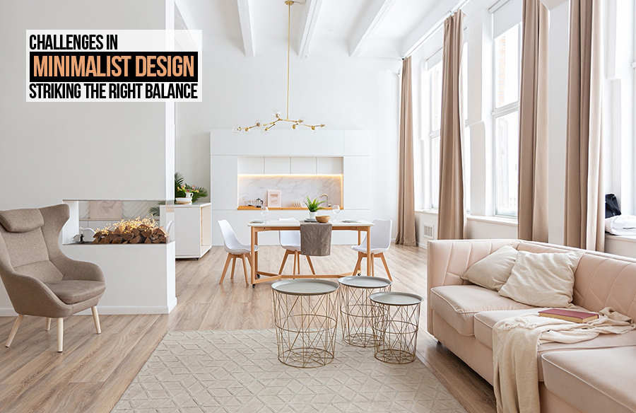
A term that has been taking the architecture, interior, and fashion world by storm is minimalism. The art of creating spaces using minimal elements that are subtle is minimalism. The beauty of minimalism lies in the fact that you do not have to over-express yourself, you can create much more elegant and cleaner spaces with limited resources and make them stand out in no time. The simplicity, soft colour palette, and clean lines are key features of a minimalistic design, making it speak volumes without being all over the place.
The trend started with a buzz and persists today like yesterday. It has happened to gain more popularity and has ended up being the first choice of clients and designers alike. However, with beauty and simplicity comes a lot of challenges of this specific design style. It becomes essential to strike a balance in minimalism as you need elements that will speak volumes. Hence the question that becomes crucial to answer is how much is too much?

- Functionality
While creating a space that you require, most of the space is to be functional. Only focusing on aesthetics and beauty does not lead to the space being functional which will lead to a failed space. Hence striking a balance between functionality and aesthetics becomes important. Using lesser elements that are functional can be of good use. For instance, a sleek armchair that can grab all the right attention or perhaps a clean storage rack that also has the right amount of added aesthetics to it. Functionality and aesthetics should always go hand in hand to create an unforgettable space.

- Colour palette
One of the key highlights of minimalistic design in the colour palette that makes it stand out from the rest of the designs. A soft colour palette consisting of pastels is a great choice if you want to create a clean space. However, the right tint and shade of these colours become a critical factor in determining the right balance. Going overboard with these colours is great but making sure over usage of these colours will bring down the purpose of the design. A monochromatic colour palate is probably the best choice to pick out for a minimalistic design as this allows faster colour selection and also a more synchronised colour palette that will be a plus point for the space

- Consistent design
Any design is boring without design elements, to elevate a space in no time design elements will always be there for the rescue! They are probably the best way to go forward if you need a space that is harmonious and rhythmic. Having constant design elements that are well in sync with each other will not just make your job easier but also get your space notches higher! However, while using design elements make sure that excessive or over-repetition of these elements can kill the idea of minimalistic design, and striking a balance between these elements becomes important

- Accessibility
How you enter or navigate through space becomes a deciding factor on how well thought the space is. Every design must cater to human needs and human responses, making a space that fails to identify these criteria will not just make the space poorly designed but also unused. Accessibility will also provide room for better understanding and judging of space by the user which in turn will be a win-win for the designer and the user. Make sure that the minimalistic elements are decluttered and organised in such a way that it leads to a better understanding of the space and better usage of it as well. Making it clean and neat will help you create better minimalistic designs.

- Declutter
When you think of a minimalistic space you think of how it is characterised by clean spaces, decluttered furniture, and immaculate vibes. This, in turn, becomes important as minimalism is all about striking a balance between different elements and how you can make it seem much more organised. The elements can be sleek making sure it goes well with your space. The whitespace balance will also be another factor in how you can add to your space’s aesthetics and visual hierarchy.