Most architects meet visualization at the end of a project, as the image on a competition board or a site hoarding. That is the least interesting place to meet it. Used early and honestly, a rendering is a drawing that can answer questions a plan cannot: how much light reaches the rear bedroom in December, how a facade reads from the opposite pavement, whether a courtyard feels like a room or a shaft.
An image is a test, not only a promise
Plans, sections and elevations are precise, but they ask the reader to assemble the experience in their head, and each reader assembles a different building. A visualization forces a single version into the open. That is uncomfortable, and it is exactly why it is useful.
The most valuable images are often the ones nobody publishes. A rough grey view from a doorway can show that a stair is too tight, that a window sits behind a column, or that a corridor ends in a blank wall. Finding this out in week 3 costs a conversation. Finding it out on site costs a variation order.
It helps to separate 2 jobs. Working images exist to decide something and can be ugly. Presentation images explain a decision that has already been made. Trouble starts when a presentation image is made first and quietly decides the design.
What each kind of visualization can test
Massing and daylight
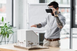
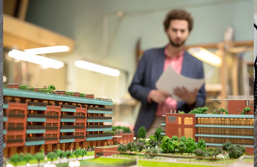
A plain grey model placed in its real surroundings is the fastest test of height, setback and rhythm. Seen from the 3 or 4 viewpoints that matter, a block that looked reasonable in plan can feel abrupt against a cornice line. A fixed camera with a moving sun shows shadow on neighbors and courtyards across hours and seasons. It does not replace a daylight simulation when a standard must be met, but it exposes problems early.
Materials and detail
A brick that looks warm as a sample can read flat across 4 storeys. Rendering a single bay at realistic resolution, with joints, reveals and true window depth, shows whether the facade has enough relief to hold shadow.
Floor plans and movement
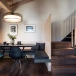
A 3D floor plan makes a layout readable to non-specialists. Furniture at true scale shows whether a bedroom takes a double bed and a wardrobe, and whether a door swing collides with a kitchen island. An animation adds sequence: arrival, threshold, view. A still cannot show whether a route feels generous or mean.
Street level
The view that matters most to the public is the one at 1.6 m above the pavement. Check what a pedestrian meets at the ground floor: entrances, active frontage, plant rooms, blank walls. Aerial views flatter almost every scheme, and street level is harder to fake.
Where renders mislead
Every image is an argument, and several habitual techniques tilt it.
- Lens: a wide angle stretches depth, makes rooms feel larger and pushes neighbors away. A focal length close to what the eye accepts keeps proportions honest. Tilted verticals and fisheye corners are warning signs.
- Light: low golden sun hides flat surfaces and gives every material a glow. Overcast light is less romantic and more truthful. Be wary of a set where every image shares the same perfect hour.
- People: crowds and cafe tables can make a thin public space look alive, and slightly small figures make a building look taller. Ask whether the activity shown is something the program can generate.
- Vegetation: mature trees on opening day are the most common cheat. They cover bulky elevations and soften harsh corners. Show planting at the size it will have when the building opens, and add a second view at maturity if growth is part of the design.
- Omissions: cables, signage, bins, plant and the neighboring building not yet demolished tend to vanish.
A useful test: would the image still persuade next to a photograph of the finished building taken on an ordinary day?
Commissioning honest visualization
Honesty is easier to specify at the start than to retrofit at the end. Begin with the question, not the picture. Tell the studio what the image must help decide and who will see it, because a planning image, a sales image and an internal design check need different cameras, light and detail.
Ask for a grey clay stage before materials. A good architectural visualization studio agrees camera, lens and light on a plain model first, so composition problems surface while they are cheap to change. A studio in Tallinn, Estonia, that has worked this way since 2013, across 1,247 projects for 215 companies in 17 countries, finds that the clay approval is where most misunderstandings get resolved.
Fix the commercial frame early too. A clear scope, a set number of revision rounds and a fixed price and delivery date agreed before work starts let both sides focus on the design. Then write the honesty rules into the brief:
- Camera height and focal length stated for every view.
- Real surroundings as they exist today, not as the client hopes they will become.
- Planting sized for the opening date.
- Time of day and weather varied across the set.
- People used to show scale and use, not to hide the architecture.
A short reflection on seeing
There is a fair worry that images now arrive before ideas, and that a scheme is judged on its surface before anyone reads the section. The worry holds when the image is the first and only test. It weakens when visualization is part of the working method, repeated at several stages and used to ask what is wrong, not to confirm what is right.
Architects have always drawn buildings before they exist. A hand sketch announces that it is an impression, while a photoreal image asserts that this is how it will look. Respecting that assertion means checking it against the drawings, the site and the weather, and being willing to publish the less flattering view as well.