The most successful interiors are not the ones that look expensive or follow a particular style trend. They are the ones that feel inevitable, where everything inside the space seems to belong there as a natural extension of the building itself. Walls, floors, furniture, textiles, and decorative objects all seem to be part of the same conversation rather than collected from different ones.
This quality of cohesion is what separates spaces that feel genuinely designed from ones that feel decorated. And achieving it is less about budget or access to rare materials than it is about understanding the logic that connects architectural decisions to interior ones and following that logic consistently through every layer of the space.
Reading the Architecture Before Making Any Interior Decisions
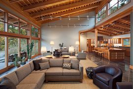
A building communicates a point of view before a single piece of furniture is placed. The ceiling height, the structural material, the window proportions, the quality of light, and the relationship between interior and exterior all set a tonal register that interior choices either align with or fight against.
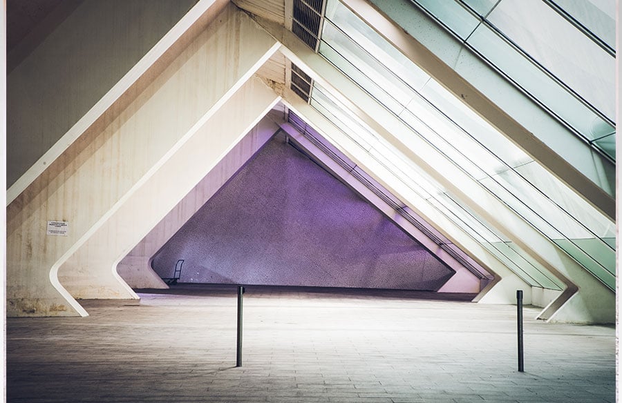
A concrete and glass structure with high ceilings and clean lines is communicating something specific: clarity, precision, a celebration of the structural material itself. Soft, heavily draped interiors with ornate furniture sit in direct contradiction to that communication. The interior works best when it picks up on the language the architecture is already speaking, choosing materials and forms that respond to what is already there rather than imposing a different aesthetic over the top of it.
The same logic applies in the other direction. A heritage terrace home with plaster cornices, timber floors, and considered fenestration has its own tonal logic. Overly minimal, cold interiors that ignore the warmth and detail of the architecture feel unsettled in these spaces, because they are working against the grain of what the building is rather than with it.
The practical starting point is always observation: what is this building saying, and how do the interior choices either carry that conversation forward or interrupt it?
Materials as the Bridge
One of the most reliable ways to build cohesion between structure and styling is through material continuity. When an interior material connects directly to an architectural material, whether by reference, complement, or deliberate contrast, it establishes a relationship between the two layers that feels considered rather than coincidental.
In a home with an exposed brick wall, interior choices that pick up on the earthy, warm tone of the brick, through timber furniture, terracotta accents, linen textiles, or ceramic objects, echo the material language of the structure without literally repeating it. The interior and the architecture are in dialogue.
This material conversation extends to the floor plane, which is often the largest continuous surface in any interior and one of the most powerful connectors between architecture and styling. Floor-to-ceiling material continuity, where internal flooring extends to or references an exterior paving material, or where a structural floor material like polished concrete is left exposed and built around, creates spatial coherence that no amount of furniture arrangement alone can achieve.
Miss Amara rugs occupy a particularly interesting position in this material conversation. A rug is one of the few interior objects that simultaneously defines a spatial zone, introduces texture and warmth, and can either reinforce or contrast the architectural palette of the room. A handwoven wool rug in earthy tones placed on polished concrete does not fight the industrial quality of the floor; it responds to it, adding warmth without denying the structure’s honesty. A geometric flat-weave rug on a timber floor in a modernist home extends the considered geometry of the space. The rug choice is never decorative in isolation: it is a spatial and material decision that either adds to or detracts from the cohesion of the whole.
Proportion and Scale: Where Many Interiors Lose the Thread
Architectural spaces have inherent proportional logic built into them. Ceiling heights, opening widths, structural bay spacings, and window sizes all create a system of proportional relationships that good interior design respects and amplifies.
The most common way interiors lose cohesion with the architecture is through scale mismatches. Furniture that is too small for a high-ceilinged room makes the space feel uncertain and unfinished. Lighting fixtures that are the wrong scale for the room they occupy read as an afterthought rather than a considered choice.
As the detailed examination of how textures change the emotional quality of a space makes clear, the spatial experience of a room is shaped as much by what surfaces do at a sensory level as by what they look like in a photograph. Scale and proportion operate in the same register: they are experienced physically and emotionally rather than analytically, and when they are right, the room simply feels correct in a way that is difficult to articulate but immediately apparent.
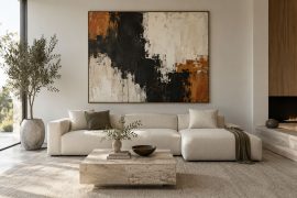
Furniture groupings should be scaled to the room’s dimensions and ceiling height. Artwork should be sized to its wall rather than treated as a floating element that happens to land somewhere. Lighting should be proportional to both the ceiling height and the task or mood it is serving.
Layering Texture to Complete the Structural Conversation
The final layer of cohesion between architecture and interiors is texture. A room that has achieved material consistency and proportional logic but lacks textural variety reads as flat and resolved in a way that is almost too neat. Living interiors have physical variety, the kind that invites touch as well as visual attention.
The role of texture in interior design is not simply decorative. Texture mediates between the harder, more permanent qualities of architecture and the softer, more variable elements of interior styling. A smooth plastered wall reads differently when a rough linen curtain hangs against it, or when a textured wool rug sits on the floor below it. The contrast is what makes both surfaces more vivid and more interesting, and what makes the room feel fully inhabited rather than simply furnished.
The principle is balance rather than uniformity. A single dominant texture reads as monotonous. Too many competing textures create visual noise that undermines the coherence that everything else in the design has been working toward. The most successful textural environments introduce variety within a family of materials that belong together, so that the room feels rich without feeling cluttered.
The Conversation That Never Ends
Cohesion between architecture and interiors is not a problem that gets solved once at the point of furnishing and stays solved. It is a conversation that continues as objects are added, as seasons change the quality of light, and as the needs of the people living in the space evolve. The interiors that age best are the ones built on a strong structural reading from the beginning: they have enough integrity in their foundational choices to absorb change gracefully rather than being destabilised by it.
Getting the architecture-interior relationship right is the investment that makes everything else in a space more legible, more beautiful, and more genuinely its own.